UI and visual design · Intermediate · 18 min
Design form errors and inline validation
By Padding · Updated 18 Nov 2026
Figma (web) and a spreadsheet · November 2026
You will have a validation timing table for every field on a booking form, a message for every way each field can go wrong, and an error-states frame in Figma showing the field errors, the error summary and where focus goes.
On this page
Most form advice stops at "show errors next to the field". The decisions that make a form pleasant or maddening come before that: when a field checks itself, what it says, whether a summary appears, and where the cursor goes once something is wrong. A field that turns red while someone is halfway through typing their phone number feels like being told off mid-sentence. A form that says nothing until submit, then shows four red boxes below the fold, feels like a trap.
In this tutorial you make those decisions for the Your details screen of the Larkfield Clinic booking app, the screen where a patient enters Full name, Date of birth, Mobile number, Email (optional) and ticks Text me a reminder the day before. You write down when each check runs, write a message for every failure, design the field error and an error summary, and annotate where focus moves. The output is two things a developer can build from: a validation timing table, and a Your details / Error states frame.
If you followed the design-a-product-end-to-end series, you already have one error frame, Your details / Errors, with a short mobile number and the message Error: Enter a mobile number with 11 digits, such as 07700 900123. That frame shows one error. This tutorial covers all of them, and the rules behind them. If you are working on your own form, swap in your fields; every step works the same way.
Step 1 · List every way each field can be wrong
Before deciding when to check anything, list what you are checking. Open a spreadsheet and make a sheet called Validation with these columns: Field, Required, Check, Example bad input. Add one row per check, not per field, because one field usually has several ways to fail.
For Larkfield's Your details screen, the rows are:
Full name, required: empty.Date of birth, required: empty; not a real date (31 02 1985); in the future.Mobile number, required: empty; wrong number of digits (07700 9001); contains letters (07700 9OO123, with capital Os).Email (optional), not required: not an email address (adaeze.okonkwo@gmail).Text me a reminder the day before: no check. A checkbox that is allowed to be ticked or not cannot be wrong.
Now look for checks you should not make. Two are common, and both lock real people out:
- Name rules. Do not check names for "letters only" or a minimum length. Real names contain hyphens (
Adaeze Okonkwo-Hughes), apostrophes (N'Golo), accented and tone-marked letters (Ọlá,Zoë), spaces, and sometimes a single word. The only check a name needs is that something was entered. - Phone formats. Do not reject spaces, brackets or a leading
+. People copy numbers from contacts in whatever format they were saved. Strip the formatting before you count digits. If your service accepts numbers from more than one country, as many clinics serving migrant or cross-border patients do, count digits per country code or loosen the check to a plausible range, rather than holding everyone to one country's rule.
Strike those through rather than deleting them, with a one-line reason, so nobody adds them back later.
Check it worked
Your Validation sheet has one row per check, eight for Larkfield (one for name, three for date of birth, three for mobile, one for email), each with a realistic bad input. The name row has no character or length rule, and the mobile row says formatting is stripped before counting.
Step 2 · Decide when each check runs
There are four moments a check can run: while the person types, when they leave the field, when they press the submit button, and after the server answers. Add a column called When to your sheet and fill it with one of these rules per row. These are the defaults Larkfield uses, and the reasoning for each:
- Never on the first pass while typing. A mobile number is "wrong" for every keystroke until the last one. Checking as someone types flags a problem that does not exist yet, and on a phone the message can push the field around under their thumb.
- On leaving the field, only if something was typed. If the person typed
07700 9001and moved on, tell them now, while the field is fresh in their mind. If they left it empty, say nothing: they may be tabbing through to see what the form asks, or planning to come back. - On submit, everything. Pressing
Continueruns every check, including the "is it empty" checks on required fields that were skipped. - After an error is showing, re-check on every keystroke, but only to clear it. Once
Mobile numbershows an error, remove the message on the keystroke that makes it valid. Do not let it show a different error mid-typing; that waits for the next leave or submit.
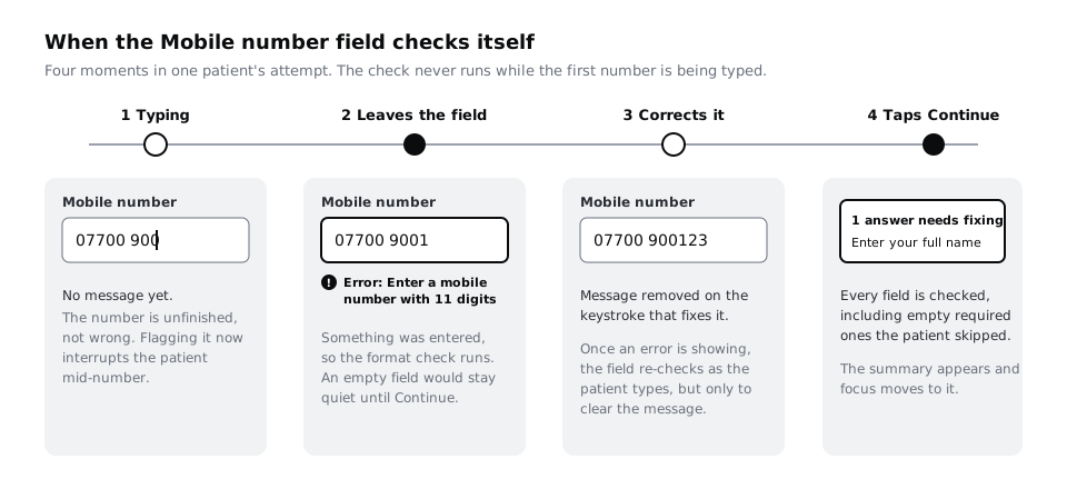
Two more decisions belong in the table, because developers will ask:
- Do not disable the
Continuebutton until the form is valid. A greyed-out button tells people something is wrong without saying what. Keep it active and let it run the checks. - Server checks go last and keep everything entered. Whether the patient's date of birth matches an existing record, or whether 10:30 on Tuesday 9 December is still free, can only be known after the server answers. On a slow or prepaid mobile connection that answer can take several seconds, so show the button as busy (
Booking...), keep every value in the form, and show the result as a message, never as a cleared form. Larkfield already has this for the slot: theConfirm / Could not bookframe.
Here is the Larkfield table once filled in:
Full nameempty: on submit.Date of birthempty: on submit. Not a real date: on leave, if typed. In the future: on leave, if typed.Mobile numberempty: on submit. Wrong digit count: on leave, if typed. Contains letters: on leave, if typed.Email (optional)not an email: on leave, if typed. Empty: never.- All fields with an error showing: clear on input.
Check it worked
Every row in your sheet has a When value, and none of them says "while typing" for a first check. Read the mobile row aloud with the example input: "If I type 07700 9001 and move to email, the error appears; if I skip it, nothing appears until Continue." If any row produces an error the moment someone starts typing, change it.
Step 3 · Write a message that says what to do
Add a Message column. Every row gets its own message, because "Enter your mobile number" and "Enter a mobile number with 11 digits" are different instructions. Write each one so a patient who reads only the message knows what to type next. Four rules:
- Start with the action.
Enter your full name, notFull name is required. The first says what to do; the second describes the form's opinion. - Give an example of a right answer when the format is the problem.
Enter a mobile number with 11 digits, such as 07700 900123. The example is a correction the person can copy the shape of, which is what WCAG 2.2's Error Suggestion criterion asks for when a fix is known. - Name the field in words the label uses. If the label says
Mobile number, the message says "mobile number", not "phone" or "contact". - No blame, no codes, no "invalid".
Invalid inputtells a patient nothing.Error 422tells them less.
The Larkfield messages:
Full nameempty:Enter your full nameDate of birthempty:Enter your date of birth- Not a real date:
Enter a date of birth that exists, such as 31 03 1985 - In the future:
Enter a date of birth before today Mobile numberempty:Enter your mobile number- Wrong digit count:
Enter a mobile number with 11 digits, such as 07700 900123 - Contains letters:
Enter a mobile number using numbers only, such as 07700 900123 - Email not an address:
Enter an email address like name@example.com, or leave this empty
Keep messages short enough to fit on two lines in a 360 px wide screen at your small text size, and plan for the translated version to be longer. If Larkfield ever offers the form in Yoruba or French, those strings can run noticeably longer than the English, so let the message wrap rather than truncate.
The Error: prefix you see in the frame is not part of each message. It is added by the component, so it is consistent and translators only handle it once. If you want a deeper pass on the wording, Write interface copy for labels, buttons and errors covers the voice rules for the whole screen.
Check it worked
Every row in your sheet has a message that starts with a verb, and none contains "invalid", "required", "error code" or an exclamation mark. Cover the Field column with your hand and read only the messages: you can still tell which field each one is about and what to type.
Step 4 · Design the field error state
Now the visual part. Open your Figma file and go to the text field component. In the Larkfield file this is Text field on the Wireframe kit page, which already has an error version from part 3. Make the versions variants of one component with a property called State and these values: Default, Focused, Filled, Error and Error focused. The last one matters: someone correcting an error is in both states at once, and the field must show the focus ring and the error together.
Style the Error variant so it changes in four ways, not one:
- Heavier outline. The 1 px
colour/borderstroke becomes 2 pxcolour/danger(#B42318). On white that is 6.57:1, comfortably above the 3:1 WCAG 2.2 asks for a component's edge. - The value stays. Never clear what the person typed. They need to see
07700 9001to work out which digit is missing. - An icon and the word
Error:. Put the alert icon at the start of the message line, thenError:and the message. The word is what makes the state readable for someone who cannot tell red from black, and what a screen reader says first. - The message under the box, above the hint. Set it in
Body/Smallandcolour/danger, which is 6.13:1 on thecolour/canvasbackground. Keep the hint, such asFor example 07700 900123, below the message rather than hiding it.
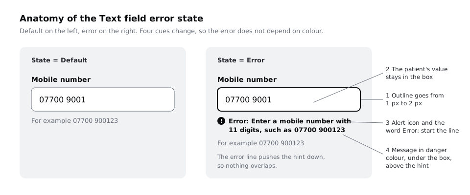
Build the variant with auto layout so the message line pushes everything below it down. A message that overlaps the next field, or a fixed-height field that clips the second line of a long message, will show up the first time someone translates the form.
Check it worked
Select the component set: the State property lists five values. Swap any instance on your screens to Error: the outline thickens, an icon and Error: appear under the box, the value is still there, and the field below moves down rather than being covered. Export the frame as a PNG and view it in greyscale in any image editor: you can still pick out the error field without colour.
Step 5 · Design the error summary
On a short form, the field messages are enough. Once a form is long enough that an error can be out of sight when the person presses the button, add a summary at the top. A simple rule: if the form is taller than one screen on a small phone (360 by 640) with the header in place, it gets a summary. Larkfield's Your details screen, with four fields, hints, a checkbox and a button, passes that height, so it gets one.
Design it as a component called Error summary, placed directly under the screen header and above the first field:
- A heading in
Heading/Mthat counts what needs fixing:1 answer needs fixing,2 answers need fixingand so on. A number tells the patient how much work is left before they can book. - A list of links, one per error, in the same order as the fields on screen. Each link's text is the field's message, word for word, so the person recognises it when they reach the field.
- A 3 px
colour/dangerborder on acolour/surfacefill, so the box reads as an error in greyscale through weight, not tint alone.
The summary is a list of what to fix, not a second copy of the instructions. Do not add "Please correct the errors below" above the links; the heading and the links already say it.
Leave server errors out of the summary. We could not book this time. Your details are saved. belongs on its own banner, because there is no field the patient can fix.
Check it worked
You have an Error summary component with a count heading and a list of links. Put it on a copy of Your details with the Full name and Mobile number fields in their Error state: the two links read exactly the same as the two field messages, in the same top-to-bottom order.
Step 6 · Decide where focus goes
A summary at the top of the screen is no use if the person is looking at the button at the bottom. Decide where focus moves after each kind of check, and write it on the canvas as a note a developer can follow:
- On submit, with a summary: move focus to the summary. The screen scrolls to the top, the summary heading is announced by a screen reader, and the first link is one tab or swipe away.
- On submit, on a short form with no summary: move focus to the first field with an error.
- Tapping a summary link: move focus into that field's input itself, not just to its label, and scroll so the label is visible above it. On a phone the keyboard opens, so the person can type straight away.
- On leaving a field: do not move focus. The person chose to go to the next field; pulling them back is an unexpected change, and WCAG 2.2's On Input criterion warns against changing context because a value changed. The message appears next to the field they left, where they can come back to it.
- When an error clears: do not move focus and do not announce anything. The message disappearing is enough.
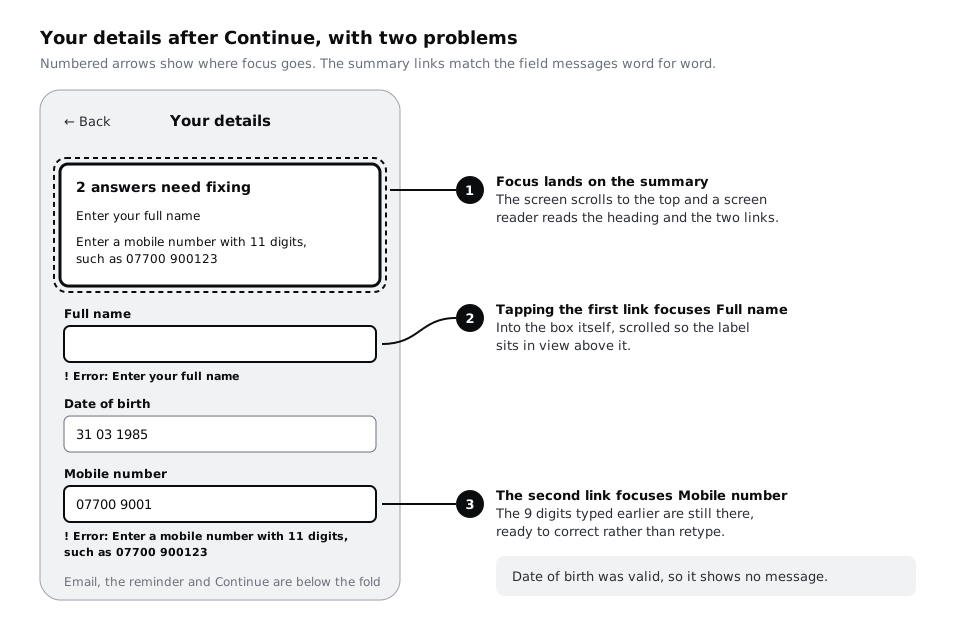
On the frame, draw numbered arrows (1, 2, 3) from the summary to each field, as in the diagram, and add a short text note beside it: "Continue with errors: focus to summary. Summary link: focus to input, label in view. Leave field: no focus change." That note is what turns a picture into a specification.
If the form is built on the web, the developer will also need the field messages tied to their inputs and the summary announced. Build accessible forms in HTML shows the markup for both, and Announce errors and notices with a live region covers messages that appear without a focus move.
Check it worked
Your frame has numbered focus arrows and a written focus note covering four moments: submit with a summary, a summary link, leaving a field, and an error clearing. Walk it with your finger: starting from Continue, you can follow the arrows to every field with an error without guessing.
Step 7 · Build the error-states frame and walk through it
Bring everything together on one page so a developer and a tester can find it. Add a page called Validation (or use the 04 High fidelity page if you prefer to keep states next to screens) and create a frame named Your details / Error states. In it, place:
- One instance of each field for every message in your sheet, each in its
Errorstate with the bad input from theExample bad inputcolumn, labelled with the row it shows. For Larkfield that is eight fields. - One
Error focusedexample, to show the focus ring and error together. - The full Your details screen after
Continue, with the summary and the focus arrows from the last step.
Paste a copy of your timing table next to the frame, or link the spreadsheet in a text note, so the visuals and the rules travel together.
Then test it the way a patient would meet it. Ask a colleague to play the patient and read them three scenarios, showing each frame as they act it out:
- "You type your mobile number but miss a digit, then move to email."
- "You skip your name by accident and tap Continue."
- "You type your date of birth as 31 02 1985."
For each, ask them what they would do next. If they cannot say, the message or the placement needs work. Note the fix beside the frame.
Check it worked
The Your details / Error states frame has one error field for every row in your Validation sheet, an Error focused example and the summary screen with focus arrows. The timing table sits beside it or is linked. In all three scenarios your colleague named the right fix without help, or you have a written change for each one they missed.
Next steps
Errors are easier to design once the form asks for less. Design a mobile form people can finish cuts and reorders the fields that produce these errors in the first place.
For the words themselves, Write interface copy for labels, buttons and errors builds a string table and a short voice guide for the whole app. When the problem is not a field, such as a booking that fails or a lost connection, Design error states that help people recover covers full-screen and banner errors. To see the field errors and summary in working code, go to Build accessible forms in HTML.
Part of these paths
Related tutorials
- Design a mobile form people can finishYou will have cut a 21-field clinic registration form down to a five-field phone screen in one column, with labels above fields, the right keyboard for each input, sensible defaults and one clear button, plus a before and after showing fields and estimated taps cut and a note of every field you deferred.
- Write interface copy for labels, buttons and errorsYou will have every string on three Larkfield Clinic booking screens rewritten to four rules and tested aloud, in a string table showing old and new side by side, plus a five-line voice guide the team can write new screens from.
- How to Build Accessible HTML FormsYou will build a contact form that works with keyboards and screen readers, with real labels, grouped radio buttons, hints tied to their fields, autocomplete values, and an error summary that takes focus and links to each problem, checking the result against specific WCAG 2.2 criteria.
Need this done for you?
Padding does this work for growing companies, from the first diagnosis to a system that keeps working.
Get new tutorials