UI and visual design · Beginner · 17 min
Design buttons: hierarchy, sizes and every state
By Padding · Updated 18 Nov 2026
Figma (web) or any design tool · November 2026
You will have a button sheet with four kinds, two sizes and six states for each kind, plus a written one-primary-per-screen rule, checked against every screen of the Larkfield Clinic booking app.
On this page
Most button problems are not drawing problems. The button looks fine; the trouble is that a screen has three of them that look equally important, or a red one where nothing dangerous happens, or a greyed-out one that nobody can explain. Those are decisions about the set, and they are cheaper to make once on a sheet than to argue about screen by screen.
This tutorial decides what the Larkfield Clinic button set should be: which kinds of button exist and when each is used, how big they are, what every state looks like, and what the words on them must do. It ends with the rule that holds the set together, one primary per screen, written down and tested on every screen of the booking flow (Home, Choose a service, Pick a time, Your details, Confirm, Booked).
It does not build the component. Turn a button into a component with variants covers the Figma mechanics, and Specify ten core components and their states writes the short spec card. This is the thinking that both of those assume has already happened.
The colours come from the Larkfield variables and ramps: colour/accent is teal #0F5E5A, colour/danger is red #B42318, and the steps above and below them come from the teal and red ramps. If your app has its own palette, keep your values and follow the same method.
Step 1 · List every action and rank it
Before you draw anything, find out what the buttons have to do. Add a page called Buttons to the Larkfield file. On it, make a plain text list of every action a patient can take on the six screens and the four state frames, one line each, with the screen it is on. Include actions that are links today, such as View or cancel a booking on Home and the Change links on Confirm, because some of them will become buttons.
Then give each line one of three ranks:
- Main: the action most patients on this screen should take next. Without it, the flow stops.
- Alternative: a real choice some patients need, such as
Add to calendaron Booked. - Minor: a quiet, low-stakes action that sits inside content, such as
Changeon a summary row.
Mark separately any action that cannot be undone. In the booking flow there is one, and it is not on the six screens: the Cancel appointment button on the Booked – details view, which removes a patient's slot.
For Larkfield the list looks something like this:
- Home:
Book an appointment(main),View or cancel a booking(minor) - Choose a service:
Choose a time(main) - Pick a time:
Continue(main); in the No times state,See next week(alternative) - Your details:
Continue(main) - Confirm:
Book appointment(main), fourChangeactions (minor); in the Could not book state,Try again(main) - Booked:
Done(main),Add to calendar(alternative) - Booked – details:
Cancel appointment(cannot be undone)
Check it worked
Your Buttons page has a list with every tappable action from all ten frames, each with a screen and a rank. Count the main actions per screen: Larkfield has exactly one on each screen and state. If one of your screens has two, note it; the last step deals with it.
Step 2 · Give each rank a kind of button
Ranks become kinds. A kind is a visual weight, and the weights must be far enough apart that someone can tell them apart at a glance, in sunlight, on a cheap screen. Larkfield uses four:
- Primary for the main action. A solid
colour/accentfill with the label incolour/on-accent(white), 7.58:1. It is the heaviest shape on any screen. - Secondary for alternatives. A
colour/surfacefill, a 1 px stroke incolour/borderand the label incolour/accent. The border is what makes it a button rather than text, so it must reach 3:1 against the surface;border(grey/500, #7F848B) gives 3.77:1 on white. - Tertiary for minor actions. No fill and no stroke, just the label in
colour/accentandLabelweight. It is the lightest kind, so use it only inside content where its position already says "this belongs to that row". - Destructive for actions that cannot be undone. A solid
colour/dangerfill with the label incolour/on-accent, 6.57:1.
Two decisions here are worth writing down beside the kinds, because they are easy to get wrong later:
- Red only at the point of no return.
Cancel appointmenton the details view opens a confirmation; it does not cancel anything yet. So it is a Secondary button. The Destructive kind appears only on the confirmation, where pressing it really removes the slot. A screen full of red buttons teaches people to ignore red. - Colour is not the only signal. A patient who cannot tell red from teal still has to know that the destructive button is different. The label (
Cancel appointment, notYes) and a line of text above it (You cannot undo this.) do that work.
Map each line of your list to a kind: main to Primary, alternative to Secondary, minor to Tertiary, cannot-be-undone to Destructive.
Check it worked
Each of the four kinds is written on the Buttons page with its fill, stroke and label tokens, and every action in your list has a kind next to it. Read down the list: no Destructive kind appears on an action that only opens a confirmation, and every Secondary has a border stroke.
Step 3 · Set two sizes and the anatomy
Two sizes are enough for a phone app. More sizes lead to buttons that are almost the same height, which looks like a mistake rather than a choice.
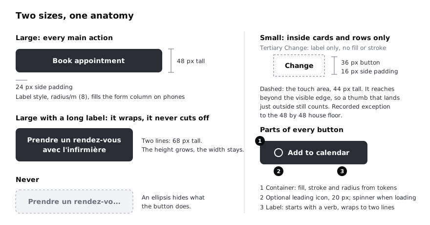
Large is the default for every kind. It is 48 px tall, with 24 px padding at the sides and the label in the Label text style. On phones, a Large Primary or Secondary at the bottom of a screen fills the width of the form column, which puts it where a thumb already is. On the clinic's desktop booking page it hugs its label instead, because a 900 px wide button reads as a banner, not an action.
Small is 36 px tall with 16 px side padding and the same text style. Use it only inside cards and list rows, where a Large button would push the content apart. The four Change actions on Confirm become Small Tertiary buttons at the end of each summary row: label only, as the kinds step says, with the row around them doing the work a border would. The button is 36 px tall, but write down that its touch area is 44 px tall, with 4 px of invisible padding on every side: the extra space is part of the button, so a thumb that lands a little outside the edge still counts. WCAG 2.2 sets 24 by 24 px as the minimum at level AA and 44 by 44 at level AAA. Larkfield's own floor is 48 by 48, the house rule in Size touch targets for thumbs, which allows 44 by 44 where a row cannot fit 48 as long as the exception is recorded. A Change action inside a summary row is that recorded exception, the same one the Card spec card makes for a Change link inside a card. The Button spec card in Specify ten core components and their states gives 48 px as the minimum height because it covers Large only; Small is a deliberate addition to that card, so add a line to it: Small is 36 px tall with a touch area of at least 44 by 44, inside cards and rows only. Never use Small for a Primary.
Every button has the same three parts: the container, an optional 20 px leading icon (which becomes the spinner when loading), and the label. Two layout rules apply to the label:
- It wraps, it never cuts off. A label that ends in an ellipsis hides what the button does. Larkfield patients choose English, French, Yoruba or Hausa, and translated labels are often a third longer than the English. A Large button with a two-line label is 68 px tall: the height grows and the width stays.
- The icon is optional and never alone. An icon helps a patient scan, but a calendar icon by itself can mean "add", "view" or "change date". Every Larkfield button has a text label.
Draw one Large and one Small button of each kind on the Buttons page, and one Large Primary with a long translated label to prove the wrap works. If you use Figma, set the button frames to hug their contents vertically, so the height grows when the label wraps.
Check it worked
Your page has eight buttons (four kinds in two sizes) and one wrapped example. Measure them: every Large is 48 px tall with one line and 68 px with two, every Small is 36 px tall, and the Small buttons have a note saying their touch area is at least 44 by 44 px, recorded as the exception to Larkfield's 48 by 48 floor. Shrink the wrapped example's width: the label moves onto another line and no text is cut off.
Step 4 · Draw six states for every kind
A button changes appearance as people use it. Larkfield needs six states: default, hover, pressed, focus, disabled and loading. Draw them all as one sheet, kinds down the side and states across the top, so the gaps and inconsistencies show.
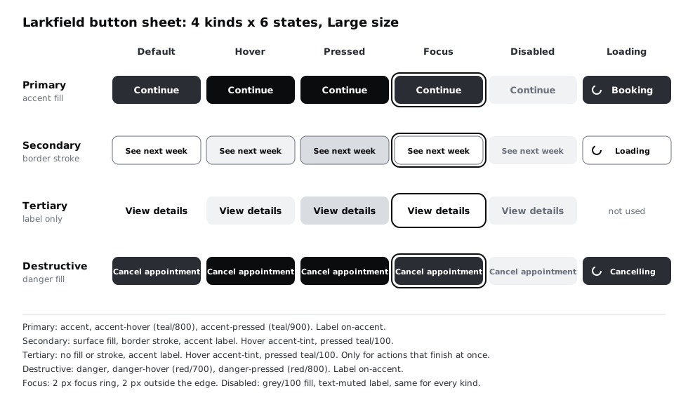
Each state uses tokens, not new colours, and every state token is an alias of a ramp step, so it moves with the ramp. Open the Larkfield collection in the variables panel and sort out five of them:
- Create
colour/danger-hover(alias of red/700) andcolour/danger-pressed(alias of red/800). No earlier tutorial adds these. - Create or check
colour/accent-hover(alias of teal/800) andcolour/focus(alias ofcolour/accent). If you followed Specify ten core components and their states, both exist already; check what they point at. - Repoint
colour/accent-pressedto teal/900. The palette tutorial created it pointing at teal/800, which would make hover and pressed identical. If you do not have it yet, create it pointing at teal/900.
Then draw each state with them:
- Default: as defined in the kinds step.
- Hover: a pointer is over the button. Phones have no hover, but the clinic's desktop page does. Primary goes to
colour/accent-hover(teal/800, #014441, white label at 11.03:1). Destructive goes tocolour/danger-hover(red/700, #9D0900, 8.49:1). Secondary and Tertiary gain anaccent-tintfill (teal/50), with the label still at 6.97:1. - Pressed: the moment a finger is down. On a slow connection this is the only sign that the tap landed, so it must be visible. Primary goes to
colour/accent-pressed(teal/900, #002B29, 15.24:1), the token you just repointed. Destructive goes tocolour/danger-pressed(red/800, #720500, 12.09:1). Secondary and Tertiary get a teal/100 fill, label at 6.24:1. - Focus: reached by keyboard or switch control. One ring for every kind: 2 px of
colour/focus(an alias ofcolour/accent), drawn 2 px outside the button's edge, so a teal ring stays visible around a teal button. It is 7.58:1 on white and 6.94:1 oncolour/canvas. Design visible focus states for keyboard users tests it on every surface. - Disabled: identical for every kind, so it never looks like a fourth weight. A grey/100 fill (#E3E8F0), no stroke, label in
colour/text-muted. WCAG exempts inactive controls from contrast, but Larkfield keeps the label readable anyway: 4.48:1, close to the 4.5:1 that text needs. The next step decides when this state may be used at all. - Loading: waiting for the server after a tap. The next step covers it.
Tertiary has no loading state. Larkfield's tertiary actions open something already on the phone (View details, View or cancel a booking), so they never wait. Write that in the empty cell rather than leaving it blank, so nobody wonders whether it was forgotten.
Check it worked
The variables panel shows colour/accent-hover → teal/800, colour/accent-pressed → teal/900, colour/danger-hover → red/700, colour/danger-pressed → red/800 and colour/focus → colour/accent. Your sheet has 24 cells: 23 drawn buttons and one cell that says why Tertiary has no loading state. Select any cell and check its fill and label colour: each is a variable, not a hex code. Read across the Primary row: every state looks different from default, and pressed is darker than hover.
Step 5 · Make disabled and loading say what is happening
These two states are where most button sets fail patients, because both leave someone looking at a button that does nothing.
Loading. On Confirm, a patient presses Book appointment and the request may take several seconds, longer on a congested mobile network or a low-end Android phone. If nothing changes, many people tap again, and a second tap can mean a second booking. So the loading state does four things:
- Keeps the button's width and position, so nothing on the screen jumps.
- Puts a spinner where the leading icon goes.
- Changes the label to say what is happening:
Booking,Cancelling,Loading. The word tells sighted patients what the spinner means, and gives developers the text to announce. - Ignores further taps until the answer comes back.
Write a note for developers next to the cell, because this is behaviour, not visuals: ignore repeat taps while loading, and announce the new label to screen readers (for example through a live region), because a changed button label is not reliably read out on its own.
If the answer is a failure, the button returns to default with the label from the Confirm / Could not book state, Try again, and the banner above it explains what happened. Draw that sequence on the page as three small frames: default, loading, failed.
Disabled. Larkfield already has one rule from the component spec: never disable Continue to hide errors. Let the patient press it and show what is missing, because a greyed-out button does not say which of four fields is wrong.
Disabled is allowed only when the action genuinely cannot happen yet and you can say why, right beside it. Larkfield has one case. Say the clinic opens bookings four weeks ahead. In the No times this week state for the fourth week, See next week cannot work. Disable it, and put the reason directly under it in Body/Small and colour/text-muted: Bookings open four weeks ahead. More times from Monday. Keep the phone fallback line under that. Do not hide the reason in a tooltip: phones have no hover, so most patients would never see it.
If you cannot write that one-line reason, the button should not be disabled. Hide it, or leave it active and explain on press.
Check it worked
Your page has the three-frame sequence for Book appointment (default, loading with Booking, failed with Try again) and a note that taps are ignored while loading. Every disabled button on your screens has a visible line of text next to it saying why. Search your screens for any disabled Continue: there are none.
Step 6 · Write the labels
A button label is a promise about what happens next. Larkfield's rules fit on four lines; write them on the Buttons page:
- Start with a verb that says what happens:
Book appointment,Add to calendar,See next week. - Name the thing when the verb alone could mean several things:
Cancel appointment, notCancel. - Same action, same words everywhere. If Confirm says
Book appointment, the loading state saysBooking, notSubmitting. - No
Yes,No,OK. A patient should be able to read only the buttons and know what each does.
Then go through your action list and test every label. Most Larkfield labels pass. Two do not:
Doneon Booked does not start with a verb, and it does not say where the patient goes. It becomesReturn to Home.- The cancellation confirmation, as first drafted, had
YesandNo. Rewrite it so the question and both buttons agree: the headingCancel this appointment?, the factsNurse appointment, Tuesday 9 December, 10:30, the lineYou cannot undo this., a SecondaryKeep appointmentfirst, then a DestructiveCancel appointmentbelow it.Keep appointmentcomes first and is where focus lands when the confirmation opens, so a patient who presses Enter by reflex keeps the booking; the destructive button is never the default. Read only the two buttons: they still make sense.
Keep labels short enough to sit on one line in English at 360 px wide, a common screen width on low-cost Android phones, and rely on wrapping for longer translations. Write interface copy for labels, buttons and errors goes further on wording.
Check it worked
Read every button label in your action list aloud without the screen around it. Each one starts with a verb and you can say what will happen when it is pressed. Done and any Yes, No or OK are gone, and the confirmation has Cancel appointment and Keep appointment.
Step 7 · Write the one-primary rule and test it on every screen
Now the rule that keeps the set honest. Write it at the top of the Buttons page, in plain words:
Each screen, state and dialog has at most one Primary button, for the action most people should take next. A Destructive button takes the Primary's place on a confirmation, and never appears next to a Primary. Everything else is Secondary or Tertiary.
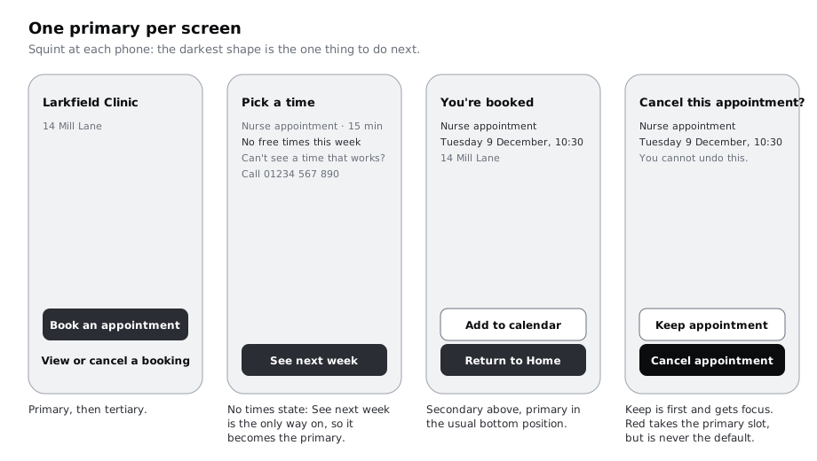
Test it on all ten frames and the confirmation, one by one. For each, count the Primary and Destructive buttons, then do a squint test: zoom out until the text is unreadable, and check that the darkest shape is the one thing a patient should do next.
Two Larkfield cases need a decision rather than a count:
- Pick a time / No times this week has no
Continue, because there is nothing to continue with.See next weekwas drawn as Secondary, which leaves the screen with no main action and a patient looking at a quiet outline. It is now the only way forward, so it becomes Primary. - Booked has
Add to calendarandReturn to Home. Both are useful, but most patients just want to leave;Return to Homestays Primary in the usual bottom position andAdd to calendarstays Secondary above it.
When a screen seems to need two Primaries, it usually has two jobs. Split it, or decide which job most patients came for and demote the other.
Check it worked
You have a list of all ten frames plus the confirmation, each with a count of Primary buttons: every count is one, apart from the confirmation, which has one Destructive and no Primary. See next week in the No times state is Primary. The rule is written at the top of the Buttons page, above the four kinds, two sizes, the 24-cell state sheet, the loading sequence and the label rules: that page is your button sheet.
Next steps
Your sheet is ready to become a component. Turn a button into a component with variants shows how to turn it into one set with Kind, Size and State properties, and Specify ten core components and their states puts these decisions on the Button spec card beside nine other components.
To see buttons in code, Build the Larkfield button in HTML and CSS builds the primary, secondary and destructive kinds and their states. For the touch area, Size touch targets for thumbs checks every target on a Larkfield screen.
Part of these paths
Related tutorials
- Specify ten core components and their statesYou will have a short written spec for each of the ten components the Larkfield Clinic app needs, listing anatomy, variants, required states, tokens and minimum touch size, placed beside the rebuilt components in Figma.
- Build the Larkfield button in HTML and CSSYou will build the Larkfield Clinic button as a real button element with primary, secondary and destructive variants drawn from colour tokens, hover, pressed, keyboard focus, disabled and loading states, a 48 pixel minimum height, and a Playwright script that checks every state's computed styles.
- Turn a button into a component with variantsYou will have a Figma button component set with Type, Size and State properties, so a teammate can place one button and switch it between primary, secondary, large, small and disabled from the right sidebar.
Need this done for you?
Padding does this work for growing companies, from the first diagnosis to a system that keeps working.
Get new tutorials