UI and visual design · Intermediate · 20 min
Design visible focus states for keyboard users
By Padding · Updated 18 Nov 2026
Figma (web) and a WCAG contrast checker in a browser · November 2026
You will have a focus sheet for the Larkfield Clinic booking app that shows one two-colour focus ring on every component and surface, the space it needs clear of sticky bars, and a numbered tab order for the Pick a time screen.
On this page
A mouse user always knows where the pointer is. A keyboard user only knows where they are if the design shows them. Every press of Tab moves focus somewhere, and if the focus indicator is faint, missing, the same colour as the button, or hidden under a sticky header, the person is navigating blind. That includes people who cannot use a mouse or touchscreen, people using switch devices that move focus the same way, power users, and anyone with a keyboard paired to a tablet or a shared office computer.
Developers can only build the focus state you design. If the design file has a hover state and a pressed state but no focus state, the browser default goes in, gets removed because it "looks wrong", and nothing replaces it. This tutorial puts focus in the design file as a first-class state, the way you already treat selected and error states.
You work on the Larkfield Clinic booking app: the six screens Home, Choose a service, Pick a time, Your details, Confirm and Booked, built from the Larkfield colour variables and components. Meet contrast rules for text, icons and focus rings measured one ring on one button. Here you design a ring that works on every Larkfield surface, give every component a focused version, keep focus clear of the fixed bars, and number the tab order of a full screen. Everything ends up on one page of the file, the focus sheet, that a developer or tester can work from.
Step 1 · List every surface and every focusable part
Add a page to the Larkfield file called Focus. Everything in this tutorial goes there.
Start with two lists in a text layer at the top of the page. First, the surfaces a focused control can sit on. In Larkfield these are:
canvas(#F6F7F8), the screen backgroundsurface(#FFFFFF), cards, fields and list rowsaccent-tint(#E3F0EE), the Booked banner and selected backgroundsaccent(#0F5E5A), when the focused control is itself filled with accent, such as the primary button and the selected time slot- the entrance photo on Home. Nothing focusable sits on it yet, but a control such as a
Get directionsbutton in the photo's corner is a likely request, so test a ring there now rather than after it ships.
Second, every part of the app that takes keyboard focus. Go through the six screens in order and write down anything a person can activate or type into: the Back control in the Header, primary and secondary Buttons, Text fields, List rows on Choose a service, the seven days in the week strip and the Time slots on Pick a time, the phone link 01234 567 890 in the fallback line, and the View or cancel a booking link on Home.
Headings, the service line Nurse appointment · 15 min, captions and the clinic photo itself do not take focus. Leave them off the list; adding them to the tab order makes keyboard users press Tab more often for nothing.
Check it worked
The Focus page has two lists. The surfaces list has five entries, each with a variable name and hex value (or "photo"). The focusable list names every component and link above, and no headings or plain text.
Step 2 · Test a single-colour ring on every surface
Before designing anything new, test the obvious choice: a 2 px accent ring with a 2 px gap, the fix from the contrast tutorial. Draw it around a button on each surface and measure the ring against the colour it touches:
- on
canvas: 7.07:1, pass - on
surface: 7.58:1, pass - on
accent-tint: 6.49:1, pass - around the accent button, with the gap showing
canvas: 7.07:1, pass - on the photo's dark doorway (#6B6A66): 1.40:1, fail
The photo breaks it, and not only at the doorway. A ring in one colour always has some background it disappears against, and photos contain most backgrounds. For accent and white, the worst case is a mid grey such as #9C9C9C, where the accent ring reaches 2.76:1 and a white gap 2.75:1. Neither band can be seen.
The W3C's technique C40 describes the way round this: draw the indicator in two colours, one light and one dark, with at least 9:1 between them. When the two colours are that far apart, one of them always reaches 3:1 against any solid background. Accent and white are 7.58:1 apart, which is why they fail on the grey. White and Larkfield's text colour (#1B1F24) are 16.56:1 apart.
Write the five results on the Focus page under a heading Single ring: rejected, with the reason in one sentence.
Check it worked
Your page shows five rings with five ratios, the doorway marked as a fail, and a sentence that says why one colour cannot work on photos. You can say in your own words why accent and white do not meet the 9:1 rule and white and #1B1F24 do.
Step 3 · Build the two-colour ring as a component
Add two colour variables to the Larkfield collection, each aliased to an existing one so a later palette change carries through:
colour/focus-inner, aliased tocolour/surface(#FFFFFF)colour/focus-outer, aliased tocolour/text(#1B1F24)
Naming them for their job means a developer can map them to two CSS custom properties without guessing which grey is meant.
If you worked through Specify ten core components and their states, the file already has colour/focus, an alias of colour/accent, and the spec cards describe a single 2 px accent ring drawn 2 px outside. This ring replaces it. Swap any layer still using colour/focus to the new ring, then delete the variable so nobody picks it by mistake, and rewrite the Focus line on each spec card to read: two 2 px bands from the control's edge, colour/focus-inner then colour/focus-outer, inset on the list row. One focus rule in the file, not two.
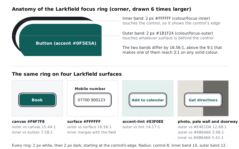
The ring has two bands, each 2 px, starting right at the control's edge. The white inner band touches the control and keeps its edge visible, even when the control is filled with accent. The dark outer band touches the background. In total the ring adds 4 px on every side.
Build it once on the Focus page:
- Draw a rectangle 128 by 48 with no fill and an 8 px corner radius. This stands for a control.
- Draw a rectangle 132 by 52, centred on it, with no fill, a 2 px
focus-innerstroke set to Inside, and a radius of 10. - Draw a rectangle 136 by 56, centred on both, with no fill, a 2 px
focus-outerstroke set to Inside, and a radius of 12. - Delete the 128 by 48 placeholder, select the two remaining rectangles, frame them, name the frame
Focus ring, set the frame's fill to none and make it a component. - Set both rectangles' constraints to Left and right, and Top and bottom, so the ring stretches when you resize an instance.
The radii grow by 2 at each band so the curves stay parallel. Using Inside strokes keeps each band exactly where you drew it, so the numbers in your spec match what you see.
Check it worked
Your file has a Focus ring component. Resize an instance to 300 by 60: both bands stay 2 px thick and the corners stay smooth. Select a band: its stroke shows a variable name, not a hex code. In the variables panel, focus-inner and focus-outer show as aliases of surface and text, and there is no colour/focus left. Search the spec cards for "2 px outside": no card still describes the old single ring.
Step 4 · Give every component a focused version
Go to the page with your main components. For each component on your focusable list, add a version called Focused next to the existing ones (as a variant, if the component is already a component set with a State property). Then place a Focus ring instance inside it:
- Drop the instance into the component and turn on Ignore auto layout, so it does not push the content around.
- Position it 4 px outside the component on every side (x and y of -4, width and height 8 larger), and set its constraints to Left and right, Top and bottom.
- Turn off Clip content on the component, or the ring is cut off at the component's edge.
Some parts need a decision rather than the default:
- Time slot. Larkfield has unselected and selected slots, and both can take focus. Make
Unselected, FocusedandSelected, Focused. On the selected slot the white band sits against the accent fill at 7.58:1, so selected and focused stay distinguishable. - Text field. Keep the field's own
borderstroke as it is, and put the ring outside it. Do not show focus by recolouring the 1 px border; that change is too thin and, as the contrast tutorial measured, too weak. - List row. Rows on Choose a service run edge to edge, so a ring outside them would be cut off by the screen. Draw this one inset: the dark band on the row's own edge, the white band 2 px inside it.
- Links. For the phone link and
View or cancel a booking, wrap the link text in a frame with 2 px of padding on each side and a 4 px radius, and put the ring around that frame, so the ring does not touch the letters. - Header back control. Its focus area is the 44 by 44 tap area from the high-fidelity step, not the arrow icon, so the ring is a square with rounded corners, not a tight circle round the arrow.
Check it worked
Every component on your focusable list has a focused version, and the time slot has two. Place one of each on the Focus page in a row labelled Focused states: every ring is the same two bands at the same 4 px offset, except the list row, which is inset and labelled as such. Nothing is clipped.
Step 5 · Measure the ring on every surface
Now prove the ring works where the single ring failed. On the Focus page, place a focused component on each of the five surfaces and log two numbers for each: the outer band against the background, and the inner band against the control.
canvas: outer 15.44:1. Around the accent button, inner 7.58:1.surface: outer 16.56:1. The inner white band merges with the white field, which is fine; the dark band carries the indicator.accent-tint: outer 14.17:1.accent(selected time slot, primary button): inner 7.58:1, outer againstcanvas15.44:1.- Photo, pale wall (#E4E1DA): outer 12.68:1. Dark doorway (#6B6A66): outer only 3.06:1, but the inner band changes those pixels to white at 5.41:1.
The photo row is the one C40 warns about: on an image, check the pixels rather than trusting the 9:1 rule. With white and #1B1F24, the worst solid colour behind the ring is a mid grey around #7E7E7E, where both bands sit at about 4:1. Anywhere else, one band is stronger. So the ring stays visible on any photo the clinic swaps in later.
Then read the ring against the three WCAG 2.2 criteria that apply, and note the result beside the table:
- 2.4.7 Focus Visible (AA): there is a visible indicator on every focusable part. Pass.
- 1.4.11 Non-text Contrast (AA): the indicator reaches 3:1 against what it touches. Pass on all five surfaces.
- 2.4.13 Focus Appearance (AAA): the dark band is 2 px thick and runs around the outside of the control, so its area is larger than a 2 px line on the control's own edge, and those pixels change by at least 3:1. Larkfield meets it, even though AAA is not required.
Check it worked
Your table has five rows with at least one ratio of 3:1 or more in each, and the photo row lists the lightest and darkest pixels you sampled. Turn your screen brightness down and look at the five examples from arm's length: you can point to the focused control on each one without hunting.
Step 6 · Keep focus clear of the sticky header and bottom bar
A ring that meets every contrast rule is still useless if it is underneath something. The usual culprits are fixed headers, fixed bottom bars, cookie banners and chat buttons.
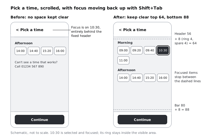
On a 390 by 844 frame, Pick a time fits on one screen. On a small Android phone with a 360 by 640 viewport, and less once the browser's own bars take their share, it scrolls. Larkfield keeps the Header (56 px tall) fixed at the top and puts Continue in a bar fixed to the bottom (80 px: a 48 px button and 16 px of padding above and below). That is 136 px of a small screen that content can disappear behind.
Picture a patient who has scrolled down to the Afternoon times and presses Shift+Tab to go back up to 10:30. The browser scrolls just far enough to bring 10:30 into the viewport, which puts it right under the header. WCAG 2.2 criterion 2.4.11 (AA) fails if the focused item is entirely hidden by content you designed, and 2.4.12 (AAA) asks that no part of it is hidden.
Design the space it should land in, and give developers the numbers:
- Duplicate
Pick a timeonto theFocuspage and make it 360 by 640. Before resizing, check the constraints of the content inside: the times and other content should be pinned Top (or Left and right, Top), not Top and bottom or Scale, or they squash instead of running past the frame's bottom edge. After resizing, the Afternoon slots should extend below 640. Turn on Clip content for the frame, and in the Prototype tab set its Overflow to Vertical, so the content below 640 scrolls. Then mark theHeaderand the bottom bar as Fixed in the prototype scroll settings, so the frame behaves the way the built screen will. - Draw a dashed line 64 px from the top: the header's 56, plus 4 for the ring, plus 4 spare. Draw another 88 px from the bottom: the bar's 80 plus the same 8.
- Label the area between them
Focus lands here, and add a developer note:Keep clear: top 64, bottom 88. Apply as scroll-margin-top and scroll-margin-bottom on focusable elements (or as scroll-padding on the scroll container). - Draw the 10:30 slot, focused, right under the top line, so the reader of the sheet sees the ring fully clear of the header.
If the header height ever changes, the space changes with it, so write the sum, not only the result. Style keyboard focus with :focus-visible shows the top half in CSS with scroll-margin-top; the bottom value works the same way with scroll-margin-bottom.
Repeat the check on Your details, where the on-screen keyboard takes roughly half of a small phone's height. Between a fixed header, the keyboard and a fixed bar, a field can be left with almost no room. If that happens, let the bottom bar scroll with the content on that screen instead of fixing it.
Check it worked
Your 360 by 640 Pick a time copy has two dashed lines, a written sum for each, and a focused slot sitting entirely between them with its ring showing. Open the frame in prototype preview and scroll: the header and bar stay put and the slots move under them. If nothing scrolls, check Clip content, the Vertical overflow setting, and that the content runs past 640.
Step 7 · Number the tab order on Pick a time
Focus order (WCAG 2.2, 2.4.3) must keep the meaning and use of the screen. On most screens that means top to bottom, left to right, and the code order will produce it. Draw it anyway, because grouped controls are where design and build disagree.
Pick a time has two groups that should each be one tab stop, not many. Nine time slots as nine tab stops means pressing Tab nine times to reach Continue. Treat the week strip and the times as two choice groups, each behaving like a radio group: Tab moves into the group and lands on the chosen item (Tue 9, then 10:30), arrow keys move to the next or previous item and select it at the same time, and Tab again leaves the group. If nothing is chosen yet, focus lands on the first item.
That arrow-selects behaviour matters on the week strip. Arrowing from Tue 9 to Wed 10 selects Wednesday, and the times below are replaced with Wednesday's. Write down what happens next so the build and the test agree: the 10:30 choice clears, and the next Tab lands on the first free time of the new day, not on a time that no longer exists. A tester following the sheet should expect exactly that, and a patient who arrows past their day by mistake loses their time, so the week strip is worth testing with real users.
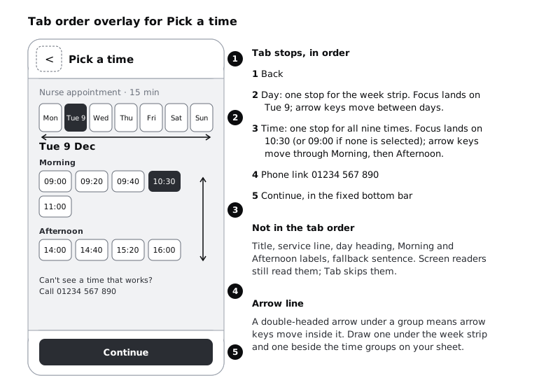
On a copy of Pick a time at normal size, make a layer group called Tab order and draw:
- A filled numbered circle at each tab stop: 1 Back, 2 week strip, 3 times, 4 phone link, 5 Continue.
- A double-headed arrow under the week strip and beside the times, meaning "arrow keys move and select inside", and a note on the week strip: "changing the day clears the time; Tab then lands on the first free time".
- A legend beside the frame listing each stop and saying what is not in the order: the title,
Nurse appointment · 15 min,Tue 9 Dec, the Morning and Afternoon labels, and the fallback sentence. Screen readers still read those; Tab skips them.
Then add the moments when focus moves on its own, because the code cannot guess them:
- On
Pick a time / Time gone, the notice appears and 10:30 disappears. Note where focus goes: to the notice text, so the patient hears that their time was taken, then Tab carries on into the times. - If a screen opens a dialog, focus moves into it, cannot leave it while it is open, and returns to the control that opened it when it closes.
Check it worked
Your overlay has five numbers, two arrows and a legend. Follow the numbers with your finger: they read in the same order as the screen reads top to bottom, and no number lands on text you cannot activate. The Time gone frame has a note saying where focus goes when the notice appears, and the week strip note says what happens to the times when the day changes.
Step 8 · Assemble the sheet and walk it with a keyboard
Arrange the Focus page from top to bottom so it reads as a spec:
- The ring: the component, the two variables, and the anatomy (2 + 2 px, radii 10 and 12).
- The rejected single ring, with its fail and the reason.
- The focused states row, every component, with the inset list row labelled.
- The surface table with ratios and the three WCAG results.
- The 360 by 640 frame with the keep-clear lines and sums.
- The tab order overlay and the two focus-moves notes.
Two notes for the developer belong at the top. First, the ring shows on keyboard focus, not on every tap, which is what the :focus-visible selector does. Second, in forced colours modes (such as Windows contrast themes) the system replaces your colours, and only an outline survives reliably, so the ring should be built with an outline rather than shadows alone. The CSS tutorial covers both.
Finally, test the flow the way a keyboard user meets it. Figma prototypes are driven by clicks, so walk the tab order by hand: start at the top of each of the six screens and say aloud where each Tab press lands, using the overlay and the focused states. Anywhere you hesitate is a gap in the sheet. Once the build exists, repeat it in the browser with Tab, Shift+Tab, the arrow keys and Enter, on a laptop and on an Android phone with a keyboard attached if you have one.
Check it worked
The Focus page has all six sections in order, with the two developer notes at the top. You can walk all six screens aloud from the overlay and focused states without guessing, and someone who has not seen the file before can find the ring size, the colours, the keep-clear space and the tab order without asking you.
Next steps
Hand the focus sheet to the person building Larkfield, and agree how you will test it together.
- Style keyboard focus with :focus-visible builds the same two-band ring in CSS (it uses 3 px bands; use 2 px for Larkfield), keeps focus clear of a sticky header with
scroll-margin-topand checks the ring in forced colours mode. - Meet contrast rules for text, icons and focus rings covers the contrast measurements behind the surface table.
- Specify ten core components and their states is where each component's spec card lives. Its Focus line describes the earlier single accent ring, so update those cards to the two-band ring from this sheet.
- Never rely on colour alone to carry meaning applies the same thinking to selected, error and notice states.
Part of these paths
Related tutorials
- Meet contrast rules for text, icons and focus ringsYou will have a contrast log for one Larkfield Clinic screen that covers icons and field borders, placeholder text, text on a photo and gradient, a disabled button and focus rings, with a measured ratio, a verdict and a fix for each failure.
- Style keyboard focus with :focus-visibleYou will remove an outline reset that hides keyboard focus, add a two-colour focus ring with :focus-visible that stays visible on white, tinted and accent backgrounds, keep it clear of a sticky header with scroll-margin, check it in forced colours mode and prove it all with a Playwright keyboard test.
- Turn a mid-fidelity layout into a high-fidelity designYou will have high-fidelity Larkfield Clinic booking screens in Figma, coloured, typeset, with icons and one photo, every text and colour pair checked for contrast and ready to wire into a prototype.
Need this done for you?
Padding does this work for growing companies, from the first diagnosis to a system that keeps working.
Get new tutorials