UI and visual design · Intermediate · 17 min
Design one layout for phone, tablet and desktop
By Padding · Updated 18 Nov 2026
Figma (web) · November 2026
You will have the Larkfield Clinic Pick a time screen designed at 360, 768 and 1280 pixels wide, with breakpoints chosen from where the content breaks and a note that tells a developer what reflows, what moves and what stays fixed.
On this page
Most responsive design files start with three device frames: a phone, a tablet, a laptop. The trouble is that devices are not where layouts break. A layout breaks at the width where one particular block stops working: a row of buttons gets too long to scan, a bar wastes half its height, a panel finally has room to sit beside the content. Those widths rarely match a device, and new devices arrive every year at widths nobody planned for.
In this tutorial you take one screen, the Larkfield Clinic Pick a time screen, and design it for every width from 320 pixels up. You decide what each block does as the screen widens, stretch the phone layout until something breaks, set two breakpoints at those points, and draw three frames that each stand for a range of widths rather than a device. You finish with a short note a developer can build from.
The screen is the one patients use after choosing a service. It shows the service (Nurse appointment, 15 minutes), a week strip with Tuesday 9 December selected, Morning and Afternoon time slots with 10:30 chosen, a phone number for people who cannot find a time, and a Continue button. Column grids and the auto layout settings behind wrapping are covered in their own tutorials, linked at the end. This one is about the decisions.
Step 1 · Give every block one rule before you draw anything
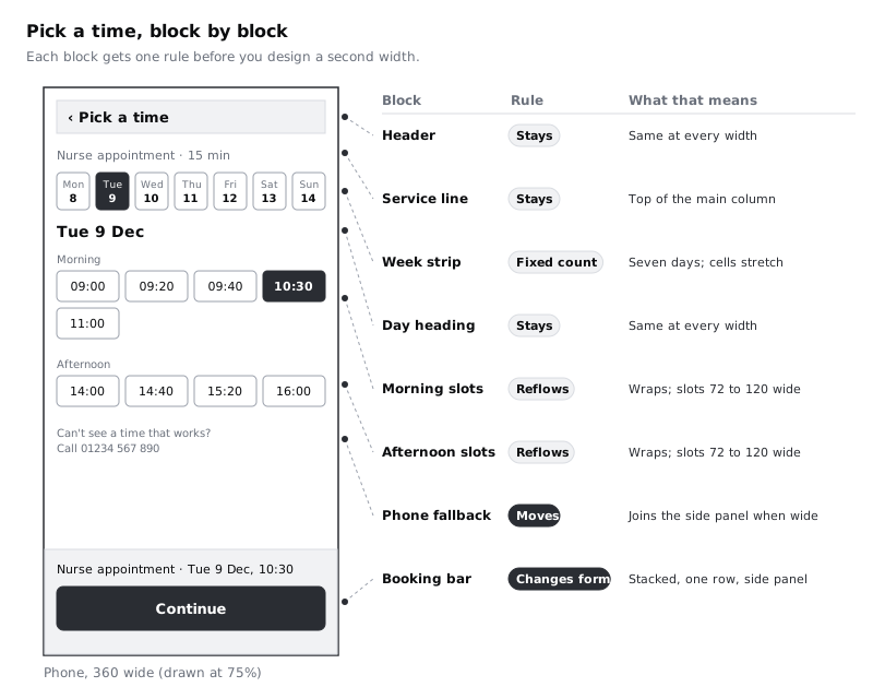
Open your Larkfield file and add a page called Responsive. Copy the Pick a time frame from 04 High fidelity onto it. Before you change a single size, list the blocks on the screen from top to bottom, and give each one a rule for what happens when the screen gets wider. There are only four rules worth using:
- Stays: the block looks and behaves the same at every width. Most blocks should be here.
- Reflows: the block keeps its place, but its contents rearrange, usually by wrapping onto fewer or more rows.
- Fixed count or fixed size: a number that must not change, such as seven days in a week or a panel width.
- Moves or changes form: the block goes somewhere else, or takes a different shape, past a certain width.
For Pick a time, write this as a text layer next to the frame:
- Header with back control: stays.
- Service line,
Nurse appointment · 15 min: stays at the top of the main column. - Week strip: fixed count. Seven days in one row at every width; the day cells share the width.
- Day heading,
Tue 9 Dec: stays. - Morning and Afternoon slots: reflow. They wrap, and each slot is between 72 and 120 wide.
- Phone fallback,
Can't see a time that works? Call 01234 567 890: moves into the side panel on wide screens. - Booking summary and Continue: changes form. On a phone it is a bar fixed to the bottom of the screen, with
Nurse appointment · Tue 9 Dec, 10:30above a full-width button.
The booking bar is new on this screen. In the high-fidelity version Continue sat after the fallback line, below nine slots. On a short phone, patients had to scroll past every time to find it, and once they had scrolled, the service line at the top was out of view. A bar at the bottom keeps the choice and the button visible together.
Check it worked
Your text layer lists every block on the screen, top to bottom, and each block has exactly one of the four rules. Only two blocks move or change form. If more than a third of your blocks move, the wider layouts will feel like a different app; push some back to stays or reflows.
Step 2 · Set up the compact frame at 360 and check it at 320
Rename the copied frame Pick a time / Compact. Set its width to 360 and its height to 640 in the right sidebar. 360 wide is a common width for budget Android phones, which many Larkfield patients carry, as do many phone users across Africa. A 640 tall frame stands for a short screen, so you see what a patient sees before scrolling. Check current statistics for your own audience before you settle on a width; they change every year.
Lay out the screen with a 16 pixel margin on each side, which leaves 328 for content:
- Slot groups: auto layout, horizontal, wrap on, gap 8. Each slot fills, with a min width of 72 and a max width of 120. At 328, four slots fit on a row (4 × 72 + 3 × 8 = 312), so Morning shows four slots and then
11:00on a second row, and Afternoon shows one row of four. - Booking bar: pinned to the bottom of the frame, a
surfaceorcanvasfill, padding 16, the summary line inBody, and Continue at full width and 48 tall. - Leave space at the bottom of the scrolling content equal to the bar's height, so the last slot and the fallback line can scroll clear of the bar.
Then duplicate the frame (Cmd+D, or Ctrl+D on Windows) and set the copy's width to 320. WCAG's reflow criterion asks that content works at a width of 320 CSS pixels without scrolling sideways. That is also what a 1280 pixel laptop window becomes at 400 percent zoom, so the 320 check is not only about small phones. At 288 of content, three slots fit on a row, and Morning wraps to three and two.
Check it worked
At 360 the Morning group shows four slots, each 76 wide, then one slot on a second row, and nothing sits closer than 16 to the frame edge. At 320 the slots wrap to three per row, the summary line wraps if it needs to, and no text is cut off or runs past the frame. Delete the 320 copy once you have looked at it, or keep it beside the compact frame as a reminder.
Step 3 · Stretch the compact layout and write down where it breaks
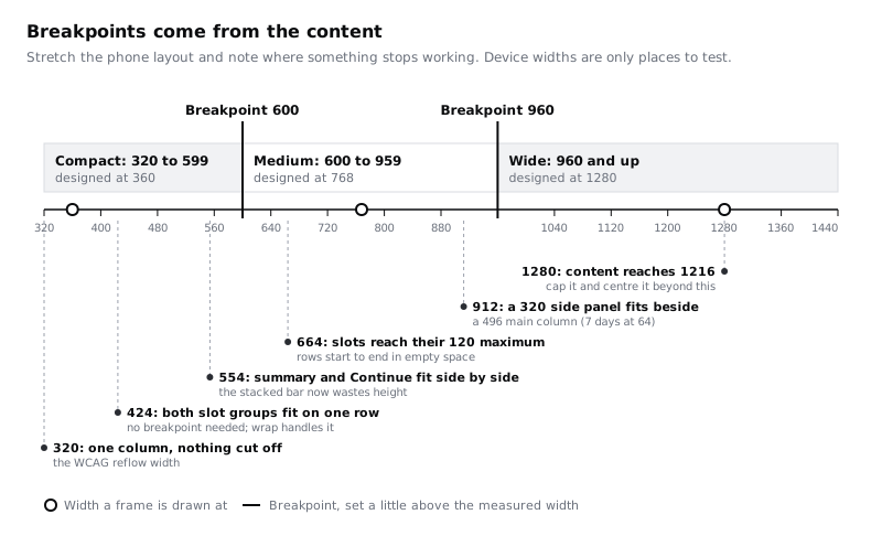
This step is the core of the method. Select the compact frame and drag its right edge slowly from 360 towards 1280. Do not fix anything yet. Every time something changes, write down the width and what happened, and mark whether it is a break or the layout doing its job. Your numbers can differ by a few pixels from these, depending on your font and padding:
- 424: five slots now fit per row (5 × 72 + 4 × 8 = 392, plus two margins of 16). Morning and Afternoon each fit on one row. Not a break: wrap handles it, and the screen reads better.
- About 550: the booking bar is now wide enough to hold the summary and the button on one line, but it is still stacked. It uses about 108 pixels of height for something that would fit in 80. That is a break, in the sense that the layout is wasting space patients need for the slots.
- 664: the five Morning slots reach their 120 maximum (5 × 120 + 4 × 8 = 632, plus margins). Past this, every row ends in empty space and Continue becomes a long bar. Not broken yet, but getting sparse.
- About 900: the screen reads as a stretched phone. The summary and Continue sit at the bottom of a wide, mostly empty window, far from the slots the patient is looking at. There is room for a panel beside the slots.
To make the 550 reading exact, measure it. Select the summary text layer, set it to hug, and read its width. In Inter Regular at 16, Nurse appointment · Tue 9 Dec, 10:30 is roughly 290 wide. With Continue at a fixed 200 and the 24 pixel margins a wider layout uses, the bar fits on one row from 24 + 290 + 16 + 200 + 24 = 554.
Check it worked
You have a list of at least four widths, each with what happened and whether it is a break. At least one change is marked as not a break. If every change on your list needs a new layout, the slots probably are not wrapping; check that wrap is on and the min and max widths are set.
Step 4 · Choose breakpoints from your list
A breakpoint is the width at which the layout switches to a different arrangement. Pick as few as you can defend, and put each one a little above the width where the content needs it, so longer text has room before the layout switches.
For Pick a time, two breakpoints cover the list:
- 600. The bar fits on one row from 554. Rounding up to 600 leaves 46 pixels for a longer summary, such as the same booking in French or a longer service name.
- 960. A side panel needs room. It holds the summary, Continue and the fallback line, and it is 320 wide, because that is what the longest summary and a full-width button need. The main column beside it needs at least 496, which is seven day cells of 64 with six gaps of 8. With margins and a gap of 32: 32 + 496 + 32 + 320 + 32 = 912. Rounding up to 960 leaves 48 to spare.
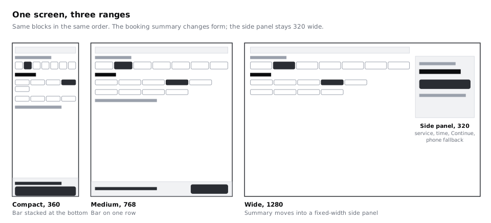
That gives three ranges: compact up to 599, medium from 600 to 959, and wide from 960. Notice what did not become a breakpoint: 424 and 664. The slots take care of those on their own. And notice that 768 and 1280, the frame widths you are about to draw, are not breakpoints either. They are sample widths in the middle of a range.
Avoid one trap. If your team already uses breakpoints from a design system or a framework, such as 640 or 1024, check them against your list rather than replacing it. If the side panel needs 912 and the shared breakpoint is 1024, the screen keeps the medium layout a little longer, which is fine. If the shared breakpoint were 768, the panel would arrive before it fits, which is not.
Check it worked
Each breakpoint you chose has a sentence beside it saying which block needs it and the measured width it sits above. You have three ranges, named compact, medium and wide (or whatever names your team uses), with no gap or overlap between them.
Step 5 · Design the medium frame at 768
Duplicate the compact frame, name it Pick a time / Medium, and set its size to 768 by 1024. Change only what your rules and breakpoints say should change:
- Margins go from 16 to 24.
- Give the content a max width of 720 and centre it. At 768 this changes nothing, but at 959, the top of the range, it stops lines and slot rows stretching to 911.
- The booking bar becomes one row: the summary on the left, filling the space, and Continue on the right at a fixed 200. The bar's background still runs the full width of the screen; only its contents are capped at 720.
- Everything else stays. The week strip still has seven days, now about 96 wide each. Both slot groups fit on one row, with slots at their 120 maximum, and the rows end in some white space, which is fine.
Then stretch this frame to both ends of its range, 600 and 959, and look at it each time. At 600 the summary has 336 of space beside the button (552 − 16 − 200), which fits the English line. At 959 the content stays 720 wide and the extra width goes into the margins.
Check it worked
At 600, 768 and 959 the bar is one row and 80 tall, the summary is not cut off, and Continue is 200 wide. The content never gets wider than 720. The order of blocks from top to bottom is the same as on the compact frame.
Step 6 · Design the wide frame at 1280 with a side panel
Duplicate the medium frame, name it Pick a time / Wide, and set its size to 1280 by 800. This is the one layout that moves things:
- Margins go to 32. The header runs across the full content width.
- Split the content into a main column and a side panel with a gap of 32. The main column fills; the panel is fixed at 320.
- The main column holds the service line, the week strip, the day heading and both slot groups. At 1280 it is 864 wide (1280 − 64 − 32 − 320).
- The panel holds the booking summary, now as
Nurse appointment · 15 mininBody/Small, the date and timeTue 9 Dec, 10:30inHeading/M, Continue at the panel's full width, and the phone fallback under the button. - Remove the bottom bar. The panel replaces it. Mark the panel as sticky in a comment, so it stays in view while the slots scroll.
- Above 1280, cap the whole content at 1216 wide and centre it, so a 1920 monitor gets wider margins rather than a 1500 pixel slot row.
Keep the panel after the main column in the layer order, as the bar was on the smaller frames. A keyboard or screen reader user moves through the slots first and reaches the summary and Continue afterwards, in the same order at every width.
Check it worked
Stretch the wide frame from 960 to 1440. At 960 the main column is 544 wide and the seven day cells are about 70 each, with no label clipped. At every width the panel stays exactly 320. At 1440 the content is 1216 wide and centred, with 112 of margin on each side. The layers panel shows the main column before the side panel.
Step 7 · Test the edges, long text and zoom
Breakpoints fail at their edges, not in the middle of a range. Resize each frame to the widths on either side of each breakpoint and compare them side by side: 599 (compact) next to 600 (medium), and 959 (medium) next to 960 (wide). Nothing should look cramped on the narrow side of a switch or empty on the wide side.
Then try three harder cases:
- Long text. Replace the summary with the longest version you might ship, for example
Rendez-vous infirmier · mar. 9 déc., 10:30if the clinic adds French, or the longest service name in the list. At 600 the summary should wrap to two lines and the bar should grow, not truncate the time. If your users read Hausa, Yoruba, Kiswahili or Arabic, test those too; translated labels are often longer, and Arabic runs right to left, which flips the panel to the left side. - Zoom. A patient who zooms a 1280 window to 200 percent is looking at a layout 640 CSS pixels wide, which is your medium range. At 400 percent the window is 320 wide, your compact range. Layouts based on width ranges handle zoom for free, as long as the ranges themselves work.
- The sticky bar and focus. On compact and medium, imagine tabbing through the slots. A slot near the bottom of the screen can sit hidden under the bar. Note that the developer needs to keep focused items clear of it, for example with scroll padding the height of the bar.
People on prepaid data pay for every image on a page. The wide layout adds no new images or icons over the compact one, so a wider screen does not mean a heavier page.
Check it worked
You have looked at 320, 599, 600, 959, 960 and 1440, and at each width every slot, the summary and Continue are fully visible. The long summary wraps rather than being cut off at 600. You have a written note about keeping focus clear of the bar.
Step 8 · Write the breakpoint note for developers
Frames show three widths. A developer has to build every width in between, so give them the rules, not just the pictures. Add a text layer beside the three frames, or put the same text in your handoff document:
Pick a time: responsive rules

Ranges (CSS px, min-width)
  Compact   up to 599    designed at 360, checked at 320
  Medium    600 to 959   designed at 768
  Wide      960 and up   designed at 1280; content capped at 1216, centred

Why these breakpoints
  600: summary and a 200 wide Continue fit on one row from 554
  960: a 320 side panel fits beside a main column of 496 from 912

Margins
  16 compact, 24 medium (content max 720, centred), 32 wide

Blocks
  Header, service line, day heading: same at every width
  Week strip: always 7 days in one row; cells share the width
  Time slots: wrap; each slot min 72, max 120; gap 8
  Booking summary
    compact: bar fixed to the bottom, summary above full-width Continue
    medium:  bar fixed to the bottom, summary left, Continue 200 right
    wide:    side panel, 320 fixed, sticky; main column fills
  Phone fallback: under the slots (compact, medium), in the panel (wide)

Fixed at every width
  Body text 16, Continue 48 tall, back control 44 x 44
  Order: slots, then summary, then Continue
  Keep focused slots clear of the bottom bar
Write the breakpoints as minimum widths, because that is how most CSS is written: the compact layout is the default, and each media query adds the changes for its range. The note says why each breakpoint exists, so when a designer later changes the summary text or the panel width, anyone can work out whether the breakpoint should move too.
Check it worked
Hide the three frames and read only the note. You can say what the screen looks like at 700 and at 1100, two widths you never drew: 700 is medium with a one-row bar and content 652 wide, and 1100 is wide with a main column of 684. Every number in the note matches the frames.
Next steps
You now have one screen designed for three ranges and a note that explains the switches. To take it further:
- Build a responsive page from a Figma frame turns these three frames and the note into a working page with media queries.
- Make layouts wrap and stretch with auto layout goes deeper into the wrap, min and max settings that let the slots reflow without a breakpoint.
- Lay out screens on a column grid adds column grids to the phone and desktop frames.
- Design a responsive site header and menu applies the same reasoning to navigation, where a breakpoint often changes the pattern entirely.
Part of these paths
Related tutorials
- Lay out screens on a column gridYou will have a Larkfield Clinic information page laid out in Figma on a 4-column phone grid and a 12-column desktop grid, with one deliberate break and a note of the grid values a developer needs.
- Build a responsive page from a Figma frameYou will build the Larkfield Clinic Pick a time screen as one responsive page from its phone, tablet and desktop frames, with values mapped to tokens, breakpoints taken from the design note, and a script that screenshots and measures the page at each width.
- Make layouts wrap and stretch with auto layout min and max sizesYou will have one Figma frame for a time-slot picker that reflows from a 360 wide phone layout to a desktop layout by itself, using wrap, minimum and maximum widths and the grid flow, with no separate frame for each size.
Need this done for you?
Padding does this work for growing companies, from the first diagnosis to a system that keeps working.
Get new tutorials