UI and visual design · Beginner · 14 min
Lay out screens on a column grid
By Padding · Updated 18 Nov 2026
Figma (web) · November 2026
You will have a Larkfield Clinic information page laid out in Figma on a 4-column phone grid and a 12-column desktop grid, with one deliberate break and a note of the grid values a developer needs.
On this page
A column grid is a set of vertical bands that every block on a screen lines up with. It does two jobs. It stops you placing things by eye, so a card on one screen starts at the same edge as a photo on the next. And it gives the developer a short list of numbers (columns, margin, gutter) instead of dozens of x positions.
In this tutorial you set up two grids in Figma: 4 columns on a 360 pixel phone frame and 12 columns on a 1280 pixel desktop frame. The margins and gutters come from the spacing scale the Larkfield Clinic screens already use: 8, 16, 24 and 32. Then you lay out one page on both, the clinic's information page with its photo, opening hours, services and booking button, and break the grid once, on purpose, with a written reason.
360 pixels is not an arbitrary choice. It is a common width on budget Android phones, which are what many patients carry, in Larkfield's town and across much of Africa. Designing at 360 first means the layout works on those phones before it works on anything larger. Usage figures change, so check current screen-size statistics for your own country before you settle on a width.
Figma calls these grids layout guides. Before May 2025 they were called layout grids, so older guides and videos use that name. They are not the same thing as the grid flow in auto layout.
Step 1 · Work out the grid numbers first
Do the arithmetic before you open Figma, so every number you type has a reason. A column grid has four values, and only three are yours to choose:
- Frame width: 360 for the phone, 1280 for desktop.
- Columns: 4 on the phone, 12 on desktop. Four columns divide into halves and full width, which is all a phone screen needs. Twelve divide into halves, thirds, quarters and sixths, so a desktop layout has room for side-by-side panels.
- Margin: the space between the frame edge and the first column. Take it from the spacing scale: 16 on the phone, to match the screen padding the Larkfield screens already use, and 32 on desktop.
- Gutter: the space between columns. Also from the scale: 16 on the phone, 32 on desktop.
The column width is what is left over. For the phone: 360 minus two margins of 16 is 328, minus three gutters of 16 is 280, divided by four is 70. For desktop: 1280 minus two margins of 32 is 1216, minus eleven gutters of 32 is 864, divided by twelve is 72.
Whole numbers matter. If the arithmetic gives you 79.33, columns land on fractions of a pixel and edges blur on some screens. Change the gutter or margin to another step on the scale until the result divides cleanly. A desktop gutter of 24, for example, gives 79.33, which is why this tutorial uses 32.
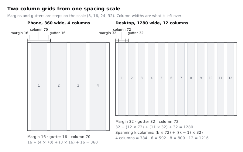
You will also need the width of an element that spans several columns. It is the columns plus the gutters between them: on desktop, spanning k columns is (k × 72) + ((k − 1) × 32). Write these down now:
- Phone: 1 column is 70, 2 columns are 156, 4 columns are 328.
- Desktop: 4 columns are 384, 6 are 592, 8 are 800, 12 are 1216.
Check it worked
You have both sums written down, and each adds back to its frame width exactly: 16 + 280 + 48 + 16 = 360 and 32 + 864 + 352 + 32 = 1280. Every margin and gutter is a number from the spacing scale, and both column widths are whole numbers.
Step 2 · Add the 4-column grid to the phone frame
Make a new page called Grid practice in your file, so the experiments stay apart from finished screens.
Press F, draw a frame and type 360 into its width and 800 into its height in the right sidebar. Name it Clinic info / Phone.
With the frame selected, find the Layout guide section in the right sidebar and click Add layout guide. Figma adds a uniform grid of squares, which is not what you want here. Open the guide's settings and change it to Columns, then set:
- Count: 4
- Type: Stretch
- Margin: 16
- Gutter: 16
Stretch is the type to use for a screen layout. The margin and gutter stay fixed and the columns share whatever width is left, so if the frame later becomes 412 wide for a larger phone, the columns widen and the margins stay at 16. The other types (Left, Center, Right) give columns a fixed width, which suits a fixed-width block inside a wider frame rather than a whole screen.
Save the guide so the desktop frame and future screens can reuse it. In the Layout guide section, choose Apply styles, then Create style, and name it Grid/Phone 4 col.
Check it worked
The frame shows four tinted columns with a clear band of 16 on each side. Draw a rectangle, set its X to 16 and its width to 70: it covers the first column exactly, with no tint showing on either side. Press Shift+G: the columns disappear, and pressing it again brings them back. Delete the test rectangle.
Step 3 · Add the 12-column grid to the desktop frame
Draw a second frame to the right of the first, 1280 wide and 900 tall, and name it Clinic info / Desktop.
Add a layout guide as before, change it to Columns and set:
- Count: 12
- Type: Stretch
- Margin: 32
- Gutter: 32
Save it as a style called Grid/Desktop 12 col.
You can stack more than one layout guide on a frame. If you want help with vertical spacing as well, add a second guide as a uniform grid of 8, which matches the smallest step of the scale. It is optional, and many teams leave vertical rhythm to auto layout gaps instead. If you add it, give it a lower opacity than the columns so the columns stay easy to see.
Check it worked
The desktop frame shows twelve columns. Draw a rectangle with X 32 and width 800: it ends exactly at the right edge of column 8. Set X to 864 and width to 384: it covers columns 9 to 12 and ends 32 from the frame's right edge. In the Layout guide section of each frame you see the style name, Grid/Phone 4 col or Grid/Desktop 12 col, rather than loose settings. Delete the test rectangles.
Step 4 · Place the phone layout on the columns
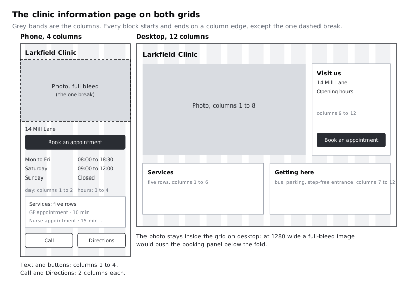
The clinic information page answers the questions patients ask before they book: where the clinic is, when it is open, what it offers and how to get in touch. On the phone, most of it runs the full width of the four columns. The interesting decisions are the places where it does not.
Build the page top to bottom. If you have the Larkfield text styles and colour variables, use them; if not, plain text at the sizes given works.
- Heading:
Larkfield ClinicinHeading/L, X 16, width 328. - Address and booking:
14 Mill LaneinBody, then aBook an appointmentbutton 48 tall. Both X 16, width 328, so the button spans all four columns. - Opening hours: a two-column table. Put the days (
Mon to Fri,Saturday,Sunday) at X 16 with width 156, spanning columns 1 and 2. Put the hours (08:00 to 18:30,09:00 to 12:00,Closed) at X 188, width 156, spanning columns 3 and 4. The hours now line up in a column of their own, which makes them quicker to scan than "Mon to Fri: 08:00 to 18:30" written as one line. - Services: the five rows from the booking app,
GP appointment · 10 min,Nurse appointment · 15 min,Blood test · 10 min,Vaccination · 15 minandMedication review · 20 min, in a list at X 16, width 328. - Contact: two secondary buttons side by side,
Callat X 16 andDirectionsat X 188, each 156 wide. The gutter between them is the grid's own 16, so you do not have to invent a gap.
For vertical spacing, use the same scale: 8 inside a group, such as a heading and the line under it, and 24 between groups. If the content is in a vertical auto layout frame, set its left and right padding to 16. The padding then does the margin's job, and anything set to Fill container lines up with the columns on its own.
Leave a space under the heading for the photo. It goes in next, in the one place you break the grid.
Check it worked
Press Shift+G to turn the guides off and back on a few times. With the guides on, every left edge on the page sits on the left edge of column 1 or column 3, and every right edge on the right edge of column 2 or 4. Click the hours text 08:00 to 18:30: the X field reads 188. Click Directions: X reads 188 and width 156. Nothing sits at 17, 20 or any other number that is not in your list from step 1.
Step 5 · Break the grid once, on purpose
A grid you never break looks rigid. A grid broken by accident looks careless. The difference is whether you can say why, in one sentence.
On the phone, the clinic photo is the one break. Draw a rectangle under the heading at X 0, width 360, with a 16:9 ratio, so 203 tall. Use it as an image fill for a photo of the clinic entrance (a photo the clinic owns, or a stock image whose licence allows it), or leave it grey for now. It runs edge to edge, ignoring the margins. If you built the page content in an auto layout frame with 16 padding, the padding will push the photo in to X 16. Either keep the photo outside that padded frame, as a direct child of the phone frame, or select it and turn on absolute position (Ignore auto layout) so you can set X 0 and width 360.
The reason: on a 360 pixel screen, 16 pixels of margin on each side take nearly a tenth of the width away from the one image that helps patients recognise the building when they arrive. Full bleed gives the photo the whole width, and because it is a picture rather than text, it does not need the margin to be readable.
Write the reason on the canvas next to the frame, as a text layer or a sticky note: "Photo is full bleed on phone so patients can recognise the entrance. Everything else stays on the grid." The note is for the next designer and the developer. Without it, the break looks like a mistake someone should fix.
Keep it to this one. If a second element wants to break the grid, that usually means the grid is wrong for the page, and the fix is to change the column count or margin, not to add exceptions.
Check it worked
The photo is the only layer on the phone frame whose X is 0, and the only one that reaches the frame's right edge. Your canvas note states what breaks the grid and why in a sentence or two. Every other layer still passes the check from the previous step.
Step 6 · Place the desktop layout on the columns
The desktop page holds the same content. It is not the phone layout stretched: with twelve columns you can put things side by side, so a patient sees the photo and the booking button without scrolling.
Lay it out like this:
- Heading:
Larkfield Clinicat X 32, width 1216. - Photo: columns 1 to 8, X 32, width 800, height 450 for 16:9. It stays inside the grid on desktop. At 1280 wide, a full-bleed photo would be 720 tall and push everything else below the first screen.
- Visit us panel: columns 9 to 12, X 864, width 384, the same height as the photo. Inside it: the heading
Visit us,14 Mill Lane, the opening hours as a two-column table, and theBook an appointmentbutton at the bottom, filling the panel's width. - Services: columns 1 to 6, X 32, width 592, with the five rows.
- Getting here: columns 7 to 12, X 656, width 592, with how to reach the clinic, such as the nearest bus stop, parking and the step-free entrance.
Put 32 between the photo row and the panels below it, which is the largest step on the scale and the same as the gutter, so the space between rows and between columns matches.
Notice what you did not do: you did not set any text across all twelve columns. A line of body text 1216 pixels wide is too long to read comfortably. Spans of 6 or 8 columns keep lines at a readable length; that is what columns are for.
Check it worked
With guides on, the photo ends at the right edge of column 8 and the Visit us panel starts at the left edge of column 9, with exactly one gutter between them. Services and Getting here meet the same way at columns 6 and 7. Every X on the page is one of 32, 656 or 864, plus whatever padding sits inside a panel. The Book an appointment button is visible inside the 900 pixel frame without scrolling.
Step 7 · Write the grid note for the developer
A developer cannot read a layout guide from a screenshot, and the X values in Figma only describe one frame width. Give them the rules instead. Add a text layer on the canvas beside the two frames, or put the same text in your handoff document:
Clinic information page: grid

Phone (designed at 360 wide)
  4 columns, stretch. Margin 16, gutter 16. Columns 70 at 360.
  Photo: full bleed, 16:9 (the one deliberate break).
  Everything else: columns 1 to 4.
  Opening hours: days in columns 1 to 2, hours in columns 3 to 4.
  Call and Directions: 2 columns each.

Desktop (designed at 1280 wide)
  12 columns, stretch. Margin 32, gutter 32. Columns 72 at 1280.
  Photo: columns 1 to 8, 16:9.
  Visit us panel: columns 9 to 12.
  Services: columns 1 to 6. Getting here: columns 7 to 12.

Columns are equal shares of the width left after margins and gutters.
Margins and gutters are fixed; column widths change with the screen.
Spacing values come from the scale: 8, 16, 24, 32.
Two things make this note useful. It describes spans ("columns 1 to 8"), not pixel positions, so it still works on a phone that is 412 wide. And it says columns are equal shares of what is left, which a developer can write directly as twelve equal fractions with a fixed gap, as the CSS grid tutorial linked below shows.
If your team works in several languages, test the page with the longest translation you have before handoff. A Yoruba or French label in a 2-column button is often longer than the English one, and the note should say whether long labels wrap or the buttons stack to full width.
Check it worked
Resize the phone frame to 412 wide. The four columns widen and the margins stay at 16, which matches what your note says. Layers placed with fixed X and width stay where they were; that is expected, and it is why the note gives spans rather than X values. If you used an auto layout frame with 16 padding, its Fill container children widen to 380 and stay on the columns, which is the behaviour the note asks the developer to build. Resize back to 360. Then read the note without looking at the frames: you can say which columns every block spans on both sizes, and where the one break is.
Next steps
- Lay out the same page at a tablet width between the two, and decide what moves where, in /tutorials/design-one-layout-for-phone-tablet-and-desktop.
- Use size, weight and position to decide what patients see first within the grid, in /tutorials/create-visual-hierarchy-with-size-weight-and-position.
- Turn the margins and gutters into named spacing tokens with /tutorials/define-a-spacing-scale-and-radius-tokens.
- Build the same 12-column layout in code with /tutorials/css-grid-layout-step-by-step.
Part of these paths
Related tutorials
- Create visual hierarchy with size, weight and positionYou will have a strip of six Figma frames that takes a flat confirmation screen to a clear one, one lever at a time, and a squint test showing the primary action is the strongest shape on the screen.
- Design one layout for phone, tablet and desktopYou will have the Larkfield Clinic Pick a time screen designed at 360, 768 and 1280 pixels wide, with breakpoints chosen from where the content breaks and a note that tells a developer what reflows, what moves and what stays fixed.
- How to Build Page Layouts with CSS GridYou will build a page with a header, sidebar, main area and footer using named grid areas, fill it with a grid of cards that adds and removes columns by itself, make one card span two columns, and change the layout for narrow screens.
Need this done for you?
Padding does this work for growing companies, from the first diagnosis to a system that keeps working.
Get new tutorials