UI and visual design · Intermediate · 17 min
Design a responsive site header and menu
By Padding · Updated 18 Nov 2026
Figma (web) · November 2026
You will have the Larkfield Clinic website header designed at 1280, 768 and 360 pixels wide, with a Book an appointment button that never hides, a menu for smaller screens, a written collapse point, and closed, open, focus and current-page states ready for a developer.
On this page
Most website headers are designed once, at desktop width, and then squeezed. The links wrap onto a second line at some laptop width nobody tried, the booking button disappears into a menu on phones, and the open menu is drawn by the developer on the day it is built. A header deserves its own small design job because it is on every page, it is the first thing a keyboard user tabs through, and on a phone it takes space from every screen.
In this tutorial you design the header for Larkfield Clinic's public website, the site people find before they ever open the booking app. It holds a logo, five links (Services, Before your visit, Tests and results, About us, Contact) and a button, Book an appointment, that is the reason most people arrive. You will draw it at three widths, work out the exact width where the links stop fitting, and design every state a developer needs: menu closed, menu open, keyboard focus and the current page.
This is website navigation: a handful of pages, read top to bottom, often on a first visit. Navigation inside an app, where people move between a few tools they use every week, is a different decision, covered in Choose a navigation pattern for an app.
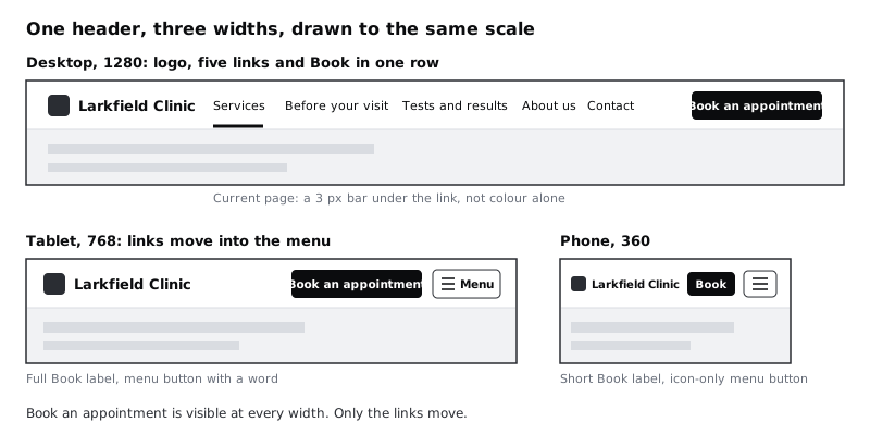
Step 1 · Write down what the header must do
Before drawing, write the header's rules on the canvas so every later decision can be checked against them. Create a page called Site header and add a text layer at the top with these lines:
- The logo links to the home page and is always visible.
- Five links: Services, Before your visit, Tests and results, About us, Contact. On wide screens they sit in a row. When they do not fit, all five move into a menu together; never show three and hide two.
Book an appointmentis visible at every width, in every state, including while the menu is open.- Every interactive part is at least 44 by 44 pixels.
- The current page is marked by shape and weight, not by colour alone.
- Focus looks the same on every control: a 2 px gap, then a 2 px ring in
colour/accent.
The 44 pixel target is above the WCAG 2.2 AA minimum of 24 and matches the level AAA guidance. A header is tapped constantly, often with a thumb on a moving bus, so it is worth the extra room. The labels come from the clinic's site map. If you have not tested them, Run a tree test on your navigation checks that people can find things under these words before you spend time on the visuals.
Check it worked
Your Site header page has a rules note with six lines. Read each one and ask "could I point at a frame and show this is true?" If a rule is vague, such as "the menu should be easy to use", rewrite it until you could check it.
Step 2 · Build the desktop header with auto layout
Draw a frame 1280 wide and name it Header / Desktop. Fill it with colour/surface and add a 1 px bottom stroke in colour/line. The divider is decorative, so its low contrast (1.42:1 on white) is fine.
Add auto layout (Shift+A), horizontal, with padding of 32 left and right and 12 top and bottom, and centre the children vertically. Set the frame's width to Fixed and its height to Hug. Inside it, build three groups, each its own auto layout frame:
- Logo: a 32 by 32 mark beside the words
Larkfield ClinicinHeading/M(20, semi bold), gap 8. Name itLogo, set its width to Hug and its height to Fixed at 48, with the mark and words centred vertically. The logo is a link, so like every other control it needs a target at least 44 tall; a 32 pixel mark that hugs would give it only 32. Use the logo as an SVG or vector, not a large bitmap. On a prepaid mobile plan every page load costs the visitor money, and the header is on every page. - Links: five link items in a horizontal frame called
Nav links, gap 8. Each link item is its own small auto layout frame with the label inBody(16) andcolour/text, padding 12 left and right, height 48, label centred vertically. The padding is what makes each link a 48 pixel tall target instead of a 24 pixel line of text. - Book: an instance of the Larkfield primary button, labelled
Book an appointment, height 48.
Set the gap of the outer header frame to Auto, so the three groups spread to the edges with the leftover space between them. Then make Nav links hug its contents. You want its width to come from the labels, because the next step measures it.
Check it worked
The header is 1280 wide and 72 tall (48 plus 12 above and below). The logo sits against the left padding, Book against the right, and the five links sit between them. Select any link item: it shows Hug for width and 48 for height, and its label uses the Body style. Select Logo: it is 48 tall.
Step 3 · Find where the row stops fitting
A desktop header only works while everything fits on one line. Work out where that line runs out on paper first, then check it on the canvas.
Select each group and read its width in the right sidebar. With Inter at these sizes you get something like this; your exact numbers will differ by a few pixels:
- Logo: about 200
- Nav links: about 608 (five labels of about 456 together, plus 24 padding on each item and four gaps of 8)
- Book: about 185
Add the two side paddings of 32 and at least 32 between each pair of groups, so the links never touch the logo or the button: 32 + 200 + 32 + 608 + 32 + 185 + 32 = 1,121. Below about 1,120 pixels, the row cannot fit.
Now test it with longer words. Labels grow in translation, and a design that only fits English breaks the day the site adds another language. Duplicate the header and replace the labels with a French stand-in: Nos services, Avant votre visite, Analyses et résultats, Qui sommes-nous, Contact. If your users read Hausa, Swahili or Portuguese, use those labels instead; the point is to try the longest version you might ship. The links grow to about 724 and the row needs about 1,237.
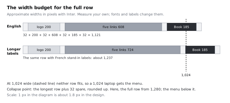
Choose the collapse point: the longest row plus 32 spare, rounded up to a width you can name. For Larkfield that is 1,280. At 1,280 and wider, the links sit in a row. Below 1,280, they move into the menu. Write this on the rules note as Collapse point: 1,280. Full row needs about 1,121 (English) and 1,237 (longer labels).
That means a 1,024 pixel laptop gets the menu. It can feel wrong to give a laptop a menu button, but the alternative is links wrapping onto two lines or running into the Book button, which looks broken. If the clinic insists on a row at 1,024, the honest fix is fewer or shorter labels, not a smaller font.
Check it worked
Drag the right edge of Header / Desktop slowly to the left. Watch the space between the links and Book: it shrinks to nothing somewhere near your calculated width, and then the groups overlap or push out of the frame. Note the width where it fails. Expect about 1,057, not 1,121: Auto spacing shrinks to 0, so the frame only fails when the groups touch, while your 1,121 budget adds two 32 pixel gaps on purpose so the links never sit against the logo or Book. Add 64 to the width you measured; the result should be within a few pixels of your sum. Set the frame back to 1280 when you are done.
Step 4 · Design the tablet and phone headers
Duplicate Header / Desktop twice. Name the copies Header / Tablet at 768 wide and Header / Phone at 360 wide. In both, delete the Nav links frame and add a menu button at the right end, after Book.
Tablet, 768. Set side padding to 24. Keep the full logo and the full Book an appointment label. The menu button is a secondary button, 48 tall, with a three-line icon and the word Menu beside it. A visible word helps people who do not read the three-line icon as "menu", and there is room for it at this width. Put Book and the menu button in their own horizontal frame with a gap of 16, so the header has two groups with Auto spacing between them.
Phone, 360. Space is tight, so add up the budget again before you draw. With 16 side padding you have 328 pixels:
- Logo: a 28 pixel mark with
Larkfield ClinicinLabel(14, semi bold), theLogoframe kept at a fixed height of 44 so the link is still a 44 pixel target: about 150 - Book, shortened to
Book, padding 16 each side: about 66. Override the primary button's height from 48 to 44 on this instance only, so it lines up with the menu button - Menu button, icon only, 44 by 44
- Two gaps of 8
That is about 276, leaving room to spare at 360 and still fitting at 320, the narrow width WCAG's reflow rule asks content to work at. Many low-cost Android phones are 360 wide, and people who enlarge their text get the same squeeze. Keep the header 64 tall on phones so it takes as little of the screen as possible. The copy still has the desktop's 12 top and bottom padding, which would make it 68 (44 plus 24), so change the vertical padding to 10: 44 plus 20 is 64.
Shortening the button's text is allowed as long as the visible word comes first in the button's accessible name. Write a note beside the phone frame: Book button: visible label "Book", accessible name "Book an appointment". A person using voice control can then say "click Book" and it works. The icon-only menu button needs a note too: Accessible name: "Menu".
Check it worked
You have three frames, 1280, 768 and 360 wide. In all three, Book is visible and sits on the right side of the header. At 360, change the phone frame to 320 wide: the logo, Book and the menu button still fit on one line without overlapping. Select the phone logo, Book and the menu button: each is at least 44 tall. Select the phone header frame: it is 64 tall.
Step 5 · Design the open menu
The menu opens from the menu button and shows the five links. Design it once for the phone and once for the tablet, as Header / Phone / Open and Header / Tablet / Open.
Place a panel directly under the header, full width, filled with colour/surface. Inside it, stack five rows in a vertical auto layout frame with no gap:
- Each row is 56 tall, fill width, with the label in
Bodyand padding 16 left and right (24 on tablet). - A 1 px
colour/linedivider under each row. - The whole row is the link, not only the text, so the target runs edge to edge.
While the menu is open, the menu button changes its icon from three lines to a cross. Keep its accessible name as Menu and note that its expanded state changes, so a screen reader announces something like "Menu, expanded". Put Book in the header exactly where it was. Someone who opened the menu looking for booking should find it without closing anything.
Then decide what happens to the page underneath. For five short rows, the simplest choice is a panel that covers the top of the page and leaves the rest visible, with no animation needed to understand it. Note one rule for the developer: if the panel is taller than the screen, as it can be on a phone held sideways, the panel scrolls; the header does not grow.
Check it worked
On Header / Phone / Open, the five rows sit directly under the header, each 56 tall and full width, and the menu button shows a cross. Book is still visible in the header. Turn the phone frame sideways in your head by setting it to 640 wide and 360 tall: the header (64) plus five rows (280) fit in 344, with a little space to spare.
Step 6 · Add current-page and focus states
The header needs to tell people where they are and show where the keyboard is. Design both as variants of the parts, not as one-off edits.
Current page. On desktop, mark the current link with a 3 px bar in colour/accent along the bottom of its link item, and keep the label in colour/text. Do not make the current link bold: a bolder label is wider and nudges the other links sideways as people move between pages. In the menu, mark the current row with a colour/accent-tint fill, a 4 px colour/accent bar on the left edge, and the label in Body size (16) set to semi bold. Do not apply the Label style here, as that would also shrink the text to 14. The text there is 14.17:1 on the tint, and the bar is a shape, so the meaning does not depend on colour alone. Add a developer note: Current page link has aria-current="page".
Focus. Use the treatment from the rules note: a 2 px gap in the header's background colour, then a 2 px ring in colour/accent. The accent ring on white is 7.58:1, well above the 3:1 a focus indicator needs. Draw it on a link item, Book, the menu button and the logo. For the full-width menu rows, there is no room outside the row for a gap, so draw the ring inset by 2 px inside the row edge instead.
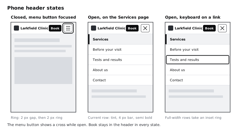
On desktop, add a hover state too: underline the link label. Hover is not available on touch screens, so it can only add to the other states, never replace them.
Check it worked
You have a current-page version and a focus version of the desktop link item, a current and a focus version of the menu row, and focus versions of Book, the menu button and the logo. Turn your screen brightness down and look at the focus versions from arm's length: you can tell which control is focused in each one. Cover the colour with your hand on the current-page versions (or look at them in grayscale): the bar still tells you which page is current.
Step 7 · Turn the header into a component and write the hand-off notes
Select the five header frames (Desktop, Tablet, Tablet Open, Phone, Phone Open), make each a component, and combine them into one component set with two variant properties:
Size: Desktop, Tablet, PhoneMenu: Closed, Open (Desktop has Closed only)
Do the same for the link item (State: Default, Hover, Current, Focus) and the menu row (State: Default, Current, Focus), and use instances of them inside the header. Then a change to the focus ring is made once.
Beside the component set, add a hand-off note. Keep it short and specific:
- Collapse point: full row at 1,280 and wider, menu below 1,280.
- Book an appointment is never inside the menu and never hidden.
- Menu button: name "Menu", expanded state on while open, Escape closes the menu and returns focus to the button.
- Focus order: logo, links (or menu button), Book. On narrow screens: logo, Book, menu button, then the menu rows when open.
- Current page: bar or tint as drawn, plus
aria-current="page". - If the header is sticky, a focused link further down the page must never be fully hidden behind it.
- Same header, same order, on every page.
The last line matters more than it looks. People learn a header once. If the Contact link moves between pages, they have to learn it again, and screen reader users notice first.
Check it worked
The component set shows five variants, and switching Size and Menu on an instance in the right sidebar changes the header without breaking anything inside it. The hand-off note has the collapse point as a number, says where Book goes at every width, and describes the menu button's name, expanded state and Escape behaviour. A developer reading only the note and the frames could build the header without asking you a question.
Next steps
You have a header that fits at every width, keeps booking in reach, and has the states a developer needs to build it. From here:
- Build a responsive navigation menu builds this header in HTML and CSS, with the menu button, Escape to close and
aria-current. - Design visible focus states for keyboard users takes the focus ring onto dark and tinted surfaces and checks it under a sticky header.
- Lay out screens on a column grid sets up the 4 and 12 column grids the header's margins line up with.
- Choose a navigation pattern for an app covers the booking app's own navigation, where tabs often beat a menu.
Part of these paths
Related tutorials
- Choose a navigation pattern for an appYou will have compared a bottom tab bar, a top app bar with a drawer and a hub screen for the Larkfield Clinic app, written down why one wins, and drawn it on four screens with active, inactive and badge states.
- Build a responsive navigation menuYou will build the Larkfield Clinic site header, with links in a row on wide screens, a menu button on narrow ones that opens, closes on Escape and reports its state, a Book button that never hides, and a Playwright keyboard test that proves it works with and without JavaScript.
- Lay out screens on a column gridYou will have a Larkfield Clinic information page laid out in Figma on a 4-column phone grid and a 12-column desktop grid, with one deliberate break and a note of the grid values a developer needs.
Need this done for you?
Padding does this work for growing companies, from the first diagnosis to a system that keeps working.
Get new tutorials