UI and visual design · Beginner · 16 min
Lay out a landing page section by section
By Padding · Updated 18 Nov 2026
Figma (web) or any design tool with column guides, and a notes document · November 2026
You will have a desktop and a phone layout for a clinic's public landing page, built on column grids, and a section list that gives each section one job, one reading order and its column spans.
On this page
A landing page is not an app screen. Nobody arrives at it in the middle of a task with the app already open. They arrive from a search result, a shared link or a poster, often on a phone, and they want one of three or four things before they leave. If the page makes them scroll past a welcome message and a photo of the team to find the opening hours, many will phone instead, or give up.
So the layout starts away from the canvas. You list what visitors come to do, give each section exactly one of those jobs, put the sections in order, and decide what each one says first. Only then do you place blocks on columns. Done in that order, the grid work is quick, because every span answers a question you have already settled.
The example is the public page for Larkfield Clinic, a fictional community clinic at 14 Mill Lane, whose patients book through the booking app from the design-a-product-end-to-end series. The page has to get people booking, tell them when the clinic is open and how to call, show where it is, and list the five services the app can book. You finish with three things: a section list, a 1280 pixel desktop layout on 12 columns and a 360 pixel phone layout on 4 columns.
Step 1 · List what visitors come to do, and how often
Open a new document and call it Landing page plan. Before you write any section names, write down the reasons people come to the page, in their words, not the organisation's. Good sources are the questions reception answers, what people type into the site search, the most common calls, and the pages people visit most on the current site.
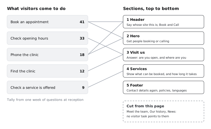
For Larkfield, reception kept a tally for one week of every question someone could have answered from a web page. Five reasons covered almost all of it:
- Book an appointment: 41
- Check opening hours: 33
- Phone the clinic: 18
- Find the clinic (address, parking, step-free access): 12
- Check a service is offered ("do you do blood tests?"): 9
Rank them by count. The order of this list becomes, roughly, the order of the page. Then write the things the clinic would like on the page that are not on the list: a welcome from the lead GP, the clinic's history, a news feed. Keep them in a separate list called Wanted by us. You decide what happens to them in the next step.
If you cannot count anything, ask three people who deal with the public which questions they answer most, and rank by agreement. An honest guess written down beats a list of sections copied from another site.
Check it worked
Your plan has a ranked list of three to six visitor tasks, each written as something a visitor would say or do, each with a count or a rank. A separate Wanted by us list holds anything the organisation wants that no visitor asked for.
Step 2 · Give each section one job
Now turn the tasks into sections. The rule is one job per section, written as one sentence that starts with a verb. If a section needs "and" in its job, ask whether it is two sections. If a section's job does not trace back to a task on your list, it does not belong on this page.
For Larkfield, five sections cover the five tasks:
- Header. Say whose site this is and keep the main actions close at hand.
- Hero. Get people booking or calling.
- Visit us. Answer "are you open, and where are you?"
- Services. Show what can be booked and how long each appointment takes.
- Footer. Repeat the contact details, and hold policies and language choices.
Visit us carries two tasks, hours and finding the clinic, because visitors ask them together ("are you open now, and how do I get there?") and the answer is one block of facts. That is a single job, so it passes the test.
Then deal with Wanted by us. Meet the team, Our history and News have no visitor task behind them, so they come off the landing page. They can live on their own pages, linked from the footer. Write the decision beside each one, so the conversation does not have to happen again.
Check it worked
Every section in your plan has a one-sentence job starting with a verb. The header's job promises the main actions close at hand, not on every screen width, so it still holds when the phone header later keeps only Call. Every visitor task from the first step is served by at least one section, and every section except the header and footer serves at least one task. Each item in Wanted by us has a written decision: cut, moved to another page, or kept with a reason.
Step 3 · Put the sections in order and test the first screen
Order the sections so that the most common task is the first thing a visitor can act on, and so that each section answers the question the previous one raises. For Larkfield, booking is the top task, so the hero offers it. Someone who reads the hero and thinks "but are they open today?" finds Visit us next. Someone still unsure whether the clinic does what they need reaches Services. The footer catches anyone who scrolled to the end looking for a phone number.
Keep the order the same on phone and desktop. A visitor who uses the page on both should not have to learn it twice, and a developer gets one order of content in the page source.
Write a one-line check for the first screen, the part visible before any scrolling. On a 360 by 640 phone, the Larkfield first screen must show the clinic's name, a way to book and a way to call. On a 1280 by 800 desktop, it must also show the opening hours, even if only as a line in the hero. Put both lines at the top of your plan; the layout steps test against them.
Many Larkfield patients, like many people across Africa and elsewhere, use budget Android phones on prepaid data. A first screen that is all photo spends their data and shows them nothing useful. Words and buttons come first on the phone; the photo can wait.
Check it worked
Your plan lists the five sections in a single order, with a sentence under each saying why it follows the one before. At the top are two first-screen lines, one for a 360 by 640 phone and one for a 1280 by 800 desktop, each naming what must be visible without scrolling.
Step 4 · Set one reading order inside each section
Each section needs its own hierarchy: what the eye lands on first, what it reads second, and what comes after. Write it as a numbered list of three under the section's job. Keep the strongest element in a section to one thing. If two elements compete for first place, the section probably has two jobs.
For Larkfield:
- Hero. 1: the heading
See a GP or nurse at Larkfield Clinic. 2: theBook an appointmentbutton, the darkest, heaviest shape on the page. 3: the supporting line and aCall 01234 567 890link. - Visit us. 1: the opening hours, set as a table so days and times line up. 2: the address
14 Mill Lanewith a Directions link. 3: the reception phone line. - Services. 1: the five service names. 2: the duration beside each (
GP appointment · 10 min,Nurse appointment · 15 min,Blood test · 10 min,Vaccination · 15 min,Medication review · 20 min). 3: a short section heading and intro. - Header. 1: the name
Larkfield Clinic. 2:Book an appointment. 3:Call. - Footer. All at one level, small and quiet. Nobody reads a footer first.
Only one solid button style appears on the page, used for Book an appointment in the header and the hero, because booking is the main task. Calling is a link on desktop and an outlined button on phone. If Services had its own solid "Book" button on every row, the page would have six equally loud buttons and none would stand out.
Decide the type sizes from the reading order, not the other way round. The Larkfield app's largest text style is 28. A landing page can take one step above that for the hero heading only, for example 40 with a line height of 48 on desktop, while section headings use the app's 20 and body text its 16. On the phone, the hero heading drops to 28.
Check it worked
Under each section's job in your plan there is a numbered reading order of up to three items, and no section has two items marked 1. The plan names one solid button style, used only for the main task, and lists the type sizes for the hero heading, section headings and body text.
Step 5 · Lay out the desktop page on 12 columns
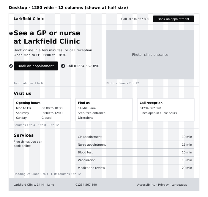
Draw a frame 1280 wide and name it Landing / Desktop. Add a Columns layout guide with Count 12, type Stretch, Margin 32 and Gutter 32. That gives columns 72 wide, the same grid as the column grid tutorial, so a 4-column span is 384 wide, 6 columns 592 and 8 columns 800. Column 5 starts at X 448, column 7 at X 656 and column 9 at X 864.
Build the sections top to bottom as full-width frames, with 64 of padding above and below each section's content. If your spacing scale stops at 32, add 64 as its next step and note it in the plan, rather than using a one-off number.
- Header, 72 tall: the name at X 32;
Book an appointmentas a solid button spanning columns 10 to 12; the call link to its left. - Hero: the heading, supporting line, button and call link in columns 1 to 6; a photo of the clinic entrance in columns 7 to 12 at 16:9, 592 by 333. The supporting line also carries the weekday hours,
Open Mon to Fri 08:00 to 18:30, to meet the desktop first-screen line. - Visit us: the section heading across the top, then three equal blocks: opening hours in columns 1 to 4, address and directions in columns 5 to 8, the reception phone line in columns 9 to 12.
- Services: the heading and a one-line intro in columns 1 to 4; the five service rows in columns 5 to 12, name on the left, duration on the right.
- Footer: three blocks on the same column spans as Visit us: name and address, phone number, and links to Accessibility, Privacy and the language choices.
Notice that no text runs the full 12 columns. The hero text sits in 6 columns, which keeps its lines well under 80 characters, the limit in WCAG's AAA success criterion 1.4.8. The service list spans 8 columns, but each row is a short name and a duration, not a paragraph.
Check it worked
Press Shift+G to toggle the guides. With them on, look at the content inside each section frame, not the full-width section frames or the footer's background band, which run from X 0 to 1280. Every text block, button and photo below the header has its left edge on the left edge of column 1, 5, 7 or 9 (the header button starts at column 10), and every right edge on a column's right edge. Draw a temporary 1280 by 800 frame over the top of the page: inside it you can see the clinic name, the hours line and the Book an appointment button. Delete the temporary frame.
Step 6 · Lay out the phone page on 4 columns
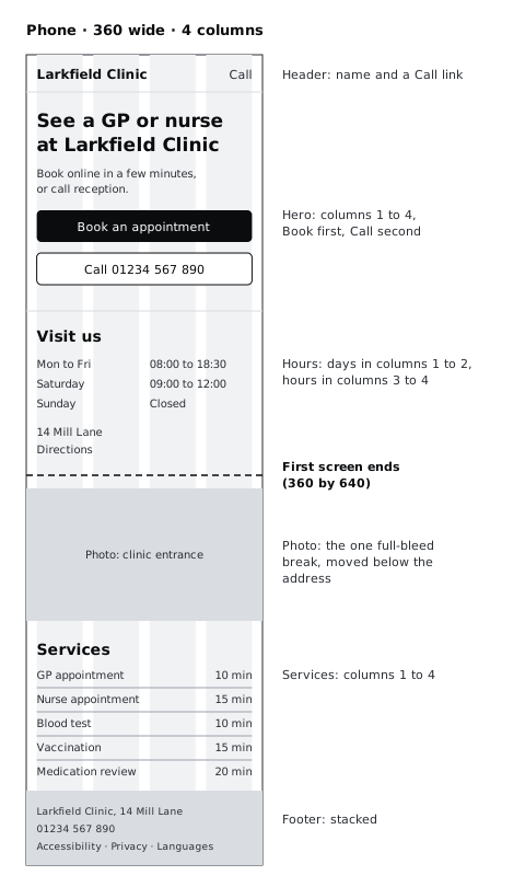
Draw a frame 360 wide and name it Landing / Phone. Add a Columns guide with Count 4, Stretch, Margin 16 and Gutter 16, which gives columns 70 wide. Column 3 starts at X 188, and a 2-column span is 156.
Keep the section order from the plan and stack everything in one column of content. The decisions are about what changes size, what moves and what goes:
- Header, 56 tall: the name on the left and a
Calllink on the right, set up as atel:link in the build so one tap starts the call. Leave the Book button out of the phone header: on the phone, Book lives in the hero, a full-width button a few centimetres below the header, and the header keeps only Call. Note this in the plan under the header's job. - Hero: the heading at 28, the supporting line, then
Book an appointmentas a solid button 48 tall across all 4 columns, andCall 01234 567 890as an outlined button the same size under it. At 48 tall and 328 wide, both are far larger than the 24 by 24 pixel minimum target in WCAG 2.2, and comfortable to hit with a thumb. - Visit us: the hours table with days in columns 1 to 2 and times in columns 3 to 4, so the times line up; then the address and a Directions link.
- Photo: the entrance photo moves out of the hero to sit under the address, full bleed from X 0 to 360. Next to the directions, it helps someone recognise the building when they arrive, and it no longer delays the buttons. This is the page's one break from the grid; write the reason on the canvas.
- Services: the five rows across all 4 columns, name on the left, duration right-aligned.
- Footer: the three desktop blocks stacked, in the same order.
Use 40 between sections on the phone instead of 64. The phone needs the separation less, because each section is already a separate stretch of scrolling.
If the page will be offered in more than one language, put the longest translation of the hero heading and the button labels into the phone frame now. A Yoruba, Hausa or French label is often longer than the English, and a heading that fits in two lines in English can need four. If it pushes the buttons off the first screen, shorten the heading in every language rather than shrinking the type.
Check it worked
Draw a temporary 360 by 640 frame over the top of the phone page: the clinic name, Book an appointment and Call 01234 567 890 are all inside it, and the hours table is too. Apart from the full-width section frames, the footer's background and the photo, every text block and button starts at X 16 or X 188, or ends on column 4's right edge at X 344, as the header Call link and the service durations do. The photo is the only piece of content that runs from X 0 to 360, and your canvas note says why.
Step 7 · Finish the section list and test it on a colleague
Go back to Landing page plan and add the layout to each section, so the document carries everything a developer or a no-code builder needs. Each section entry should have four lines:
3. Visit us
Job: answer "are you open, and where are you?"
Reading order: 1 opening hours, 2 address and Directions, 3 reception phone line
Desktop: heading across 12; hours 1-4, address 5-8, phone 9-12
Phone: hours table days 1-2, times 3-4; address; photo full bleed below
Then test the layouts on someone who has not seen them. Show the desktop frame for five seconds and hide it, and ask what the page is for and what they could do on it. Then show the phone frame and give them three tasks, one at a time: find out whether the clinic is open on Saturday, find how to book a nurse appointment, and find the phone number. Note where they look first for each. If someone looks in the hero for Saturday hours and does not find them, that is a reason to move the Saturday line up, not a failure of the person.
Change one thing at a time and keep the reason in the plan. A section list with reasons is what stops the page drifting back to a welcome message and a team photo the next time someone edits it.
Check it worked
Every section in your plan has a job, a reading order, a desktop span and a phone layout. Your colleague could say in one sentence what the page is for after five seconds, and found Saturday's hours, the booking button and the phone number on the phone frame without help. Any change you made from the test is written in the plan with the task that prompted it.
Next steps
- Build a page like this without code, with stacks and breakpoints, in /tutorials/build-a-one-page-site-in-framer. It works from its own plan for Larkfield, with a different section order and hero; use your section list in place of the plan in its first step.
- Practise the reading-order step on a single screen, one lever at a time, in /tutorials/create-visual-hierarchy-with-size-weight-and-position.
- If column guides are new to you, set up the 4- and 12-column grids used here in /tutorials/lay-out-screens-on-a-column-grid.
- Add a tablet width between the two and decide what reflows, in /tutorials/design-one-layout-for-phone-tablet-and-desktop.
Part of these paths
Related tutorials
- Create visual hierarchy with size, weight and positionYou will have a strip of six Figma frames that takes a flat confirmation screen to a clear one, one lever at a time, and a squint test showing the primary action is the strongest shape on the screen.
- Build and publish a one-page site in FramerYou will have a live one-page site for Larkfield Clinic, built with stacks, adjusted for phone and tablet, with a working contact link and a custom domain.
- Lay out screens on a column gridYou will have a Larkfield Clinic information page laid out in Figma on a 4-column phone grid and a 12-column desktop grid, with one deliberate break and a note of the grid values a developer needs.
Need this done for you?
Padding does this work for growing companies, from the first diagnosis to a system that keeps working.
Get new tutorials