UI and visual design · Intermediate · 16 min
Design for low-end Android phones
By Padding · Updated 18 Nov 2026
Figma (web) and an entry-level Android phone · November 2026
You will have a written low-end phone profile, a Larkfield Clinic booking screen revised to work at 360 by 640 dp on a dim screen with large text, and a constraint checklist your team can run on every new screen.
On this page
Most design files are drawn on a large, bright laptop screen and checked on the designer's own phone, which is usually newer and better than the phones many patients carry. The gap shows up in small ways: a Continue button that sits below the fold, a grey hint that vanishes in sunlight, a fade-in that stutters, a photo that costs part of someone's data bundle before they have booked anything.
This tutorial reviews the Larkfield Clinic booking flow (Home, Choose a service, Pick a time, Your details, Confirm, Booked) against the phone a typical patient might own: an entry-level Android model with a small, dim screen, little free memory and storage, an Android release a few years old, and in many homes more than one person using it. In Nigeria, Kenya and much of Africa, Android is the most used mobile system and entry-level models are common, but the same phones are in use everywhere, from rural clinics to city centres. You do not need a separate "lite" design. You need one design that still works at the bottom of the range.
You will write a short profile of that phone, measure one screen against it, fix what fails, and finish with a checklist to run on every new screen.
Step 1 · Write a low-end phone profile
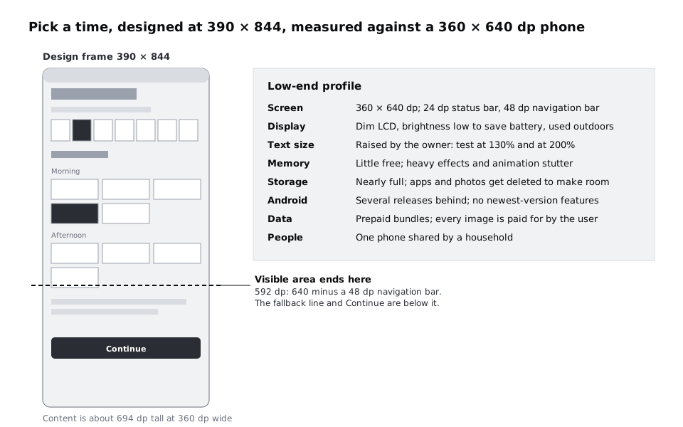
Before you change anything, write down the phone you are designing for, so every decision has something concrete to point at. On the 04 High fidelity page, add a text block next to the screens titled Low-end profile with one line for each constraint:
- Screen: 360 by 640 dp. Android measures layouts in density-independent pixels (dp), so a 360 dp wide phone has the same layout width whether its panel is 720 or 1080 real pixels across. Allow 24 dp for the status bar at the top and 48 dp for a navigation bar at the bottom; that leaves about 568 dp of height for your screen.
- Display: a dim LCD with modest contrast, often with brightness turned down to save battery, often used outdoors.
- Text size: raised by the owner in Android's settings. Recent Android versions let people scale text up to 200 percent, and many people with older eyes use a larger setting all the time.
- Memory: little free memory, so heavy effects and long animations stutter or drop frames. Google even makes a cut-down version of Android, Android (Go edition), for phones like this.
- Storage: nearly full. When space runs out, people delete large apps and photos first.
- Android version: several releases behind the latest, and it may never be updated.
- Data: bought in prepaid bundles, so every image and font download is paid for by the person using the app.
- People: a phone shared by a household, so anyone may pick it up and read the screen or a notification.
Then add one line under it saying who this profile represents. For Larkfield that could be "an older patient booking for herself on a phone her son bought her, and a parent booking for a child on a shared family phone".
Check it worked
Your file has a Low-end profile text block beside the screens with eight constraint lines and one sentence naming the people it represents. Each line is specific enough to test: a size in dp, a percentage, or a condition you can recreate, not "older phones".
Step 2 · Put one screen in a 360 by 640 frame and find the fold
Pick the screen with the most on it. In Larkfield that is Pick a time: a header, the service line, the seven-day week strip, the day heading, nine time slots in two groups, the phone fallback line and the Continue button.
Duplicate the frame and rename the copy Pick a time / 360x640. In the right sidebar, set its width to 360 and its height to 640, and make sure Clip content is on so anything past the bottom edge is hidden. If the screen uses auto layout, the slots reflow to the narrower width; if not, move them into three columns by hand. Add two plain rectangles on top as stand-ins for the system bars: 360 by 24 at the top and 360 by 48 at the bottom, both filled dark grey and named Status bar and Navigation bar.
Now add up the heights. Larkfield's high-fidelity Pick a time, squeezed to 360 dp wide, comes to about 694 dp: a 56 dp header, a 56 dp week strip, nine 48 dp slots in four rows, the group labels, the two-line fallback and a 48 dp button, with 16 to 24 dp gaps between them. The visible area ends at 592 dp, where the navigation bar starts. The fallback phone number and the Continue button are both off screen. A patient who taps 10:30 sees nothing happen and has to guess that they should scroll.
Repeat the measurement for each of the other five screens. Write the total height of each one under the Low-end profile block, and mark any screen where the main action is below 592 dp.
Check it worked
You have a Pick a time / 360x640 frame with both bar stand-ins, and the clipped frame shows the button missing. Under your profile there is a list of six screen heights, and every screen whose primary button falls below 592 dp is marked. For Larkfield, Pick a time and Your details are usually the two that fail.
Step 3 · Fit the main action into the first screen
Fix the fold by changing the layout, not by shrinking type or targets. Android's guidance for touch targets is at least 48 by 48 dp, and the slots and button should stay at that size. The one place that is hard at this width is the week strip, covered in item 3.
Work through Pick a time in this order, measuring after each change:
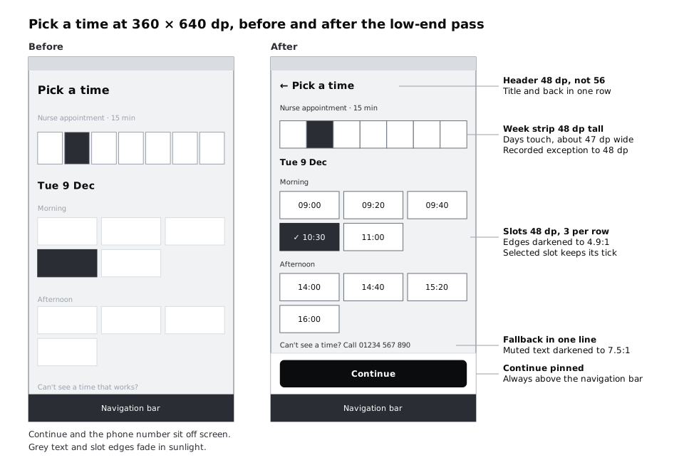
- Pin the primary action. Put Continue in a bottom bar, 72 dp tall (12 dp padding, the 48 dp button, 12 dp padding), that sits directly above the navigation bar and stays put while the slots scroll behind it. Now the action is always visible, whatever the content height.
- Tighten the header. A 48 dp header with the back arrow and the title on one row reads the same as a 56 dp one.
- Shorten the week strip. Reduce the strip's height from 56 to 48 dp; the day name and date still fit. Remove the gaps between the days so their hit areas touch: seven days across 328 dp gives each one about 47 dp of width, separated by a 1 dp divider line drawn inside each cell rather than by space. That is just short of Android's 48 dp recommendation, but well above the WCAG 2.2 minimum target size of 24 by 24 CSS pixels, and with no gaps a tap near an edge still lands on a day. Record it as a known exception in a note on the frame. If your team would rather meet 48 dp exactly, let the strip scroll sideways with six full days and part of the seventh in view instead.
- Keep three slots in each row at 104 dp wide. Three slots and two 8 dp gaps fill the 328 dp content width, so five morning times still take two rows and four afternoon times take two, as in the tally.
- Cut the fallback to one line. "Can't see a time? Call 01234 567 890" says the same as the two-line version.
If a screen still does not fit after this, the content is the problem rather than the spacing. On Your details, the four fields and the reminder checkbox will never fit above a keyboard on a 640 dp phone, and they do not need to: pin Continue, and make sure the field in focus scrolls into view above the keyboard. Write that as a note for developers on the frame.
Check it worked
In your Pick a time / 360x640 frame the Continue button is fully visible between the slots and the navigation bar, without scrolling. Measure the slots and the button with the Alt or Option key: each is at least 48 dp tall. Each day in the week strip is 48 dp tall and about 47 dp wide, with no gap between days, and the frame has a note recording that exception. The selected slot still shows its tick as well as its fill.
Step 4 · Raise contrast for dim screens and sunlight
WCAG 2.2 asks for at least 4.5:1 for normal text and 3:1 for control edges such as field borders. Those are minimums measured on a good screen. A dim LCD outdoors flattens everything, so for the greys that carry real information, aim for the enhanced level of 7:1 for small text, and well above 3:1 for edges.
Check the Larkfield greys against that margin:
text-muted#5A6270 oncanvas#F6F7F8: 5.73:1. Passes the minimum, but small hints such as "Nurse appointment · 15 min" are the first thing to fade in sunlight. Darken it to #4A515C: 7.47:1 on canvas, 8.01:1 on white.border#7D8592 onsurface#FFFFFF: 3.72:1, and only 3.47:1 against canvas. Unselected time slots are told apart by their edge alone. Darken it to #6A717D: 4.92:1 on white.text#1B1F24 oncanvas: 15.44:1. Leave it.
Edit the two variables rather than the layers, so every screen changes at once. Then check the type for thinness. Light and Thin weights break up on low-resolution panels, so no text in the app should be lighter than Regular. Android measures text in scale-independent pixels (sp), which follow the person's font size setting; keep 14 sp as the smallest size, which Larkfield's Body/Small and Label already use.
Status colours need the same treatment. Larkfield's notice #8A5A00 on notice-tint #FFF4DC is 5.43:1: fine, but if your own palette has amber or green text on a pale tint near 4.5:1, it will be the first thing lost outdoors. Pair every status colour with an icon and words, as the high-fidelity tutorial already does.
Check it worked
Your contrast note on the canvas has three new lines for the revised greys, each with its ratio. colour/text-muted and colour/border show the new hex values in the variables panel. Search the page for text layers in Light or Thin weights or below 14: you find none.
Step 5 · Check the layout with larger text
The person holding the phone may have their font size turned up. A layout that fits at 100 percent can clip or overlap at 130 percent, and at 200 percent buttons have to grow. The full method for this is in Design layouts that survive large text (linked in Next steps); here, do a quick pass on the revised screen.
Duplicate Pick a time / 360x640 and name it Pick a time / 130%. On the copy, raise each text size by about 30 percent: 20 to 26 for the header title, 16 to 21 for body text, and 14 to 18 for Body/Small and the slot times. Change the layers on this frame only, not the text styles, so the other screens are not affected.
Look for three failures:
- Clipped or truncated text. "Nurse appointment · 15 min" may wrap to two lines; that is fine. Text cut off at a fixed height is not. Set the slot and button heights to grow with their content (a minimum height of 48, not a fixed one).
- Slots that no longer fit three across. At 18 sp, "10:30" with a tick still fits in 104 dp. If your times are longer (for example "10:30 am"), drop to two per row at large sizes and write that rule down.
- The pinned bar taking over. If the bottom bar grows past about a fifth of the screen, it hides the slots it is meant to confirm. Keep only the button in it.
Check it worked
Your Pick a time / 130% frame shows every word in full, with no text overlapping or clipped, and the Continue button still visible above the navigation bar. Any rule you had to add (minimum heights, two slots per row above a certain size) is written in a note beside the frame.
Step 6 · Cut weight from images, effects and motion
Low memory and prepaid data hit the same things: large images, layered effects and animation.
Images. At 360 dp wide, Home's 16:9 clinic photo is about 203 dp tall: over a third of the visible area, and often the heaviest download in the flow. Keep it, because it helps patients recognise the building, but move it below the "Book an appointment" button so the action comes first, and write an export budget on the frame, such as "under 60 KB as WebP at 2x". Do not add more photos to other screens. The data side of this, including budgets for the whole flow, is covered in Design for slow networks and costly data.
Effects. Background blur, large soft shadows and stacked transparent layers look fine on a new phone and can make an old one stutter while it scrolls. Larkfield's style uses flat fills and 1 dp borders; if your design uses blurs or heavy shadows, replace them with a solid surface and a border, which a weak graphics chip draws cheaply.
Motion. Review every transition in the prototype. Keep screen-to-screen transitions short (200 ms or less is a reasonable house rule) or use none, never loop an animation, and make sure nothing important is said only through motion. Android has a "Remove animations" setting, and web apps can read the equivalent preference through the prefers-reduced-motion media feature; note on the prototype that every transition must be skippable when it is on.
Fonts and storage. Every custom font weight is another file to download and store. Larkfield uses two weights of one typeface; if your design uses four or five, ask whether the system font would do. If the clinic offers an installable app, keep the booking flow on the web as well, so people with full storage are not forced to install anything.
Check it worked
Home in your 360 by 640 version shows the primary button above the photo, and the photo frame has a written size budget. Go through each connection in the prototype: every transition is 200 ms or shorter, or instant, and none uses a looping animation. Your notes list the number of font weights the app uses, and it is two or three at most.
Step 7 · Plan for shared phones and older Android
Two constraints are about who holds the phone and what it runs, not about pixels.
Shared phones. Assume the next person to pick up the phone is not the patient. Go through the flow and check:
- Booked already masks the phone number (
07••• ••• 123). Keep it masked. - Write the reminder text message so a lock screen preview says nothing private: "Larkfield Clinic: appointment Tue 9 Dec at 10:30. Reply C to cancel." does not need to name the service, and "Nurse appointment" or a test name can be sensitive in a family.
- Your details should start empty unless the patient has chosen to save their details on this phone, and any saved details need a visible "Not you? Clear details" link.
Older Android. Do not design anything that only works on the newest release. Features such as dynamic colour, which takes an accent from the wallpaper, need Android 12 or later, so treat them as an extra and make sure Larkfield's own accent works without them. Ask the developers for the lowest Android version they support and write it on the profile.
Check it worked
Your reminder SMS text, written on the Booked frame, contains the clinic name, date and time but no service name. Your details has a note saying when fields are pre-filled and how a person clears them. The Low-end profile block now names the lowest Android version the team supports.
Step 8 · Test on a real phone and write the checklist
A frame on a laptop cannot show you a dim screen. Borrow an entry-level Android phone, ideally the kind a Larkfield patient might own rather than a flagship from two years ago.
Open the prototype on the phone with the Figma mobile app, or export the revised frames as PNG at 2x and view them full screen. Then try the screens in the conditions from your profile:
- Turn the brightness to a quarter and step outside or stand by a window. Read every hint line and pick out the unselected slots.
- Hold the phone in one hand and reach for Continue with your thumb.
- Hand the phone to someone who has not seen the design and ask them to book the Nurse appointment for Tuesday 9 December at 10:30. Do not help.
- In the phone's display settings, set the font size to the largest available and open any app your team has already built, to see how it behaves at that size. Set it back afterwards.
Then turn what you have learned into a checklist. Add a text block called Low-end checklist on the page, written as yes or no questions:
- Is the primary action visible at 360 by 640 dp without scrolling?
- Are all touch targets at least 48 by 48 dp, and is any exception (such as a seven-day strip at 47 dp) recorded on the frame, with no gaps between targets and nothing below 24 by 24?
- Is small information text at least 7:1, and every control edge at least 3:1, aiming for 4.5:1 or more on dim screens?
- Is all text Regular weight or heavier, and 14 sp or larger?
- Does the screen still work with text at 130 percent, with nothing clipped?
- Does the screen use at most one photo, with a size budget written on it?
- Are transitions 200 ms or shorter, and can they all be switched off?
- Is nothing private shown on the screen or in notifications that a family member should not see?
- Does the screen work without features from the newest Android release?
Check it worked
Your notes record what happened in the four phone checks, including anything the person you handed the phone to struggled with. The Low-end checklist has nine questions, and the revised Pick a time and Home frames answer yes to every one. Any screen that still answers no has a note saying what will change.
Next steps
Run the checklist on every new screen before it moves to a prototype, and add to it when testing finds a new failure.
- The data side of the same phones (budgets, offline states and SMS fallbacks) is in /tutorials/design-for-slow-networks-and-costly-data.
- For hit areas, spacing between targets and one-handed reach, see /tutorials/size-touch-targets-for-thumbs.
- To test every screen at 200 percent text properly, work through /tutorials/design-layouts-that-survive-large-text.
- If you have not built the Larkfield screens yet, start with /tutorials/turn-a-mid-fidelity-layout-into-a-high-fidelity-design.
Part of these paths
Related tutorials
- Design for slow networks and costly dataYou will have a per-screen data budget for the Larkfield Clinic booking flow, Figma frames for what each screen shows offline, a save-and-resume state, a use-less-data option and SMS confirmation text that fits in one message.
- Size touch targets for thumbsYou will have the Larkfield Clinic Pick a time screen with every tappable area at least 48 by 48 pixels, the main action within one-handed reach, and an overlay frame that shows each hit area and its size.
- Design layouts that survive large textYou will have the Larkfield Clinic booking screens tested at the largest phone text size and at 200% browser zoom, every truncated label, overlap and fixed-height box fixed so it wraps, stacks or scrolls, and each screen shown at default and large text side by side.
Need this done for you?
Padding does this work for growing companies, from the first diagnosis to a system that keeps working.
Get new tutorials