UI and visual design · Intermediate · 17 min
Design for translation and longer text
By Padding · Updated 18 Nov 2026
Figma (web) or any design tool with auto layout, and a spreadsheet · November 2026
You will have the Larkfield Clinic booking screens tested with pseudo-localised text up to twice as long, fixed wherever they broke, and a localisation note that tells translators what each string is for and how much room it has.
On this page
Translation is a job for translators. Getting a design ready for translation is a design job, and it is easier to do before the first translated file arrives than after. A screen that fits "Continue" on one line may not fit the same word in French, a date heading that reads well in English may need a different word order in Hausa, and a sentence assembled from three fragments may be impossible to translate at all.
This tutorial gets Larkfield Clinic, the fictional community clinic from the design track, ready for French, Hausa and Swahili versions of its booking app. You will not translate anything. Instead you will replace every English string with pseudo-localised text: the same words with accented letters and extra length, wrapped in brackets so a cut-off string is obvious. Then you fix what breaks, check the typeface for the letters each language needs, and write the note that goes to the translators with the strings.
The screens are the six from the design track: Home, Choose a service, Pick a time, Your details, Confirm and Booked, plus their state frames. If you are using your own app, swap in its screens as you go.
Step 1 · List every string in a sheet
Open a new spreadsheet and name the first tab Strings. Give it these columns: A ID, B screen, C English, D where it appears, E pseudo, F notes.
Go through the screens in flow order and add one row for every piece of text a patient can see: titles, labels, button text, hints, error and notice messages, the five service names and their durations, the day names in the week strip, and the summary rows on Confirm. Include text inside components (the Time slot times, the Header title) and text that only shows in a state frame, such as "No free times this week".
Give each row an ID that says where it lives, so a translator and a developer can talk about the same string: home.book-button, service.nurse, service.nurse-duration, time.no-times, details.full-name-label, booked.text-sent. Write the English exactly as it appears on screen.
For a string with a value that changes, write a named placeholder in braces where the value goes, not the example value. On Booked, "We've sent a text to 07••• ••• 123." becomes We've sent a text to {phone}. Keep a separate column or a note with the example value you designed with.
Check it worked
Read each screen aloud and tick off its rows in the sheet as you go: every word you say has a row, and every row has a unique ID. For Larkfield, Choose a service alone has at least thirteen rows (title, intro line, five service names, five durations and the button). No row contains two separate pieces of text joined together.
Step 2 · Make pseudo-localised text with one formula
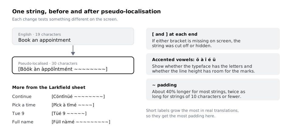
Pseudo-localisation fakes the two things translation does to a layout, longer text and unfamiliar letters, while staying readable to you. Three changes do it:
- Brackets at each end. On screen, a missing
]means the string was cut off or hidden behind something. - Accented vowels.
a e i o ubecomeà é î ö ü, so you can see whether the typeface has the letters and whether accents collide with the line above or get clipped. - Padding. Tildes add length: about 40% for most strings, and as much again as the string itself for strings of ten characters or fewer, because short labels tend to grow the most in proportion when translated.
Paste this into E2 and fill it down the column. It works in Google Sheets, Excel and LibreOffice Calc; if your spreadsheet uses semicolons between arguments, swap the commas for semicolons.
="[" & SUBSTITUTE(SUBSTITUTE(SUBSTITUTE(SUBSTITUTE(SUBSTITUTE(C2,"a","à"),"e","é"),"i","î"),"o","ö"),"u","ü") & " " & REPT("~", MAX(2, ROUND(LEN(C2) * IF(LEN(C2) <= 10, 1, 0.4), 0))) & "]"The formula changes lower-case vowels only, so placeholders such as {phone} would become {phöné}. For any row with a placeholder, type the pseudo version by hand with the example value in place: [Wé'vé sént à téxt tö 07••• ••• 123. ~~~~~~~~~~~~].
Check it worked
Column E has a value on every row. Continue reads [Cöntînüé ~~~~~~~~], Pick a time reads [Pîck à tîmé ~~~~], and Book an appointment reads [Böök àn àppöîntmént ~~~~~~~~]. Every pseudo string starts with [ and ends with ], and you can still tell which English string each one came from.
Step 3 · Put the pseudo text on a copy of the screens
Duplicate the page that holds your high-fidelity screens and name the copy Pseudo-localised. Leave the original alone; it is your English reference.
On the copy, replace every text layer with its column E value. Work screen by screen, and edit the text inside each component instance as an override rather than changing the main component, so the English screens stay English. For text that lives in a component used many times (the nine Time slot times, the five List row names), it is quicker to paste each value into the instance than to look for a shortcut; you only do this once.
Do not fix anything yet. If a string does not fit, leave it overflowing, truncated or overlapping. The broken screens are the result you need.
Check it worked
Every frame on the Pseudo-localised page shows bracketed, accented text and no plain English remains. Search the page for a common English word such as "appointment" (without accents): no visible text matches. The original page still shows English.
Step 4 · Find what broke and fix the layout, not the words
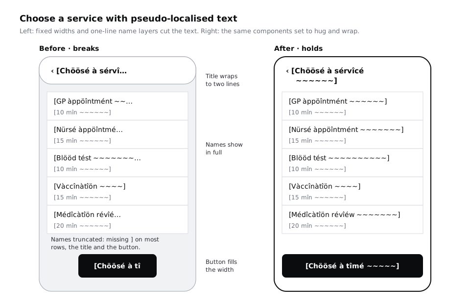
Go through each screen and mark every place a closing bracket is missing, two pieces of text touch or overlap, or a component has grown out of its frame. Put a numbered comment on each one. For Larkfield, the usual failures are:
- Titles in the
Header.[Chöösé à sérvîcé ~~~~~~]runs under the back control or is cut with an ellipsis. - List rows. The duration already sits under the service name, but if the name is a one-line text layer with a fixed width, or the row has a fixed height,
[Médîcàtîön révîéw ~~~~~~~]is truncated with an ellipsis instead of wrapping, and a name that does wrap is clipped by the row. - Buttons with a fixed width.
[Chöösé à tîmé ~~~~~]loses its end. - The week strip.
[Tüé 9 ~~~~~]does not fit a narrow day cell. - Fixed-height banners, such as the notice on Pick a time / Time gone, where a second line of text is hidden.
Fix each one in the component or the screen's auto layout, and never by shortening the pseudo text: translators cannot shorten a word to fit your box. In Figma, the fixes are nearly always these:
- Set text layers that might wrap to auto height, so they grow downwards instead of being cut or truncated.
- Set containers to hug their content vertically, and remove fixed heights from banners, rows and cards.
- Stack pairs that sit side by side when either side can grow, such as a label above its value on Confirm.
- Let buttons fill the width of the screen and allow their label to wrap to two lines rather than shrinking the type.
- Turn off clip content on frames that do not need it, or allow them to grow, so nothing disappears silently.
For the week strip, decide whether the cells should get wider and the strip scroll sideways, or show the day number alone with the full day name in the heading below (Tue 9 Dec is already there). Either is fine; write down which you chose, because it affects every language.
Text that grows because of translation and text that grows because someone set their phone to a large font size break the same layouts. The tutorial on large text in Next steps covers that side, and every fix here helps both.
Check it worked
Every comment you added is resolved. On every frame of the Pseudo-localised page, each string shows both its [ and its ], nothing overlaps, and no text is truncated with an ellipsis. Switch back to the English page: the screens still look right in English, because the components you fixed now hug short text as well as long.
Step 5 · Check the typeface has every letter each language needs
Longer text is half the problem. The other half is letters your English screens never use. Add a frame called Letter test to the Pseudo-localised page with one text layer per language, set in each of your text styles from the largest to the smallest:
- French:
É È Ê À Ç Œ Ô Û é è ê ë à â ç î ï ô û ù ü ÿ œ æ - Hausa:
Ɓ Ɗ Ƙ Ƴ ɓ ɗ ƙ ƴ ʼ(the hooked letters of the standard Latin spelling) - Swahili: standard Swahili uses unaccented Latin letters, so its test is length, not letters. Add a long name instead, such as a patient name of 40 characters.
Look at each line closely at 200% zoom:
- Every letter should be drawn in the same typeface as its neighbours. A letter that looks slightly different in weight or shape is being drawn from a fallback font, which means the typeface does not include it.
- Capital accents (
É,Ô) must not be clipped at the top of a text box or touch the line above. Check them inHeading/L, where the line height is tightest relative to size. - Hausa hooks must not collide with letters on the line above or below.
If a letter is missing, you have three choices: switch to a typeface that covers all three languages, use a fallback typeface chosen on purpose for those languages, or accept the phone's system font for them. The typeface tutorial in Next steps shows how to compare candidates. On low-cost Android phones with prepaid data, also think about the download: a typeface that covers more languages can be a bigger file, so ask the developers whether the app can load only the letters each language needs.
Check it worked
Your Letter test frame shows every letter in all of your text styles. You have written beside it either "all letters present" or which letters fall back and what you decided. No capital accent is clipped in any style.
Step 6 · Take words out of images and keep names whole
Text inside an image cannot be translated without redrawing the image, and screen readers cannot read it either. Select every image and illustration on the screens and look for words, numbers or letter shapes inside them. On Larkfield, the photo of the entrance is fine because its caption, "Larkfield Clinic, 14 Mill Lane", is a separate text layer. A sign on the building that reads "Larkfield Clinic" in the photo is also fine, because it is part of the scene, not information the patient needs. Anything that carries information (a map with street labels, a badge reading "New", an icon that is a letter such as "i") becomes live text or an icon with a text label next to it.
Then look at the form on Your details with names in mind. Larkfield already asks for Full name in one field, which suits names from every culture: some people have one name, some put the family name first, some have several family names. Keep it that way, and do not split it into first and last name for a translated version. Fill the field on the Pseudo-localised page with a long real-world name to prove the field wraps or scrolls: Adaeze Okonkwo-Hughes from the mid-fidelity part works, and so does a longer one with four parts.
The same goes for Date of birth and Mobile number: their formats change by country more than by language. The tutorial on dates, times, phone numbers and money in Next steps covers those.
Check it worked
No image on any screen contains words a patient needs to read. The Full name field on the Pseudo-localised page shows a long, four-part name in full, with no truncation, and the form still has one name field, not two.
Step 7 · Mark strings that must stay whole
Go back to the Strings sheet and use the notes column to mark three kinds of string.
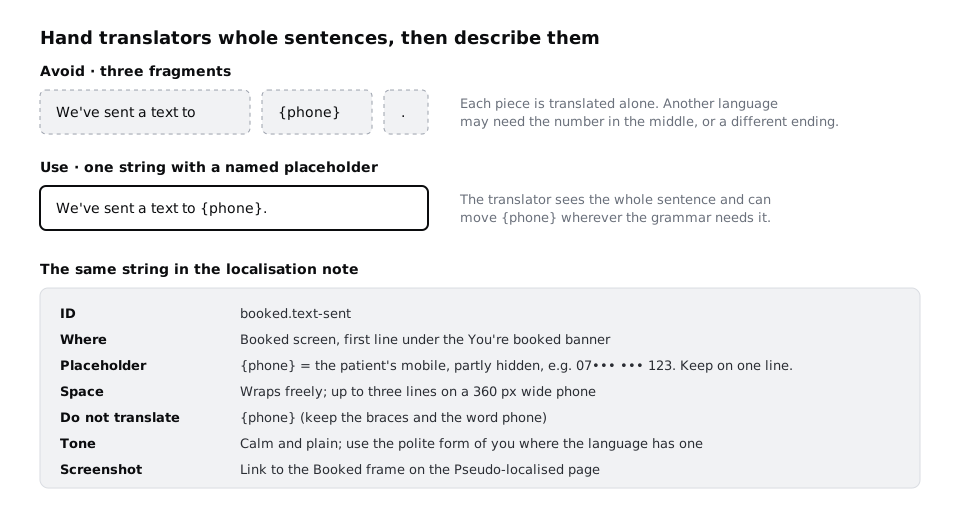
Do not split. Any sentence built from pieces is a problem: translators get the pieces in isolation and cannot change the word order. If a developer would naturally build "We've sent a text to" + phone number + ".", rewrite it as one string with a named placeholder, We've sent a text to {phone}., so the translator can put {phone} wherever the grammar needs it. Do the same for anything with a count. "1 time left" and "3 times left" are two strings in English, and some languages need more than two forms; mark these as plural strings so the developers use their plural handling rather than adding an "s".
Do not translate. Write do not translate against the clinic name (Larkfield Clinic), the address 14 Mill Lane, the phone number 01234 567 890, and the placeholders themselves.
Keep on one line. Times (10:30), phone numbers and short codes must never break across lines. Write keep together against them, so the developers use a non-breaking space or prevent wrapping there.
Check it worked
Filter the notes column: every placeholder appears inside a full sentence, never as a row of its own, every count has a plural mark, and the clinic name, address and phone number are all marked do not translate. No row in the sheet ends or starts with a space, which is a sign that it is a fragment of a longer sentence.
Step 8 · Write the localisation note for translators
Translators see a list of strings, not your screens. The note tells them what they cannot see. Add a tab called Note for translators with a short introduction at the top, and then one entry per string that needs more than its English to translate well. Simple, obvious strings ("Done") can rely on the screenshot alone.
The introduction covers what is true for every string:
- Who reads it: patients booking a clinic appointment on a phone, often in a hurry, sometimes unwell.
- Tone: calm, plain and polite. Where a language has a polite and a familiar form of "you", use the polite one. Tell translators to keep it consistent across all strings.
- Placeholders: text in braces is filled in by the app. Keep the braces and the word inside exactly as written, and move them wherever the sentence needs them.
- Space: most text wraps, so a translation can be longer than the English. Strings marked "one line" have a limit, given in characters.
- Screens: a link to the English page and to the
Pseudo-localisedpage, so they can see where every string sits.
Then, for each string that needs it, give: the ID, the English, where it appears, what each placeholder holds with an example, how much space it has, anything not to translate, and a link to its frame. Write these in plain English, because the note itself may be read by people working in their second language.
Finally, decide who checks the translations. A translation from a professional translator or a machine translation tool still needs a fluent speaker to read it on the real screens, ideally someone who is also a patient or works with patients in that language. Add a last line naming who that will be for French, Hausa and Swahili.
Check it worked
Give the note and the Pseudo-localised page to a colleague who has not seen the project, and ask them five questions: where does booked.text-sent appear, what goes in {phone}, which strings must not be translated, which form of "you" to use, and how long the Choose a time button label can be. They can answer all five from the note without asking you. Each string the note describes has an ID that also appears in the Strings tab.
Next steps
Your screens now hold longer text and unfamiliar letters, and translators have what they need to start. Next, deal with the formats that change by country rather than by language in /tutorials/show-dates-times-phone-numbers-and-money-clearly, and run the same screens at the largest phone text setting with /tutorials/design-layouts-that-survive-large-text.
If the letter test showed gaps, compare replacement typefaces with /tutorials/choose-and-pair-typefaces-for-an-interface. To tighten the Your details form further for long names and different number formats, see /tutorials/design-a-mobile-form-people-can-finish.
Part of these paths
Related tutorials
- Show dates, times, phone numbers and money clearlyYou will have a formatting table that fixes how dates, times, time zones, phone numbers and prices appear in three locales, and the Larkfield booking screens updated to follow it.
- Design layouts that survive large textYou will have the Larkfield Clinic booking screens tested at the largest phone text size and at 200% browser zoom, every truncated label, overlap and fixed-height box fixed so it wraps, stacks or scrolls, and each screen shown at default and large text side by side.
- Choose and pair typefaces for an interfaceYou will have a one-page type decision for an app, with the test strings you ran, a pass or fail for each candidate typeface on legibility, numbers, language coverage, weights, licence and file size, and a written reason for using one family or a pair.
Need this done for you?
Padding does this work for growing companies, from the first diagnosis to a system that keeps working.
Get new tutorials