UI and visual design · Intermediate · 18 min
Design for slow networks and costly data
By Padding · Updated 18 Nov 2026
Figma (web) and a spreadsheet · November 2026
You will have a per-screen data budget for the Larkfield Clinic booking flow, Figma frames for what each screen shows offline, a save-and-resume state, a use-less-data option and SMS confirmation text that fits in one message.
On this page
A booking flow that works on office wifi can fail in three quieter ways on a phone. The connection is slow, so a screen sits half-loaded while the patient wonders whether to wait. The connection drops between masts, so the app loses its place. Or the connection is fine but the patient is paying for every megabyte from a small prepaid bundle, and a large photo on the first screen is the reason they close the app and call instead.
Speed fixes in the code help, and the frontend tutorial in Next steps covers measuring and cutting page weight. But many of the biggest savings are design decisions that nobody can make in the code: which screens need the network at all, what the app keeps on the phone, which images are worth their weight, and what the patient gets when the app cannot help. Those decisions belong in the design file, where the whole team can see them.
This tutorial makes those decisions for the Larkfield Clinic booking app: six screens (Home, Choose a service, Pick a time, Your details, Confirm, Booked) and the example booking, a Nurse appointment on Tuesday 9 December at 10:30. What happens when a request fails, and the words each failure message uses, are covered in Design error states that help people recover; this tutorial links to that work rather than repeating it. You finish with a data budget table and a set of Figma frames for the offline, resume and low-data states.
Step 1 · List what each screen loads and set a data budget
Open a spreadsheet and name the first tab Data budget. Add one row for each screen, plus one row at the top for the app shell: the code, styles, fonts and icons the app needs before it can show any screen. Then add these columns:
- Loads: everything the screen fetches, in plain words. For Home: the clinic photo, the address and phone number, and a check that online booking is open.
- First booking (KB): the budget for someone using the app for the first time on this phone.
- Repeat booking (KB): the budget when they come back to book again, with anything the app saved last time still on the phone.
- Use less data (KB): the budget with the low-data option on, which you design in a later step.
- Measured (KB): left empty for now. Developers fill it in once a build exists.
The numbers you write are targets, not facts. Nobody has measured anything yet, and that is the point: a budget written before the build gives the team something to design against and something to test against later. For Larkfield, the budget reads:
- App shell: two weights of Inter, the styles, the six icons and the app code. First 200, repeat 0, because it is saved after the first visit.
- Home: the clinic photo (60) and the clinic details (2). First 62, repeat 2.
- Choose a service: the five services and their durations. First 2, repeat 2.
- Pick a time: the free times for one week. First 6, repeat 6. Each extra week the patient looks at adds about 6 more.
- Your details: nothing is loaded; the patient types. 0 and 0.
- Confirm: sending the booking and getting the answer. 2 and 2.
- Booked: the confirmation details. 1 and 1.
Add a total row. Larkfield's first booking comes to 273 KB against a budget of 300 KB, and a repeat booking to 13 KB against a budget of 50 KB. If Larkfield ships as an installed app rather than a web app, the shell arrives with the install instead; give the install size its own row and keep the per-booking rows the same.
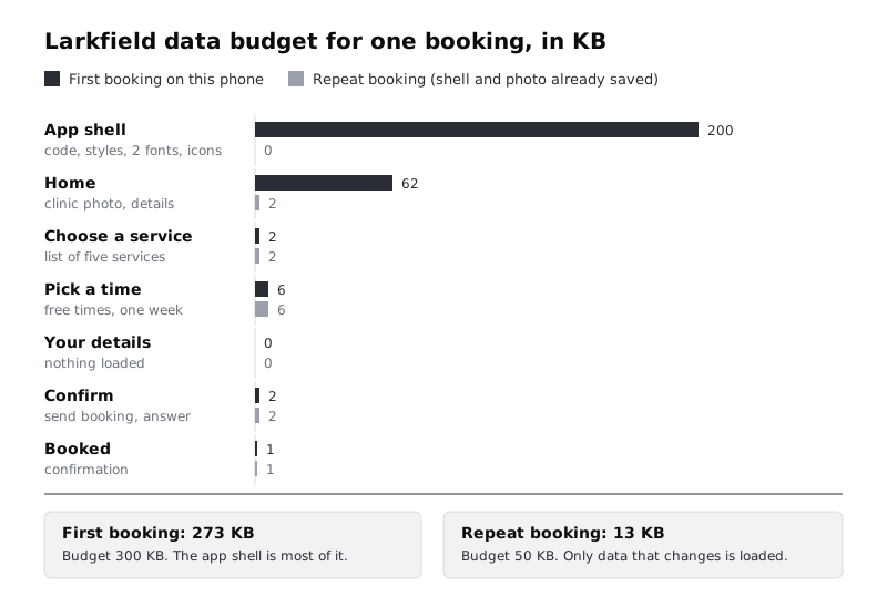
Two rows carry nearly all the weight. That tells you where design decisions pay off: the photo on Home, which you control, and the shell, where the design choices are the number of font weights and whether any decoration (an illustration, an animation file, a map) has crept in. Write next to the shell row anything that would quietly push it over budget if someone added it later: a third font weight, an embedded map on Confirm, a chat widget, an autoplaying video.
Last, add one line under the table that turns the budget into the patient's terms. Look up the smallest mobile data bundle sold by the most common network in the clinic's area, write down its size and the date you checked, and work out what share of it one first booking uses. That line is what makes a data budget persuasive in a meeting; a KB figure on its own means little to most people.
Check it worked
Your Data budget tab has an app shell row and six screen rows, each with something in Loads and a number in the first-booking and repeat-booking columns. The total row shows both totals under their budgets. The Measured column is empty, and there is a dated line describing the local bundle you compared against.
Step 2 · Decide what each screen can do with no connection
Most screens in a booking flow do not need the network as much as it first seems. Add a second tab called Offline rules with one row per screen and three columns: with no connection, what it shows, and what the patient can still do. For with no connection, choose one of three answers:
- Works offline. The screen needs nothing from the server.
- Saved copy. The screen shows what the app saved last time, with the age of that copy visible.
- Needs the network. The screen cannot finish its job without the server.
For Larkfield:
- Home: saved copy. Clinic name, address, phone number and opening hours rarely change. The photo shows only if it was saved before.
Book an appointmentstays available. - Choose a service: saved copy. The five services change a few times a year at most, so the saved list is almost always right. A
Body/Smallline at the bottom says when it was last updated. - Pick a time: saved copy, with care. Free times change by the minute, so saved times are shown with a line that says how old they are:
Times last checked 08:52. ThePick a time / Offlineframe from the error-states work already handles losing the connection on this screen; add that one line to it. - Your details: works offline. Typing needs nothing, and what the patient types is saved as they go (a later step covers how).
- Confirm: needs the network. Booking is the one action that changes something on the server.
- Booked: works offline once it has loaded. The confirmation is saved on the phone and stays available from Home until the appointment has passed.
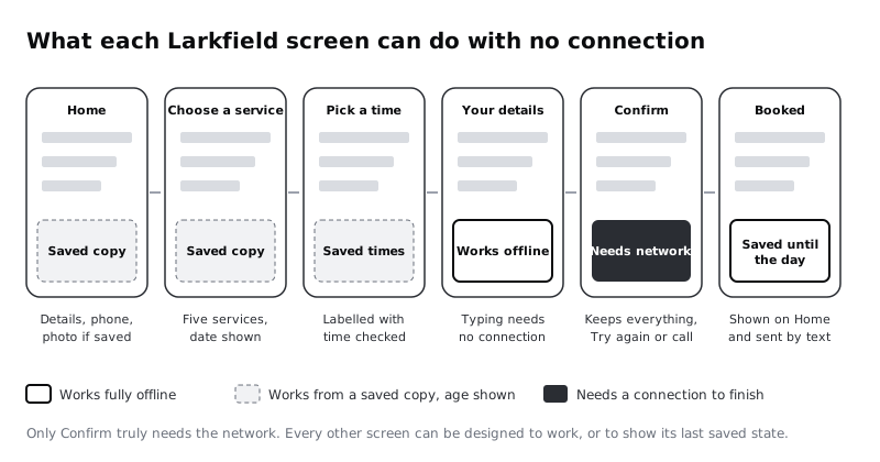
One decision needs a sentence of its own in the sheet: Confirm does not queue a booking to send later. It is tempting to let the patient tap Book appointment offline and send it when the signal returns, but by then 10:30 may have gone, and a patient who saw the button work may believe they are booked. Write the rule down: Confirm keeps the summary and everything typed, offers Try again and the phone number, and nothing is booked until the server says so. The error matrix from the error-states work already has the words for this, in its No connection row; the next step draws them on Confirm.
Check it worked
Your Offline rules tab has six rows, each with one of the three answers. Only Confirm says needs the network. Every saved-copy row says how the age of the copy is shown, and the Confirm row states in words that bookings are never queued.
Step 3 · Build the offline frames
Now draw what the rules say. On the 04 High fidelity page, or a new page called Network states, duplicate each screen the rules change and rename the copy. Lay them out in a row under the screens they come from.:
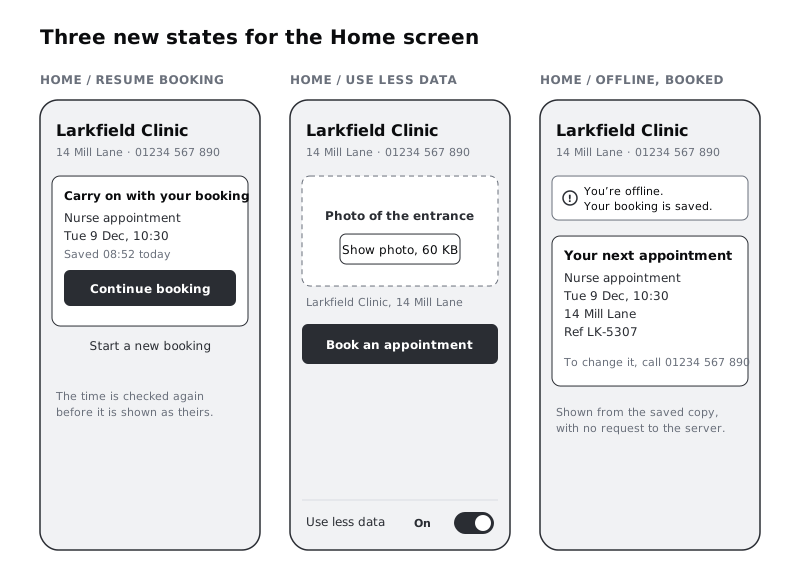
Home / Offline, from Home. Under the header, anotice-tintbanner with the alert icon andYou're offline. You can look around and book when you're back online.If you built the banner component with theToneproperty in the error-states work, use an instance of it withToneset toNotice. Where the photo was, show only its caption,Larkfield Clinic, 14 Mill Lane, so the layout does not jump when the photo arrives later. TheBook an appointmentbutton stays.Choose a service / Saved list, from Choose a service. The five rows unchanged, and at the bottom, inBody/Smallandtext-muted,List saved Mon 8 Dec. No banner: nothing here is wrong or risky, so there is nothing to warn about.Pick a time / Offline, the existing frame. AddTimes last checked 08:52inBody/Smallandtext-muteddirectly above the Morning slots, where the patient is looking when they choose.Confirm / Offline, from Confirm. The summary stays as it was:Nurse appointment,Tue 9 Dec, 10:30,14 Mill Laneand the patient's details. Under the header, the samenotice-tintbanner with the No connection message from the error matrix:You're offline. Your details are saved on this phone.Try againreplacesBook appointment, and below itOr call 01234 567 890 to book.Nothing on this frame suggests the booking will be sent later.Home / Offline, booked, from Home, for after the booking. The offline banner readsYou're offline. Your booking is saved., and under it a card titledYour next appointmentshowsNurse appointment,Tue 9 Dec, 10:30,14 Mill Lane, the booking referenceLK-5307andTo change it, call 01234 567 890.
The last frame matters most. A patient on the bus to the clinic, with no data left, should still be able to open the app and check the time and address of their appointment. That works only if it was designed and saved on purpose.
Mark the age line and the saved card with a short comment for developers: they are shown from what is stored on the phone, with no request to the server. For a web app, that means a service worker and on-device storage; for an installed app, the platform's own storage. The design does not need to say which, only that it has to work with no connection.
Check it worked
You have five frames, named as above, each the same size as the screens. Confirm / Offline still shows the full summary and offers Try again and the phone number, with no wording that suggests the booking is queued. Read Home / Offline, booked with nothing else open: you can answer what, when, where and how to change it from that frame alone. Every frame that shows saved information says how old it is, except the booked card, where the appointment itself is the date that matters.
Step 4 · Design for a connection that is slow, not gone
A dropped connection is at least clear. A slow one is worse: the screen is neither working nor failed, and patients either tap again, which can send the same request twice, or give up. Add a third tab called Slow loading, and for each screen that loads something, write what appears first and what waits.
Order the content so that what the patient needs to act on arrives before anything decorative:
- Home: the clinic name, address, phone number and
Book an appointmentfirst. The photo last, in a space already reserved for it, so nothing moves when it arrives. - Pick a time: the header, the service line, the week strip and the day heading first, from what the app already knows. The free times load into the slot area behind a skeleton, and at 8 seconds a line appears above it:
This is taking longer than usual. Keep waiting or call 01234 567 890.This is thePick a time / Slowframe from Design loading states; reuse it rather than writing new words. - Confirm: after
Book appointmentis tapped, the button turns into a progress line and cannot be tapped again. The summary stays on screen.
Two rules for every screen. Never cover a whole screen with a spinner when part of it could already be read. And never let text wait for a font: ask that text appears straight away in the phone's own font and switches to Inter when it has loaded, so a slow font file never leaves the patient looking at a blank screen.
Use one frame for this, Pick a time / Slow. If you made it in the loading-states work, bring it to this page and change one thing on top of it: the header, service line and week strip come from what the app saved last time, so they appear at once even on a repeat visit with no response yet, and only the slot area waits. If you have not done that work, draw it now from Pick a time with the same name and the same words: everything above the slots in place, plain grey blocks where the slots go, the slow-state line above them in Body/Small and text-muted, and Continue in its disabled style.
Check it worked
The Slow loading tab has a row for every screen that loads something, each saying what appears first. Your Pick a time / Slow frame uses the same name and words as the loading-states work, shows enough to tell the patient where they are and what they are waiting for, offers the phone number, and has no whole-screen spinner.
Step 5 · Add save and resume so a booking survives a lost signal
Signal drops, a call comes in, the phone runs out of memory and closes the app. A patient who comes back and finds an empty Home screen has to start again, and many will not. Save-and-resume means the booking in progress is written to the phone after every step, and Home offers to carry on.
Add a fourth tab, Saved booking, and decide three things:
- What is saved, and when. For Larkfield: the chosen service when the patient leaves Choose a service, the day and time when they leave Pick a time, and each field on Your details as it is filled in. It is saved to the phone's storage, not only held in memory, because on low-memory phones the system closes background apps quickly.
- How long it is kept. A booking in progress is useful for hours, not weeks. Write a rule such as "until the booking succeeds, the patient taps
Start a new booking, or the chosen day has passed". If the clinic's data protection lead has already said what health-related details may be stored on the phone (the error-states work asks this question), follow that answer here. - What is checked on resume. The chosen time may have gone while the patient was away. On resume, the app checks it again before showing it as theirs, and if it has gone, the patient lands on Pick a time with the same day open and the
Pick a time / Time gonemessage.
Then draw Home / Resume booking, from Home. Above Book an appointment, add a card titled Carry on with your booking, with Nurse appointment, Tue 9 Dec, 10:30 and Saved 08:52 today in Body/Small and text-muted. Give it a primary Continue booking button. Below the card, a text link, Start a new booking, clears the saved booking. The usual Book an appointment button is hidden while the card shows, so the patient has one clear way on and one way out.
Check it worked
The Saved booking tab names what is saved at each step, a rule for how long it is kept, and what is checked on resume. Your Home / Resume booking frame shows the service, day, time and when it was saved, and offers exactly two actions: carry on, or start again. Follow the resume path in your head with 10:30 taken while the patient was away: it ends on Pick a time with Tuesday 9 December open, not on an error screen.
Step 6 · Offer a lighter way to use the app
Some patients will want the app to spend as little data as possible, every time, whatever the network. Give them one switch for it and decide what it changes. Add the switch at the bottom of Home, as a row reading Use less data with a toggle, so it is visible without hunting through settings. Then list in a fifth tab, Use less data, everything the switch changes:
- Photos load on tap. The Home photo becomes a placeholder the same size, with the text
Photo of the entranceand a secondary buttonShow photo, 60 KB. Saying the size lets the patient decide. If the photo is already saved on the phone, it shows as normal, since it costs nothing. - No automatic refresh. Pick a time loads free times once when the screen opens, and again only when the patient asks, with a
Check againlink beside theTimes last checkedline. - Nothing plays by itself. Larkfield has no video or sound today. Write the rule down anyway, for the switch on or off: no video or audio ever starts by itself. A video starts only when tapped, shows its length and size before it plays, and has its words available as text below it. This goes further than WCAG, which requires a way to pause, stop or hide moving content that starts automatically and lasts more than five seconds, and a way to stop audio that plays for more than three.
Fill in the Use less data column of the budget. With the switch on, Home drops to 2 KB on a first booking, and the first-booking total drops from 273 to 213.
Decide the default, too. The switch is off by default for most patients, but developers can turn it on automatically where the browser asks for less data. Some browsers send a Save-Data signal for this, but support is limited, so the switch on Home is the one every patient can rely on. Whatever the default, the app remembers the patient's choice.
Draw Home / Use less data with the switch on and the photo placeholder in place, as in the diagram above.
Check it worked
Your Home / Use less data frame shows the switch, the photo placeholder with its size in the button label, and the same Book an appointment button in the same place as on Home. The Use less data column in your budget has a number for every row, and the total is lower than the first-booking total. Your tab states the no-autoplay rule for both positions of the switch.
Step 7 · Use SMS as the record that works without data
Larkfield already texts the patient: Booked says We've sent a text to 07••• ••• 123. We'll text you a reminder the day before. Treat those texts as part of the design, not something the back office writes later. An SMS reaches a phone with no data left, an older phone without the app, and a phone that is sometimes shared with family. In many markets, including much of Africa, it is the channel people trust most for something they must not forget.
Design toasts, banners and notifications already wrote the reminder text and explained the SMS character limits. This step extends that work with the confirmation text and checks both against the offline rules. Draw a frame called SMS / Booked on the Network states page: a plain text layer the width of a phone screen, with no imitation of any messaging app. Next to it, place the Outside / Reminder SMS frame from the notifications work, or draw it now with the same name and text:
- Booked:
Larkfield Clinic: your appointment is booked for Tue 9 Dec at 10:30, 14 Mill Lane. Ref LK-5307. To change or cancel, call 01234 567 890.That is 136 characters. - Reminder:
Larkfield Clinic: reminder of your appointment tomorrow, Tue 9 Dec, at 10:30, 14 Mill Lane. To cancel, reply C or call 01234 567 890.That is 133 characters.
Neither text names the service. An SMS may be read on a shared phone or a lock screen, and some clinic services are private; the patient knows what they booked.
Keep each one within a single message: 160 characters in the standard SMS set, or 70 if any character falls outside it, as the notifications tutorial explains. Three pitfalls to check:
- Curly apostrophes and quotes. App copy often uses curly ones, as in
You’re booked; the standard SMS set has only straight ones, so use those in SMS text. - Other languages. Larkfield already sends Yoruba reminders to patients who ask. Write the Yoruba version of
SMS / Bookedas its own short text within 70 characters per part, and have a Yoruba speaker check it. - Currency signs and emoji. The naira and cedi signs and every emoji fall outside the standard set. Larkfield's appointments are free, but a paid service would write an amount as, for example,
NGN 5,000.
Under each frame, add a text layer with the character count and the character set it fits. Then add a sixth row to the Offline rules tab for the texts: they work with no data at all.
If the error-states work left a booking whose outcome was unknown, the SMS is also how that patient finds out: when the server confirms the booking after the app gave up waiting, the Booked text arrives anyway. Note that on the Confirm / Checking your booking frame: If you leave this screen, we'll text you when it's booked.
Check it worked
You have SMS / Booked and Outside / Reminder SMS frames side by side, each with text under 160 characters, no curly apostrophes and a count written beneath it. Each text names the clinic, the day, the time and the place, leaves out the service, and gives a way to change or cancel that does not need data.
Step 8 · Walk the flow on three connections and hand it over
Put the six screens and every frame from this tutorial on one page, in flow order, with the state frames under the screen they belong to. Then walk the booking three times, reading each frame aloud as if you were the patient:
- Good connection, use less data off. The normal screens, ending on Booked.
- Slow connection, use less data on. Home with the photo placeholder, then
Pick a time / Slow, then the normal screens, ending on Booked andSMS / Booked. - Connection lost after Pick a time.
Your detailsfilled in offline, thenConfirm / Offline, then the app closed, thenHome / Resume booking, then Confirm again with the connection back, ending on Booked and laterHome / Offline, booked.
Anywhere you reach a moment with no frame for it, either draw one or write down why it is not needed. Then add a short notes for developers list to the spreadsheet, stating only what the design depends on:
- Show saved copies and the age line without waiting for a request.
- Treat a request that gets no answer as offline; the phone saying it is online does not prove the server can be reached.
- Save the booking in progress to storage on the phone after each step, not only in memory.
- Serve the Home photo at the size it is shown, with a smaller file for smaller screens, and never load it before the text.
- Show text in the phone's own font until Inter has loaded.
- Announce the offline banner and the
Times last checkedline to screen reader users as status messages when they appear. - Fill in the Measured column of the budget from a real build on a slow, throttled connection, and flag any row over budget.
Share the budget and the page with the team, and agree who fills in Measured and when.
Check it worked
All three walks reach a frame for every moment, with no gaps you cannot explain. The budget's Measured column has an owner and a date. Someone who did not make the frames can open Home / Offline, booked and SMS / Booked and tell you when and where the appointment is without asking you anything.
Next steps
Your frames say what the app does when the network lets it down. The next jobs are to check the build meets the budget and that the screens hold up on the phones people actually carry.
- To measure the real page weight on a slow connection and cut it to fit a budget like this one, work through /tutorials/test-and-speed-up-a-page-on-a-slow-phone-connection.
- To review the same flow for small screens, dim displays and limited memory, see /tutorials/design-for-low-end-android-phones.
- For the words and layout of each failure message referred to here, see /tutorials/design-error-states-that-help-people-recover.
- For holding states while something loads, including the
Pick a time / Slowframe used here, see /tutorials/design-loading-states-spinners-skeletons-and-progress. - For the reminder text, SMS character limits and when each message uses SMS, push or a banner, see /tutorials/design-toasts-banners-and-notifications.
Part of these paths
Related tutorials
- Design for low-end Android phonesYou will have a written low-end phone profile, a Larkfield Clinic booking screen revised to work at 360 by 640 dp on a dim screen with large text, and a constraint checklist your team can run on every new screen.
- Design error states that help people recoverYou will have an error matrix covering every way a booking can fail outside the form, and five Figma state frames that keep the person's work, say what happened in plain words and offer a next step.
- Test and speed up a page on a slow phone connectionYou will measure a heavy clinic home page on a throttled slow mobile connection, set a 500 kB page weight budget with a check that fails when the page grows, and cut its images, JavaScript and third-party widget until it passes, with before and after numbers to show for it.
Need this done for you?
Padding does this work for growing companies, from the first diagnosis to a system that keeps working.
Get new tutorials