UI and visual design · Intermediate · 16 min
Design a first-run experience without a tour
By Padding · Updated 18 Nov 2026
Figma (web) · November 2026
You will have replaced a five-slide welcome carousel with a first run that opens on Home and reaches a booked appointment, plus a table showing where every cut slide's content went.
On this page
Most welcome carousels are written by the people who built the app, for the people who built the app. Each slide answers a question someone on the team was asked in a meeting: what does it do, why is it different, can we get the notification opt-in up. The person opening the app for the first time had a different question. They wanted to do one thing, and the carousel stands between them and it.
This tutorial removes one. The Larkfield Clinic booking app (the fictional community clinic used across this library, with the screens Home, Choose a service, Pick a time, Your details, Confirm and Booked) has gained a five-slide welcome carousel ahead of Home, ending in an account sign-up. You will take every slide apart, decide where its content belongs, and design a first run in which a new patient opens the app on Home and books a nurse appointment for Tuesday 9 December at 10:30 without passing through a tour, an account form or a permission prompt they did not ask for.
The aim is not "no help at all". The help moves to where it is needed: a line on the screen where a choice is made, an empty state that explains a tab, a request for permission at the moment the patient can see what it is for. You finish with a revised first-run flow on its own Figma page and a table of the cut slides with the destination of each.
Step 1 · Inventory the carousel and name the one first-run goal
Make a page called First run in your Larkfield file. Draw the carousel as it stands, one 390 by 844 frame per slide, in a row. If you are working on your own app, screenshot each slide and paste it into a frame. The Larkfield carousel is:
- Welcome to Larkfield Clinic. A large illustration, the clinic name and a language picker. Buttons:
Next, and aSkiplink. - Book in a few taps. An illustration of the service list and the line "Choose from GP, nurse, blood tests, vaccinations and medication reviews."
- Pick a time that suits you. An illustration of time slots and "See free times for the whole week. Can't find one? Call us."
- Never miss an appointment. "Turn on notifications for reminders" and a button
Allow notifications, which opens the system permission dialog. - Create your account. Email, password, confirm password,
Create account, and a smallNot nowlink.
Skip on slides 1 to 3 jumps to slide 5, not to Home, so every route passes the account form.
Next to the row, write the one goal of a first run in a single sentence. For Larkfield: "A new patient books their first appointment." Everything in the first run is judged against that sentence. Then count what stands in the way: open a table with the columns Slide, What it says, What it asks the patient to do, and Taps before Choose a service.
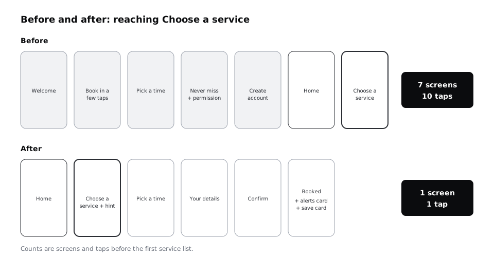
Counting the fastest honest path for Larkfield: four Next taps, one answer to the permission dialog, three fields and Create account (or Not now, if they spot it), then Book an appointment on Home. That is ten taps and seven screens before the patient sees a single service, with typing on top.
Check it worked
Your First run page has five slide frames in order and a goal sentence that names one action a patient takes, not a feeling ("feels welcome") or a business metric ("sign-ups"). The table has a row per slide and a total for taps and screens before the first useful screen.
Step 2 · Decide where each slide's content goes
A slide is not one thing; it usually holds a claim, a piece of real help and sometimes a request. Split each slide into those parts, and give each part one of four fates:
- Move it to the screen where the patient needs it, at the moment they need it.
- Defer it until after the goal is done.
- Leave it to the system, when the phone already does the job better.
- Cut it, when it only describes the app the patient is about to use.
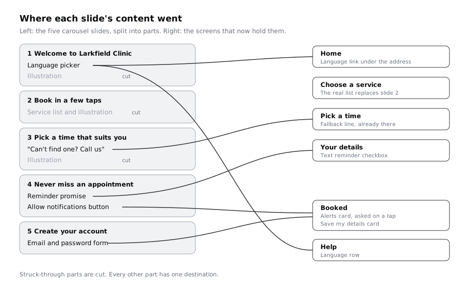
Add a column called Where it went to the table, give each part its own row, and fill it in. For Larkfield:
- 1 Welcome, clinic name: Move. Home heading, already there.
- 1 Welcome, illustration: Cut. Home's photo of the entrance does the job.
- 1 Welcome, language picker: Leave to the system, then Move. The app follows the phone's language; a
Languagerow in Help and a small link on Home cover the rest. - 2 Book in a few taps, list of services: Cut. Choose a service shows the real list.
- 2 and 3, illustrations: Cut. Nowhere.
- 3 Pick a time, "Can't find one? Call us": Move. The fallback line on Pick a time, already there.
- 4 Never miss, reminder promise: Move. The reminder checkbox on Your details.
- 4 Never miss, notification request: Defer. An alerts card on Booked, asked only on a tap.
- 5 Create account, sign-up form: Defer. An optional "Save my details" card on Booked.
Notice how much of the carousel was already in the app. Slides 2 and 3 describe screens the patient reaches in one or two taps, where the real thing explains itself better than a drawing of it.
Check it worked
Every row has a fate and a specific destination: a named screen and position, or "Nowhere" with a reason. No row says "somewhere on Home" or "TBD". Count the parts marked Cut: if more than half of the carousel is cut, that is normal, and it tells you the slides were describing rather than helping.
Step 3 · Make Home the first screen a new patient sees
Duplicate your high-fidelity Home frame onto the First run page and name it Home / First open. This is now the first screen of the app, so it has to work for someone who has never seen it, with nothing filled in and no account.
Go through it top to bottom and ask what a first-time patient needs that a returning one does not:
- The heading
Larkfield Clinic, the photo of the entrance and14 Mill Lanestay. They answer "is this my clinic" faster than a welcome slide. Book an appointmentstays the primary button, and it is the only primary button on the screen.View or cancel a bookingstays. A patient who booked by phone may open the app for the first time to check it.- Add a small text link,
Language: English, under the address inBody/Small. The app already follows the phone's language, but people in multilingual households often set the phone to one language and prefer to read health information in another. A one-tap way to change it, visible without scrolling, replaces the picker on slide 1.
Do not add a "Welcome!" banner, a "New here?" card or a dismissible tip. If Home needs a banner to be understood on first open, the Home layout is the problem.
Think also about what the first open costs. On a lower-cost Android phone on prepaid data, five full-screen illustrations are a download the patient pays for before they can book. Home with one photo is lighter, and if that photo is slow to arrive, the button and address still show at once.
Check it worked
Home / First open has one primary button, the clinic name and address, the existing booking link and the language link, and nothing that only makes sense on a first visit. Hand the frame to someone outside the project and ask "how would you book a nurse appointment here?": they point at the primary button without reading anything else.
Step 4 · Replace the teaching slides with hints on the screens
The only real teaching in the carousel was on slides 2 and 3. Slide 3's fallback line already lives on Pick a time. What remains is a question new patients actually have on Choose a service, and that the slide never answered: which service do I pick?
Write a hint for the point of decision, not a tour of the app. Larkfield's front desk says the most common first-time question is "do I need the GP or the nurse?". Add one line under the What do you need an appointment for? subtitle on Choose a service, in Body/Small and colour/text-muted:
"Not sure which one? Choose GP appointment and the doctor will refer you if needed."
Follow four rules for every hint like it:
- It sits on the screen it is about, in the normal layout, not in an overlay, a tooltip that points at a control, or a numbered coach mark.
- It answers one question in one sentence. If it needs two, the screen's labels need rewriting.
- It shows to everyone, every time. A patient on their third visit can ignore one line; a patient who dismissed it on their first visit and needs it on the second cannot get it back.
- It comes from evidence: front-desk questions, support calls or a usability test. Do not write hints for questions nobody asks.
Check the other screens against the same rules. Pick a time already has its fallback line. Your details has the format hint under the mobile number field from the high-fidelity work. That is enough; no screen gets more than one hint.
Check it worked
Choose a service has exactly one new line, set in an existing text style, inside the normal page flow. Nothing on any first-run screen sits on top of other content or needs to be dismissed. For each hint, you can name the question it answers and where you heard that question.
Step 5 · Defer the account until the booking is safe
Slide 5 asked for an email and a password before the patient had done anything. Larkfield does not need an account to book: Your details asks for Full name, Date of birth, Mobile number and Email (optional), and that is enough to hold the appointment and text the patient. An account only helps on the second booking, by saving those details.
So offer it after the first booking, when the patient can see the benefit. On Booked, below Add to calendar and Done, add a surface card:
- Heading in
Label: "Book faster next time" - Body in
Body/Smallandcolour/text-muted: "Save your name, date of birth and mobile number on this phone. You can remove them in Help." - A secondary button:
Save my details
Design the card so it reuses what the patient already typed. Asking them to enter their details again to create the account would be redundant entry, which WCAG 2.2 asks you to avoid within a process. If your service needs a password or a code, ask only for that.
Make a frame for the second booking, Your details / Saved, with the four fields filled in from the saved details and a Change link beside them. That frame is the payoff the card promises; without it, the card is just slide 5 in a new place.
If your app truly cannot work without an account (a patient portal that shows test results, for example), keep the account step but put it immediately before the first screen that needs it, and say on that screen what it unlocks.
Check it worked
You can trace a first booking from Home / First open to Booked without seeing an account form. Booked has the save card below the main actions, never above You're booked, and Your details / Saved shows what the patient gets for saving. Pressing Done without touching the card loses nothing from the booking.
Step 6 · Ask for notification permission at the moment it is useful
Slide 4 asked for notification permission before the patient had an appointment to be reminded about. On both major phone platforms, that request is costly to waste. On Android 13 and later, notifications need a runtime permission, and after a person denies a permission more than once the system stops showing the dialog. On iOS, the system shows the notification prompt only the first time an app asks; after that, the person has to change it in Settings. An early "no" is close to permanent.
Start by asking what Larkfield's notifications are for. The day-before reminder already goes by text message, chosen with the checkbox on Your details, which works on any phone and without the app. The only message that needs the app is an alert when the clinic has to move an appointment, for example when a nurse is off sick. That is worth asking for, but only once there is an appointment to move.
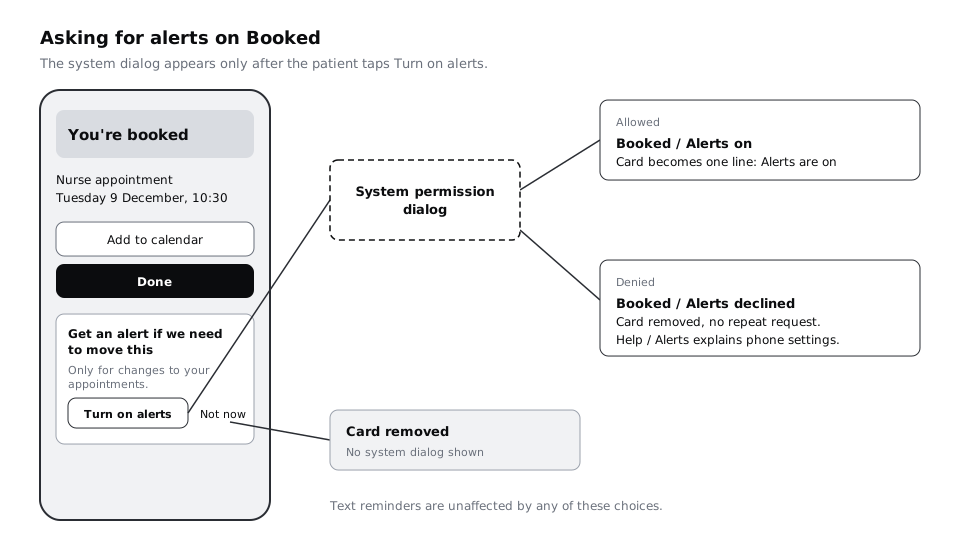
On Booked, above the save card, add a second card that explains the value in the patient's terms, with two buttons:
- Heading in
Label: "Get an alert if we need to move this" - Body in
Body/Small: "We'll only use this for changes to your appointments." - A secondary button,
Turn on alerts, and a text link,Not now
Only Turn on alerts triggers the system dialog. Not now closes the card and asks the system for nothing, which keeps the one real prompt for a moment when the patient has said yes. Make three more frames: Booked / Alerts on (the card replaced by a one-line confirmation), Booked / Alerts declined (card gone, no nagging) and Help / Alerts (a row that explains how to turn alerts on later, including the phone's settings for anyone who said no in the system dialog).
Check it worked
No frame before Booked mentions notifications. The First run page shows the four alert frames, and only one path, Turn on alerts, leads to the system dialog. The card's body says what notifications will be used for in one sentence, and the Help / Alerts frame tells a patient who refused how to change their mind.
Step 7 · Let the empty tabs explain themselves
A tour often exists to explain tabs a new patient has not used. Larkfield's tab bar has Home, My appointments and Help. On first open, My appointments is empty, and that empty state is the right place to say what the tab is for.
If you built the first-use empty state in Design empty states that say what to do next, place that frame on the First run page as it is: "No appointments yet", with Book an appointment and the note about phone bookings. If you have not, build it there rather than here.
Help takes the rest of what the carousel said that a patient might want later: the language setting, the alerts row from the last step, the clinic's phone number and opening hours, and Remove saved details. Those are settings and reference, read when needed, not on the way in.
Check it worked
Tap through the three tabs on a first open in your head or in a prototype: each one either does its job straight away (Home, Help) or says what will appear and how to make it appear (My appointments). Every row of the slide table whose destination is Help or My appointments has a matching element in those frames.
Step 8 · Draw the revised flow and compare it with the carousel
On the First run page, lay the new frames in one row in flow order: Home / First open, Choose a service with the hint, Pick a time, Your details, Confirm, Booked with the alerts and save cards. Under the row, put the old carousel frames, greyed out with a 40 per cent white layer, and the slide table beside them. Connect the new frames with arrows, or wire them as a prototype if you want to test it.
Count the same things you counted at the start. For Larkfield the new first run reaches Choose a service in one tap from the first screen, against ten taps and seven screens before. The full booking now takes the same taps as a returning patient's booking, plus the four fields on Your details.
Then write a short note beside the flow for the team: the goal sentence, the before and after counts, and what you will watch once it ships. Good measures here are the share of first-time patients who book in their first session, how many contact the front desk with "which service" questions, and the share who turn on alerts from the card. Compare these with the carousel's numbers if you have them, and treat a drop in alert opt-ins with care: fewer people saying yes to a request they understood can be worth more than many saying yes to one they did not.
Check it worked
Your First run page has the new flow in one row, the old carousel greyed out below it, the slide table with a destination for every part, and a note with the before and after counts. Reading the new row left to right, a first-time patient meets no slide, no account form and no permission dialog before Booked.
Next steps
- If the Your details form has grown again since it was designed, cut it back with /tutorials/design-a-mobile-form-people-can-finish.
- Build the My appointments states that do the explaining with /tutorials/design-empty-states-that-say-what-to-do-next.
- Map the new first run as a flow with decision points and the alerts branch using /tutorials/draw-a-user-flow-for-one-task.
- Design the confirmation shown when alerts are turned on, and the alert itself, with /tutorials/design-toasts-banners-and-notifications.
Part of these paths
Related tutorials
- Design empty states that say what to do nextYou will have four empty-state frames for one list screen, first use, no results, all done and cleared, each with its own message and next action, plus a copy table a developer can build from.
- Design a mobile form people can finishYou will have cut a 21-field clinic registration form down to a five-field phone screen in one column, with labels above fields, the right keyboard for each input, sensible defaults and one clear button, plus a before and after showing fields and estimated taps cut and a note of every field you deferred.
- Draw a user flow for one taskYou will have a user flow for booking a first appointment that shows every screen, decision and error path, and a screen list taken from it that tells you exactly what to wireframe.
Need this done for you?
Padding does this work for growing companies, from the first diagnosis to a system that keeps working.
Get new tutorials