UI and visual design · Intermediate · 17 min
Design a dark mode that is not just inverted
By Padding · Updated 18 Nov 2026
Figma (web) · November 2026
You will have three Larkfield Clinic screens in light and dark mode side by side, and a token mapping table that gives every colour role a dark value chosen on purpose and checked for contrast.
On this page
The quickest dark mode is a filter that flips every colour. It looks finished for about ten seconds. Then you notice that the clinic's teal has turned pink, the photo of the front entrance is a negative, the cards have sunk into the background, and the error red is a pale cyan that nobody reads as an error. Contrast often still passes, which is what makes inversion tempting. Everything else about the screen is wrong.
A good dark mode keeps the same colour roles (text, surface, accent, danger) and gives each one a second value chosen for a dark screen. Five decisions do most of the work: dark grey rather than black for the background, lighter greys for surfaces that sit higher, off-white text, lighter and softer accent and status colours, and a plan for photos and shadows, which do not translate on their own.
In this tutorial you make those decisions for Larkfield Clinic, the fictional community clinic whose booking app runs from Home through Choose a service, Pick a time, Your details and Confirm to Booked. You start by inverting a screen to see what breaks, then choose values role by role, and finish with three screens in both modes and a table a developer can build from. The mechanics of variable modes and CSS are in their own tutorials, linked as you go; this one is about what the values should be and why.
Step 1 · Invert one screen and list what breaks
Open the Larkfield file and add a page called Dark mode. Copy three frames onto it from the 04 High fidelity page: Home, Pick a time / Time gone and Your details / Errors. Between them they hold the photo, a selected time slot, a notice banner, an error and every text style, so most dark mode problems will show up on one of them.
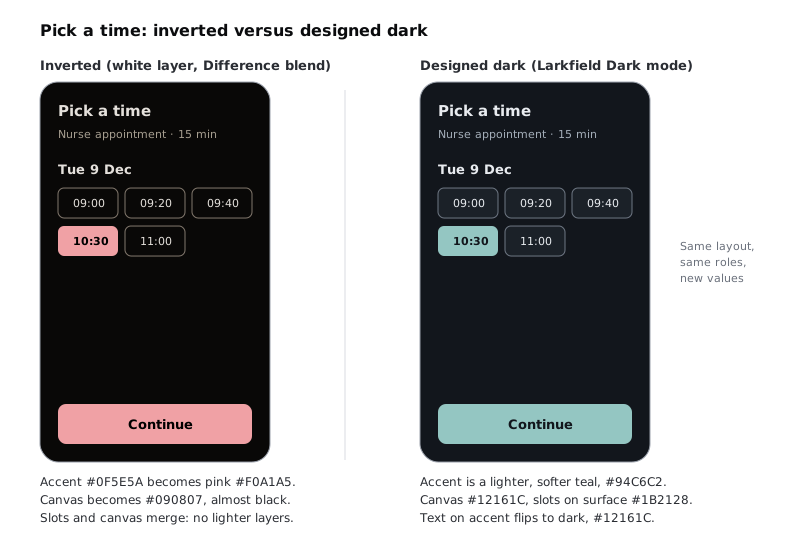
Duplicate Pick a time / Time gone and name the copy Inverted test. Draw a rectangle over the whole copy, fill it white, and in the Appearance section of the right sidebar set its blend mode to Difference. White with Difference flips every colour underneath it, which is roughly what an automatic invert does.
Now write down, in a text layer beside the frame, everything that has gone wrong. With the Larkfield values you should find at least these:
- The accent teal #0F5E5A has become a pink, #F0A1A5. The selected slot and the Continue button no longer look like Larkfield.
- The canvas #F6F7F8 has become #090807, almost black, and the white cards have become the same black. The slots no longer sit on anything.
- The amber notice banner has turned a cold blue, and the red error on
Your details / Errorswould turn cyan. Their meaning came partly from the hue, and that is gone. - Any photo is a negative. On
Home, try the same rectangle and see the clinic entrance.
Then check one pair with the contrast checker: the inverted text #E4E0DB on #090807 is about 15.23:1. It passes. Inversion is not a contrast problem; it is a problem of meaning, brand and depth.
Check it worked
Beside Inverted test you have a written list of at least four problems, each naming a colour or element and what it turned into. Delete the white rectangle from any frame other than Inverted test, so only the test frame is inverted.
Step 2 · Choose dark greys for the surfaces
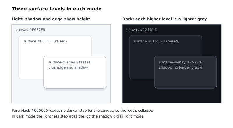
Start with the background, because every other value is judged against it. Larkfield uses three surface levels: the canvas behind everything, surface for cards, fields and slots, and surface-overlay for sheets and menus that sit above the rest. In light mode a white card on a pale grey canvas, plus an edge and a shadow, tells you which is higher. In dark mode the shadow stops working (step 6), so lightness has to carry height: the higher a surface sits, the lighter its grey.
Use these values:
colour/canvas: #12161Ccolour/surface: #1B2128colour/surface-overlay: #252C35
Why not pure black for the canvas:
- There is nothing darker to go to. If the canvas is #000000, the next level up has to be lighter, but the canvas itself can never sit below anything, and the three levels end up squeezed into the very dark end where the eye barely separates them.
- Text glare. White text on black is 21:1. Many readers find text at that extreme harder to read for long, with letters that seem to bloom at the edges. A slightly lifted background and slightly dimmed text are calmer.
- Smearing on some OLED phones. Pixels that are fully off can take a moment to switch on, which on some screens leaves a faint smear behind text as you scroll over pure black.
Keep a hint of the brand in the greys: Larkfield's are slightly blue, the same tint as the light-mode greys, so the two modes feel like one product.
A note on battery: dark screens save power mainly on OLED panels, where dark pixels draw less. Many lower-cost Android phones, common across Nigeria and much of Africa, use LCD panels with a backlight that stays on whatever the colour. Offer dark mode for comfort and preference; do not promise users that it saves battery on every phone.
Check it worked
Draw three swatches on the canvas in the three values above, overlapping like a card and a menu on a page. Zoom to 100%: you can see the edge between each pair, the overlay is the lightest, and none of the three is #000000.
Step 3 · Set text and borders against the new surfaces
Text in dark mode is off-white, not white, for the same glare reason. Give the text roles these values and check each against the surface it sits on most:
colour/text: #E8EBEF. Onsurfaceit is 13.56:1, oncanvas15.17:1.colour/text-muted: #A3ADB8. Onsurfaceit is 7.13:1, and still 6.19:1 onsurface-overlay, the lightest surface it will sit on.
Lines and borders need separate thought, because they are not text:
colour/line, the dividers between list rows, becomes #3A4552. It is 1.66:1 onsurface. That is fine for a decorative divider, which is not needed to identify anything.colour/border, the edge of fields, unselected time slots and secondary buttons, becomes #6E7783. It is 3.58:1 onsurfaceand 4.00:1 oncanvas, above the 3:1 WCAG 2.2 asks for a component boundary. Do not reuse the light value #7D8592 without checking: it happens to pass too, at 4.36:1, but it looks heavier on dark than it did on white, and every unselected slot starts to shout.
If you added colour/line-strong in Show layers with elevation, borders and shadows, give it #5A6270 in dark mode, as that tutorial does.
Check it worked
On a text layer beside the swatches, you have a list of six pairs (text on surface, text on canvas, text-muted on surface, text-muted on surface-overlay, border on surface, border on canvas), each with a ratio. Every text pair is 4.5:1 or more, and both border pairs are 3:1 or more.
Step 4 · Lighten and soften the accent and status colours
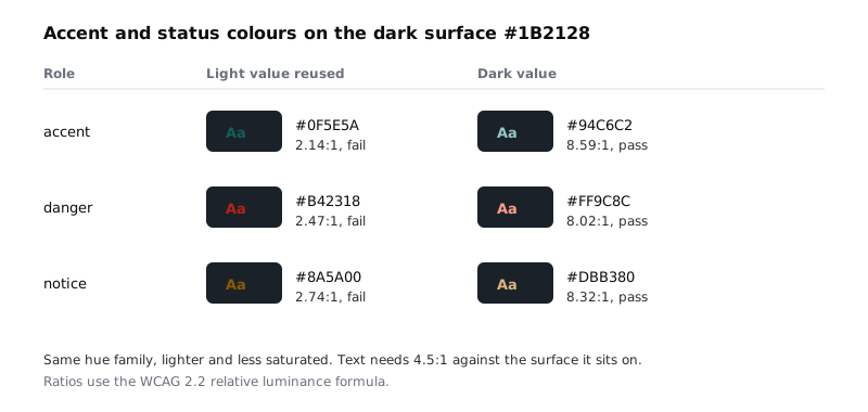
Now the colours with a job. Put each light value on the dark surface and measure it:
- accent #0F5E5A: 2.14:1
- danger #B42318: 2.47:1
- notice #8A5A00: 2.74:1
All three fail. They were chosen to be dark enough for white backgrounds, so they are too dark here. The fix is not to push them brighter and more saturated. Saturated colours on a dark background look like they glow, and a vivid red or teal next to off-white text tires the eye. Keep each hue, raise its lightness and lower its saturation.
For Larkfield:
colour/accent: #94C6C2, 8.59:1 onsurface. If you built ramps in Build a colour palette with tonal ramps, this isteal/300.colour/danger: #FF9C8C, 8.02:1 (red/300).colour/notice: #DBB380, 8.32:1 (amber/300).
Choosing from an existing ramp, not a colour picker, keeps the dark palette from drifting into a second brand.
A lighter accent changes the text that sits on it. White on #94C6C2 would fail badly, so colour/on-accent flips to dark: #12161C, which gives 9.61:1. The selected time slot and the Continue button now read as a pale teal shape with dark text, which is how a light accent works on a dark screen.
The tints behind messages flip too. In light mode they are pale washes; in dark mode they are dark versions of the hue, close to the surface but recognisably coloured:
colour/accent-tint: #16302E. Accent text on it is 7.43:1.colour/danger-tint: #351D1B. Danger text on it is 7.73:1.colour/notice-tint: #33281A. Notice text on it is 7.38:1.
Meaning must not rest on hue alone, in either mode. The selected slot still has its tick, and every error and notice still has its alert icon and its words. That is what lets you soften the colours without losing the message.
Check it worked
You have a dark value for accent, on-accent, the three tints, danger and notice, and none of them is the same hex as its light value. For each of the six pairs above (accent on surface, on-accent on accent, and each status colour on surface and on its tint) your note shows a ratio of 4.5:1 or more.
Step 5 · Write the token mapping table and add the Dark mode
Collect every decision into one table. This is the deliverable a developer builds from, so put it in a text frame called Dark mode tokens on the Dark mode page, next to the screens.
| Variable | Light | Dark | Checked against (dark) |
| --- | --- | --- | --- |
| colour/canvas | #F6F7F8 | #12161C | – |
| colour/surface | #FFFFFF | #1B2128 | – |
| colour/surface-overlay | #FFFFFF | #252C35 | – |
| colour/text | #1B1F24 | #E8EBEF | surface 13.56:1 |
| colour/text-muted | #5A6270 | #A3ADB8 | surface-overlay 6.19:1 |
| colour/line | #D5D9DF | #3A4552 | decorative |
| colour/border | #7D8592 | #6E7783 | surface 3.58:1 |
| colour/accent | #0F5E5A | #94C6C2 | surface 8.59:1 |
| colour/on-accent | #FFFFFF | #12161C | accent 9.61:1 |
| colour/accent-tint | #E3F0EE | #16302E | accent on it 7.43:1 |
| colour/danger | #B42318 | #FF9C8C | surface 8.02:1 |
| colour/danger-tint | #FDECEA | #351D1B | danger on it 7.73:1 |
| colour/notice | #8A5A00 | #DBB380 | surface 8.32:1 |
| colour/notice-tint | #FFF4DC | #33281A | notice on it 7.38:1 |
If your light column differs, because you moved values onto ramps in the design system series, keep your light values and the dark ones above; recheck any pair whose light value changed the role's meaning. Step 6 adds two number variables, opacity/photo-dim (0 Light, 15 Dark) and, if you have colour/scrim from the elevation tutorial, opacity/scrim (50 Light, 70 Dark); add rows for them and for colour/scrim (#1B1F24 Light, #000000 Dark) when you get there, so the table covers everything that changes between modes.
Then put the values into Figma. Add a mode called Dark to the Larkfield collection and type each dark value into its column. Create colour variables with light and dark modes shows the variables window, modes and aliases step by step; if your collection points roles at primitives, point the dark column at primitives too rather than typing hex codes.
If your plan allows only one mode per collection, you can still review the design: duplicate the frames and apply the dark values by hand. Treat those frames as a review copy and delete them once the values are agreed, so no hard-coded colours stay in the file.
Check it worked
The Dark mode tokens frame lists every colour variable the screens use, with a dark value in every row and a check in every row that is text or a control edge. In the variables window, the Larkfield collection has a Dark column with no empty cells.
Step 6 · Fix the photo, the illustrations and the shadows
Variables change fills and strokes. They do not decide what a photo or a shadow should do, so these need their own decisions.
The Home photo. A bright daylight photo of the clinic entrance is the brightest thing on a dark screen and pulls the eye away from the text. Dim it slightly rather than replacing it. Add a number variable called opacity/photo-dim to the Larkfield collection, with 0 in Light and 15 in Dark. Draw a rectangle exactly over the photo, fill it #000000, name it Photo dim, and apply opacity/photo-dim to the layer's opacity (Shift-click the opacity field, or right-click it and choose Apply variable). In light mode the layer is invisible; in dark mode it takes the edge off the photo. Do not invert, recolour or desaturate the photo itself: people should still recognise the building.
Illustrations and icons. Line icons that use a colour variable for their stroke already follow the mode. Any image with a white background baked in (an illustration, a map tile, a partner logo) shows up as a glowing white box. List them on the page and ask for versions with a transparent background, or a dark variant.
Shadows. The overlay shadow, #1B1F24 at 18%, is close to invisible on #12161C. Leave it in place; it costs nothing and helps in light mode. Do not swap it for a light glow to make it show; that reads as a highlight, not as depth. The lighter surface-overlay from step 2 already does the job. If you have a colour/scrim behind bottom sheets, a scrim at light-mode strength barely shows against a dark screen. Give colour/scrim #000000 in Dark. Then treat its strength the way you treated the photo: add a number variable called opacity/scrim with 50 in Light, the value the Scrim layer already has, and 70 in Dark, and apply it to the Scrim layer's opacity in Confirm / Change sheet. Typing a higher opacity straight onto the layer would darken the light-mode sheet too. If 70 does not make the screen behind the sheet clearly dimmer than the sheet, raise the Dark value only. Add both variables to the Dark mode tokens table.
Check it worked
Switch a duplicate of Home to Dark (next step shows how): the Photo dim layer's opacity field reads 15% there and 0% on the light frame, and the photo is visibly calmer than in light mode. If you have the change sheet, its Scrim layer reads 50% on the light frame and 70% on the dark one, and the light frame looks exactly as it did before. Your page has a list of any images with a baked-in white background, even if the list says "none".
Step 7 · Build the three screens in both modes and review them
Arrange the page as two rows: the three light frames on top, and below each one a duplicate. Select the three duplicates and, in the Appearance section of the right sidebar, use Apply variable mode to set the Larkfield collection to Dark. Name them Home / Dark, Pick a time / Time gone / Dark and Your details / Errors / Dark. Delete Inverted test, or move it off to the side labelled as the before picture.
Review the dark row against the light row with four questions, and write a one-line answer under each dark frame:
- Hierarchy. Squint, or zoom out until text is unreadable. The strongest shape on each screen should be the same in both modes: the Continue button on Pick a time, the error field on Your details. If the photo or a banner wins in dark mode, it is too bright.
- Depth. Can you see where each card and slot ends against the canvas? On
Pick a time / Time gone / Darkthe slots onsurfacewith aborderedge should be distinct from the canvas. - Meaning without colour. Turn the dark frames greyscale in your head, or with a desaturate layer on top. The selected 10:30 slot still has its tick, the notice still has its icon and "10:30 was just taken. These times are still free.", and the error still says "Error: Enter a mobile number with 11 digits, such as 07700 900123".
- Anything left over. Use Selection colors in the right sidebar on each dark frame. Any raw hex value there is a fill that will not switch with the mode; bind it to a variable.
Then look at the dark frames on a real phone if you can. Export them as PNG at 2x and open them on the cheapest Android phone you can borrow, with the brightness at about a third. Cheap screens often crush very dark greys together, so this is where canvas and surface are most likely to merge. If they do, lighten surface and surface-overlay one small step each, keep the canvas, and recheck the text pairs in your table. Six PNG phone screens add up on prepaid data; send them over Wi-Fi or open a shared folder once.
When you hand this over, note one thing for developers next to the table: the app should follow the phone's own light or dark setting by default (on the web that is the prefers-color-scheme media feature) and let people override it. Add dark mode with CSS variables builds the system default and a toggle that remembers the reader's choice; a Settings screen would add a third option, System, that clears the saved choice and goes back to following the phone.
Check it worked
Your Dark mode page has six frames in two rows, three light and three dark, with a one-line answer to each of the four questions under every dark frame. Selection colors on each dark frame shows only Larkfield variables. The Dark mode tokens table sits beside them, and if the phone test changed any value, the table shows the new value and its new ratio.
Next steps
You have a dark mode whose every value is a decision with a reason and a number, and a table that says so.
- Add dark mode with CSS variables turns a table like yours into custom properties that follow the system setting and remember the reader's choice.
- Create colour variables with light and dark modes covers modes, aliases and switching frames in the variables window in more detail.
- Show layers with elevation, borders and shadows builds the three elevation levels whose dark surfaces you used here, and tests them on a washed-out screen.
- Build a colour palette with tonal ramps gives you the ramp steps to choose dark accent and status colours from, instead of the colour picker.
Part of these paths
Related tutorials
- Create colour variables with light and dark modesYou will have a Figma screen whose every colour comes from variables, so switching one setting on the frame turns it from light to dark and back.
- How to Add Dark Mode to a Website with CSS VariablesYou will define your colours once as CSS custom properties, switch them with light-dark() and the user's system setting, add a toggle button that remembers the choice without a flash on reload, and check the text contrast of both themes with a short script.
- Show layers with elevation, borders and shadowsYou will have three elevation tokens (flat, raised and overlay) in your Figma file, each a fixed recipe of surface, edge and shadow, and a frame showing them on a card, a bottom sheet and a menu in light mode, dark mode and on a washed-out screen.
Need this done for you?
Padding does this work for growing companies, from the first diagnosis to a system that keeps working.
Get new tutorials