UI and visual design · Intermediate · 16 min
Show layers with elevation, borders and shadows
By Padding · Updated 18 Nov 2026
Figma (web) · November 2026
You will have three elevation tokens (flat, raised and overlay) in your Figma file, each a fixed recipe of surface, edge and shadow, and a frame showing them on a card, a bottom sheet and a menu in light mode, dark mode and on a washed-out screen.
On this page
Depth on a flat screen is a set of hints. A slightly different background says "this is a separate thing". A thin line says "this is where it stops". A shadow says "this is on top of something else, and what is underneath is still there". Each hint costs something: backgrounds use up contrast, lines add visual noise, and shadows are the first thing to vanish in dark mode or in sunlight.
Most interfaces pick these hints one component at a time. One designer gives the card a shadow, another gives the dropdown a heavier one, and a third draws a border round the sheet. After a year the app has seven shadows and no one can say what any of them means.
In this tutorial you do the opposite. You decide that the Larkfield Clinic booking app has exactly three levels, choose the cheapest hint that works at each level, store each level as a token, and apply them to a card, a bottom sheet and a menu. Then you try to break them in dark mode and on a washed-out screen, and adjust before anything goes into code.
Step 1 · List every surface and give it a level
Open your Larkfield file and add a page called Elevation. On it, add a text box called Surface list and write down every distinct surface the app has or is about to have. A surface is any area that has its own background, edge or shadow. For Larkfield:
- the screen background on all six screens
- the five service rows on Choose a service
- the appointment summary on Confirm, under
Your appointment: the rowsService,Date and time,WhereandYour details, filled in with the Nurse appointment on Tuesday 9 December at 10:30 - a Change sheet that slides up from the bottom of Confirm when a patient taps one of the
Changelinks - a language menu that drops down from the Home header, with English, Français, Kiswahili and Yorùbá
The sheet and the menu are new. Many clinics serve patients in several languages, and a menu is the smallest overlay worth testing.
Next to each surface, write one of three levels, using one question for each:
- Flat: does it belong to the screen itself? The background and the service rows do. Rows are separated by space and dividers, not lifted.
- Raised: is it a distinct object that sits in the page and scrolls with it? The Confirm summary is.
- Overlay: does it cover other content for a while, and go away again? The sheet and the menu do.
If you find yourself wanting a fourth level ("raised, but a bit more"), write the surface down with a question mark and move on. Most of these turn out to be a raised surface that needs more space around it, not a new level. The white space tutorial covers that fix.
Check it worked
The Surface list text box has five or more surfaces, and every one has exactly one of flat, raised or overlay next to it. No surface has two levels, and there are no levels other than these three.
Step 2 · Pick one hint for each level, cheapest first
For each level, decide which of the three hints it uses. Go in this order and stop as soon as the level is clear:
- Background shift: a different fill from the surface below.
- Edge: a 1 pixel border inside the shape.
- Shadow: the most expensive, because it is decoration on a white screen and almost invisible on a dark one.
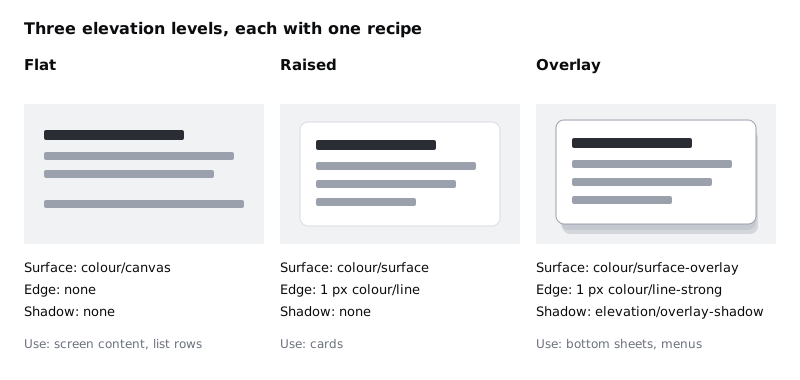
Write the result as a table in a new text box called Elevation recipe. For Larkfield it is:
| Level | Surface | Edge | Shadow |
| --- | --- | --- | --- |
| Flat | colour/canvas | none | none |
| Raised | colour/surface | 1 px colour/line | none |
| Overlay | colour/surface-overlay | 1 px colour/line-strong | elevation/overlay-shadow |
The reasons, so you can defend them later:
- Flat needs nothing. It is the page.
- Raised uses a background shift and an edge, but no shadow. White on the #F6F7F8 canvas is a contrast of only about 1.07:1, so the shift alone is too faint; the light #D5D9DF line adds a defined edge. A raised card does not cover anything, so a shadow would say something untrue.
- Overlay is the only level that gets a shadow, because it is the only one that really sits above other content. It also gets a stronger edge,
colour/line-strongat #9AA0A8. The shadow will fail in dark mode and in sunlight, and the edge has to hold the shape on its own when it does.
Why not reuse colour/border, the #7D8592 edge you gave fields, unselected time slots and secondary buttons in the high-fidelity tutorial? Because in Larkfield that darker edge means "you can tap or type here". If a menu or sheet wore the same edge, a patient could read it as one big field. The overlay edge sits between the two: clearly stronger than the card's colour/line, and still lighter than a control. An overlay does not depend on its edge alone either, because its rows, its shadow and, on a sheet, the scrim also mark it out.
One shadow in the whole app is a deliberate limit. When every overlay uses the same one, a patient learns that a shadow means "this will go away".
Check it worked
The Elevation recipe table has three rows and four columns. Only the overlay row has a shadow. Every cell names a variable or a style, or says none; no cell contains a raw hex value.
Step 3 · Add the variables and the shadow style
Open the variables panel and add these to the Larkfield collection. colour/canvas, colour/surface and colour/line already exist from the high-fidelity tutorial; leave their values alone.
colour/surface-overlay: #FFFFFF. It has the same value ascolour/surfacein light mode, but it gets its own name because dark mode will separate them.colour/line-strong: #9AA0A8, the edge of sheets and menus. Keep it separate fromcolour/border(#7D8592), which stays reserved for controls.colour/scrim: #1B1F24. This is the dimming layer behind a bottom sheet. You set its transparency on the layer, not in the variable.
If your collection uses primitives and aliases, as in Name design tokens from primitives to roles, point the new variables at the existing primitives instead of typing hex codes.
Now make the shadow. Draw any rectangle, select it, and add a drop shadow in the Effects section of the right sidebar. Set:
- X: 0, Y: 8
- blur: 24, spread: 0
- colour: #1B1F24 at 18% opacity
From the effects section, create a new style from these effects and name it elevation/overlay-shadow. Then delete the rectangle. The style stays in the file.
There is no single Figma variable type that holds a fill, a stroke and a shadow together. So in this file an elevation token is the recipe in your table: three named parts that always travel together. The level names in the table's first column, flat, raised and overlay, are what you and the developers call each recipe. When you hand this over, each level becomes one CSS class or one theme entry with that name, made from the same three parts.
Check it worked
The variables panel shows colour/surface-overlay, colour/line-strong and colour/scrim alongside the existing colours. Click empty canvas: the effect styles list in the right sidebar contains elevation/overlay-shadow, and its preview shows one drop shadow.
Step 4 · Apply raised to the Confirm summary card
Copy the Confirm frame from your 04 High fidelity page onto the Elevation page, so you can experiment without changing the real screen. Set the frame's fill to colour/canvas.
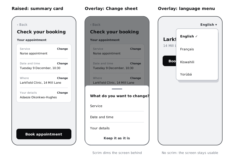
Select the frame that holds the four summary rows (Service, Date and time, Where and Your details, each with its Change link). Apply the raised recipe:
- fill:
colour/surface - stroke: 1, inside,
colour/line - effects: none. Remove any shadow left over from earlier work.
Keep the corner radius the card already has (8 in Larkfield) and 16 pixels of padding inside.
Then look at the card from about a metre away. It should read as one block of information that belongs to the page. If the edge looks heavy, check that the stroke is 1 pixel and set to inside; a 1 pixel stroke set to centre or outside makes the card look 1 pixel bigger than its neighbours.
Check it worked
Select the summary card. The right sidebar shows its fill as colour/surface, a 1 pixel stroke as colour/line, and an empty effects section. On the canvas, the card is white on the light grey screen with a thin edge and no shadow below it.
Step 5 · Apply overlay to a bottom sheet
Duplicate your Confirm copy and rename the duplicate Confirm / Change sheet. This is the moment when a patient has tapped Change and the sheet has slid up.
First, add the scrim: a rectangle covering the whole frame, filled with colour/scrim, layer opacity 50%. Name it Scrim. The scrim does most of the work here. It tells the patient that the screen behind is paused and the sheet is the only thing they can use.
Then add the sheet above the scrim, anchored to the bottom of the frame and the full width of it:
- fill:
colour/surface-overlay - stroke: 1, inside,
colour/line-strong - effect:
elevation/overlay-shadow - corner radius: 8 on the top two corners only, 0 on the bottom two
Inside it, put a small grabber bar at the top, the heading What do you want to change?, three rows (Service, Date and time, Your details) separated by colour/line dividers, and a text button Keep it as it is at the bottom. Make every row at least 48 pixels tall, so it is easy to tap.
Because the shadow is offset 8 pixels downwards, most of it falls off the bottom of the frame on a sheet. That is fine. On a sheet, the scrim and the edge carry the level; the shadow is there so that the sheet matches every other overlay.
Check it worked
Confirm / Change sheet has two new layers, Scrim and the sheet, in that order from bottom to top. The sheet's fill, stroke and effect show the three overlay parts by name in the right sidebar. With the scrim hidden, the sheet still has a visible edge against the card behind it.
Step 6 · Apply overlay to the language menu
Copy the Home frame onto the Elevation page and rename it Home / Language menu. In the header, add a text button reading English ▾ on the right.
Draw the menu directly below the button, aligned to its right edge, about 200 pixels wide, and apply exactly the same recipe as the sheet: colour/surface-overlay, a 1 pixel inside stroke in colour/line-strong, elevation/overlay-shadow, and radius 8 on all four corners. Add four rows, each at least 48 pixels tall: English with a tick, Français, Kiswahili, Yorùbá. Write each language name in that language, so a patient who does not read English can still find their own.
Do not add a scrim. A menu is small and the patient can tap outside it to close it, so the screen should stay readable behind it. That is the one difference between the menu and the sheet, and it is a behaviour decision, not an elevation one.
Before you move on, type a longer name into one row, such as Português (Brasil), and check that the menu widens or wraps rather than cutting it off. Translated labels are often longer than the English ones you designed with.
Check it worked
The menu and the sheet show identical fill, stroke and effect names in the right sidebar. The menu has no scrim behind it, and the Home heading and the Book an appointment button are still readable around it. The longest label fits.
Step 7 · Test the levels in dark mode
Add a mode called Dark to the Larkfield collection and give the variables you have used on this page a dark value. These are example values for this test; Design a dark mode that is not just inverted builds the full dark palette.
| Variable | Light | Dark |
| --- | --- | --- |
| colour/canvas | #F6F7F8 | #12161C |
| colour/surface | #FFFFFF | #1B2128 |
| colour/surface-overlay | #FFFFFF | #252C35 |
| colour/line | #D5D9DF | #3A4552 |
| colour/line-strong | #9AA0A8 | #5A6270 |
| colour/scrim | #1B1F24 | #000000 |
| colour/text | #1B1F24 | #E8EBEF |
| colour/text-muted | #5A6270 | #A3ADB8 |
Leave any other variables without a dark value for now. Duplicate the three frames, select the duplicates, and switch them to the Dark mode from the Appearance section of the right sidebar.
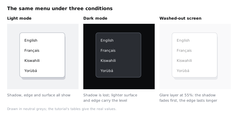
Look at each surface in turn. Note what happens to the shadow: a dark shadow on a dark canvas barely shows. This is why the dark overlay surface is a step lighter than the raised one. In dark mode, the background shift does the job the shadow did in light mode: lower layers are darker, higher layers are lighter.
If your plan does not allow a second mode, duplicate the frames and type the dark values in by hand for this test only. Delete those frames afterwards so no hard-coded colours stay in the file.
Check it worked
In the dark frames you can still put a finger on the edge of the summary card, the sheet and the menu. The menu and the sheet are visibly lighter than the card, and the card is visibly lighter than the canvas. If any surface merges with what is below it, change its dark surface value by one step, not its shadow.
Step 8 · Test on a cheap or washed-out screen
Phones at the cheaper end of the market often have dimmer screens with less contrast. People use them outdoors, with the brightness turned down to save battery. The faint hints you see on a good monitor are the first to go.
Do this test in two ways.
In Figma: duplicate the three light frames and put a rectangle over each one, filled white at 55% opacity, named Glare. This roughly simulates a screen in sunlight. It is not accurate, but it shows which hint fails first.
On a phone: export the three light frames and the three dark frames as PNG at 2x, put them on the cheapest Android phone you can borrow, turn the brightness down to about a third and look at them near a window. If you are sending the images over mobile data, PNGs of six phone screens add up; a shared folder that the phone opens once over Wi-Fi saves data.
For each surface, write one line under the frame: still clear, faint but findable, or gone.
What to expect with the Larkfield values: the shadow is the first thing to fade. The raised card's #D5D9DF edge, at about 1.32:1 against the canvas, becomes faint. The overlay's #9AA0A8 edge, at about 2.64:1 against white, survives, helped by the rows and the scrim that also mark out the sheet and the menu.
Then decide what each result means. WCAG 2.2 success criterion 1.4.11 asks for 3:1 contrast for visual information needed to identify a component. A boundary is not required when something else, such as its text, already identifies the component. The Confirm summary is not a button, and its text and the space around it still group it, so a faint edge there is acceptable. If a raised card in your app is itself the thing to tap and the edge is the only clue to where it ends, give that card's edge colour/border, which reaches 3.72:1 on white, or design its tap target another way. Do not use colour/line-strong for this: at 2.64:1 it is below 3:1.
Check it worked
Under each test frame there is a one-line verdict for the card, the sheet and the menu. The sheet and the menu are "still clear" or "faint but findable" in every condition. Any surface marked "gone" has a written decision next to it: either accepted, with the reason, or changed, with the new value.
Step 9 · Build the Elevation in use frame
Collect the result into one frame that a developer or a new designer can read in a minute. Make a frame called Elevation in use and put in it:
- the
Elevation recipetable, updated with anything you changed in the last two steps - the light card, sheet and menu frames in one row
- the dark versions in a row below
- one line of rules underneath:
Three levels only. Shadow means overlay. Overlays always have an edge. New surfaces pick an existing level.
Delete the Glare rectangles and any hand-coloured dark frames. Keep the verdict lines from the last step next to the frame, as a record of why the values are what they are.
Check it worked
The Elevation in use frame shows three levels and six screen frames, and nothing else. Click any surface in it: the fill, stroke and effect in the right sidebar are all variables or the elevation/overlay-shadow style, never a raw value. A search of the page's effect styles finds one shadow style in use.
Next steps
You have a small elevation system that works without its shadow, which is the condition it will often be seen in. From here:
- Design a dark mode that is not just inverted builds out the full dark palette that this tutorial only sketched.
- Choose between a modal, a bottom sheet and a new screen helps you decide when the Change sheet should be a sheet at all.
- Use white space to group and separate content covers the surfaces you marked flat, where space does the work that edges would otherwise do.
- Create colour variables with light and dark modes explains modes in more detail if the dark mode step was new to you.
Part of these paths
Related tutorials
- Use white space to group and separate contentYou will have a dense form-and-summary screen regrouped with space instead of boxes and divider lines, keeping two of its sixteen lines and boxes, and a gap ratio rule you can apply to any screen.
- Design a dark mode that is not just invertedYou will have three Larkfield Clinic screens in light and dark mode side by side, and a token mapping table that gives every colour role a dark value chosen on purpose and checked for contrast.
- Create colour variables with light and dark modesYou will have a Figma screen whose every colour comes from variables, so switching one setting on the frame turns it from light to dark and back.
Need this done for you?
Padding does this work for growing companies, from the first diagnosis to a system that keeps working.
Get new tutorials