UI and visual design · Intermediate · 16 min
Make a data table work on a phone
By Padding · Updated 18 Nov 2026
Figma (web) · November 2026
You will have tried four phone patterns on the same Larkfield appointment table, matched each one to the task it suits, and finished a 360 px frame for the pattern you chose, with a short note on when the other three would win.
On this page
A desktop table gets its power from width: eleven columns side by side, so the eye can run along a row or down a column. A phone at 360 pixels wide holds about three of those columns. Something has to give, and there are four usual ways to give it: let the table scroll sideways, turn each row into a card, keep a few columns and move the rest behind a tap, or drop the grid and write each row as a list item with its key facts.
None of the four is right for every table. Each one is good at one kind of task and poor at others, and the honest way to choose is to try all of them against the same data and the same tasks. That is what you do here.
The data is Larkfield Clinic's staff appointment table, from Design a data table people can scan. It is Tuesday 9 December at 10:35. The desktop table has eleven columns: Select, Time, Patient, Date of birth, Status, Waiting, Service, Clinician, Room, Duration and Actions. You use the same six morning rows as the desktop drawing, including the booking from the patient flow: Sam Patel, Nurse appointment, 10:30, Room 3, booked and not yet arrived. Each clinician works from one room all morning: Dr Ada Okafor in Room 1, Dr Amaka Bello in Room 2 and Nurse Ruth Ellis in Room 3.
- 09:00 Tom Reilly, GP appointment, Dr Ada Okafor, Room 1, Seen
- 09:20 Fatima Yusuf, Blood test, Nurse Ruth Ellis, Room 3, Seen
- 09:40 Kwame Asante, Vaccination, Nurse Ruth Ellis, Room 3, Arrived, waiting 41 minutes
- 10:00 Lena Novak, Medication review, Dr Amaka Bello, Room 2, Arrived, waiting 14 minutes
- 10:30 Sam Patel, Nurse appointment, Nurse Ruth Ellis, Room 3, Booked
- 11:00 Chidinma Okoro, GP appointment, Dr Ada Okafor, Room 1, Booked
The statuses and actions are the desktop table's too. The day runs Booked, Arrived, With clinician, Seen, Did not attend; a Booked row offers Mark arrived, an Arrived row offers Call in, and the last three statuses have no button. None of these six rows is With clinician or Did not attend this morning, but your designs still need room for both.
Step 1 · Write down who opens the table on a phone, and why
Phones change who uses the table, not just its width. The receptionist at the desk has a laptop. The people holding a phone are somewhere else: a receptionist walking the waiting room on a busy morning, a nurse between rooms, the practice manager at home the evening before. Each wants a different slice of the same data.
Make a page called Staff table / Phone and add a text note listing four tasks. For each, write who does it and which columns it needs:
- Mark arrivals in the waiting room. Receptionist. Needs Time, Patient, Status and the Mark arrived action. Date of birth only to confirm identity, one patient at a time.
- See who is here and who is next. Nurse or doctor. Needs Time, Patient, Status and Waiting.
- Spot gaps and room clashes in the day. Practice manager. Needs Time, Clinician and Room, compared down many rows.
- Prepare for my own list. A clinician with about eight patients. Needs every field, but for a few rows only.
Notice that task 3 compares rows and the others act on one row at a time. That split decides most of what follows: comparing needs columns that line up, acting needs the row's facts close to its action.
Make four frames, 360 by 800, side by side, one per pattern. 360 by 800 is one of the most common Android screen sizes in use, including across Africa, where many clinic staff use an entry-level phone as their work phone. Turn on clip content for each frame so anything wider than 360 is cut off at the edge, as it would be on the phone.
Check it worked
Your page has a note with four tasks, each naming a person and the columns they need, and one task marked as comparing rows. Next to it sit four empty 360 by 800 frames with clip content on, labelled A to D.
Step 2 · Pattern A, scroll sideways with Time fixed
The least effort is to keep the desktop table and let it scroll sideways inside the screen. Done well, the first column stays put while the others slide under it, so you never lose track of which row you are on.
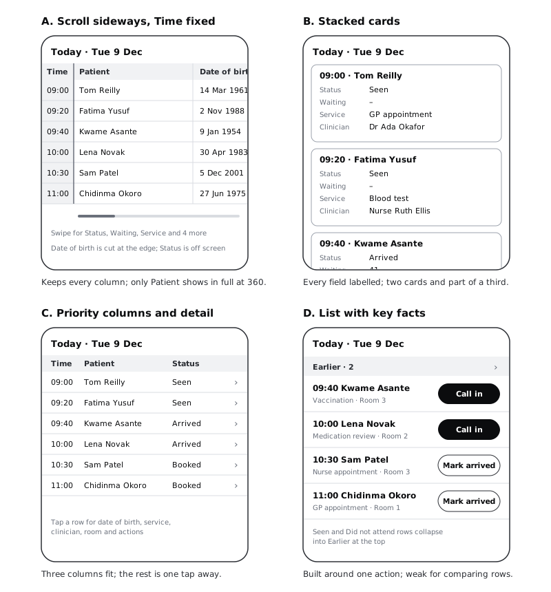
In frame A, place the desktop header row and the six rows, keeping the desktop widths (Patient 208, Date of birth 120, Status 128 and so on) with no side padding, so the table runs far past the right edge of the frame. Then:
- Drop the Select column; bulk selection on a phone is a separate problem, and you will come back to it in the last step.
- Make Time the fixed column, 56 wide, with a
colour/canvasfill and a 1.5 px divider on its right edge so the fixed part reads as fixed. - Under the table, draw a short scroll indicator and a line of text such as "Swipe for Status, Waiting, Service and 4 more". A sideways scroll that nobody discovers is the same as no columns at all.
Now do the sum. Time takes 56, which leaves 304 for the scrolling part. Patient takes 208 of that, and Date of birth gets the last 96 of its 120, so it is cut at the edge. Status starts at 384, past the edge, and does not show at all. Status, the column asked about most, is off screen, because the desktop order put Date of birth before it. The pattern keeps every column, but in the desktop's order, and that order was chosen for a 1366-pixel screen.
WCAG 2.2's reflow rule asks pages to work at 320 CSS pixels wide without scrolling in two directions, and it exempts content that needs a two-dimensional layout, which includes data tables. So the sideways scroll is allowed, as long as only the table scrolls and the rest of the page fits the screen.
Check it worked
In frame A, the Time column sits at the left edge with a visible divider, and you can count how many other columns show in full. On the Larkfield table it is one: Patient. Date of birth is cut off part way through, and no part of Status is visible. Write that on the frame. If Status is not among the columns in full, note it as the pattern's main cost for tasks 1 and 2.
Step 3 · Pattern B, stacked cards
The second pattern turns each row into a card. The row's identity (time and name) becomes the card's heading, and every other cell becomes a label and value pair underneath.
In frame B, build one card as a vertical auto layout frame, fill width, with 12 pixels of padding, an 8-pixel gap between items and an 8 radius:
- Heading:
10:30 · Sam PatelinLabel(Semi Bold 14). - Then one line per remaining column: a label in
Body/Smallandtext-mutedon the left, its value inBody/Smallandtexton the right, in this order: Status, Waiting, Service, Clinician, Room, Date of birth, Duration. - The action button, 44 tall and full width, at the bottom of the card:
Mark arrivedon Sam Patel's card.
Make it a component and stack six instances with 8 pixels between them. Labels matter here: on a card, "3" means nothing without "Waiting" beside it, and a screen reader user needs the same pairing. Write in the spec that each label is tied to its value in the markup, not only placed next to it.
Check it worked
Count the cards visible in the 800-pixel frame without scrolling. Each card is 292 tall: 24 of padding, eight 20-pixel lines, a 44 button and eight 8-pixel gaps. So you see two full cards and part of a third. Then try to answer task 3 ("is Room 3 double-booked at any point?") from frame B: you have to scroll and remember values from card to card. Write "2 rows per screen, no comparing" on the frame.
Step 4 · Pattern C, priority columns with a detail view
The third pattern keeps a real grid but only for the columns that earn their place on a phone, and moves the rest to a detail screen one tap away.
Go back to your task note and count how often each column appears. Time, Patient and Status appear in three of the four tasks. Those three stay. Everything else (Date of birth, Waiting, Service, Clinician, Room, Duration and the actions) goes to the detail view.
In frame C, build the grid with these widths, which add up to 344 inside 8 pixels of side padding:
- Time: 48, tabular figures
- Patient: 138, wrapping to a second line when needed; never truncate a name staff use to identify someone
- Status: 120
- A chevron: 38, which also tells people the row opens
Use Chidinma Eze-Williams to test the Patient width, as on desktop. Then build the detail view as a second 360 by 800 frame for Sam Patel: his time and name as the heading, all the other fields as labelled lines, and the Mark arrived button and the More actions at the bottom.
The rule that makes this pattern work: the whole row is the tap target, at least 48 tall, not just the chevron.
Check it worked
Frame C shows all six rows with Time, Patient and Status in full. Type Did not attend, the longest status, into one Status cell: it fits on one line. Tapping in your head through task 2 ("who is here and who is next?"): you answer it from the grid without opening anything. Task 1 needs one extra tap per patient to reach Mark arrived. Write that on the frame.
Step 5 · Pattern D, a list with key facts and the action
The last pattern stops pretending to be a table. Each row becomes a list item written for one task: here, marking patients as arrived and calling them in.
In frame D, build a list row as a horizontal auto layout component, 72 tall, with two parts:
- Left, fill width: line 1 is the time and name,
10:30 Sam Patel, inLabelat 15 with tabular figures; line 2 is service and room inBody/Smallandtext-muted. - Right, hug: the one action that matches the status, from the desktop table's rules.
Bookedshows a secondaryMark arrivedbutton,Arrivedshows a primaryCall inbutton, andWith clinician,SeenandDid not attendshow the status word instead of a button.
Make the buttons 44 tall. WCAG 2.2 sets 24 by 24 as the minimum target, but these are tapped many times a morning, often one-handed while greeting someone, so use the enhanced 44 by 44 size.
Then group the rows. Rows whose appointment is over (Seen, Did not attend) go into an Earlier section at the top, and the rest go into Now and next. Earlier starts collapsed: one 44-tall row showing only Earlier · 2 and Show, with no patient rows under it until someone taps it. The list opens on what is happening now instead of on 09:00.
Check it worked
In frame D, every row shows exactly one of: a Mark arrived button, a Call in button or a status word. The Now and next section starts with Kwame Asante at 09:40, and the collapsed Earlier row shows 2 with no rows under it. Try task 3 on it: Clinician is missing entirely, so the list cannot answer it. Write "built for task 1, cannot compare" on the frame.
Step 6 · Score each pattern against each task
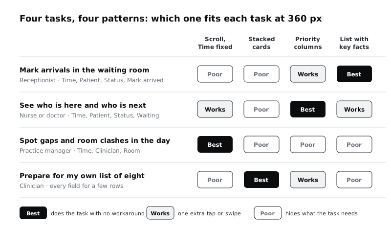
Now compare the four frames against the four tasks. Use three marks, and write a reason for each:
- Best: the task works with no workaround.
- Works: one extra tap or swipe per row.
- Poor: the pattern hides or buries what the task needs.
Fill a small grid on the canvas, tasks down the side and patterns across the top. Here is how the Larkfield table comes out:
- Mark arrivals: D is best, because the action sits on the row. C works, with one tap into the detail. A and B are poor: in A the action column is at the far end of a long swipe, and in B the receptionist scrolls past eight lines per patient.
- Who is here and who is next: C is best, because Status lines up down the column. A and D work. B is poor.
- Gaps and room clashes: A is best, because it is the only pattern where Room and Time line up for every row. The rest are poor.
- Prepare for my own list: B is best for eight rows read one at a time. C works. A and D are poor.
Check it worked
Your grid has sixteen marks and each one has a reason that points at something visible in a frame, such as "Status off screen" or "action on the row". Every pattern wins at least one task or is clearly beaten everywhere; if one wins nothing, say why in a line under the grid.
Step 7 · Pick one pattern and finish the 360 px frame
You could build a different phone view for each task, but each view is another thing to design, build and keep in step with the desktop table. Pick one main pattern for the most frequent phone task and give the others a route.
At Larkfield, the phone is used most during the morning rush, when a second receptionist walks the waiting room. That is task 1, so the main view is pattern D, the list with key facts. Task 2 is served almost as well by D with a filter. The practice manager plans on a laptop, and the clinician's own list is a separate screen.
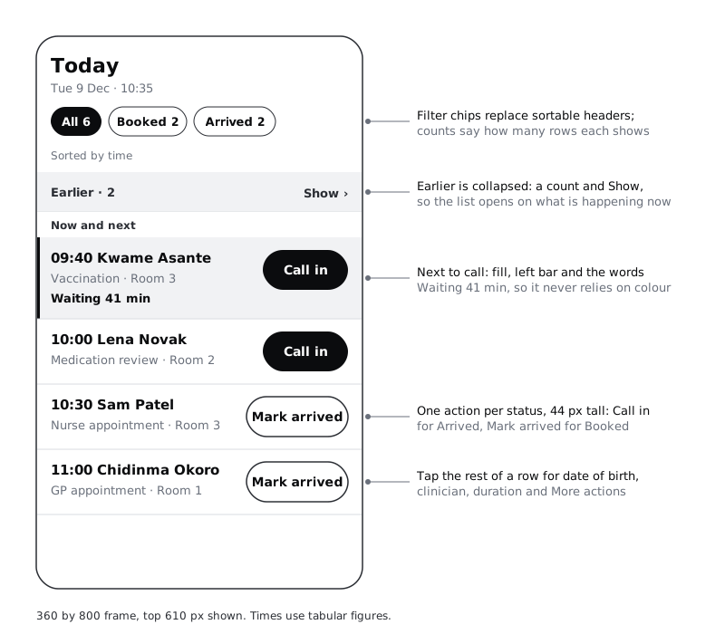
Finish frame D into a real screen:
- Header:
TodayinHeading/L, andTue 9 Dec · 10:35under it inBody/Small. - Filters instead of sortable headers: there are no column headers left to tap, so give staff three filter chips with counts, using the status words:
All 6,Booked 2andArrived 2. Under them, a line sayingSorted by time, so nobody wonders about the order. - Earlier, collapsed:
Earlier · 2withShow, as in pattern D. Tapping it expands the two Seen rows in place. - The next patient to call: Kwame Asante has waited longest, so his row gets the
accent-tintfill, a 4-pixelaccentbar on the left edge, and a third line,Waiting 41 min, inLabel. The fill and bar draw the eye, and the words carry the meaning for anyone who cannot see the colour. - Detail: tapping anywhere on a row except its button opens the detail view from pattern C, with date of birth, clinician, duration and the
Moreactions. Reuse that frame rather than drawing a new one. - Empty values: where a row has no wait time, show nothing on the list, and an en dash in the detail view, as the desktop spec says.
Two checks for real phones. First, large text: set the text styles to twice their size on a copy of the frame. Rows grow taller and names wrap, but nothing overlaps and no column has to scroll, which is a strength of the list over pattern A. Second, data: a few text fields per row cost little either way, but preloading every row's detail view and patient record would not, and it slows the list on an entry-level phone with a weak signal. Keep the detail view loading on tap, not in advance, and write that in the spec.
Check it worked
Your final frame is 360 wide, with clip content on, and nothing is cut off at its right edge. Earlier is a single collapsed row reading Earlier · 2. Every patient row has either one action button 44 tall or a status word. Desaturate the frame: you can still find the next patient to call by the bar and the words Waiting 41 min. Your copy at double text size has no overlapping text.
Step 8 · Write the note on when the others win
The choice will be questioned, and the scoring grid is the answer. Put a short note beside the final frame, one line per pattern you did not choose, saying when it would win:
- Scroll sideways with Time fixed wins when someone has to compare many rows across several columns on a phone, such as checking room clashes away from a laptop. Fix the column people search by, and reorder the columns for the phone so the most asked-about one comes second.
- Stacked cards win for short lists read one item at a time, where every field matters, such as a clinician's own eight appointments. They lose as soon as the list is long or people compare rows.
- Priority columns with a detail view win when people mostly read status down a column and only sometimes act, such as a nurse checking who is in. They are the closest phone version of a table, and the safest default when you do not know the tasks yet.
End the note with the rule you used, in one sentence, so the next designer can apply it to a different table: comparing across rows needs aligned columns; acting on one row needs that row's facts next to its action.
Check it worked
Your note names three patterns, each with a situation where it would beat your choice and an example from Larkfield. Ask someone who has not seen the work which pattern they would use for the practice manager's evening check of room bookings: if the note is clear, they answer "scroll with Time fixed" without looking at the frames.
Next steps
You now have the same table in four phone patterns, a scoring grid, a finished 360 px frame and a note on the trade-offs.
- Build a responsive HTML table builds the desktop table in code and makes it work on a phone with a labelled scrolling wrapper and a sticky first column, which is pattern A done properly.
- Size touch targets for thumbs goes further into the row and button sizes you set in pattern D.
- Design layouts that survive large text expands on the double-size text check.
- Design a data table people can scan is the desktop table this tutorial starts from, if you skipped it.
Part of these paths
Related tutorials
- Design a data table people can scanYou will have a desktop appointment table for Larkfield Clinic's reception staff, with columns ordered by task, aligned numbers, two row densities, sortable headers, row actions and a selected state, plus a written spec for every column.
- Build a responsive HTML tableYou will build the Larkfield Clinic staff appointment table with real table markup, tabular numbers, a sticky header and a sticky first column inside a labelled, keyboard-focusable scroll area, so it keeps its table semantics from a desktop monitor down to a 360 pixel phone.
- Size touch targets for thumbsYou will have the Larkfield Clinic Pick a time screen with every tappable area at least 48 by 48 pixels, the main action within one-handed reach, and an overlay frame that shows each hit area and its size.
Need this done for you?
Padding does this work for growing companies, from the first diagnosis to a system that keeps working.
Get new tutorials