UI and visual design · Beginner · 14 min
Choose and use icons consistently
By Padding · Updated 18 Nov 2026
Figma (web) and an open-licence SVG icon set · November 2026
You will have a 12-icon set for the Larkfield Clinic app, taken from one open-licence icon family, built as named Figma components at three sizes, with a label decision for every icon and a short usage rule beside them.
On this page
Icons go wrong in small ways that add up. One screen gets a calendar with a thin stroke, another gets a filled one from a different set, a clock means "duration" on one screen and "opening hours" on the next, and a tab bar of three bare symbols leaves half the patients guessing. None of these is a big mistake on its own. Together they make an app feel stitched together, and they make people hesitate before they tap.
The fix is mostly decisions, not drawing. In this tutorial you make five of them for the Larkfield Clinic booking app: which meanings the app needs, which single icon family to take them from, which sizes are allowed, when an icon gets a visible label, and how icons take their colour. Then you build the result as Figma components and write the rule on one sheet so the next person to add a screen follows it.
You will not draw icons here. If you need a symbol your set does not have, Draw and edit vector shapes in Figma covers the pen and vector tools; draw it to the same rules you check in Step 3.
Step 1 · List the meanings before you look at any icons
Start from what the app has to say, not from a gallery of pretty symbols. Open your Larkfield file and add a page called Icons. On it, make a text layer called Icon meanings and list every place an icon could help a patient, one line each, with the meaning in plain words.
For Larkfield the high-fidelity screens already use six icons, built in part 4 as the components Icon / Back, Icon / Calendar, Icon / Clock, Icon / Location, Icon / Tick and Icon / Alert. You keep those six and check them alongside the new ones; you do not rebuild them. The tab bar on Home adds three sections, Home, My appointments and Help, and the service list and sheets need a way forward and a way out. That gives twelve meanings:
- Back: go to the previous screen
- Chevron: this row opens the next level
- Close: dismiss a sheet or dialog
- Home: the Home tab
- Appointments: the My appointments tab
- Help: the Help tab
- Calendar: a date
- Clock: a time or a duration
- Location: the clinic address
- Phone: call the clinic
- Tick: selected, or done
- Alert: an error or a warning
Now apply the most useful rule in this tutorial: one icon, one meaning. If you notice the calendar doing double duty (a date on Confirm, and the My appointments tab), give the tab its own icon. Twelve icons that each mean one thing are easier to learn than eight that change meaning by screen.
Check it worked
Your Icons page has a list of twelve meanings, each written as words a patient would understand. No meaning appears twice, and no icon name is listed against two different meanings.
Step 2 · Pick one open-licence set and read its licence
Choose a single icon family that covers all twelve meanings. Mixing families is the most common cause of icons that look slightly off together, so pick one and stay in it.
Two widely used free sets show what to look for:
- Lucide: line icons on a 24 by 24 grid with a 2 px stroke, released under the ISC licence.
- Material Symbols from Google: released under the Apache License 2.0, in three styles, with adjustable fill, weight and optical size.
Other open sets exist, and any of them works if it passes three tests:
- Coverage. Search the set for all twelve meanings. Write the set's own name for each beside your list (
arrow-leftfor Back, for example). If one meaning is missing, try a synonym before you give up on the set. - Licence. Open the licence page itself, not a summary on a blog. Note the licence name and any condition, such as keeping a copyright notice in the app's open-source credits. Copy the licence link onto the
Iconspage. - Format. You want SVG files, one per icon, that you can paste into Figma as editable vectors.
Larkfield's screens use line icons, so a line set suits them. If you built the six icons in part 4, use the same set you took them from, so the new icons match. Download the SVGs you do not have yet (for Larkfield, the six new ones: Chevron, Close, Home, Appointments, Help and Phone) into a folder called larkfield-icons. Starting without the series, download all twelve.
A note for apps used on low-cost Android phones and prepaid data: ship only the icons you use, as individual SVGs, rather than a whole icon font. Twelve small SVGs weigh a few kilobytes; a full icon font can be far heavier, and it downloads before the first icon shows.
Check it worked
Beside each of your twelve meanings is the set's file name for it, all from the same set. The Icons page holds the set's name, the licence name and a link to the licence page, and your larkfield-icons folder has an SVG for every meaning that does not already have a component (six for a Larkfield file from part 4, twelve if you started fresh).
Step 3 · Check the set for consistent stroke, grid and corners
Even a single set can drift, and you may still be tempted to borrow one icon from elsewhere. Check before you build. Drag the new SVGs onto the Icons page and put each in a 24 by 24 frame. If you have the six components from part 4, drag an instance of each from the Assets panel into the same row, so old and new are checked together. Line all twelve up in one row with equal gaps. Zoom to 400 percent and compare them in four ways:
- Stroke. Select each vector and read its stroke weight in the right sidebar. All twelve should match (2 for a 24 px line set). An icon at 1 or 1.5 looks faint next to the others.
- Fill style. Line icons and filled icons do not mix. A solid clock beside an outline calendar looks heavier and more important, whether or not it is.
- Joins and ends. Round joins and round line ends beside sharp ones are visible even at 16 px, especially on arrows and ticks.
- Grid coverage. Each icon should leave a small margin inside its frame (Lucide's guide asks for at least 1 px) and look about as big as its neighbours. A circle that touches every edge looks larger than a square of the same size, so good sets draw circles slightly bigger on purpose. Judge by eye, not by measuring.
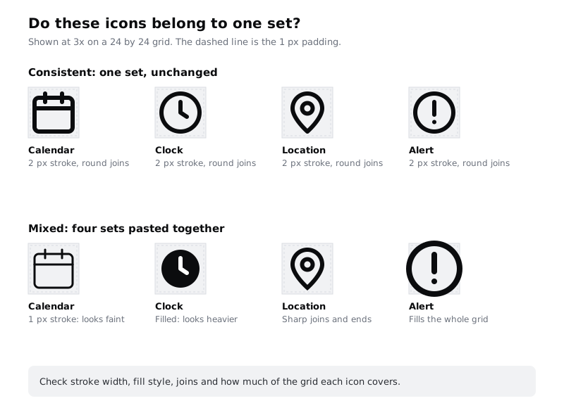
If an icon fails, look for a replacement inside the same set first. If you must draw one, copy an existing icon from the set as a starting point so it inherits the same stroke, caps and margin.
Check it worked
All twelve icons, the six existing instances and the six new frames for a Larkfield file, sit in a row on the Icons page. Every vector shows the same stroke weight in the right sidebar, there are no filled shapes in a line set, and when you zoom out to 100 percent no icon looks bolder, smaller or bigger than the others.
Step 4 · Allow three sizes and pair each with a text style
Allow exactly three icon sizes: 16, 20 and 24. Each one pairs with a Larkfield text style so icons and words sit on the same line comfortably:
- 24: standalone icons. The header's Back control, the tab bar, the chevron at the end of a list row, Close on a sheet.
- 20: beside
Bodytext (16 on 24) and inside buttons, such as the calendar besideTuesday 9 Decemberon Booked. - 16: beside
Body/Smalltext (14 on 20), such as the clock beside15 minon Choose a service.
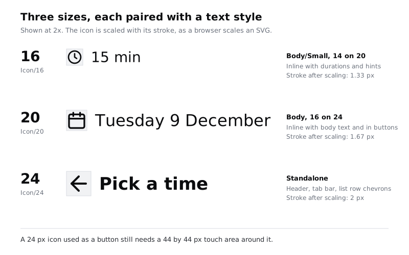
Build the 24 px versions first. For a smaller size, duplicate the 24 px frame and shrink the copy with the Scale tool (press K, then type the new width in the right sidebar). The Scale tool shrinks the stroke along with the shape, so a 2 px stroke becomes 1.67 at 20 and 1.33 at 16. That matches what a browser does when it shows a 24 px SVG at a smaller size, so the design and the built app look the same. Resizing with the normal selection handles keeps the stroke at 2, and small icons come out heavy.
The size of the icon is not the size of the thing people tap. A 24 px Back arrow in the header still sits inside a 44 by 44 px tappable area, as the Larkfield header already does. Size touch targets for thumbs covers how big that area should be.
Check it worked
Your Icons page has a short size note naming 16, 20 and 24 and where each is used. You have one test pair for each size: a 20 px calendar next to Tuesday 9 December in Body, and a 16 px clock next to 15 min in Body/Small. Select a scaled copy: the stroke weight in the right sidebar reads about 1.67 or 1.33, not 2.
Step 5 · Decide which icons need a visible text label
An icon on its own asks people to guess. Some symbols are close to universal; most are not, and meanings shift between cultures and apps (a house for Home is common, but a clipboard for appointments or a question mark for Help is a guess). Labels also help people reading in a second language. The default for Larkfield is therefore: every icon has a visible text label, unless it passes one of two tests.
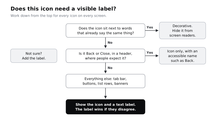
Work through all twelve meanings with these two tests and write the answer next to each:
- Decorative. The icon repeats words already beside it. The calendar beside
Tuesday 9 Decemberand the alert before an error message are decorative: the words carry the meaning, and the icon helps people scan. Mark thesedecorativeso the developer hides them from screen readers, otherwise a screen reader announces "calendar, Tuesday 9 December". - Icon only. Back and Close in a header or sheet, where nearly every app puts them. These have no visible word, so write the accessible name the developer must give the button:
Back,Close. - Icon and label. Everything else. The tab bar shows
Home,My appointmentsandHelpunder the three icons. TheCall the clinicbutton shows the phone icon and the words. The chevron on a list row has the service name as its label. Here too the developer hides the icon from screen readers and lets the visible text be the accessible name, so the button is announced as "Call the clinic", not "phone, Call the clinic".
If a visible label exists, the button's accessible name must contain those same words, so that someone using voice control can say "Tap My appointments" and it works. Leave room for longer labels: in Yoruba, Hausa or French the tab labels can be twice as long as the English ones, so a tab item that fits Help exactly will not fit its translation.
Check it worked
Each of the twelve meanings on your list now ends with one of decorative, icon only: <accessible name> or icon and label: <label>. Only Back and Close are icon only. Every tab bar item has a visible label.
Step 6 · Make icons take the colour of the text beside them
Icons should not have colours of their own. An icon takes the colour of the text it belongs to, so a muted duration line has a muted clock, the white label on an accent button has a white icon, and the danger text in an error has a danger alert. That keeps the palette small and makes contrast easy, because the text pairs are already checked.
Map each context to a Larkfield colour variable:
- Plain content and the header:
colour/text - Secondary facts such as
15 min:colour/text-muted - On a primary button or the selected time slot:
colour/on-accent - Selected tab, links, the Booked banner:
colour/accent - Errors:
colour/danger. Notices:colour/notice
Icons that carry meaning need at least 3:1 contrast against what is behind them. The Larkfield text colours pass that easily on their own backgrounds (text-muted on canvas is 5.73:1). The one to avoid is colour/line (#D5D9DF): it is a divider colour at 1.42:1 on white, far too faint for an icon. Meet contrast rules for text, icons and focus rings goes deeper.
In Figma, set the stroke of each 24, 20 and 16 px icon to colour/text with the variable picker. That is the default. When you place an icon inside a button or banner, change the stroke on that instance to the variable that matches its text. In code, the developer gets the same behaviour by giving the SVG a stroke of currentColor, so the icon follows the text colour automatically. Write that on the sheet.
Check it worked
Select any icon on the Icons page: its stroke shows a variable name, colour/text, not a hex value. Place a 20 px tick inside a primary button and set its stroke to colour/on-accent: it matches the button label exactly. No icon anywhere uses colour/line.
Step 7 · Build and name the icons as components
Turn each new icon frame into a component (select the frame, then Create component in the toolbar). Name them by what they show, with the size in the middle:
Icon/24/Back,Icon/24/Calendar,Icon/24/Tickand so on for all twelveIcon/20/CalendarandIcon/16/Clockonly for the icons the screens actually use at those sizes
Do not rebuild the six components from part 4. Rename them instead: double-click each main component's name in the layers panel and change Icon / Calendar to Icon/24/Calendar, Icon / Back to Icon/24/Back, and so on. Renaming a main component keeps every instance on the screens and inside Time slot and Header linked to it, so nothing on the screens changes. If you rebuilt one anyway, swap its instances on the screens to the new component, then delete the old main component so the set has one of each.
The slashes group the components by size in the Assets panel, so someone looking for a 16 px icon sees only 16 px icons. Inside each component, name the vector layer Glyph, keep it the only layer, and leave the frame exactly 24, 20 or 16 square with no fill. Use the same names as your meaning list, so Icon/24/Appointments is the tab icon, not a second calendar.
Next, let other components swap icons without breaking. On the Button component, add an instance swap property called Icon on its leading icon, and set its preferred values to the 20 px icons that may appear in a button (Calendar, Phone, Tick). Do the same for the tab bar item with the three 24 px tab icons. The swap menu then offers only the icons that belong there.
After swapping an icon in an instance, check its colour. Figma does not always keep a colour override through a swap, and an icon that drops back to colour/text on an accent button disappears.
Check it worked
The Assets panel shows an Icon group with a 24 folder holding twelve components, and 20 and 16 folders with only the sizes you need. No component sits loose in the Icon group outside those folders: if one does, it is an old Icon / ... name you have not renamed yet. Select the tick in a selected Time slot: the right sidebar names its main component Icon/24/Tick. Select the leading icon in a Button instance: the right sidebar shows an Icon swap with Calendar, Phone and Tick as suggestions. Swap one and confirm the stroke still matches the label.
Step 8 · Put the set and its rule on one sheet
Finish with the thing other people will actually look at. Make a frame on the Icons page called Icon sheet. Lay out the twelve 24 px instances in a grid, each with its component name and its one meaning underneath, then add a usage rule of no more than five lines.
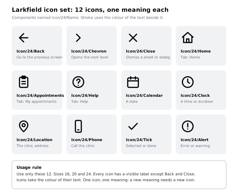
Larkfield's rule reads:
- Use only these twelve icons, from one set. A new meaning needs a new icon from the same set, added to this sheet first.
- Sizes are 16, 20 and 24, paired with
Body/Small,Bodyand standalone use. - Every icon has a visible label, except Back and Close, which get an accessible name.
- Icons take the colour of their text, never a colour of their own.
- Icons that repeat nearby words are decorative and hidden from screen readers.
Below the rule, keep the licence name and link from Step 2. Then walk the ten high-fidelity frames once. Icons that were instances of the six renamed components already point at the right names; replace any icon that is not an instance of an Icon/... component, such as a pasted SVG or a detached copy.
Check it worked
The Icon sheet frame shows twelve icons with names and meanings, a rule of five lines or fewer, and the licence link. Search the high-fidelity page's layers for Vector: every icon you find sits inside an Icon/... instance, not loose on a screen. A teammate who has never seen the file can say, from the sheet alone, which icon to use for "a date" and whether it needs a label.
Next steps
Icons are one half of the imagery on a screen. Choose and crop photos for an interface does the same job for photographs: one treatment, clear crops and a licence check.
To write the icon rules into the component specs your developers use, see Specify ten core components and their states. To check icon and focus contrast across the whole app, go to Meet contrast rules for text, icons and focus rings, and to make sure the icon buttons are big enough to hit, Size touch targets for thumbs.
Part of these paths
Related tutorials
- Choose and crop photos for an interfaceYou will have three licensed photos for a clinic's app and website, each with marked crops for a phone and a desktop ratio, written alt text and a file size budget, collected on one photo sheet a developer can build from.
- Specify ten core components and their statesYou will have a short written spec for each of the ten components the Larkfield Clinic app needs, listing anatomy, variants, required states, tokens and minimum touch size, placed beside the rebuilt components in Figma.
- Draw icons with vectors and boolean operations in FigmaYou will have drawn a calendar icon and a clinic icon on a 24 px grid in Figma with the pen tool, shape tools and boolean operations, and turned them into flattened, outlined SVGs ready for a developer.
Need this done for you?
Padding does this work for growing companies, from the first diagnosis to a system that keeps working.
Get new tutorials