UI and visual design · Beginner · 16 min
Choose and crop photos for an interface
By Padding · Updated 18 Nov 2026
Figma (web) or any design tool that can crop an image fill, and a spreadsheet · November 2026
You will have three licensed photos for a clinic's app and website, each with marked crops for a phone and a desktop ratio, written alt text and a file size budget, collected on one photo sheet a developer can build from.
On this page
Photos do more work in an interface than almost anything else on the screen. A patient opening a clinic's booking app sees the photo before they read a word, and in that moment it answers "is this the right place, and is it for people like me". A good photo answers both. A generic one answers neither, and a badly cropped one, with the door cut off or a nurse's face under the status bar, makes the whole product look careless.
This tutorial is about the decisions around photos rather than the mechanics of cropping them in a tool. You will choose photography for Larkfield Clinic, the fictional community clinic whose appointment booking app runs through the design tutorials on this site, and end with a photo sheet: three images, each with a crop for a phone ratio and a desktop ratio, alt text and a file size budget.
Larkfield's app already has one photo: the front entrance on the Home screen, set at 16:9 in Turn a mid-fidelity layout into a high-fidelity design. The clinic website needs two more, for its Before your visit and About us pages. If you are not following the Larkfield example, use any three places in your own product where a photo is planned.
Step 1 · Write a shot list from the screens
Do not start by browsing photos. Start by writing down where each photo goes and what job it does, because the job decides what the photo must show and the layout decides its shape.
Open your spreadsheet and add a tab called Photo sheet. Give it these columns: ID, Where, Job, Must show, Must not show, Phone ratio, Desktop ratio, Source, Licence, Consent, Alt text, Budget. Fill in the first seven for Larkfield:
- P1 · App Home, website Contact page. Job: help a patient recognise the building when they arrive. Must show: the front door, the clinic sign and the ramp. Must not show: car number plates, people's faces in close-up. Phone 16:9, desktop 21:9.
- P2 · Website, Before your visit. Job: show what happens when you walk in, so a first visit feels less unknown. Must show: the reception desk with a receptionist, the check-in screen and the seating. Must not show: patients who have not agreed to be photographed, anything on a computer screen. Phone 4:5, desktop 3:2.
- P3 · Website, About us. Job: show the people who will look after you. Must show: a nurse with a patient in a consulting room, both faces visible, a calm moment such as a blood pressure check. Must not show: needles, blood, anyone undressed or distressed. Phone 1:1, desktop 3:2.
The two ratios come from the layout. Phone screens are narrow, so a wide 21:9 strip at 360 px wide would be about 154 px tall, too short to read a door and a sign; on a laptop the same strip is a calm banner. Portrait and square crops suit phones because they use the height a phone has.
Check it worked
Your Photo sheet tab has three rows, P1 to P3. Each row names a screen or page, a job in one sentence, at least two things the photo must show and at least one it must not, and two ratios written as width:height. If a job could apply to any clinic in the world ("show a friendly clinic"), rewrite it until it could only be Larkfield's.
Step 2 · Choose real people and places over generic stock
Now find candidates for each row. In order of preference:
- Photos taken at the clinic, of its own staff and building. This is the only way P1 can do its job: a stock entrance cannot help anyone find 14 Mill Lane. A phone camera in good daylight is enough for an interface if you hold it level and shoot more than you need.
- Photos the clinic already owns, such as ones taken for a newsletter or an opening day, if they show the current building and staff.
- Stock photos, only where the job is general (P3 could be any nurse and patient) and only after the first two options have failed.
Take or collect at least three candidates per row, and look at each against its row in the sheet. Reject any candidate that fails a Must show or breaks a Must not show, however good it looks.
Then check representation. The people in the photos should look like the people the clinic serves and employs: their ages, skin tones, dress, and whether they use a wheelchair or a walking stick. If the clinic's patients are mostly older adults and parents with young children, a set of photos of people in their twenties in a glass office tells them the app is not for them.
A note on stock images of Africa. If your product serves people in an African city, search results for stock often push the same few scenes: a dusty rural road, a child in need, a doctor from somewhere else arriving to help, a sunset over a savannah. Most of your users live nothing like that. A clinic in Lagos, Nairobi or Accra has tiled floors, plastic chairs, queue tickets, phones in every hand and staff who are the patients' neighbours. Show that. Avoid photos that present patients as objects of pity, and prefer local photographers, who know the places and can get proper consent in the languages people speak.
Check it worked
Each row has a shortlist of candidates, and for each one you can point to where it meets every Must show. P1's shortlist is photos of the real Larkfield entrance, not stock. Read your three favourites side by side and ask: would a regular patient recognise this place or these kinds of people? If the answer for any of them is "probably not", keep looking.
Step 3 · Check the licence and consent for each photo
A photo you are allowed to see is not a photo you are allowed to use. Before a candidate goes any further, fill in its Source, Licence and Consent cells.
For Source, write who took the photo and where the original file lives: "Clinic shoot, 3 Nov, folder larkfield-photos/raw" or the full page address of a stock image, not a search result.
For Licence, write what the terms say about four things:
- Commercial use. A clinic app and website are in use by an organisation; treat them as commercial unless a lawyer tells you otherwise.
- Changes. You are going to crop the photo and perhaps adjust its colour. Some licences forbid changes. Creative Commons licences marked ND (NoDerivatives) are one example.
- Attribution. Whether you must credit the photographer, and where. If the licence requires a credit, add it to the
Must showlist for the page, not as an afterthought. - Restrictions on sensitive uses. Some stock licences restrict using identifiable people in ways that suggest they have a health condition. Look for a clause headed "sensitive use" or "sensitive subjects" in the licence terms and read it before you choose. A nurse photo for About us is usually fine; the same person on a page about a specific illness may not be.
For Consent, write who appears and what they agreed to. A copyright licence covers the photograph, not the people in it: Creative Commons, for example, says its licences do not grant publicity or privacy rights. For photos you take yourself, get written consent from every identifiable person that says where the photo will appear and for how long, and keep it with the original file. For patients, the clinic's own consent policy applies, and the simplest answer is often to photograph staff or volunteers instead.
Check it worked
Every candidate still on your shortlist has a source you could open tomorrow, a licence summary that answers all four points, and a consent note naming who is shown. Any candidate with a blank cell, or a licence you could not find, is crossed out. For Larkfield, the P2 and P3 rows should say "staff, written consent on file" or similar.
Step 4 · Set one treatment for every photo
Three good photos can still look like they came from three different products. Decide a treatment and apply it to all of them, so the set reads as one clinic.
Write these decisions at the top of your sheet:
- Light and colour. Daylight, warm-neutral white balance, no heavy filters. If one photo is blue-grey and fluorescent and the others are warm, correct it in your photo editor or replace it.
- Framing. Eye-level, people looking at each other or at their task, not posing at the camera. Leave space around the subject so crops have room to move.
- Shape on screen. Square corners or the same corner radius your cards use. Pick one and use it on every photo.
- Text on photos. None. Put headings and captions below the photo instead of over it. Text over a photo has a different contrast at every point of the image, and a later photo swap can make it unreadable.
- What you never do. No colour overlays in the brand accent, no fake depth-of-field, no AI-edited faces.
For Larkfield, that means warm daylight, eye-level framing, square corners to match the 16:9 Home photo from the high-fidelity step, and the caption pattern already on Home ("Larkfield Clinic, 14 Mill Lane") under each photo.
Check it worked
Place your chosen photo for each row next to each other at the same height in your design file. They look like one set: similar light and warmth, the same corner treatment, no text on any of them. If one stands out at a glance, fix or replace that one before you crop anything.
Step 5 · Mark the safe area and crop for two ratios
Now crop. A crop is not "make the photo fit the box"; it is choosing which part of the photo the reader needs at that size. The trick that keeps two crops consistent is to mark the safe area first.
In your design file, add a page called Photos. For each photo, place the original at full size in a frame named after its ID, such as P1 Entrance. Draw a rectangle over the part that must survive every crop and name it Safe area. Give it a dashed stroke and no fill:
- P1: the door, the sign above it and the ramp to its left.
- P2: the receptionist's face and hands, the edge of the desk and the check-in screen.
- P3: both faces and the blood pressure cuff between them.
Then draw two more rectangles over the original, one for each ratio in your sheet, and name them by ratio: 16:9 phone, 21:9 desktop. Move and resize each one (hold Shift to keep its ratio) until it contains the whole safe area, with a little space on every side.
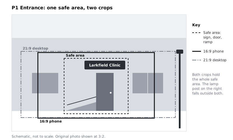
Follow a few rules as you place each crop:
- Do not cut through the subject's face or joints. Crop above the head with a little headroom, or through the upper forehead on a tight portrait; crop between joints (mid-thigh, mid-upper arm), never at a neck, wrist or knee.
- Leave room in the direction people look. If the nurse faces right, place her left of centre so she looks into the frame, not out of it.
- Keep the subject away from where the interface will sit. On phones, the top of the Home photo sits under the app header; keep faces and the sign out of the top 15 per cent of the phone crop.
When a crop is right, copy the crop rectangle into your screen as a frame of the same size, give it the photo as an image fill and use your tool's Crop mode to position the photo to match. Place, crop and mask images in Figma covers the fill and crop controls if you have not used them.
Check it worked
Each of the three frames on the Photos page shows the original photo with a dashed Safe area rectangle and two named crop rectangles. Both crops contain the whole safe area with space around it, and no crop edge passes through a face, neck, wrist or the clinic sign.
Step 6 · Check every crop at real size
Crops that look right on a large canvas can fail at the size people see them. Put each crop into the screen it belongs to and look at it at 100% zoom.
For phone crops, use a frame 360 px wide: a common width for budget Android phones, which many of Larkfield's patients use. For desktop crops, use the width of your content column, such as 1200 px.
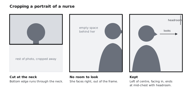
At 100% zoom, check:
- Recognition. Can you name what the photo shows in two seconds without the caption? At 360 px wide, P1's sign should be readable or at least clearly a sign, and the door clearly a door.
- Faces. Faces are big enough to read an expression. If a face is smaller than a fingertip on the phone screen, crop tighter or choose a different photo for phones.
- Collisions. Nothing important sits under the header, a floating button or the rounded screen corners.
Check it worked
You have looked at all six crops (three photos, two ratios) at 100% zoom inside their screens. For each one you can write a short note, such as "P1 phone: door and sign clear, ramp visible on the left", in your sheet's Phone ratio and Desktop ratio cells beside the ratio. Any crop that failed has been moved and checked again.
Step 7 · Write alt text for each photo
Alt text is written for someone who cannot see the photo, and it should do the photo's job, not list its contents. Go back to the Job column: the alt text carries that job in words.
- P1, App Home: "The front entrance of Larkfield Clinic, with a ramp to the left of the door." (This matches the alt text from the high-fidelity tutorial; keep one wording everywhere the photo appears.)
- P2, Before your visit: "A receptionist at the front desk of Larkfield Clinic, next to the check-in screen where you sign in on arrival."
- P3, About us: "A Larkfield nurse checking a patient's blood pressure in a consulting room."
A few rules for these:
- Do not start with "Image of" or "Photo of". A screen reader already announces it as an image.
- Do not guess things you cannot know from the photo, such as someone's ethnicity, age or health. Describe what the job needs.
- If the caption below the photo already says everything the photo shows, the alt text can be shorter, but do not leave it empty. Empty alt text (
alt="") is for decorative images only, and none of these three is decorative. - Write alt text in each language the site is published in. If Larkfield's site has a French or Hausa version, the alt text is translated along with the page.
Draft alt text with AI and edit it shows why context matters more than description if you want to go further.
Check it worked
The Alt text column has one entry per photo, each under about 150 characters, none starting with "Image of", and each one says something that matches the row's Job. Read each one aloud with your eyes closed: you know what the photo is for.
Step 8 · Set a size budget for each photo
A large photo is the slowest thing on most pages, and many patients pay for every megabyte. On prepaid mobile data, which is how many people across Africa get online, a 2 MB photo on the Home screen costs them money every time it loads on a new device. Set a budget per crop before anyone exports a file.
For each crop, write two numbers in the Budget column:
- Export width in pixels. For phone crops, twice the display width, so they stay sharp on high-density phone screens: 720 px for a 360 px crop. For desktop crops, cap the export at 1600 px, which is enough for a photo shown at up to 1200 px on laptop screens, most of which are density 1.
- Maximum file size. For Larkfield: 80 KB for each phone crop and 200 KB for each desktop crop, in WebP or AVIF with a JPEG fallback. These are Larkfield's own limits, not a standard; pick numbers your team can hold to and write them down.
For Larkfield, that gives:
- P1 Entrance: phone 16:9 at 720 × 405 px, max 80 KB; desktop 21:9 at 1600 × 686 px, max 200 KB.
- P2 Reception: phone 4:5 at 720 × 900 px, max 80 KB; desktop 3:2 at 1600 × 1067 px, max 200 KB.
- P3 Nurse: phone 1:1 at 720 × 720 px, max 80 KB; desktop 3:2 at 1600 × 1067 px, max 200 KB.
Busy, detailed photos compress less well than calm ones. If P2 cannot get under its budget, choose a calmer frame from your shortlist rather than lowering the quality until it looks smeared.
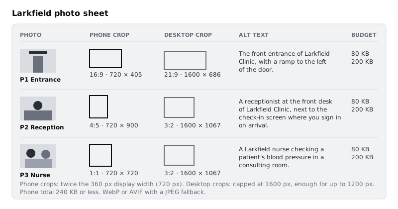
Hand the sheet and the Photos page to whoever builds the pages. Serve responsive images with srcset and picture shows how a developer turns two crops per photo into the right file for each screen. For brevity, that tutorial puts all three photos on one "Visit us" page, art-directs only P1 with its 16:9 and 21:9 crops, and serves P2 and P3 at 3:2 on every screen; on your own pages, build each photo's phone crop the same way it builds P1's.
Check it worked
Every row of your Photo sheet has all twelve columns filled. Each crop has an export width and a maximum size in KB, and the three phone crops together come to 240 KB or less. If you export one crop now and check its file size, it is within its budget.
Next steps
You have three photos chosen for a job, licensed, consented, consistently treated, cropped for two shapes, described and budgeted. From here:
- Place, crop and mask images in Figma goes deeper on image fills, crop mode and masks.
- Serve responsive images with srcset and picture builds the phone and desktop crops into a page that downloads only what each screen needs.
- Draft alt text with AI and edit it practises alt text on photos, icons and charts.
- Choose and use icons consistently applies the same "one set, one treatment" thinking to Larkfield's icons.
Part of these paths
Related tutorials
- Choose and use icons consistentlyYou will have a 12-icon set for the Larkfield Clinic app, taken from one open-licence icon family, built as named Figma components at three sizes, with a label decision for every icon and a short usage rule beside them.
- Place, crop and mask images in FigmaYou will have a doctor's profile card in Figma with a cover photo, a circular portrait, a tiled pattern strip and a masked status band, and you will know when to use an image fill and when to use a mask.
- Serve responsive images with srcset and pictureYou will have a clinic web page whose photos come in several widths and in AVIF, WebP and JPEG, with a closer crop of the entrance on phones, lazy loading below the fold and space held for every image, plus a script that reports which file each screen size downloads.
Need this done for you?
Padding does this work for growing companies, from the first diagnosis to a system that keeps working.
Get new tutorials