UI and visual design · Beginner · 14 min
Choose between cards, lists and tables
By Padding · Updated 18 Nov 2026
Figma (web) · November 2026
You will have the same five clinic services laid out as cards, a list and a table, scored against four questions, with one layout chosen for patients, one for staff and a short written rule for when each container wins.
On this page
Cards, lists and tables are three ways of putting a set of similar things on a screen. Teams often pick one by habit: cards because the last app used them, a table because the data came from a spreadsheet. The choice changes how fast people find one item, whether they can compare items, how many fit on a phone, and what breaks when the text gets bigger.
The honest way to choose is to lay out the same content all three ways and test each layout against the jobs people have. That is the whole tutorial. You take the five services at Larkfield Clinic, a fictional community clinic, and build a cards frame, a list frame and a table frame at the same phone width, with the same facts in each. Then you score them, pick one for patients booking an appointment and one for reception staff, and write down the rule you learned so the next decision is quicker.
The services are the five from the Larkfield booking app: GP appointment, Nurse appointment, Blood test, Vaccination and Medication review. The worked example is Tuesday 9 December at 10:35, the morning a patient books the 10:30 Nurse appointment.
Step 1 · Write down the content and the two jobs
Before you draw anything, fix what every layout must hold. If one version gets an extra field, the comparison is no longer fair.
Make a page called Containers and add a text note with the content. For each service, write five facts:
- GP appointment: 10 min, seen by a GP, "New or ongoing health problems", 31 booked today, 6 free today
- Nurse appointment: 15 min, seen by a nurse, "Dressings and blood pressure", 18 booked, 5 free
- Blood test: 10 min, seen by a nurse, "If a clinician asked for one", 12 booked, 3 free
- Vaccination: 15 min, seen by a nurse, "Flu, travel and routine vaccines", 9 booked, 0 free
- Medication review: 20 min, seen by a GP, "A check of all your medicines", 4 booked, 2 free
Under the content, write the two jobs as plain sentences, each with the person, the device and the question they arrive with:
- Patient, on their own phone: "I need a blood test. Which one do I tap?" They pick one service, once, and move on to Pick a time.
- Receptionist, at the desk on a laptop: "Someone is on the phone asking for anything today. What still has space, and how long does it take?" They compare services, many times a day.
Most container decisions go wrong because only one of these jobs was written down.
Check it worked
Your Containers page has a note listing all five services with the same five facts each, no gaps, and two job sentences that each name a person, a device and a question.
Step 2 · Lay out the services as cards
Draw a frame 360 by 800 and name it Services / Cards. 360 pixels is a narrow but common Android width, and among the most common phone resolutions in Africa, so a layout that works here works on most phones. Give the top of the frame the same fixed space in all three versions: a 24 pixel status bar, then the heading Choose a service at 24 bold with 24 pixels above it and 16 below. That leaves the content starting 88 pixels down, with 712 pixels of screen below it. Keep a 16 pixel margin at each side.
Build one card with auto layout, vertical, padding 20, gap 12, white fill, a light border and a corner radius of 10:
- service name, 18, bold
- a caption line:
10 min · GP · 6 free today, 14 and in a muted grey - the description at 16:
New or ongoing health problems - a secondary button, full width, 48 high (the Larkfield button height), labelled
Choose
Make it a component, then place five instances in a vertical auto layout stack with a gap of 16 and fill in each service. If you have not built a card with auto layout before, Build a responsive card with auto layout covers the sizing in detail.
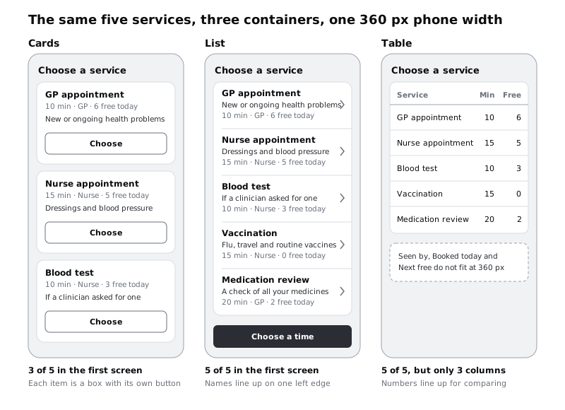
Notice what the card format pushes you towards. Each item becomes a box with its own action, and the box invites more: an icon, a photo, a second button. Resist adding any of them for now. The comparison only works if all three versions carry the same facts.
Check it worked
Services / Cards holds five instances of one card component, each showing name, caption, description and a Choose button. Select one card and read its height in the right sidebar: with the sizes above it is about 180 pixels. Three cards and their two gaps take about 580 of the 712 pixels below the heading, and a fourth would need about 780, so three whole cards sit inside the 800 pixel frame, with Vaccination and Medication review below the fold.
Step 3 · Lay out the same services as a list
Duplicate nothing from the cards frame. Draw a fresh 360 by 800 frame named Services / List, with the same status bar, Choose a service heading and side margins.
A list is one surface divided into rows, with no box around each item. Build a row with horizontal auto layout and padding 16:
- on the left, a vertical stack: service name (16, bold), the description, then the caption
10 min · GP · 6 free todayin muted grey - on the right, a chevron, centred vertically
- a 1 pixel divider along the bottom
Set the text stack to fill width so the chevron always sits on the right edge, and make the row a component. If you have the Larkfield List row component from the wireframe series, use it and add the description line. Stack five rows with no gap (the dividers do the separating) on one white surface, and put the Choose a time button at the bottom of the frame, as on the Larkfield Choose a service screen. Tapping a row selects it; the button moves on.
Check it worked
Services / List shows all five services and the Choose a time button inside the 800 pixel frame without scrolling. Every service name starts at the same x position, which you can confirm by selecting the five name layers and checking that the X value in the right sidebar shows one number, not "Mixed".
Step 4 · Lay out the same services as a table
Draw a third 360 by 800 frame, Services / Table, with the same status bar, heading and margins. A table puts each fact in a column with a header, so values line up down the page.
Start with every column the content has: Service, Min, Seen by, Booked, Free. You will run out of width at about the third column. That is the first finding, so write it down rather than squeezing the text. Keep the three columns that fit (Service, Min, Free) and note on the canvas which columns are missing.
Build it with auto layout so it stays editable: a header row and five data rows, each a horizontal auto layout frame with the same column widths. Right-align the number columns, and if your font offers tabular figures in the text settings, turn them on so the digits sit in straight columns. Inter, used in the Larkfield file, has them.
Leave the description out. A table cell is the wrong place for a sentence, and if you wrap "Flu, travel and routine vaccines" inside a 140 pixel column, the row heights stop matching and the table loses the straight lines that make it worth using.
Check it worked
Services / Table shows a header row and five data rows, all five services visible. The numbers in Min and Free line up on their right edge. A short note beside the frame lists the columns that did not fit and the description you left out.
Step 5 · Score each layout on four questions
Put the three frames side by side. Now test them against four questions, one at a time, and write a short verdict per frame in a 4 by 3 grid on the canvas.
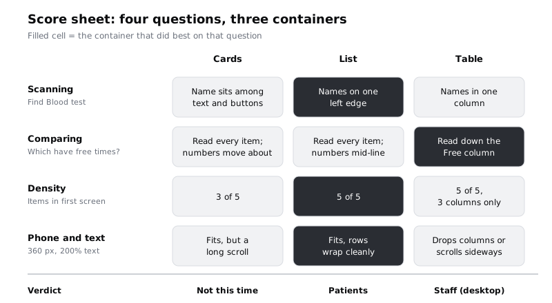
- Scanning. Ask someone who has not seen the frames to find Blood test, and watch where their eyes go. If nobody is free, look away, look back at each frame and count how many things you read before you land on it. In the list, names sit on one left edge with nothing between them but short lines. On the cards, names are separated by descriptions and buttons.
- Comparing. Ask: "Which services still have a free time today, and which is shortest?" In the table you read down the Free column, then the Min column. In the cards and the list, the numbers are mid-sentence in a caption, so you read every item, and on the cards you also scroll.
- Density. Count the services that fit in the first screen. Write the number, not a feeling.
- Phone and text size. Set every text layer in each frame to roughly double its size, a quick stand-in for the 200 percent text zoom that WCAG expects content to survive. Then look at what breaks. Lists wrap onto more lines and grow taller, which is fine. Cards grow taller too, and you now see one and a half at a time. The table runs out of width almost at once: headers clash, and you either drop another column or the reader has to scroll sideways.
Fill each cell of the grid in a few words, then shade the one container that did best on each question.
Check it worked
Your canvas has a grid with four rows and three columns, every cell filled with a short verdict, and one shaded winner per row. The density row holds numbers (for example 3, 5 and 5), not words such as "good".
Step 6 · Try longer words and a slow connection
Two more checks catch problems a tidy English mock-up hides.
Longer words. Larkfield serves a mixed community. Replace two service names with longer versions, as a translation might produce, such as Rendez-vous avec l'infirmière for Nurse appointment, and double the length of the Medication review description, as a Swahili or Yoruba version might need. A list row wraps the name onto a second line and gets taller. A card does the same. A table column has to grow, which pushes the Free column off the edge or forces the name to wrap and the rows to go uneven. Write down which frame needed the most fixing.
Slow or costly data. Cards tempt designers into a photo for each service. On a low-end Android phone with prepaid data, five photos on a list of choices cost data and load time and help nobody pick a blood test. Note it beside the cards frame as a rule for later: if the content has no image that helps the decision, cards lose one of their main reasons to exist. Design for slow networks and costly data covers image budgets in more depth.
Undo the text changes once you have your notes.
Check it worked
Each frame has a sticky note or text note with one line on what broke with longer names. The table's note says which column was pushed out or which rows went uneven. Your three frames are back to their English text.
Step 7 · Pick one for patients and one for staff
Go back to the two jobs from the first step and match them against the score sheet.
Patients get the list. Their question is "which one do I tap?", a single choice from five items alike in shape. The list won scanning, density and the phone check, and its caption still carries the duration for the patient who wants it. Rename the frame Services / List · Patients. The cards were not wrong, just not needed: five similar text-only services gain nothing from a box each, and each Choose button is one more thing to read.
Staff get the table, at desktop width. The receptionist's question is a comparison, which only the table answered well, and the phone was where the table struggled. Duplicate Services / Table, name the copy Services / Table · Staff, and set its width to 1280. Now every column fits: Service, Min, Seen by, Booked, Free, plus a Next free column if you want one (11:00 for Nurse appointment, Wed 10 Dec for Vaccination). For the full treatment of sorting, density and row actions, follow Design a data table people can scan.
Under each chosen frame, write two sentences: which job it serves, and which question from the score sheet decided it.
Check it worked
You have a frame named Services / List · Patients, a 1280 wide frame named Services / Table · Staff showing all five columns with no column cut off, and two short reasons on the canvas, each naming a job and a score sheet row. The cards frame is still on the page, marked "Not chosen" with a one-line reason.
Step 8 · Write the rule for when each container wins
The last step turns one decision into a rule you can reuse. Write it on the canvas as two questions asked in order, with an answer for each.
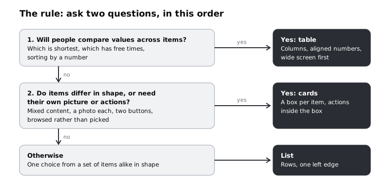
Phrase it in your own words, but keep it short enough to fit on a sticky note. For example:
- Table when people compare values across items, often with numbers, and usually on a wide screen. On a phone, plan what happens to the columns before you commit.
- Cards when each item is different in shape or needs its own image or several actions, such as a news feed or a set of appointments each with Reschedule and Cancel.
- List for everything else, especially a single choice from items that look alike. It is the densest, the easiest to scan and the most forgiving of long text.
Then test the rule on three screens it has not seen. Larkfield's upcoming appointments for one patient (each with two actions) should come out as cards. The day's appointment book for reception should come out as a table. The list of clinic locations with an address each should come out as a list. If your rule gives a different answer, either the rule or your reading of the job needs another look.
Check it worked
Your canvas has a rule of three lines or fewer, one per container, each starting with the condition that makes that container win. You have written the container your rule picks for the three test screens above, and each answer matches what you would design without the rule.
Next steps
You now have three comparable frames, two decisions with reasons, and a rule you can apply to the next set of items.
- Design a data table people can scan takes the staff table further, with column order, densities, sorting and row actions.
- Make a data table work on a phone deals with the columns that did not fit at 360 pixels.
- Design a dashboard people read at a glance applies the same "start from the question" approach to numbers, lists and charts.
- Make a whole card clickable without breaking accessibility builds the card version in HTML and CSS for the cases where cards do win.
Part of these paths
Related tutorials
- Design a data table people can scanYou will have a desktop appointment table for Larkfield Clinic's reception staff, with columns ordered by task, aligned numbers, two row densities, sortable headers, row actions and a selected state, plus a written spec for every column.
- Design a dashboard people read at a glanceYou will have a one-screen morning dashboard for a clinic manager, built from three questions, with a number, a short chart or a list chosen for each, and a note that maps every element on it to the question it answers.
- Make a data table work on a phoneYou will have tried four phone patterns on the same Larkfield appointment table, matched each one to the task it suits, and finished a 360 px frame for the pattern you chose, with a short note on when the other three would win.
Need this done for you?
Padding does this work for growing companies, from the first diagnosis to a system that keeps working.
Get new tutorials