UI and visual design · Intermediate · 17 min
Set a type scale for an app
By Padding · Updated 18 Nov 2026
Figma (web) and a spreadsheet · November 2026
You will have a type scale for the Larkfield Clinic app worked out from a base size and a ratio, stored as Figma variables and six text styles named by role, shown on a specimen frame with real copy and checked at 200% text size.
On this page
Larkfield Clinic's booking app has five text styles: Heading/L at 28 on 34, Heading/M at 20 on 26, Body at 16 on 24, Body/Small at 14 on 20 and Label at 14 on 20 in Semi Bold. They were chosen one at a time, each to fix the screen in front of the designer, and it shows. The jump from heading to subheading is 1.4 times, the jump from subheading to body is 1.25 and the jump from body to small is 1.14. Two of the line heights, 34 and 26, sit off every spacing step the app uses. The appointment time on the Booked screen, the one thing a patient must remember, shares a style with every screen title.
None of that is broken. It only gets in the way when someone needs a seventh size: there is no rule to say what it should be, so it ends up as 22 or 23 or whatever looks right that afternoon. A type scale is that rule. You pick a base size and a ratio, let the arithmetic propose the sizes, and then decide which ones the app actually uses.
This is part 4 of the series that turns the Larkfield app into a minimal design system. Part 1 audited the screens, part 2 split the values into primitive and semantic tokens, and part 3 built the colour ramps. Here you do the same for type. Which typeface to use is a separate decision, covered in Choose and pair typefaces for an interface; Larkfield keeps Inter.
Step 1 · Write down what the current styles are doing
Open the Larkfield file and add a page called Type scale. Open your spreadsheet next to it, start a tab called Type, and list every text style with the jobs it does on the screens. Use part 1's audit sheet for the type rows; it already merged strays such as the 15 on 22 service description into Body/Small.
Heading/L, 28 / 34: screen titles, Home'sLarkfield Clinic, the time on BookedHeading/M, 20 / 26: header titles,Tue 9 Dec,Your appointmentBody, 16 / 24: sentences people readBody/Small, 14 / 20: durations, hints, error linesLabel, 14 / 20 Semi Bold: buttons, time slots, field labels
Add two columns: the ratio from each size to the one below it (28 ÷ 20 = 1.4, 20 ÷ 16 = 1.25, 16 ÷ 14 = 1.14), and whether the line height divides by 4. Then mark any style doing two jobs that deserve different weight in the hierarchy. On Larkfield that is Heading/L: a screen title and the booked time are not equally important.
Check it worked
Your Type tab lists five styles with their sizes, line heights, jobs, the ratio to the next size down and a yes or no for "line height divides by 4". Two rows say no (34 and 26), the ratios are not equal, and one row is flagged as doing two jobs.
Step 2 · Pick a base size and compare three ratios
The base is the size of body text, because body text is what people read most. For an app used on phones, 16 px is a sound base: it is the browser default for 1rem, Larkfield's body is already 16, and smaller than that makes paragraphs hard work on a small screen.
Every other step is the base multiplied or divided by the ratio. Step +1 is 16 × r, step +2 is 16 × r², and step −1 is 16 ÷ r. In the spreadsheet, put the step numbers −1 to +4 down column A and three candidate ratios across row 1: type 1.2 in B1, 1.25 in C1 and =4/3 in D1. Then fill the grid with =16*B$1^$A2 and copy it across and down. Type the third ratio as the formula =4/3, not as 1.333: the rounded number drifts at the higher steps (it gives 50.50 at step +4 instead of 50.57). With these ratios you get:
- Ratio 1.2: 13.33, 16.00, 19.20, 23.04, 27.65, 33.18
- Ratio 1.25: 12.80, 16.00, 20.00, 25.00, 31.25, 39.06
- Ratio 4 ÷ 3 (about 1.333): 12.00, 16.00, 21.33, 28.44, 37.93, 50.57
Each list runs from step −1 to step +4.
Do not choose from the numbers alone. On the Type scale page, draw three 390 px wide frames, one per ratio, and set Check your booking at steps +3, +2 and +1 and a body sentence at step 0 in each. Look at them at 100% zoom, then on your phone through the Figma mobile app or a shared prototype link.
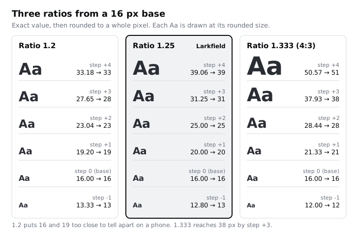
For Larkfield, 1.2 makes step +1 (19) hard to tell from body text at arm's length, so a heading needs bold to do the work size should do. 1.333 is clear, but a title at step +3 is 38 px, and Check your booking at that size fills most of a 360 px phone's width. 1.25 gives four clearly different steps that all fit. Choose 1.25.
A product with long reading pages or a desktop dashboard might choose differently. That is fine; the point is that you can say why.
Check it worked
Your sheet has a six-by-three grid matching the lists above to two decimals, with D1 holding =4/3. On the Type scale page there are three frames, one per ratio, and a text note under them names the ratio you chose and gives one sentence of reasoning that refers to what you saw on the phone.
Step 3 · Round the sizes and keep only the steps the app needs
Screens render whole pixels more predictably, and whole numbers are easier to talk about. Add a column with =ROUND(C2,0) for the 1.25 values. The 1.25 column becomes 13, 16, 20, 25, 31 and 39.
Now match roles to steps. Most products need five to seven text styles; more than that and nobody can remember when to use which. Larkfield needs six roles, and they do not map one to one onto the steps:
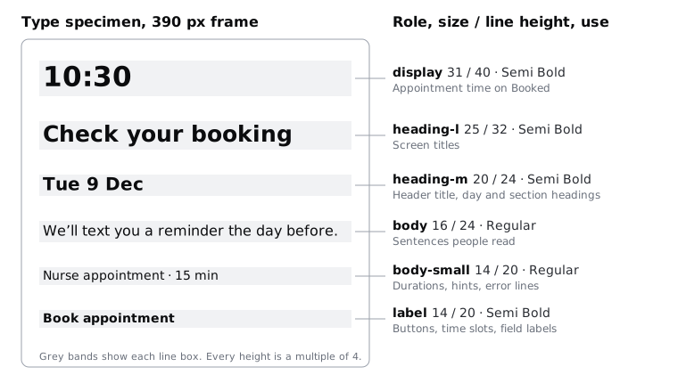
- display takes step +3, 31 px. It is for the appointment time on Booked and nothing else.
- heading-l takes step +2, 25 px, for screen titles.
- heading-m takes step +1, 20 px, for header titles and day and section headings.
- body is step 0, 16 px.
- body-small would be step −1, 13 px. Overrule the arithmetic here. Durations, hints and error messages are text patients must read, many of them on budget phones in bright light, so set a floor of 14 px and use 14.
- label is 14 px too, set apart from body-small by weight (Semi Bold) rather than size.
Step +4, 39 px, has no job in this app. Leave it out of the system rather than keeping it "in case". If a marketing page needs it one day, the ratio tells you what it is.
Write the floor down as a rule next to the table: "No text below 14 px." A scale is a proposal; the rules are what stop drift.
Check it worked
Your sheet has a role table with six rows: display 31, heading-l 25, heading-m 20, body 16, body-small 14, label 14. Every size except 14 comes straight from the rounded 1.25 column, the 14 has a written reason, and no size in the table is unused.
Step 4 · Set line heights on a 4 px rhythm
Line height decides how much vertical room each line of text takes. If every line height is a multiple of 4, text boxes line up with the spacing scale part 5 builds on a 4 px base, and stacked components add up to round numbers.
Use a target ratio per kind of text, then round up to the next multiple of 4 with =CEILING(size*target, 4):
- Headings and display: target 1.2. Large text needs less space between lines.
- Body: target 1.5. Body text wraps over several lines, and the extra room helps the eye find the next line.
- body-small and label: target 1.4.
Rounding up rather than to the nearest step means a line never gets tighter than its target. For Larkfield the results are:
- display: 31 × 1.2 = 37.2, line height 40 (actual ratio 1.29)
- heading-l: 25 × 1.2 = 30.0, line height 32 (1.28)
- heading-m: 20 × 1.2 = 24.0, line height 24 (1.20)
- body: 16 × 1.5 = 24.0, line height 24 (1.50)
- body-small: 14 × 1.4 = 19.6, line height 20 (1.43)
- label: 14 × 1.4 = 19.6, line height 20 (1.43)
Then test the tight ones with text that needs room above and below the letters. Larkfield serves patients who write their names in several languages, so set heading-m and body-small on a test frame with a string such as Ẹ̀ Ọ́ Ṣ ɓ ɗ ƙ Agnès Ğ Åsa (dot-below and tone marks used in Yoruba, hooked letters used in Hausa, and accents on capitals). If an accent on one line touches the descender of the line above, raise that role's line height by one 4 px step.
Leave letter spacing at 0 for every role for now. Inter is drawn for interface sizes, and changing tracking is a typeface decision, not a scale decision.
Check it worked
The role table now has a line height column in which every value divides by 4 (40, 32, 24, 24, 20, 20) and every actual ratio sits between 1.2 and 1.5. Your diacritics test frame shows no marks touching the line above at heading-m or body-small, or you have raised a line height and noted why.
Step 5 · Store the scale as type tokens
Type gets the same two layers part 2 gave colour. Raw numbers go in the Larkfield primitives collection, and role-named tokens in the Larkfield collection alias them, so a screen only ever uses roles.
In Larkfield primitives, add number variables named by value, following part 2's rule that a primitive is family/step and ends in a number:
font-size/14,font-size/16,font-size/20,font-size/25,font-size/31line-height/20,line-height/24,line-height/32,line-height/40
Add one string variable, font-family/inter, with the value Inter. This name breaks the ends-in-a-number rule, and on purpose: a typeface has no numeric step, so a string primitive is named by its value, in lowercase. The name still tells you its layer, because no semantic token starts with a family name.
In Larkfield, add the semantic tokens. Part 2's naming rule is category, then role; type tokens need a third part for the property, so they read type/<role>/<property>. Create a number variable for each role's size and line height and set its value to the primitive by choosing it from the variable picker (an alias), not by typing the number:
type/display/size→font-size/31,type/display/line-height→line-height/40type/heading-l/size→font-size/25,type/heading-l/line-height→line-height/32type/heading-m/size→font-size/20,type/heading-m/line-height→line-height/24type/body/size→font-size/16,type/body/line-height→line-height/24type/body-small/size→font-size/14,type/body-small/line-height→line-height/20type/label/size→font-size/14,type/label/line-height→line-height/20
Add type/family as a string aliasing font-family/inter. Weights stay in the text styles in this part; part 7's style guide records which role uses which weight.
Part 2's rule says that adding a family or category is a team decision written in the change log, and this step adds several. Write one change log entry that records:
- three new primitive families:
font-sizeandline-height(step is the value in pixels) andfont-family(named by value, the one exception to "ends in a number") - one new semantic category,
type, whose names have three parts,type/<role>/<property>, with propertiessize,line-heightandfamily - the six type roles:
display,heading-l,heading-m,body,body-smallandlabel
Then add the same lists to the rule paragraph on your Tokens frame, so the next person can name a type token without asking.
Check it worked
Larkfield primitives has five font-size variables, four line-height variables and one font-family variable. Larkfield has thirteen type variables, and clicking any of them shows an alias to a primitive rather than a typed number. No primitive is left without a semantic token pointing at it, and your change log has an entry naming the new families, the type category and its three-part shape.
Step 6 · Rebuild the text styles by role
Edit the existing styles rather than creating new ones beside them, because editing a style updates every layer that uses it. Click empty canvas, find each style in the right sidebar, open its edit panel, rename it and bind its properties to the tokens with the variable control next to each field:
Heading/Lbecomesheading-l: Inter Semi Bold, sizetype/heading-l/size, line heighttype/heading-l/line-height.Heading/Mbecomesheading-m: Inter Semi Bold, with the heading-m tokens.Bodybecomesbody,Body/Smallbecomesbody-smallandLabelbecomeslabel, each with its own tokens.
Bind the font family on all of them to type/family. Then make display: set a text layer reading 10:30 in Inter Semi Bold, bind it to the display tokens, and create a style from it in the Typography section of the right sidebar.
Now go to the Booked screen, select the appointment time and apply display. That is the only layer that should change by hand. Every screen title moves from 28 to 25 and every heading-m line box from 26 to 24 on its own. Step through the screens in flow order and look for anything that now wraps or shifts: a title that fitted on one line at 28 will still fit at 25, but a component with a fixed height may now have 2 px of slack.
Check it worked
Click empty canvas: the text styles list shows exactly six styles, display, heading-l, heading-m, body, body-small and label, with nothing left under the old names. Open any style's edit panel: font family, size and line height show variable names, not typed values. On Booked, the appointment time shows display in the Typography section, and Home's Larkfield Clinic shows heading-l.
Step 7 · Build a specimen frame with real copy
A specimen frame is the scale's shop window. It shows every role at once, with the words it will actually carry, so a reviewer sees the hierarchy and not abstract "Aa" samples.
On the Type scale page, draw a 390 px frame called Type specimen with a vertical auto layout and 24 px between rows, a step on the spacing scale part 5 builds. Add one text layer per role, each using its style and copy from the screens:
- display:
10:30 - heading-l:
Check your booking - heading-m:
Tue 9 Dec - body:
We'll text you a reminder the day before. - body-small:
Nurse appointment · 15 min - label:
Book appointment
To the right of each row, add a note in body-small with the role name, size and line height, weight and where it is used, as in the diagram in the previous step. Under the frame, paste the two rules: the 14 px floor and "line heights are multiples of 4".
Read the frame from top to bottom. Each row should look clearly less important than the one above, except body-small and label, which differ by weight at the same size. If two rows look the same, a role is redundant or a weight is wrong.
Check it worked
The Type specimen frame holds six rows of real Larkfield copy, each using a different text style, and each with a note giving role, size, line height, weight and use. Click each of the six text layers in turn: the Typography section of the right sidebar shows a style name (display, heading-l and so on), not a list of plain font, size and line height values.
Step 8 · Check every role at 200% text size
People raise text size. WCAG 2.2 asks that text can be resized to 200% without losing content or function, and Android has allowed system font scaling up to a maximum of 200% since Android 14. iOS goes further: with the larger accessibility sizes turned on, Dynamic Type takes body text from 17 pt at the default Large setting to 53 pt at the largest, about three times. Many patients use phones around 360 px wide, often with font size turned up, so check at that width rather than only at 390.
Android scales large text less than small text (the curve is nonlinear), and iOS Dynamic Type has its own size ladder, so doubling every size is not the exact result on either platform. It is the WCAG 1.4.4 benchmark and Android's ceiling, which makes it a good first design check; if your app also ships on iOS, repeat the check on the body and label rows at three times their size. Duplicate the Pick a time and Confirm screens, set the frames to 360 px wide, and in each duplicate temporarily double the size and line height of every text layer (detach the style on the duplicates only, so the real styles stay put). Then look at what breaks.
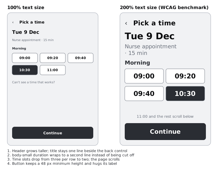
Write one note per role in a 200% notes text layer beside the specimen. For Larkfield they read something like:
- display (31 → 62):
10:30still fits on one line at 360 px. The date line under it wraps; let it. - heading-l (25 → 50):
Check your bookingwraps to two lines. Titles must wrap, never truncate, so no fixed-height title areas. - heading-m (20 → 40): the header title still sits beside the 44 px back control, but the header must grow in height. Long titles belong in the page, not the header.
- body (16 → 32): screens get long and must scroll. The Continue button can stay pinned at the bottom only if the content above it scrolls.
- body-small (14 → 28): durations wrap under the service name, so list rows hug their content height.
- label (14 → 28):
10:30no longer fits three slots to a row; slots reflow to two per row.Book appointmentmay wrap, so buttons keep a 48 px minimum height and grow.
Several of these notes are rules for components rather than for type. Copy them into your list for part 6, which specifies the components. When the scale moves into code, sizes go in rem so the browser's text setting still applies; Build fluid type with CSS clamp() does that with this scale. Text spacing matters too: WCAG 1.4.12 expects layouts to survive a reader raising line height to 1.5 times the size, which is another reason for hugging heights over fixed ones.
Check it worked
Your Type scale page has two 360 px duplicates at doubled sizes and a 200% notes layer with six lines, one per role, each naming what wraps or reflows and the rule that keeps it usable. None of the notes says text is cut off or overlaps without a fix beside it, and the component rules are copied into a list for part 6.
Next steps
The scale is set and every text layer in the app traces back to six roles and thirteen tokens. Part 5, Define a spacing scale and corner radius tokens, builds the 4 px spacing scale these line heights were chosen to sit on.
For long help pages inside the app, Make body text readable: measure, leading and size goes further on line length and paragraph spacing than a scale can. To take this scale into CSS with sizes that stretch between phone and desktop, see Build fluid type with CSS clamp(). If you skipped part 3, Build a colour palette with tonal ramps sets up the two variable collections this part adds to.
Part of these paths
Related tutorials
- Build a colour palette with tonal rampsYou will have four ten-step colour ramps built in OKLCH on a Figma palette page, each step labelled with its contrast on white and on the darkest grey, and the Larkfield semantic colour tokens pointing at ramp steps.
- Define a spacing scale and corner radius tokensYou will have a seven-step spacing scale on a 4 px base, three corner radius tokens and two border widths in Figma variables, a reference frame with the rules for choosing a step, and a Larkfield Pick a time screen whose every gap, padding, radius and stroke is a token.
- Make body text readable: measure, leading and sizeYou will have before and after frames of a long help article, reset for comfortable reading on phone and desktop by changing line length, line height, paragraph spacing, size and alignment, checked at 200% text size and summed up in a short text settings rule.
Need this done for you?
Padding does this work for growing companies, from the first diagnosis to a system that keeps working.
Get new tutorials