UI and visual design · Beginner · 14 min
Fix a cluttered screen with alignment
By Padding · Updated 18 Nov 2026
Figma (web), or any design tool with rulers and guides · November 2026
You will have repaired a cluttered settings screen so that seven different left edges become two, with icons seated on their labels, centring used only where it helps, and a before and after with the alignment lines drawn on.
On this page
A screen can have tidy colours, sensible type and good copy and still look messy. When you cannot say why, count the edges. Each place where things start (the left side of a heading, an icon, a paragraph, a button) is a line the eye has to find. Three lines read as order. Seven lines a few pixels apart read as mistakes, because the eye notices that 16 and 20 are almost the same and wonders whether the difference means something.
This tutorial is a repair job. You build a small settings screen that has every common alignment fault: seven left edges, centred text mixed in with left-aligned rows, icons sitting high against their labels, and four right edges where there should be one. Then you count the lines, cut them to two left edges and one right edge, fix the places where lining up the boxes is not enough, and decide where centring belongs. You finish with a before and after, side by side, with the lines drawn on so anyone reviewing it can see what changed.
The steps use Figma, but nothing here depends on it. Any tool that shows X positions and lets you drag out guides will do, and the same counting works on a screenshot of a live app.
Step 1 · Build the cluttered screen
Make a page called Alignment repair and draw a frame 360 wide and 500 tall. Name it Settings / Before. 360 is a common width for Android phones, including many low-cost ones, so it is a fair test: a screen that is tidy at 360 has little room to hide mistakes.
Add these layers, using the X position field in the right sidebar to place each one exactly. The values are deliberately inconsistent; that is the point.
- Back arrow icon in a 24 by 24 box at X 12, and the title
Settingscentred in the top bar - Section label
ACCOUNTat X 16 - A 40 px grey circle for the profile photo at X 16, with
Amara MensahandEdit profilestacked beside it at X 84 - Section label
NOTIFICATIONSat X 20 - Two rows: a bell icon (24 box) at X 20, a label at X 56 (
Appointment reminders, thenSMS reminders) and a toggle on the right. Put the first toggle's right edge at 336 and the second's at 340. Line the top of each icon up with the top of its text layer. - The help line
Reminders arrive 24 hours before your visit.centred across the frame - A row with
Languageat X 28 andEnglishright-aligned, ending at 330 - A
Sign outbutton 280 wide at X 40, with its label centred - A
Delete accounttext link at X 16
Look at the result at 100% zoom. It is not broken. Nothing overlaps and everything is readable. It just looks unsure of itself, and that is the feeling you are about to take apart.
Check it worked
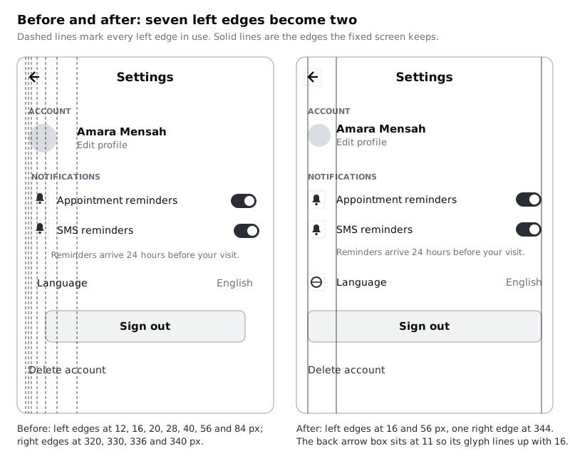
Select each layer in turn and read its X value in the right sidebar. You should find left edges at 12, 16, 20, 28, 40, 56 and 84, right edges at 320 (the Sign out button), 330 (English), 336 and 340 (the toggles), and two centred text layers (the title and the help line).
Step 2 · Count the alignment lines
Turn on rulers from the main menu (View, then Rulers). Select the Settings / Before frame and drag a guide out of the left ruler onto it for every left edge you found: 12, 16, 20, 28, 40, 56 and 84. Guides dragged onto a selected frame belong to that frame, so they stay with it when you move it. Add right-edge guides at 320, 330, 336 and 340. The Sign out button counts twice, once on each side: it starts on 40 and ends on 320, and both are edges nothing else shares.
Now write the count on the canvas next to the frame, as a text layer, so it is part of the record:
- Left edges: 7 (12, 16, 20, 28, 40, 56, 84)
- Right edges: 4 (320, 330, 336, 340)
- Centred text: 2 (title, help line)
- Icons aligned by top edge, not by the text: 2
This is the whole diagnosis. Most of the clutter on this screen is these numbers. If you have a real screen in front of you, do the same count on it before changing anything. A screenshot dropped into a frame works fine: drag guides onto it where things start.
Check it worked
The frame shows eleven guides, seven on the left half and four on the right half. Next to it, a text layer lists the counts. Hold Alt (Option on a Mac) with a guide selected and hover another layer: Figma shows the distance, which lets you confirm a guide sits exactly on an edge rather than a pixel off.
Step 3 · Choose two left edges and one right edge
Before moving anything, decide where things should start. A screen like this needs very few lines:
- Outer edge at 16. Everything that starts a row starts here: section labels, the profile photo, row icons, the button and the
Delete accountlink. - Text edge at 56. Every label that follows an icon or photo starts here. With a 24 px icon at 16 and a 16 px gap, text lands on 56. With a 32 px photo and an 8 px gap, it lands on 56 too, so make the photo 32 instead of 40.
- Right edge at 344. Toggles, the
Englishvalue and the button's right side all end here, 16 in from the frame, mirroring the outer edge.
The useful test for each element is not "where does it look nice" but "which line does it belong to". The Language row is the awkward one: it has no icon, so its label could sit on 16 or on 56. On 16 it looks like a section heading; on 56 it floats with nothing to its left. Give it a globe icon at 16 and the label moves to 56, and the row now matches the two above. Fixing alignment often means adding or removing one small thing, not only moving things.
The help line is the other decision. It explains the two reminder rows, so it belongs under their labels at 56, left-aligned, not centred across the screen.
Check it worked
Write a mapping next to the frame, one line per element, such as ACCOUNT → 16, Amara Mensah → 56, SMS toggle → right 344, help line → 56, left-aligned. Every element from step 1 appears once, and each is assigned to 16, 56 or 344. If any element needs a fourth line, write down why before you accept it.
Step 4 · Move everything onto the lines
Duplicate the frame (Ctrl+D or Cmd+D), name the copy Settings / After, and delete the copy's guides by dragging them back to the ruler or selecting each and pressing Delete. Add three new guides at 16, 56 and 344.
Now move each layer to its line by typing its X value. Resize what needs resizing:
- Photo: 32 by 32 at X 16; name and
Edit profileat X 56 - Section labels, icons, globe icon and
Delete accountat X 16 - All row labels and the help line at X 56; set the help line to left-aligned text
- Toggles: set X so the right edge is 344 (X 308 for a 36 px toggle)
English: right-aligned text whose box ends at 344Sign outbutton: X 16, width 328, so both of its edges sit on the outer lines- Back arrow: leave at X 12 for now; it gets its own fix in the optical alignment step
If you rebuild the rows with auto layout instead, the lines come from padding and gaps rather than typed positions: a row with 16 px horizontal padding and a 16 px gap between a 24 px icon and its label produces 16 and 56 every time. That is how the alignment survives the next person who edits the screen. Set the row's alignment to centre vertically, which also prepares the next step.
Check it worked
Select each label and read the X field in the right sidebar: it reads 56. Select each section label, icon, the photo, the button and Delete account: each reads 16. Count again on the new frame. You should get two left edges and one right edge. The only layers that start anywhere else are the back arrow, which you fix in the optical alignment step, and the centred Settings title, which you deal with in the centring step.
Step 5 · Seat icons on their labels
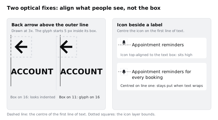
Zoom to 400% on one of the reminder rows in the Before frame. The bell is lined up with the top of the text layer, but a text layer's box includes space above the capital letters, and the text people see sits lower. So the icon looks a little high, as if it is floating off the line.
The fix is to line the icon up with the middle of the first line of text, not the top of the box:
- Select the icon and its label together.
- Align vertical centres (Alt+V, or the button in the right sidebar). For a one-line label this puts the icon in the right place.
- If the label might wrap onto two lines, centring against the whole text block would pull the icon down between the lines. Instead, keep the icon centred on the first line: give the icon the same height as the label's line height, or put both in an auto layout row aligned to the top, wrap the icon in its own frame (an icon layer cannot take padding), and give that frame top padding equal to half of (line height minus icon height).
Test it by typing a longer label: Appointment reminders for every booking. On a 360 px screen, longer translations wrap often (a reminder label in Kiswahili, isiZulu or Hausa can be noticeably longer than the English), so plan for two lines.
Check it worked
At 400% zoom, a horizontal line through the middle of the bell passes through the middle of the lowercase letters on the first line of the label. After you make the label wrap to two lines, the icon has not moved. Undo the longer label when you are done.
Step 6 · Fix optical alignment for icons and round shapes
Lining up boxes is a measurement. Lining up what people see is a judgement, and sometimes the two disagree. Two places on this screen need the judgement.
The back arrow. Icons are drawn inside a square with empty space around the shape. The arrow's tip starts about 5 px inside its 24 px box. Put the box on 16 and the arrow appears at about 21, indented from ACCOUNT and everything else on the outer line. Move the box to X 11 so the visible arrow starts at 16. This is the one place where a layer's X value is off the line on purpose. Note it in your mapping (back arrow → box 11, glyph on 16) so nobody "fixes" it later. Row icons are different: they all share the same internal space, they sit in a column of their own, and the eye compares them with each other, so keep their boxes on 16.
The profile photo. A circle touches its box at only one point on each side, so at the same X as a square or a line of text it can look slightly further in. Zoom out to 50% and compare the left side of the photo with the left side of ACCOUNT above it. If the circle looks inset, move it 1 px left. If you cannot see a difference, leave it on 16. Optical fixes are small, never more than a couple of pixels on a screen this size, and you only make them when you can see the problem at normal size.
Text has a smaller version of the same effect: some capital letters have a little space before them. At these sizes it is rarely worth correcting. Leave text on its line.
Check it worked
Zoom to 100% and look down the left side of the After frame with your eyes half closed. The arrow tip, ACCOUNT, the photo, the icons, the button and Delete account should read as one straight edge. Select the back arrow: its X reads 11 and your mapping explains why.
Step 7 · Decide where centring is right
Centring is not wrong; mixing it with left alignment for no reason is. On this screen there were two centred text layers. Go through each centred or centrable item and ask whether it stands alone or sits in a column of left-aligned things:
- The help line. It sat in a column of left-aligned rows, so centring made it start at its own edge. Left-aligned at 56 it now reads as part of the reminder group. Fixed in step 4.
- The
Sign outlabel. Centred inside a button that spans 16 to 344. The button's edges carry the alignment, so the label inside can be centred. Keep it. - The title
Settings. A centred title in a top bar is common, and a left-aligned one beside the back arrow is also common; platforms differ. Pick one and use it on every screen in the app. If you keep it centred, it is centred on the frame, not on the space left over beside the arrow. - Short, single-purpose screens such as an empty state or a success message, with one icon, one line and one button, can be centred as a whole. A list of settings cannot.
The rule of thumb: centre a thing when it stands alone or sits inside its own bounded shape; align it to an edge when it belongs to a list or a column. Centred multi-line text is also harder to read on a narrow screen, because every line starts in a different place.
Check it worked
In the After frame, only two things are centred: the title and the Sign out label. Write one line beside the frame for each saying why, for example Sign out: centred inside the button, which sits on 16 and 344.
Step 8 · Draw the before and after
Guides are a working aid. To show the change to someone else, draw the lines as real layers that export with the frames.
- Put
Settings / BeforeandSettings / Afterside by side in a section or a frame calledAlignment repair / Review. - Over the
Beforeframe, draw 1 px vertical lines at each of its seven left edges and four right edges. Make them dashed, so they read as "lines that should not all be here". - Over the
Afterframe, draw solid 1 px lines at 16, 56 and 344. - Group each set of lines (
Lines / Before,Lines / After) so you can hide them, and lock the groups so you do not move them by accident. - Under each frame, add a caption with the counts:
Before: 7 left edges, 4 right edges, 2 centred linesandAfter: 2 left edges, 1 right edge, back arrow nudged to 11. - Export the review frame as PNG at 2x and attach it wherever your team reviews design work.
Check it worked
The exported PNG shows both screens with their lines visible. Someone who has not read this tutorial can count the lines on each side and see seven become two without you explaining it. Hide the line groups and the After screen still looks ordered on its own; that is the real test.
Next steps
Alignment decides where things start. Spacing decides which things belong together, and the two are easier to get right together. Try these next:
- Use white space to group and separate content, to set the gaps between the rows and sections you just lined up
- Lay out screens on a column grid, to turn the 16 and 344 lines into margins every screen shares
- Apply Gestalt principles to an interface, for the reasons edges and groups read the way they do
- Create visual hierarchy with size, weight and position, once the screen is ordered and you want the important things to stand out
Part of these paths
Related tutorials
- Use white space to group and separate contentYou will have a dense form-and-summary screen regrouped with space instead of boxes and divider lines, keeping two of its sixteen lines and boxes, and a gap ratio rule you can apply to any screen.
- Lay out screens on a column gridYou will have a Larkfield Clinic information page laid out in Figma on a 4-column phone grid and a 12-column desktop grid, with one deliberate break and a note of the grid values a developer needs.
- Apply Gestalt principles to an interfaceYou will have six annotated before-and-after fixes, one for each of proximity, similarity, common region, continuity, closure and figure-ground, each naming the principle a screen broke and the change that repaired it.
Need this done for you?
Padding does this work for growing companies, from the first diagnosis to a system that keeps working.
Get new tutorials