Figma and design tools · Intermediate · 14 min
Annotate a design for developers
By Padding · Updated 18 Nov 2026
Figma (web) · November 2026
You will have one Figma screen with its error, empty and loading states beside it and notes on validation, truncation, focus order and responsive behaviour, so a developer can build it without asking you what happens when things go wrong.
On this page
A finished screen in Figma shows one moment: the data is there, the text fits, nothing has gone wrong. The developer building it has to code every other moment too. What happens when the email address is wrong? What does the list look like with nobody in it? Where does the keyboard go after a person is removed? If the file does not say, the developer guesses or messages you, and the guesses ship.
This tutorial is about writing those answers down on the canvas, next to the layers they belong to. It is deliberately not about spacing and pixel values. Dev Mode already shows sizes, colours and padding to anyone who inspects a layer, so annotating "16 px" is mostly noise. Your notes are for the things a static frame cannot show: behaviour, states, limits, accessibility and how the layout changes with width.
The worked example is a "Team members" settings screen: an email field and a Send invite button at the top, and a list of people with a Remove button on each row. Follow along with your own screen. Any screen with an input and a list will raise the same questions.
Step 1 · List the questions the screen cannot answer
Before touching the annotation tool, work out what is missing. Open your screen and, in a notes app or a sticky note beside the frame, write one line for each of these, filled in for your screen:
- Input rules. For each field: what counts as valid, when it is checked (on submit, when the field loses focus, or as the person types), and what the message says.
- Actions. For each button: what happens while it waits, what happens on success, what happens on failure, and whether it can be pressed twice.
- Data extremes. For each repeated item: zero items, one item, a lot of items, and the longest realistic text.
- Keyboard and screen readers. The order focus moves through the controls, the name each control is read out as, and where focus goes after something on screen changes.
- Width. What stretches, what wraps, and what moves when the screen is narrower or wider than the frame you drew.
For the Team members screen, the list starts like this: "Email invalid: message text?", "Email already a member: message?", "Send invite while sending: disabled?", "Zero members except me: empty state?", "Long name: wrap or cut?", "After Remove: where does focus go?", "Below 600 px: does the button go under the field?".
Do not answer anything yet. The aim is a complete list of gaps.
Check it worked
You have at least eight questions written down, and at least one falls under each of the five headings. If a heading has none, look again: a screen with no width question has usually only been drawn at one size.
Step 2 · Set up annotation categories and a notes fallback
Figma's annotations are notes attached to a specific layer, shown on the canvas and in Dev Mode. Each one has a category. A new file comes with four: Development, Interaction, Accessibility and Content. They map onto the questions from Step 1 well enough to keep:
- Interaction: input rules and what actions do.
- Content: message wording, text limits and truncation.
- Accessibility: focus order, accessible names, announcements.
- Development: data conditions, such as when a state appears.
Add one more for width. Select the Annotation tool in the toolbar (or press Shift T), click any layer, open the category dropdown on the note, choose Edit categories…, and add a category called Responsive with its own colour. Categories you add apply to this file only, so other files keep their defaults. Delete the test note (select it and press Delete).
If your team is on Figma's free plan, or you have a view or Dev seat, you cannot add annotations or measurements. Use a plain fallback instead: a frame called "Notes" to the right of the screen, with one text block per note, each starting with a category name in capitals (INTERACTION, CONTENT and so on) and a letter or number that you also place as a small marker on the screen. It is clunkier, because notes do not follow the layer when it moves, but developers read it the same way.
Check it worked
Open the category dropdown on a new annotation and you see five categories, including Responsive. Or, on the fallback route, you have a Notes frame beside the screen with a heading for each of the five categories.
Step 3 · Draw the states next to the screen
Many answers from Step 1 are easier to draw than to describe. "The field gets a heavier border and a message appears under it" is one glance as a frame, and a paragraph as text.
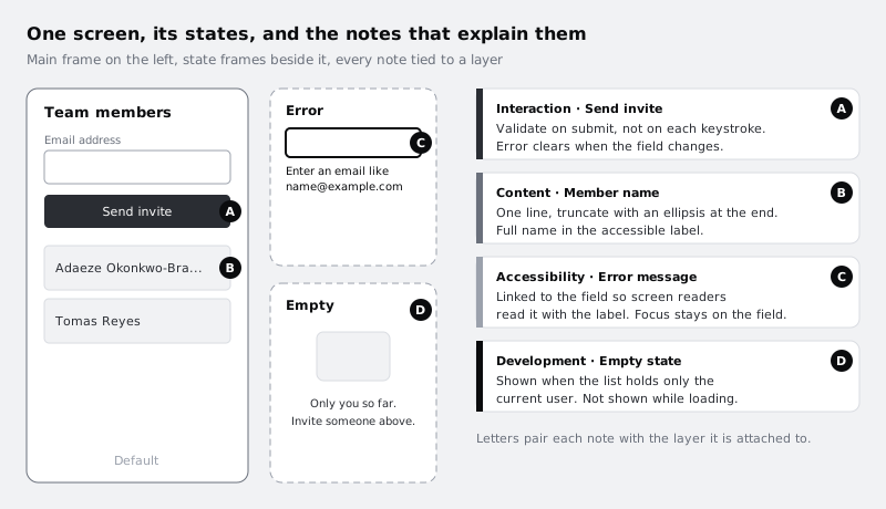
Duplicate your screen for each state that changes the layout or content, and place the copies in a row to the right of the original. Name each one after the screen and the state, for example "Team members / Error", "Team members / Empty" and "Team members / Loading". For the example you need:
- Error: the email field in its error style, with the real message under it, such as "Enter an email address like name@example.com". Draw one error state per distinct message if the layout differs; if only the wording changes, one frame and a note listing the messages is enough.
- Empty: the list area when you are the only member, with a short line telling the person what to do next.
- Loading: the list area before the data arrives. Say whether it is a spinner, grey placeholder rows, or nothing.
If your design system has components with error and disabled variants, swap to those variants instead of restyling layers by hand, so the states match what developers already have in code.
Check it worked
Your screen has a row of named state frames beside it, and every question from Step 1 about errors, empty data or loading points at one of those frames. Cross those questions off your list.
Step 4 · Annotate validation and actions
Now attach the rules a frame cannot show. Select the Annotation tool, click the layer the rule belongs to, and write the note. Put it on the specific layer, the input or the button, not on the whole frame, so the note shows when a developer inspects that element.
Write each note as a rule a developer can turn into code: the trigger, then the result. For the example:
- On the email field (Interaction): "Check the format when Send invite is pressed, not while typing. Clear the error as soon as the field changes."
- On the email field (Content): "Messages: invalid format, 'Enter an email address like name@example.com'. Already a member, 'Priya Nair is already in this team'. Server error, 'We could not send the invite. Try again.'"
- On the Send invite button (Interaction): "While sending, show the button as busy and ignore further presses. On success, clear the field and add the person to the top of the list as Invited."
Avoid notes that describe the picture ("red border on error"). The developer can see the picture. Note what they cannot see: when, why, and what next.
The + Property option in an annotation pins a design property, such as a fill or a text style, to the note. Use it sparingly, when a property is the point of the note, for example pinning the error text style to the error message so its use is explicit.
Check it worked
Click the email field and the Send invite button in turn. Each has at least one annotation that says when something happens and what happens next, and every error message is written out word for word. No note only describes what the frame already shows.
Step 5 · Set text limits and truncation rules
Long text breaks more layouts than anything else. Your frame probably uses tidy names like "Tomas Reyes". Real data includes "Adaeze Okonkwo-Bramwell" and email addresses with 40 characters.
Test each text layer with realistic extremes before writing the rule. Temporarily replace the text with the longest value you expect and look at what your layout does. Then decide the rule and annotate the text layer (Content category):
- Truncate: "One line. Cut with an ellipsis at the end when it does not fit. Full name stays in the accessible name and appears on hover."
- Wrap: "Wraps to as many lines as needed; the row grows in height."
- Limit at input: "The team name field allows 40 characters. Show a count from 30."
Put the long value back afterwards, or keep a copy of the row with the long name as a visible example. Developers trust an example they can see over a sentence.
Do the same for numbers that can grow (a count of 9 versus 1,248) and for dates, if your screen shows them.
Check it worked
Every text layer that shows user data or server data has a Content annotation saying truncate, wrap or limit, and at least one row on the canvas shows the longest case so the rule is visible.
Step 6 · Mark focus order and accessible names
Keyboard and screen reader users move through controls one at a time. The order and what each control is called are design decisions, and they are invisible in a static frame.
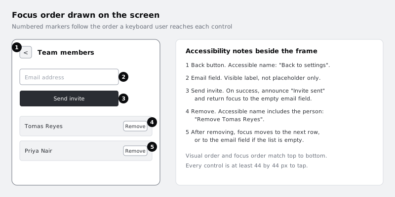
Number the interactive elements in the order focus should reach them, using small numbered markers placed on the screen (a circle with a number, kept on its own layer group named "Focus order" so it can be hidden). Then add an Accessibility annotation to each control that needs more than its visible text:
- Icon-only buttons need a name: the back arrow is "Back to settings".
- Repeated buttons need the item in their name: each Remove button is "Remove Tomas Reyes", not just "Remove".
- Changes need an announcement: after an invite is sent, a screen reader should hear "Invite sent".
- Focus needs a home after content changes: after a row is removed, focus moves to the next row, or to the email field if the list is now empty.
Also note that the email field has a visible label, not placeholder text only, and that the error message is tied to the field so it is read with it. Keep tap targets at 44 by 44 px or larger and say so in one note on the frame, rather than measuring each one.
Check it worked
Read your numbered markers in order: they go from top to bottom and left to right, with no jumps back up the screen. Every icon-only or repeated control has an Accessibility annotation giving its spoken name, and there is a note saying where focus lands after each action that removes or adds content.
Step 7 · Write the responsive rules
A design drawn at one width answers one width. A developer needs to know what happens between the frames you drew.
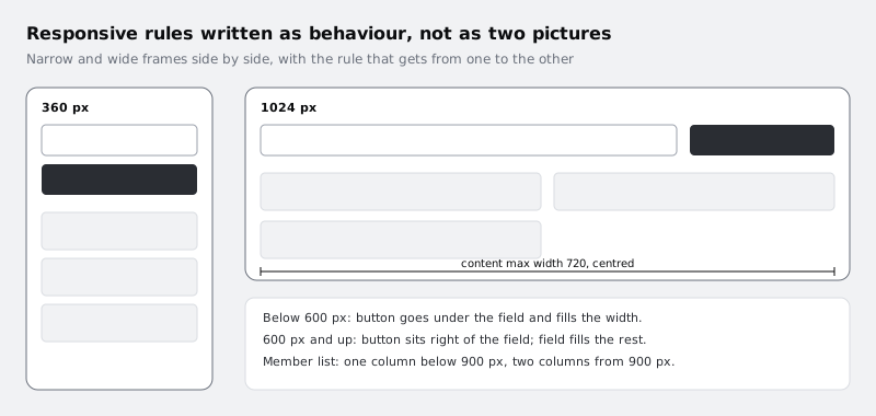
If you have not already, draw the screen at a narrow width (360 px) and a wide one (1024 px or wider). Then annotate the rules that take one to the other, in the Responsive category, on the layers that change:
- On the field and button row: "Below 600 px, the button goes under the field and fills the width. From 600 px, the button sits to the right and the field fills the remaining space."
- On the list: "One column below 900 px, two columns from 900 px."
- On the content container: "Maximum width 720 px, centred."
Here a measurement does earn its place, because the value is a rule, not a reading. Use the Measurement tool (Shift M), drag from one edge of the content container to the other on the wide frame, double-click the measurement and change its label to "max 720, centred". Use measurements for limits and breakpoints like this, not for padding a developer can read by inspecting the layer.
If you built the screen with auto layout, set its resizing to match the rules (fill for the field, hug for the button) so the frame behaves as the note says when someone resizes it.
Check it worked
Resize your main frame wider and narrower. Every element that moves, stacks or changes column count has a Responsive annotation saying at what width it changes and how. The narrow and wide frames are both on the canvas.
Step 8 · Review the annotations with a developer's questions
Go back to the list from Step 1. Each question should now have an answer in a state frame or an annotation. Cross off the answered ones. Anything left is either a decision you have not made yet, which you make now, or an open question, which you write as a Development note starting "Open:" so nobody mistakes it for a decision.
Then switch to Dev Mode with the toggle in the toolbar (or ask someone with a Dev seat to open the file). Click each layer as a developer would and read the notes in context. Filter by one category at a time (right-click an annotation and choose Filter by, or use the annotations option in Dev Mode) and check that each category reads as a complete set: all the Accessibility notes together should describe the full keyboard journey.
Last, hide the annotations from the main menu under View and look at the screen without them. If the design itself looks wrong without its notes, a note may be covering for a design problem that should be fixed in the frame instead.
Check it worked
Every question from Step 1 is crossed off or marked "Open:" in a Development note. Filtering by each category in turn shows a coherent group of notes, and a colleague who has not seen the design can tell you what happens on error, with no data, with a long name and on a narrow screen, using only the file.
Next steps
When the annotations are done, mark the screen ready and walk a developer through it in Hand off a design with Figma Dev Mode. Icons and images the developer needs as files are covered in Export assets from Figma for web and mobile. If your states are hand-styled layers, Build a button component with variants shows how to turn them into variants so states match between design and code. To get feedback on the annotated screen first, see Share a Figma file and collect comments.
Part of these paths
Related tutorials
- Hand off a design with Figma Dev ModeYou will have the Larkfield Clinic booking screens cleaned up, grouped in one section, checked from the developer's side in Dev Mode, marked ready for dev and sent with a short note that lets a developer build without a handoff meeting.
- Export assets from Figma for web and mobileYou will have a folder of icons and images exported from Figma in the right format and pixel size for a website, an iOS app and an Android app, with names a developer can drop straight into a project.
Need this done for you?
Padding does this work for growing companies, from the first diagnosis to a system that keeps working.
Get new tutorials