AI in design · Intermediate · 18 min
Design a chat interface for an AI assistant
By Padding · Updated 18 Nov 2026
Figma (web) · November 2026
You will have a scope sheet for a task-focused booking assistant and seven Figma frames covering its main chat states, from the opening message to hand-offs to the real booking form and to a person.
On this page
Most chat interfaces start from the shape of an open chatbot: a blank box, a blinking cursor and an invitation to ask anything. That shape suits a general assistant. It is the wrong starting point for a clinic, where a patient wants one of a few things done and the assistant must not pretend to be a doctor.
This tutorial designs a narrow assistant for Larkfield Clinic's booking app. It answers questions such as "can I get a travel vaccine this week", finds free times, explains the five services and practical details, and passes everything else to the right place: the normal booking screens, the reception desk, or the emergency number. The interesting design work is in those edges, not in the bubbles.
You start with a written scope, because every later decision depends on it. Then you design the opening message, suggested prompts, the message layout, answers that carry real booking actions, the hand-offs, and what happens to the conversation afterwards. You finish with seven state frames in Figma, next to the Larkfield screens they hand off to.
Step 1 · Write the assistant's scope on one sheet
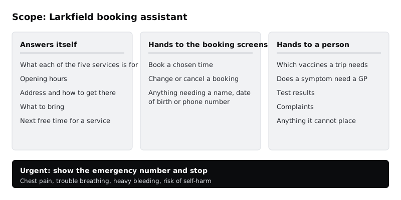
Add a page to the Larkfield file called 05 Assistant. On it, draw a frame called Scope and split it into three columns with auto layout: Answers itself, Hands to the booking screens and Hands to a person. Under each, write the jobs as short lines a patient could say.
For Larkfield the sheet reads:
- Answers itself: what each of the five services is for (GP appointment, Nurse appointment, Blood tests, Travel health, Child check-up); opening hours; the address and how to get there; what to bring; the next free time for a service.
- Hands to the booking screens: booking a chosen time; changing or cancelling a booking; anything that needs a name, date of birth or phone number.
- Hands to a person: which vaccines a trip needs; whether a symptom needs a GP; test results; complaints; anything the assistant cannot place.
Add a fourth, short line across the bottom in bold: Urgent: chest pain, trouble breathing, heavy bleeding or anyone saying they might harm themselves. The assistant does one thing for these: show the emergency number and stop.
Take the sheet to the person who knows the clinic's rules and go through it line by line. A nurse will move things you did not expect. At Larkfield, "which vaccines do I need for Ghana" moved from Answers itself to Hands to a person, because the answer depends on the patient's history, not on a web page.
Check it worked
Your Scope frame has three columns and an urgent line, and every item is written as something a patient would say or ask. Take your ten real questions and place each one on the sheet. If any question does not fit a column, add it now. The person who knows the rules has initialled or commented on the frame.
Step 2 · Write the opening message and the suggested prompts
The opening message has one job: tell people what the assistant can do, what it cannot, and where the other door is. Write it in Larkfield's voice, short enough to read without scrolling on a small phone:
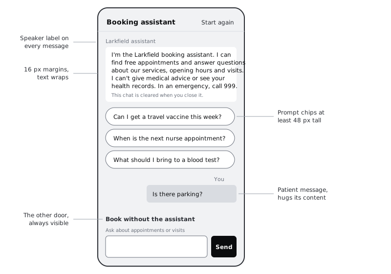
I'm the Larkfield booking assistant. I can find free appointments and answer questions about our services, opening hours and visits. I can't give medical advice or see your health records. In an emergency, call 999.
Replace 999 with the emergency number where your service runs. Read the message against the scope sheet: each sentence should match a column. If the message promises anything the sheet does not list, cut it.
Under the message, add three or four suggested prompts as tappable chips. Take them from your real questions, not from what shows off the assistant:
Can I get a travel vaccine this week?When is the next nurse appointment?What should I bring to a blood test?
Then add a plain link, always visible above the text box: Book without the assistant. It opens Choose a service. Some patients will never want to type to software, and the booking flow you already designed works without it.
Check it worked
Your opening message is four sentences or fewer and names at least one thing the assistant cannot do. Every suggested prompt sits in the Answers itself column of your scope sheet. The Book without the assistant link is on the frame, and you can say which screen it opens.
Step 3 · Build the message components
Go to your components page and build three components with auto layout. Use the Larkfield variables and text styles from part 4 throughout, so the chat looks like the rest of the app.
- Message, with a variant property
Fromset toAssistantorPatient. Both useBodyintext. Assistant messages sit on the left onsurfacewith no bubble tail, full width minus 16 px margins. Patient messages sit on the right onaccent-tint, hugging their content up to about 80% of the frame width. Above each, aBody/Smalllabel intext-mutedreadsLarkfield assistantorYou, so the speaker is clear without relying on position or colour. - Suggested prompt, a chip at least 48 px tall with a 1 px
borderstroke andLabeltext. Give it aStateproperty withDefaultandPressed. - Composer, the bottom bar: a text field with the placeholder replaced by a hint above it (
Ask about appointments or visits), a Send button 48 by 48 with a visible label or an icon plus an accessible name noted in a comment, and theBook without the assistantlink above it.
Set each message's width to fill the container and its height to hug contents, so long answers and long words wrap rather than overflow. Draw the chat frame at 360 by 800. Many patients on lower-cost Android phones see the app at about that width, and WCAG's reflow check is at 320 CSS pixels, so also try a 320 px wide copy.
Write two test messages into patient bubbles before you move on: one in English and one in a language your patients use, such as Yoruba with its tone marks (Ṣé mo lè rí àyè ní ọ̀sẹ̀ yìí?). If the diacritics clip at the top of the line, or the bubble breaks badly, fix the line height and padding now.
Check it worked
Your components page has Message with two From variants, Suggested prompt with two states, and Composer. In a 320 px wide test frame, a five-line assistant message wraps without overflowing, and the Yoruba bubble shows every tone mark. Desaturate the frame (or picture it in greyscale): you can still tell who said what from the You and Larkfield assistant labels.
Step 4 · Turn answers into actions
A booking assistant that only replies in sentences makes the patient retype what they just read into the booking flow. Design answers that carry the next step.
Build a component called Answer card with auto layout: a Body sentence, then a slot area that can hold instances of the Time slot component you already have, then a secondary button. Lay out the answer to the opening example:
Yes. Travel health has free times this week:
with two time slots below it, Thu 11 Dec · 14:00 and Fri 12 Dec · 09:40, and a secondary button See more times. Tapping a slot does not book anything. It opens Your details with the service and time already filled in, and the patient finishes on the normal Confirm screen. The assistant finds; the booking screens book.
Add a second variant, Answer card / Next step, for answers that end in a person. For "which vaccines do I need for Ghana", the sentence says the nurse decides this, and the button reads Book a Travel health appointment. The assistant does not list vaccines, even if a model would happily produce a list.
Every time the assistant states a fact that matters (a time, a date, an address), that fact must come from the clinic's own data, and the screen it opens must show the same value. Note this on the frame as a comment for the developers: the slot shown in chat and the slot preselected on Your details must be the same record, checked when the patient taps.
Check it worked
Your Answer card component has at least two variants. On the frame, the answer to "can I get a travel vaccine this week" shows real time slots, and each slot has a prototype link or a sticky note pointing to Your details, not to Booked. Nothing in the chat completes a booking without the patient seeing Confirm.
Step 5 · Design the hand-offs to a form and to a person
Most of what a constrained assistant does well is send people somewhere better. Build a Hand-off component with a variant property To and three values:
- Booking: a short sentence and a primary button, for example
Continue to your details, used when the patient has chosen a time or asks to change a booking. - Reception:
I can't answer that, but reception can.followed by the phone number as a tappable link and the opening hours. Outside opening hours, the second line says when the line opens and offersBook a GP appointmentinstead. - Urgent: a
danger-tintcard with the alert icon and one sentence:If this is an emergency, call 999 now.No suggested prompts below it and no further chat until the patient tapsBack to the assistant.
Say what travels with the patient. If reception will see the conversation, the card says so. If it will not, the card says that too, so the patient is not surprised to repeat themselves. Do not imply a person is reading the chat when nobody is.
On a prepaid data plan, a failed hand-off costs the patient twice. Keep the phone number as plain text as well as a link, so it can be copied or read aloud if the dialler does not open.
Check it worked
The Hand-off component has three To variants. Each one names a destination the patient can recognise (a screen name, a phone number, an emergency number) and none of them is a dead end. On the Urgent variant, there are no suggested prompts and no text box visible.
Step 6 · Decide what the conversation history keeps
An open chatbot keeps a list of past chats. A clinic booking assistant usually should not, and the decision belongs in the design, not left to defaults.
Write a short frame called History rules next to the scope sheet, and agree it with the clinic and whoever builds the app. For Larkfield:
- The conversation lasts for the visit. It is cleared when the patient closes the assistant, finishes a booking or leaves it idle for 30 minutes.
- There is no list of past conversations. The record of what happened is the booking itself, on Booked and in the patient's appointments.
- A
Start againcontrol in the header clears the chat at any time. - The opening message's last line, in
Body/Small, says this:This chat is cleared when you close it.
Phones are often shared within a family, and health questions are private. A thread left on screen ("is the blood test for pregnancy?") can tell someone else more than the patient meant. That is why clearing is the default here.
Only write the notice once the engineering team confirms the app really does clear the chat. A privacy promise in the interface that the system does not keep is worse than no promise.
Check it worked
Your History rules frame lists when the conversation is cleared, that there is no chat list, and where Start again sits. The welcome frame shows the clearing notice and the header shows Start again. Someone from engineering has commented on the frame to confirm the behaviour, or the notice is marked Not confirmed in red on the canvas.
Step 7 · Lay out the seven main states
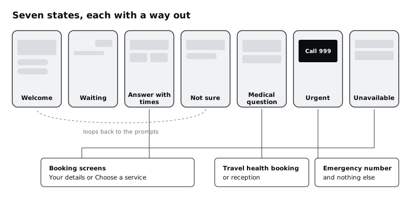
Now assemble the states as frames on the 05 Assistant page, each 360 by 800, in one row, named so they sort in order:
Assistant / Welcome: the opening message, three suggested prompts, the clearing notice, the composer.Assistant / Waiting: the patient's question and a short status line,Looking for free times…. The full design of streaming text and long waits has its own tutorial; here, place the line and aStopbutton.Assistant / Answer with times: the Travel health answer card with two slots.Assistant / Not sure: the assistant could not match the question. It says so, repeats what it can do in one line, and shows the suggested prompts again.Assistant / Medical question: the Next step answer card for the vaccine question, ending in a Travel health booking button.Assistant / Urgent: the Urgent hand-off and nothing else.Assistant / Unavailable: the assistant itself has failed to load or answer. One sentence,The assistant isn't working right now., and a primary buttonBook an appointmentthat opens Choose a service.
For screen readers, add a comment to the message list on the Welcome frame for the developers: the list is a log region, so new messages are announced in order, and the status line in Waiting is announced without moving focus. Ask that the finished answer is announced once, not word by word.
Check it worked
Your 05 Assistant page has seven frames named as above, in one row. Every frame except Urgent shows the Book without the assistant link or a button to the booking screens. Select each frame and check Selection colors: every entry is a Larkfield variable, with no raw hex values.
Step 8 · Walk real questions through the frames with a person
The frames describe what the assistant should do. Whether the AI behind it actually does that is a separate question, answered by testing the built system with real questions and checking every answer by hand before launch. Do the design half now.
Make a table on the canvas with three columns: the question, the state it should produce, and the hand-off it should end in. Put in your ten real questions, plus five awkward ones: a question in another language, a question with a typo (travle jab), two questions in one message, a symptom described casually (my chest feels tight, can I come in tomorrow), and a request to book for someone else.
Walk the table with the person who knows the clinic's rules. For each row, they point to the frame they expect. When their answer differs from yours, the design or the scope sheet changes, not their expectation. At Larkfield, the tight chest moved the team to show the Urgent card whenever a message mentions chest pain or tightness, even inside a booking request.
Keep the table. It becomes the first set of test cases for the built assistant: the team runs each question through it and a person marks whether the reply matched the expected state, before any patient sees it.
Check it worked
Your canvas has a table of at least fifteen questions, each mapped to one of the seven frames and a hand-off. The five awkward questions are included, and every row has been agreed with the person who knows the rules. Any change you made to the scope sheet during the walk-through is visible on the Scope frame.
Next steps
You have the shape of a narrow, honest assistant. The states you sketched quickly here each deserve more care.
- Design the Waiting state properly, including streamed text, a Stop button and screen reader behaviour, in /tutorials/design-for-streaming-ai-answers-and-long-waits.
- Decide how answers show where they came from and when they are unsure in /tutorials/show-uncertainty-and-sources-in-ai-answers.
- Work through every way the assistant can fail, including answers that look right and are not, in /tutorials/design-error-refusal-and-fallback-states-for-ai.
- If you are still unsure the clinic needs an assistant at all, test the idea first with /tutorials/decide-whether-a-feature-needs-ai-at-all.
Related tutorials
- Write team rules for using AI in design workYou will have a one-page AI policy for your design team, covering approved tools, data that never goes in, client disclosure, who checks output and how generated assets are labelled, plus a three-question check every designer runs before using AI on a task.
- Write prompts that give usable design outputYou will have turned a one-line design prompt into a five-part prompt, compared the output at every version in a prompt log, and saved a reusable prompt template with three before and after examples for design tasks.
- Use Figma's built-in AI features on a real fileYou will have tried Figma's built-in AI tools for layers, text, search and images on a copy of a real design file, timed and checked each result, and written a keep-or-skip verdict for every tool on a scorecard beside your screens.
Need this done for you?
Padding does this work for growing companies, from the first diagnosis to a system that keeps working.
Get new tutorials