AI in design · Beginner · 16 min
Write prompts that give usable design output
By Padding · Updated 18 Nov 2026
Any AI chat assistant or prompt-to-UI tool, and a text document · November 2026
You will have turned a one-line design prompt into a five-part prompt, compared the output at every version in a prompt log, and saved a reusable prompt template with three before and after examples for design tasks.
On this page
"Design a booking screen for a clinic app" is a complete sentence and a useless prompt. Whatever comes back, a chat assistant's description or a generated screen, has to fill every gap you left with a guess: who is booking, on what device, which services, which times, in which style. The guesses look confident, and most of them are wrong for your product. You then spend longer correcting the output than you would have spent drawing it.
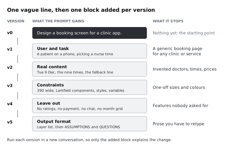
Good design prompts are not clever. They hand over the same things you would give a new designer on a project: who the screen is for, the real content, the limits of the system, what is out of scope, and what form you want the work in. This tutorial adds those one at a time to a vague prompt and runs each version, so you can see what each part fixes, rather than taking a long template on trust.
The running example is the Pick a time screen from Larkfield Clinic, the fictional community clinic from the design-a-product-end-to-end series. You already know what that screen should contain, which is the point: you can only judge AI output on a screen whose right answer you know. If you are working on your own product, pick one screen you have designed and can describe from memory.
Keep personal data out of every prompt. Describe screens and content, never real patients, customers or records.
Step 1 · Run the vague prompt and set up a prompt log
Open a document and call it Prompt log. Every version of the prompt goes in it, with the output and a score, so you compare versions on paper and not from memory.
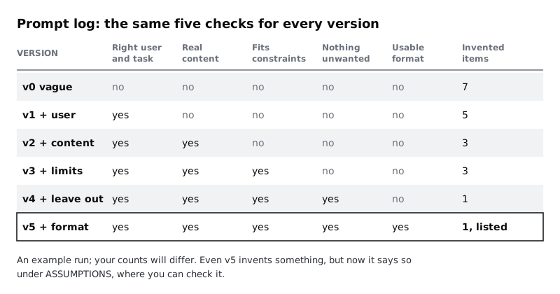
Write down five checks. They are the same for every version, and each one matches a part of the prompt you will add later:
- Right user and task. Does the output serve a patient picking a time for a nurse appointment on a phone?
- Real content. Is every word, date and time on it real, with no placeholder text and nothing made up?
- Fits constraints. Does it fit a 390-pixel-wide phone screen and use only Larkfield's components, text styles and colour variables?
- Nothing unwanted. Is it free of features nobody asked for?
- Usable format. Could you build it in Figma without retyping it or guessing what was meant?
Add a sixth column, Invented items, and count everything the output states that you did not tell it: a doctor's name, a price, a rating, a time that is not in the clinic's list.
Now start a new conversation and send version 0:
Design a booking screen for a clinic app.Paste the output into the log under v0. If your tool generates a screen, take a screenshot and write a short list of what is on it. Mark each check yes or no, and count the invented items. A typical v0 answer describes a month calendar, a list of doctors with photos and star ratings, a search bar, a price per visit and a "Book now" button under a gradient header. It looks finished and fails all five checks.
Check it worked
Your prompt log has a v0 entry with the exact prompt, the full output, five yes or no marks and an invented-items count above zero. You can name at least three things in the output that are not on the real Larkfield Pick a time screen.
Step 2 · Add the user and the task
Start a new conversation for every version from now on. If you keep chatting in one thread, the earlier answers shape the later ones and you cannot tell which change in the prompt did the work.
Write the user and task as a short paragraph, in the order a person would live it: who they are, where they are, what they did just before, what they want now and what comes next.
You are helping design one screen of a booking app for Larkfield Clinic,
a small community clinic.

USER AND TASK
A patient is booking an appointment on their phone. On the previous screen
they chose "Nurse appointment". On this screen, "Pick a time", they choose
a day and a time. On the next screen they enter their details. Most patients
book within a week and want the earliest time that suits them.

Design the "Pick a time" screen.
Save this as v1, run it and score it. The output typically stops being a generic booking page for any clinic or service and narrows to one patient booking a nurse time for themselves: a row of days and a list of times. It still invents the times, the clinic's name for the service and often a clinician to choose from.
Check it worked
The v1 entry has a yes for Right user and task: the output is about one patient picking a nurse time for themselves, with no service picker, no list of doctors to compare and no booking on someone else's behalf. Read v0 and v1 side by side: you can point to at least one change that came from the new paragraph.
Step 3 · Paste in the real content
AI output fills empty content with plausible content, and plausible is the problem. Give it the words and data that are really on the screen, copied from your design or content document, so there is nothing to make up.
Add a CONTENT block under the task:
CONTENT (use exactly as written; do not add other text)
- Screen title: Pick a time
- Reminder line: Nurse appointment · 15 min
- Day row: the seven days of the week, Tue 9 selected
- Day heading: Tue 9 Dec
- Morning times: 09:00, 09:20, 09:40, 10:30, 11:00
- Afternoon times: 14:00, 14:40, 15:20, 16:00
- Selected time: 10:30
- Fallback line: Can't see a time that works? Call 01234 567 890
- Button: Continue
Save it as v2 and run it. Count the invented items again; they usually drop sharply. What is left tends to be extra labels the model thinks a booking screen needs, such as "Available" on each slot or a "Next available" badge.
If your users read the app in more than one language, put one translated line in the content too, such as the fallback line in French or Swahili with its longer word lengths. The output then has to make room for it, which is the same lesson as wireframing with real content.
Check it worked
The v2 output shows Tue 9 Dec, nine times split into Morning and Afternoon, 10:30 selected, the fallback line and a Continue button. Real content is marked yes, or the log names each word that was added. Real content asks only whether the content you gave is all there and unchanged; extra labels such as "Available" are counted under Invented items instead, which is why a yes can sit beside a count above zero. The invented-items count is lower than for v1.
Step 4 · Add the constraints of your design system
Now the limits a real designer would work within: the platform, the screen size, the parts the screen must be built from, and the accessibility rules. Name your components, text styles and colour variables exactly as they appear in your file, so the output speaks the same language as your design system.
CONSTRAINTS
- Platform: mobile app, portrait. Frame 390 by 844. Must also work at
  360 wide without text overflowing.
- Build only from these components: Header, Button, Text field,
  Time slot, List row.
- Text styles: Heading/L, Heading/M, Body, Body/Small, Label. No other
  sizes.
- Colour variables: colour/text, colour/text-muted, colour/surface,
  colour/canvas, colour/line, colour/border, colour/accent,
  colour/accent-tint, colour/on-accent. Refer to them by name, never hex.
- Every tap target at least 44 by 44 pixels. Text contrast at least 4.5:1.
- The selected time must not rely on colour alone.
The 360-pixel line is there for a reason. Many people, across much of Africa and elsewhere, book on low-cost Android phones with narrow screens, and on prepaid data a screen that loads a large image for decoration costs them money. If that is true of your users, say it in the constraints, because the model will not assume it.
Save as v3, run and score. Typical output now names Time slot instances and text styles. It may still add one extra component, often a toggle or a chip row, that is not in your list.
Check it worked
Fits constraints is yes for v3: every element in the output is one of the five components or a text layer with one of the five styles, every colour is a variable name, and nothing is wider than 390 pixels. If the output still uses a component that is not on your list, write its name in the log; the next step deals with it.
Step 5 · Say what to leave out
Models add features the way a keen junior designer does: because similar screens have them. Name the things you do not want, especially the ones you saw in earlier versions. Your log already lists them under invented items.
LEAVE OUT
- No clinician choice, photos or ratings. Patients do not choose who
  they see.
- No prices or payment. Appointments are free at the point of booking.
- No month calendar, search bar, filters or chat assistant.
- No marketing images or banners.
- Do not change the flow: no login, no account creation on this screen.
Keep each line to a reason you can defend. "No clinician choice, because patients do not choose who they see" teaches the model something about the clinic; a bare "no doctors" just bans a word.
Save as v4, run and score.
Check it worked
The v4 output has none of the items in your LEAVE OUT list, and Nothing unwanted is yes. Every invented item from v0 to v3 is either gone or covered by a line in LEAVE OUT.
Step 6 · Ask for a format you can use
The last block decides whether you can act on the answer. A paragraph of design prose has to be read, interpreted and redrawn. A list in the order you would build the screen, with the names from your file, can be followed one line at a time.
OUTPUT
Return the screen as a layer list, top to bottom, one line per element:
element name | component or text style | colour variable | exact text.
Do not write code. Do not describe colours in hex.
Then a section ASSUMPTIONS: every decision you made that I did not tell
you, one per line.
Then a section QUESTIONS: anything you needed and did not have.
If your tool draws screens rather than writing text, keep the ASSUMPTIONS and QUESTIONS part and ask for them alongside the screen. The screen is the format; the assumptions are what make it reviewable.
The ASSUMPTIONS section matters most. Without it, a guess sits silently in the output looking like a decision. With it, the model has somewhere to put the guess where you will see it.
Save as v5, run and score. Put all six versions side by side in your log.
Check it worked
The v5 output is a layer list you could build from in order, followed by an ASSUMPTIONS section and a QUESTIONS section. Your log has six rows, v0 to v5, each with five marks and an invented-items count, and Usable format is yes only for v5.
Step 7 · Check the best output by hand
A prompt that scores five out of five is not output you can trust. The checks in your log are coarse; now check the detail, against the real screen, yourself. Assistants are unreliable at checking their own work, so do not ask the model whether its answer followed the prompt.
Go through the v5 output line by line next to the Larkfield Pick a time screen:
- Every time and date. Nine times, in the right groups, 10:30 selected, Tue 9 Dec as the heading. A missing 09:40 is as much an error as an invented 12:00.
- Every assumption. Mark each line in
ASSUMPTIONSasagree,wrongorask the team. Typical ones: that past times are hidden rather than greyed out, or that the day row scrolls. Some will be reasonable decisions you had not written down; add those to your design notes. - Every question. If the model asked something you can answer, the answer belongs in the prompt next time.
- Anything not listed. An element in the output that is not in
CONTENTand not underASSUMPTIONSis a silent invention. Count it.
Then run the v5 prompt once more in a fresh conversation and compare the two answers. Where they differ, the prompt left that detail open. Decide it and write it into the prompt.
Check it worked
Every line of the v5 output has a tick or a correction beside it in your log. Every assumption is marked agree, wrong or ask the team. You have a short list of the differences between the two v5 runs, and each one has become a new line in the prompt or a note to decide with the team.
Step 8 · Save the template and write three before and after examples
Strip the Larkfield detail out of v5, leaving the block headings and square brackets for what changes. Save it in your team's shared notes, not only in one person's AI account, so it outlives a change of tool.
You are helping design [screen or artefact] for [product], [one line on
what the product does and for whom].

USER AND TASK
[Who, on what device, where they are. What they did just before, what
they want now, what comes next.]

CONTENT (use exactly as written; do not add other text)
[Every real label, line of copy and data value, pasted from the source.]

CONSTRAINTS
- Platform and size: [platform, frame size, narrowest width]
- Build only from: [component names]
- Text styles: [names]. Colour variables: [names]. Never raw values.
- Accessibility: [contrast, target size, not colour alone]

LEAVE OUT
- [Feature or pattern], because [reason].

OUTPUT
[The format you will work from, in the order you will use it.]
Then ASSUMPTIONS: every decision you made that I did not tell you.
Then QUESTIONS: anything you needed and did not have.
Under the template, write three before and after pairs from your own work, so a colleague can see the template applied to more than one kind of task. Larkfield's three:
1. A screen layout (the one you built in this tutorial). Before: Design a booking screen for a clinic app. After: the full v5 prompt from your log.
2. Error states for a form. Before:
What errors should the details form have?After:
You are helping design error states for the "Your details" screen of
Larkfield Clinic's booking app, where patients book appointments.

USER AND TASK
A patient has picked a time and is filling in the form on their phone.
They tap Continue and something is wrong.

CONTENT
Fields: Full name, Date of birth, Mobile number, Email (optional).
Checkbox: Text me a reminder the day before.
Existing message, as a style example:
"Error: Enter a mobile number with 11 digits, such as 07700 900123"

CONSTRAINTS
- Each message says what to do, not only what is wrong. Start with "Error:".
- Messages appear under the field, in Body/Small, colour/danger.

LEAVE OUT
- No password, CAPTCHA or account fields; they are not on this form.

OUTPUT
A table: field | what went wrong | message text | when it appears
(on Continue, or as the patient leaves the field).
Then ASSUMPTIONS and QUESTIONS.
3. Layout options for a screen. Before:
Give me ideas for the home screen.After:
You are helping explore layouts for the Home screen of Larkfield Clinic's
booking app.

USER AND TASK
Two kinds of patient open Home: someone booking for the first time, and
someone returning to check an appointment. Both are on a phone.

CONTENT
[Paste Home's real content from your file: the clinic name, the photo
and its caption "Larkfield Clinic, 14 Mill Lane", the booking button,
the phone number 01234 567 890.]

CONSTRAINTS
- 390 by 844, also works at 360 wide. Larkfield components and styles only.
- One photo at most, because many patients are on prepaid data.

LEAVE OUT
- No news feed, promotions or chat assistant.

OUTPUT
Three options that differ in what comes first, not in decoration.
For each: elements top to bottom, which patient it suits best, and one
risk. Then ASSUMPTIONS and QUESTIONS.
Run each "after" prompt once and check the output by hand, as in the previous step, before you share the examples. An example that produces a bad answer teaches the wrong thing.
Check it worked
Your shared notes hold the template with every Larkfield detail replaced by square brackets, and three before and after pairs for three different kinds of task: a screen, a set of states and a set of options. Give the template to a colleague with a screen you have not prompted for yet. They can fill in every bracket from the design file and the content document without asking you anything.
Next steps
You now have a prompt that carries the context a designer would need, a log that shows what each part of it does, and a habit of checking the output by hand.
- Put a prompt like v5 into a prompt-to-UI tool and score the screen against the researched design in Generate a screen from a prompt and judge it.
- Use the same blocks for words rather than layouts in Generate interface copy variants with AI.
- When generated output ignores your design system anyway, Rebuild an AI-generated screen with your own components shows the clean-up.
- If you do not yet have the real content to paste into
CONTENT, start with Wireframe with real content instead of placeholder text.
Related tutorials
- Write team rules for using AI in design workYou will have a one-page AI policy for your design team, covering approved tools, data that never goes in, client disclosure, who checks output and how generated assets are labelled, plus a three-question check every designer runs before using AI on a task.
- Use Figma's built-in AI features on a real fileYou will have tried Figma's built-in AI tools for layers, text, search and images on a copy of a real design file, timed and checked each result, and written a keep-or-skip verdict for every tool on a scorecard beside your screens.
- Usability-test an AI featureYou will have a usability test plan for an AI feature with tasks judged by outcome rather than exact wording, a note-taking sheet that records what the AI said in every attempt, and a severity scale for AI-specific problems such as wrong answers nobody noticed.
Need this done for you?
Padding does this work for growing companies, from the first diagnosis to a system that keeps working.
Get new tutorials