AI in design · Intermediate · 17 min
Generate a screen from a prompt and judge it
By Padding · Updated 18 Nov 2026
Figma Make or a comparable prompt-to-UI tool, Figma (web) and a spreadsheet · November 2026
You will have two AI-generated versions of a booking screen scored against a researched design on five criteria, with every invented feature listed and a written view on what prompt-to-UI tools are good for.
On this page
Type "a screen for booking a nurse appointment" into a prompt-to-UI tool and in under a minute you get something that looks like a product: a calendar, a grid of times, a confident button, maybe a friendly photo of a nurse. It is tempting to treat that as a head start on the design. Sometimes it is. Often it is a plausible screen for a clinic that does not exist, with features nobody asked for and the hard parts left out.
This tutorial gives you a fair way to find out which. You take one screen you already designed from research, write a prompt for it, generate it twice (once from words alone, once with your design attached), and score both results against the real thing on five criteria: content accuracy, hierarchy, accessibility, missing states and invented features. You end with a scoring sheet, a log of everything the tool made up, and a short written view your team can use the next time someone asks whether AI can "just do the screens".
The running example is Pick a time in the Larkfield Clinic booking app, a fictional community clinic. In the earlier series the screen went from sketch to high fidelity: a reminder line Nurse appointment · 15 min, a seven-day strip with Tue 9 selected, the day heading Tue 9 Dec, Morning and Afternoon slot groups with 10:30 selected, a phone fallback line and a Continue button, plus two state frames for when no times are free or a time has just gone. If you are using your own screen, swap in its details as you go.
The steps use Figma Make as the worked tool because it is the one most Figma teams can reach. Any tool that turns a prompt into a previewable screen works the same way; where a step depends on a Figma Make feature, it says so.
Step 1 · Write a reference card for the real screen
You cannot judge generated output against a feeling. Before you open any AI tool, write down what the researched screen has to do, so the scoring later is a comparison with a list, not with your memory of the design.
In a new document, write a reference card for Pick a time with four short sections:
- Content. Every piece of text and data on the screen, exactly: the title
Pick a time, the reminderNurse appointment · 15 min, the seven days withTue 9selected,Tue 9 Dec, the Morning times09:00,09:20,09:40,10:30,11:00, the Afternoon times14:00,14:40,15:20,16:00, the lineCan't see a time that works? Call 01234 567 890, andContinue. - Behaviour and states. One time can be selected;
Continuemoves to Your details;Pick a time / No times this weekreplaces the slots withNo free times this weekand aSee next weekbutton;Pick a time / Time goneshows10:30 was just taken. These times are still free.above the remaining eight times. - Accessibility facts. Selection shown by a tick as well as the accent fill, so it does not rely on colour alone; text and slot borders meet WCAG 2.2 contrast (4.5:1 for body text, 3:1 for component edges); every tap target at least 24 by 24 CSS pixels, and Larkfield's own rule of 44 by 44 for the back control; body text at 16.
- Why it is like this. The research reasons behind choices a tool cannot guess. For Larkfield: the phone line stays because several patients said they would rather call than fight an app; there is no doctor choice because the clinic does not let patients pick a clinician for nurse appointments; and the screen carries no photos, because many patients book on low-end Android phones on prepaid data and every image costs them.
Keep the card to one page. If a line would only make sense to someone who sat in the research, rewrite it until it would make sense to a stranger, because that is roughly the position the AI tool is in.
Check it worked
Your card has four headed sections. The content section lists all nine times and the exact fallback sentence. The states section names both state frames with their message text. The "why" section holds at least three reasons, each one something a person could not work out by looking at a generic booking app.
Step 2 · Write one prompt, then a second with the design attached
You will run the tool twice, because the two runs answer different questions. Run A, from words alone, shows what the tool assumes when it has no design to follow. Run B, with your real design attached, shows how far it sticks to a design it has been shown. Most people only ever do one of these and draw the wrong conclusion from it.
Write the prompt for run A from your reference card. Be specific: a vague prompt gets a generic screen, and then you have learned about your prompt, not the tool.
Design a single mobile screen, 375 px wide, for a community clinic's
appointment booking app. The screen is called "Pick a time".

Show, top to bottom:
- A header with a back control and the title "Pick a time"
- A reminder line: "Nurse appointment · 15 min"
- A row of seven days, Mon 8 to Sun 14, with Tue 9 selected
- A day heading: "Tue 9 Dec"
- A "Morning" group with times 09:00, 09:20, 09:40, 10:30, 11:00
- An "Afternoon" group with times 14:00, 14:40, 15:20, 16:00
- 10:30 is selected
- A line: "Can't see a time that works? Call 01234 567 890"
- A full-width "Continue" button

Rules: one time can be selected at a time. Show the selected time with a
tick as well as colour. Keep text at 16 px or larger for body copy.
Do not add photos, prices, ratings or a choice of clinician.
For run B, use the same prompt and add your high-fidelity Pick a time frame as context. In Figma Make you can attach a Figma design to the chat (by pasting its link or the frame itself) before you send the prompt; in other tools, look for an option to attach a design or an image. Add one line at the end: Follow the attached design for layout, colours and type.
Do not put real patient data, names or phone numbers into either prompt. Larkfield's phone number is a made-up example; if you are working on a live product, use a placeholder.
Check it worked
You have two prompts saved in your document, labelled Run A and Run B, word for word what you will send. Run B differs from Run A only by the attached design and its one extra line. Neither prompt contains anything that would identify a real person.
Step 3 · Generate both screens and capture them untouched
Start a fresh project or chat for each run, so run A's answer cannot shape run B. In Figma Make, create a new Make file for each from your drafts; in another tool, start two new projects.
Send each prompt once. Then stop. The urge is to send "make the button bigger" and "remove that photo" straight away, but every fix you make now hides something you are trying to measure. You will try one follow-up prompt later, on purpose.
For each run, capture:
- A screenshot of the preview at 375 px wide, the whole screen, scrolled if needed.
- The tool name, the date and, if the tool shows it, the model or mode used.
- Whether the preview is clickable: try tapping a different time and
Continue, and note what happens. - If the tool shows the generated code (Figma Make does), a copy of it saved alongside the screenshot. You need it for the accessibility checks.
Put the two screenshots side by side with a screenshot of your real high-fidelity frame on a new Figma page called AI comparison, labelled Real design, Run A (prompt only) and Run B (prompt and design).
Generated output changes from one attempt to the next, so the run you capture is one sample, not the tool's fixed answer. If you have time, generate run A two more times and note how much the screens differ; that variation is itself a finding.
Check it worked
Your AI comparison page holds three labelled frames of the same width. Under each AI frame is a note with the tool, date and whether tapping a time worked. You have not sent any second prompt in either chat yet.
Step 4 · Set up a scoring sheet with five criteria
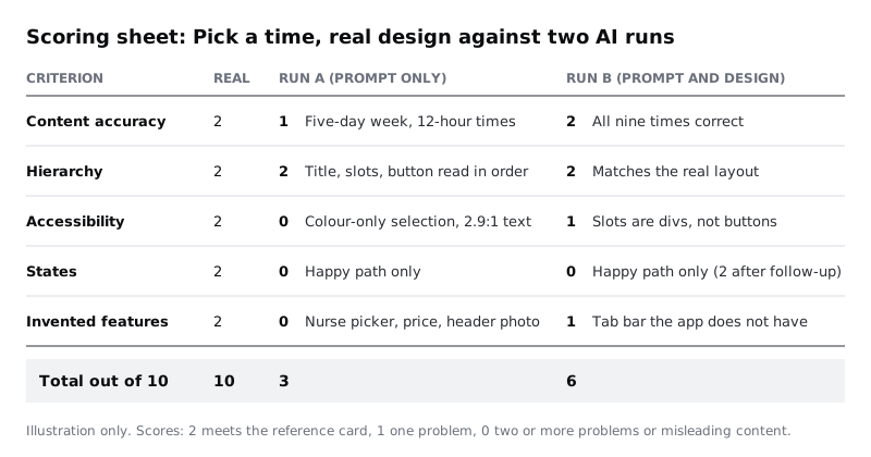
Scoring stops the review turning into "I quite like run B". Make a spreadsheet with one row per criterion and a column for each run. Score each criterion 0, 1 or 2, and write the evidence beside each score:
- Content accuracy. 2: every item on the reference card's content list appears, correct. 1: most appear, with one to three wrong or missing. 0: four or more wrong or missing.
- Hierarchy. 2: the title, the selected day, the slot groups and
Continueread in the right order at a glance. 1: one thing competes for attention that should not. 0: you cannot tell where to look first. - Accessibility. 2: every accessibility fact on your card holds. 1: one fails. 0: two or more fail.
- States. 2: both state frames are handled, or the tool produced them when asked in the prompt. 1: one is. 0: none, and nothing in the output suggests the screen can be empty or out of date.
- Invented features. 2: nothing was added that the brief did not ask for. 1: additions that are harmless but would need removing. 0: additions that would mislead patients or contradict the research.
The fifth criterion scores in the same direction as the others (higher is better) so the totals add up. Add a total row for each run, out of 10, and a column for the real design, which should score 10; if it does not, you have found a gap in your own design, which is worth knowing too.
Check it worked
Your spreadsheet has five criterion rows, three score columns, an evidence column for each AI run and a total row. Each criterion has its 0, 1 and 2 definitions written in a note or a header row, so another person could score the same screens and get close to your numbers.
Step 5 · Check content and log every invention
Work through the content section of your reference card line by line against each AI screen. Tick what is right, mark what is wrong, and add anything missing. Look closely at the data, not just the layout: a tool can draw a beautiful slot grid with the wrong times in it.
Then make an invention log: a separate list of everything on each AI screen that is not on your card. Write each one down, even small ones. Things worth looking for on a screen like this:
- Data the prompt did not give: a price, a clinic address, a clinician's name or photo, a star rating, "3 slots left" badges.
- Controls the prompt did not ask for: a clinician picker, a filter, a search box, a "favourite" heart, a bottom tab bar with sections the app does not have.
- Changed facts: a five-day week instead of seven, 12-hour times with AM and PM, the wrong date for Tuesday,
10:30shown as unavailable. - Removed content: the phone fallback line is the most likely loss, because generic booking screens rarely have one.
Mark each invention as harmless (decoration you would delete) or misleading (something a patient might believe, such as a price at a clinic that does not charge, or a clinician choice the clinic cannot honour). Misleading inventions decide the score for that criterion.
Score content accuracy and invented features for both runs, with the evidence in the sheet.
Check it worked
Each AI screen has a content checklist with every reference item marked right, wrong or missing, and an invention log in which every item is marked harmless or misleading. The content accuracy and invented features rows on your sheet are filled in, and each score points to a line in one of those lists.
Step 6 · Check hierarchy and accessibility
For hierarchy, zoom the AI comparison page out to about 25 percent, or step back from the screen, and note what you see first on each frame. On the real design it should be the title, then the selected time, then Continue. On AI screens a decorative header image, a large calendar or a bright banner often wins instead.
For accessibility, check each fact from your card against the AI screens, not against how they feel:
- Contrast. Use a colour picker on the screenshot (or read the colours from the generated code) and run the main pairs through a contrast checker: body text on its background, the slot border on white, the button label on the button. Body text needs at least 4.5:1, slot edges at least 3:1.
- Colour alone. Look at the selected slot. If the only difference from the others is its fill colour, it fails. Convert the screenshot to greyscale in Figma if you are unsure.
- Target size. Measure the slots, the day buttons and the back control. Each needs at least 24 by 24 px; Larkfield's own standard for the back control is 44.
- Text size. Body text below 16 px fails Larkfield's rule even if it passes contrast.
- Real controls. If you have the generated code, search it for the time slots. They should be buttons or radio inputs with the time as their name, not plain
divelements with a click handler, which a screen reader announces as text and a keyboard cannot reach.
Score hierarchy and accessibility for both runs. A screen that looks polished can still score 0 for accessibility, and that is a common result.
Check it worked
The accessibility row for each run lists the contrast ratios you measured, the selected-slot result, the smallest target size you found and what the code uses for a time slot. Every score has at least one measured number or code finding behind it, not an impression.
Step 7 · Check states, then try one follow-up prompt
Look at each AI screen and its preview for the two states on your card. Does anything show what happens when no times are free this week? When a patient taps a time that someone else has just taken? Most single-prompt output shows only the happy path, with every slot available and nothing that can go wrong. Score the states row on what you got first.
Now send one follow-up in the run B chat, and only one:
Add two states for this screen. First, no free times this week: replace
the slot groups with "No free times this week" and a "See next week"
button, and keep the phone line. Second, a chosen time has just been
taken: show "10:30 was just taken. These times are still free." above
the slots, with 10:30 removed.
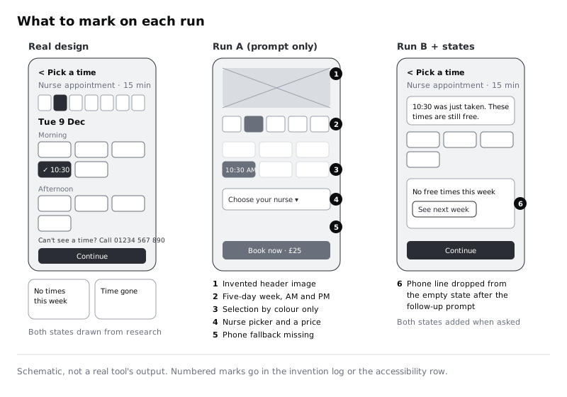
Capture the result as before and add it to the AI comparison page as Run B + states. Check it against your state frames: is the message text exact, does the phone line survive, did fixing the states break anything that was right before (a common side effect), and did any new inventions appear?
Add a row note on the sheet saying how the states score changed after the follow-up. That gap, between what the tool offers unprompted and what it does when you spell out the states, is the honest measure of how much design thinking it saves you.
Check it worked
Your AI comparison page now has four frames, with Run B + states beside the others. The states row on the sheet shows the run B score before and after the follow-up, and you have noted at least one thing the follow-up changed that you did not ask it to change, or written "none found".
Step 8 · Write your verdict on what the tool is for
Totals alone do not tell your team what to do. Under the scoring sheet, write a short verdict of five to eight sentences that answers three questions:
- Where did it help? Typical honest answers: run A gave three layout ideas in a minute that you can sketch from; run B laid the screen out faster than building it by hand; the generated code was a usable starting point for a developer prototype.
- Where did it fall short? Name the inventions that would have misled patients, the accessibility failures and the states it missed, with their scores.
- What is it for on this team? Write a rule people can follow. For Larkfield the evidence usually points to something like: prompt-to-UI output is useful for early options and quick throwaway prototypes; it is not finished design, and nothing generated reaches patients until a designer has checked it against the reference card and a person has rebuilt it with the clinic's components.
Keep the human check in the rule explicitly. A generated screen that scores well today can score badly on the next run, because the output changes between attempts, and the tool has no way to know about the research behind your choices unless someone puts it in.
Share the page and sheet with your team, and attach the prompts so anyone can repeat the comparison on another screen.
Check it worked
Under your sheet sits a verdict of five to eight sentences answering all three questions, with at least two scores quoted as evidence. It contains a one-line rule for when the team may use prompt-to-UI output, and that rule includes a human review step before anything reaches users.
Next steps
Take the better of your two runs and bring it into line with Larkfield's variables and components in Rebuild an AI-generated screen with your own components. To get closer to usable output on the first attempt, see Write prompts that give usable design output. If you skipped the series that built the real screen, Turn a mid-fidelity layout into a high-fidelity design covers it, and Design empty states that say what to do next goes deeper on the state AI tools most often leave out.
Related tutorials
- Write team rules for using AI in design workYou will have a one-page AI policy for your design team, covering approved tools, data that never goes in, client disclosure, who checks output and how generated assets are labelled, plus a three-question check every designer runs before using AI on a task.
- Write prompts that give usable design outputYou will have turned a one-line design prompt into a five-part prompt, compared the output at every version in a prompt log, and saved a reusable prompt template with three before and after examples for design tasks.
- Use Figma's built-in AI features on a real fileYou will have tried Figma's built-in AI tools for layers, text, search and images on a copy of a real design file, timed and checked each result, and written a keep-or-skip verdict for every tool on a scorecard beside your screens.
Need this done for you?
Padding does this work for growing companies, from the first diagnosis to a system that keeps working.
Get new tutorials