Figma and design tools · Beginner · 15 min
Inspect a Figma design as a developer
By Padding · Updated 18 Nov 2026
Figma (web) · November 2026
You will have the CSS for one card from a shared Figma file, written from the spacing, type and variables you read in Dev Mode, and a short list of questions for the designer about everything the file does not answer.
On this page
A designer sends you a Figma link and says the screens are ready. What you need from that file is not a picture. You need numbers you can type into code: how much padding, how big the gap, which font size, which colour token. You also need to know what the picture leaves out, such as what happens when the text is twice as long or the button is pressed.
Figma has a view for this called Dev Mode. It hides the drawing tools and shows the properties of whatever you select, plus a code snippet. The snippet is a starting point, not finished code. It reflects how the designer built the layer, and it knows nothing about your components, your class names or your framework.
In this tutorial you inspect one card in a shared file and turn it into CSS by hand. You take the measurements yourself, read the variable names instead of copying hex values, and translate auto layout settings into flexbox properties one by one. Along the way you keep a notes file with two parts: the values you will build from, and the questions you need the designer to answer. The examples use a booking card with a title, a line of detail and a button, but the method works on any card in any file.
Open a plain text file or a note now and add two headings: Values and Questions. Everything you find goes under one or the other.
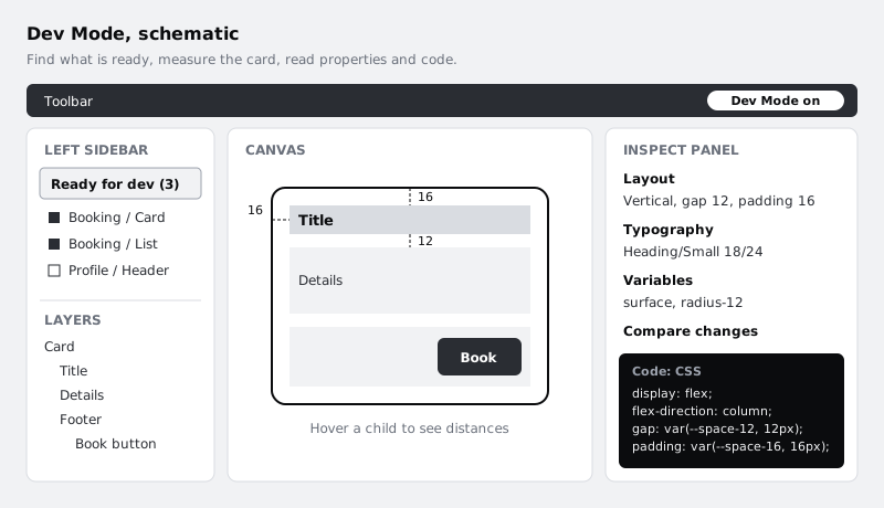
Step 1 · Open the file in Dev Mode
Open the link in your browser. Figma opens the file in the design view the designer uses, with layers on the left and properties on the right.
Switch to Dev Mode with the toggle in the toolbar, or press Shift+D. The toolbar changes colour, the drawing tools disappear, and the right sidebar now shows an inspect panel instead of editing controls. You cannot move or change anything by accident in this view, which is a good reason to stay in it.
Dev Mode is part of paid plans and needs a Full or Dev seat. If the toggle is missing or asks you to upgrade, tell whoever owns the file. You can still select layers and read many properties in the normal view, so the reading steps below still apply, but you will not see the code snippet or the ready for dev list.
Check it worked
Click any layer on the canvas. The right sidebar shows its properties and, lower down, a Code section with a snippet. If you see fill, stroke and effect controls you can edit, you are still in the design view.
Step 2 · Find the designs marked ready
Large files hold explorations, old versions and parked ideas next to the real screens. Building from the wrong frame is the most expensive mistake in handoff, so start from what the designer has marked as ready for development.
When at least one design in the file has that status, a Ready for dev entry appears in the left sidebar. Open it to see a list of every section, frame or component marked ready. You can filter the list to show ready items or completed ones, and sort it, for example by recent activity. Click an item to open a focused view of just that design.
If there is no Ready for dev entry, nothing in the file has been marked. Do not guess which frame is current. Add a line under Questions asking which frames to build from, and carry on with the frame the designer pointed you to, treating every value as provisional.
Check it worked
Your notes list the page and frame name of the card you are building, written exactly as Figma shows it, for example "Booking / Card - default". You can find it again from the Ready for dev list without scrolling the canvas.
Step 3 · Read the layer tree and measure the spacing
Select the card. Look at the layers panel on the left: a well-built card is a frame with auto layout, holding named child frames such as Header, Details and Footer. Expand it and note the nesting. That tree becomes your HTML structure, roughly one element per auto layout frame.
Now take measurements. With the card selected, hover over a child layer. Dev Mode draws red lines with the distance in pixels between the two. Measure:
- the padding: the distance from each edge of the card to its content
- the gap: the distance between one child and the next
- the card's width and corner radius, which the inspect panel lists under layout and appearance
Check the inspect panel against your measurements. If the card uses auto layout, the panel shows padding and gap as settings, and those settings are more reliable than a hover measurement, which can pick up an invisible layer. If the card has no auto layout and you are measuring loose layers, write that down: it usually means the spacing is not systematic, and you should ask which value is intended.
Check it worked
Under Values you have four padding numbers (top, right, bottom, left), a gap for each auto layout frame, the card width and the radius, for example "Card: padding 16 all sides, gap 12, width 360, radius 12; Footer: gap 8". Each number came from the inspect panel or a measurement you can repeat.
Step 4 · Read typography and variables
Select the card title. The inspect panel shows its typography: font family, weight, size, line height and letter spacing. If the designer used a text style, its name appears too, such as "Heading/Small". Write down the style name as well as the values. A name maps to a class or token you probably already have; raw values do not.
Do the same for colours, spacing and radius. When a property uses a variable, the inspect panel shows the variable name instead of, or next to, a raw value. If the designer has set a code syntax for that variable, the code snippet uses that name, which should match a custom property in your codebase. A colour that shows only a hex value with no variable is either a one-off or a mistake. Put it under Questions.
Before you copy anything from the snippet, open the language dropdown at the top right of the Code section. Pick CSS for the web, SwiftUI or UIKit for iOS, or Compose or XML for Android. Language settings sit at the bottom of the same dropdown: for CSS you can switch units from px to rem, which assumes a 16px root font size by default. Choose whatever your codebase uses so you do not convert numbers by hand later.
Check it worked
Your notes list each text layer with its style name and values, and each colour, spacing and radius with its variable name, for example "Title: Heading/Small, 18/24, weight 600, colour text-primary". Any value with no style or variable has a matching line under Questions.
Step 5 · Translate auto layout into flexbox
Auto layout and CSS flexbox describe the same idea: a container that places its children in a row or a column, with a gap between them and padding inside. That means you can translate the settings one at a time instead of copying the snippet.
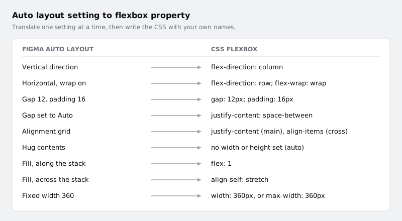
Read the card's auto layout settings in the inspect panel and translate them:
- Direction: vertical is
flex-direction: column, horizontal isflex-direction: row. Wrap isflex-wrap: wrap. - Gap and padding: copy them across as
gapandpadding. If the gap is set to Auto, the children are pushed apart, which isjustify-content: space-between. - Alignment: the alignment grid sets both axes at once. Along the direction of the stack it becomes
justify-content; across it,align-items. - Hug: the element sizes to its content. Usually you write no width at all.
- Fill: along the stack's direction, the child takes the remaining space:
flex: 1. Across it, the child stretches:align-self: stretch, which is already the default unless the container setsalign-items. - Fixed: a set width or height. Ask whether a fixed width is really fixed or a maximum, because a card fixed at 360 pixels will not fit a 320 pixel phone.
Then write the CSS yourself, using your variable names:
.booking-card {
  display: flex;
  flex-direction: column;
  gap: var(--space-12);
  padding: var(--space-16);
  max-width: 360px;
  border-radius: var(--radius-12);
  background: var(--surface);
}

.booking-card__title {
  font: 600 1.125rem/1.5rem var(--font-sans);
  color: var(--text-primary);
}

.booking-card__footer {
  display: flex;
  justify-content: space-between;
  align-items: center;
  gap: var(--space-8);
}
Now compare your version with the snippet in the Code section. The snippet usually has more: an explicit width on every layer, flex: 1 0 0 or align-self: stretch on children, and properties that only restate defaults. Keep what you are missing; drop what the layout already gives you.
On mobile the same reading applies: a vertical auto layout frame is a VStack(spacing:) in SwiftUI or a Column with Arrangement.spacedBy in Compose, and padding and alignment carry across in the same way.
Check it worked
Your notes contain CSS for the card where every number is either a variable or a value you recorded in the Values list. Line up your rules against the snippet: each difference is either a default you left out on purpose or something you have now added.
Step 6 · Compare versions before you build
Designs change after they are marked ready. Before you start, and again before you open a pull request, check what moved.
Select the card in Dev Mode. In the inspect panel, use Compare changes. It opens the frame's history so you can put the current version next to an earlier one and see which properties changed. For a component instance, the panel offers Compare with main component instead, which shows where this copy differs from the component in the library. Overrides like that are worth a question: either the instance is a deliberate variant, or the component should change.
If you have already built part of the card, compare against the version from the day you started. Every changed value goes into your Values list with the date.
Check it worked
You can name the date of the version you are building from, and your notes either say "no changes since <date>" or list each changed property with its old and new value.
Step 7 · Write questions for the designer
A Figma frame shows one state at one width with one set of content. Your code has to handle all the others. Go through the card and write a question wherever the file is silent. The ones that come up most:
- Long content: what happens when the title runs to two lines, or three? Does it wrap, or truncate with an ellipsis?
- Narrow screens: is 360 a fixed width or a maximum? What does the card do at 320?
- States: what do hover, focus, pressed and disabled look like for the button? Is there a loading or error state for the card?
- Missing tokens: which variable should replace each hard-coded colour or spacing value you found?
- Empty data: what shows when there is no detail line?
- Assets: which icons are exported, and in what format?
Keep each question answerable with a short reply or a link to a frame. Post them as comments pinned to the layer in the file, so the designer sees them in context and the answers stay with the design.
Check it worked
Your Questions list has at least one entry for content length, screen width and interactive states. Each question names the layer it is about, and none of them asks for something you could have read from the inspect panel.
Next steps
- See handoff from the designer's side, including what they check before marking anything ready, in Hand off a design with Figma Dev Mode.
- If a screen uses auto layout's grid flow or a two-dimensional layout, build it with How to Build Page Layouts with CSS Grid.
- Learn what Hug, Fill and Fixed mean on each layer from the builder's view in Build a responsive card with auto layout.
Part of these paths
Related tutorials
- Hand off a design with Figma Dev ModeYou will have the Larkfield Clinic booking screens cleaned up, grouped in one section, checked from the developer's side in Dev Mode, marked ready for dev and sent with a short note that lets a developer build without a handoff meeting.
- How to Build Page Layouts with CSS GridYou will build a page with a header, sidebar, main area and footer using named grid areas, fill it with a grid of cards that adds and removes columns by itself, make one card span two columns, and change the layout for narrow screens.
Need this done for you?
Padding does this work for growing companies, from the first diagnosis to a system that keeps working.
Get new tutorials