Figma and design tools · Beginner · 12 min
Make a social media graphic in Canva
By Padding · Updated 18 Nov 2026
Canva (web) · November 2026
You will have a square post for Larkfield Clinic announcing online booking, laid out with a margin, one clear headline and a photo that stays out of the way of the text, checked at phone size and downloaded as a PNG ready to post.
On this page
Most social posts that do not work fail for the same three reasons: text runs to the edge of the square, three things fight to be the biggest, and words sit on top of a busy photo. Templates hide these problems until you change the wording, and then the layout falls apart. This tutorial teaches the three habits that prevent them, so you can make a clear post with or without a template.
The example is a post for Larkfield Clinic, a fictional community clinic, telling patients they can now book appointments online. You start from a blank square rather than a template, so every decision is yours and you can see why it works. The same habits apply to any post: an event, an opening time change, a new service.
You need about 30 minutes. Canva's menus move around between releases, so where a step names a button, look for the same idea nearby if the wording differs.
Step 1 · Write the post before you design it
Open a notes app or a sheet of paper. A post is read in a second or two as people scroll, so it can carry one message, not a leaflet's worth. Write four lines:
- Headline: the one thing you want people to remember, in seven words or fewer. For Larkfield Clinic: "Book your appointment online".
- Supporting line: one sentence that answers "why should I care?". For example: "Pick a time that suits you, any day of the week."
- Action: where to go. A short web address works better than "link in bio" on its own, because the image is often shared without the caption. Use your real address; this tutorial uses larkfield.example.
- Who it is from: the organisation's name.
Cut anything else. Opening hours, phone numbers and the list of services belong in the caption or on the website, where people can read them at their own pace.
Check it worked
Your note has exactly four lines, and the headline is seven words or fewer. Read the headline alone, out loud: someone who saw nothing else would still know what changed.
Step 2 · Create a square design at 1080 by 1080 pixels
On the Canva home page, choose to create a design and pick Custom size. Enter 1080 for the width and 1080 for the height, with the unit set to pixels, and create the design. A blank white square opens in the editor.
A square works in the main feed of every large social platform, so it is a safe first format. 1080 pixels is wide enough to look sharp on a phone screen; Canva warns that very small designs can look blurry once downloaded. Canva also offers ready-made social post sizes when you search the create menu. Any of those is fine too, but a custom size makes the number explicit.
Rename the design straight away. Click the title in the editor's top bar (it says "Untitled design" until you change it) and call it "Larkfield Clinic - online booking post". A clear name saves you from hunting through a dozen untitled designs next month.
Check it worked
Open the File menu in the editor's top bar. The design's name appears at the top of the menu as the name you typed, with its size, 1080 × 1080 px, shown beneath it. Close the menu without changing anything. (Avoid checking with Resize: on the free plan it may open an upgrade prompt rather than the current size.)
Step 3 · Set a margin with guides
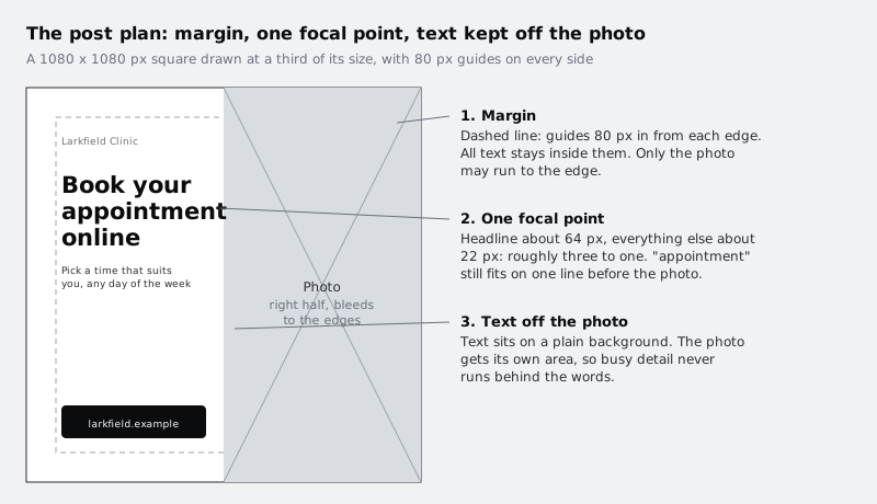
This is the first habit: nothing important touches the edge. Social apps round corners, lay icons and buttons over the image, and crop previews. Text close to the edge gets clipped or feels cramped even when it is not.
Turn on rulers and guides from the File menu (look for "Rulers and guides", then the option to show them). Rulers appear along the top and left of the page. Drag a guide out of the left ruler and drop it at 80 px, and another at 1000 px. Do the same from the top ruler at 80 px and 1000 px. You now have an inner square 80 px in from each edge. Guides only show while you edit; they do not appear in the downloaded image.
If a guide will not move after you drop it, the guides may be locked. Look in the same rulers and guides options in the File menu for a setting to lock or unlock them, unlock, adjust the guide, then lock them again so you do not nudge them by accident.
Check it worked
You see four guide lines forming a square inside your page. Hover over each one, or read the ruler under it: they sit at 80 and 1000 on both rulers.
Step 4 · Add the photo to its own half of the square
The second habit: text never sits on top of detail. A photo behind words looks fine on a large monitor and turns unreadable on a phone, because the eye cannot separate letter edges from the shapes behind them. Give the photo its own area instead.
If your photo shows people, make sure they agreed to appear in your clinic's posts before you upload it. Do not use patients' faces for a health service post without written consent.
Upload your photo: open Uploads in the left side panel, upload the file from your computer, then click it to add it to the page. Resize it with the corner handles so it covers the right half of the square, from 540 px across to the right edge, and from the top edge to the bottom edge. It is fine for the photo to run past the guides and off the page; only text has to stay inside the margin.
Now crop so the important part of the photo shows. With the photo selected, choose Crop in the toolbar above the page and drag the image inside its crop box until the subject (a face, a desk, a sign) sits roughly in the middle of the right half. Canva keeps the parts you crop away, so you can come back and adjust later.
Check it worked
The photo fills the right half of the square, edge to edge, with no white gap at the top, bottom or right. The left half is plain white. The subject of the photo is not cut off by the edge of the page.
Step 5 · Set one headline that wins
The third habit: one thing is clearly the biggest. When the headline, the logo and the address are all similar sizes, the eye does not know where to start and moves on. Make the headline about three times the size of everything else.
Press T or choose Text in the left side panel and add a heading. Type the headline from your note. In the toolbar, set the font size to about 64 and pick a plain, heavy sans serif font; bold or extra bold is easier to read small than a light weight. Let it break onto three lines ("Book your / appointment / online") by narrowing the text box so it fits between the left guide at 80 px and the photo at 540 px, with a little space before the photo. That column is only about 440 px wide, so the longest word, "appointment", sets the limit: if it splits or touches the photo, lower the size a step at a time (64 to 68 suits most heavy fonts) until it sits whole on its own line.
Add the other three lines as separate text boxes:
- The supporting line at about 22, regular weight, two or three lines long, under the headline.
- The clinic name at about 22, at the top of the left half.
- The web address at about 22, near the bottom of the left half. Put it on a small dark rectangle (from Elements, a square shape) with white text, so it reads as the place to go.
Use dark grey or near-black text on the white half. Pale grey text or coloured text on a coloured background loses contrast quickly on a phone in daylight.
Check it worked
Your page has four text boxes. In the toolbar, the headline's font size is roughly three times the supporting line's (for example 64 and 22), and "appointment" sits whole on one line without touching the photo. If you squint at the screen until the words blur, the headline is still the first shape you notice.
Step 6 · Line everything up to the left guide
Things that nearly line up look like a mistake. Give the left half one shared edge.
Drag each text box and the address rectangle until its left edge snaps to the guide at 80 px; a short line flashes when it snaps. For finer control, select several elements together (hold Shift and click each one), open Position in the toolbar and choose to align their left edges. Set the left alignment for the text inside each box too, so every line starts on the same edge.
Now space them out. Keep the headline and supporting line close together, because they belong together, and leave clearly more space above the address. Distance tells the reader what is related. When it looks right, select the headline and supporting line together and group them so they move as one later.
Check it worked
Every piece of text, and the address rectangle, starts on the guide at 80 px. Nothing in the left half crosses the guides. The gap between the supporting line and the address is visibly larger than the gap between the headline and the supporting line.
Step 7 · Check it at the size people will see it
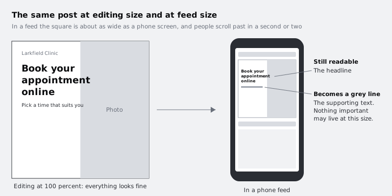
You have been looking at the post at full size on a large screen. Your audience sees it about as wide as a phone, for a second or two. Check it under those conditions before you post.
First, zoom out in Canva until the square is roughly 7 to 8 cm wide on your monitor, about the width of a phone screen. Then do the real test: download a draft (the next step shows how) and send it to your phone, or open the design in the Canva app on your phone, and hold the phone at arm's length.
Ask three questions:
- Can you read the headline without bringing the phone closer?
- Does the photo still show what it is of, or has it become a blur?
- Would someone who reads only the headline know what changed?
If the answer to any of them is no, go back: shorten the headline and make it bigger, crop tighter on the photo's subject, or darken the text. Supporting text that is hard to read at this size is acceptable, as long as the headline carries the message on its own.
Check it worked
On your phone, at arm's length, you can read the headline in one glance and say what the photo shows. You have written down anything you changed after the check, so you remember it for the next post.
Step 8 · Download the post as a PNG
Open Share in the top-right corner of the editor and choose Download. Set the file type to PNG, which keeps text edges crisp and is what Canva recommends for social uploads. Leave the size at 1x, since the design is already 1080 px. Download the file.
Some options in the download panel, such as a transparent background, need a paid Canva plan. You do not need any of them for this post.
Give the downloaded file a clear name on your computer, such as larkfield-online-booking-2026-11.png, so you can find it when you post and again when someone asks for "that booking image".
Check it worked
You have a PNG file on your computer. Open its file information (Get Info on a Mac, Properties then Details on Windows): the dimensions are 1080 by 1080. Open the image itself and confirm the guides do not appear in it.
Next steps
You now have a post built on three habits you can reuse: a margin, one headline that wins, and text kept off the photo. Make the next post faster by saving the clinic's colours, fonts and logo once:
- Set up a brand kit in Canva for a small business stores your colours, fonts and logo so every new design starts on brand.
- Design a printable flyer in Canva applies the same layout habits to an A5 or A4 page, with the extra steps print needs.
- Choose between Figma, Sketch, Adobe XD, Penpot, Framer and Canva helps you decide when a job has outgrown Canva.
Part of these paths
Related tutorials
- Set up a brand kit in Canva for a small businessYou will have a Canva Brand Kit holding your logo, colours and fonts, and one template for repeat posts that anyone on your team can fill in without breaking the look.
- Design a printable flyer in CanvaYou will have an A5 open day flyer with bleed, safe margins, a clear reading order and a tested QR code, exported as a print-ready PDF a print shop will accept.
- Choose between Figma, Sketch, Adobe XD, Penpot, Framer and CanvaYou will have a one-page decision sheet that picks a design tool for three real jobs, with the reasons written down so you can defend each choice to a client or a team.
Need this done for you?
Padding does this work for growing companies, from the first diagnosis to a system that keeps working.
Get new tutorials