UI and visual design · Intermediate · 18 min
Audit your screens before you build a design system
By Padding · Updated 18 Nov 2026
Figma (web) · November 2026
You will have an audit page in Figma that lists every colour, text setting, spacing value, corner radius and component your screens use, with each near-duplicate marked keep, merge or drop.
On this page
Most design systems that fail were drawn on a blank page. Someone picks a palette of forty colours, a twelve-step type scale and a component list copied from a big public system, and none of it matches what the product's screens actually do. The team keeps designing the way they always did, and the system becomes a second, unused file.
A minimal system starts the other way round: from what already exists. Before you name a single token, you count what your screens use. You will find a short list of values doing real work, plus a tail of near-duplicates that crept in one paste at a time: a grey one shade off the real one, a 15 px gap next to a 16 px one, a corner radius of 6 on one card and 8 on everything else. The audit separates the two, and gives every value a decision.
This is part 1 of an eight-part series that turns the Larkfield Clinic booking app into a small, documented design system. The input is the ten high-fidelity frames from the series that designed the app: six screens (Home, Choose a service, Pick a time, Your details, Confirm, Booked) and four state frames (Pick a time / No times this week, Pick a time / Time gone, Your details / Errors, Confirm / Could not book). If you are working on your own product, pick any six finished screens that cover a list, a form, a confirmation and an error. You will end with an audit page in Figma that the next seven parts turn into tokens, a palette, a type scale, spacing, components and documentation.
Step 1 · Set up an audit page with five sections
Open the Larkfield file. Add a page called 11 Audit. Do not copy the screens onto it: you audit the live frames where they are, so that nothing you count is a stale copy. Keep the frames' page open in a second browser tab if switching pages slows you down.
On 11 Audit, choose the Section tool (Shift S) and draw five sections in a column, named Colour, Type, Spacing, Radius and Components. Inside each section, add a table header as a row of text layers, with these five columns:
- Value: the hex code, the font settings, the number in pixels, or the component name.
- Job: what the value does, in two or three words ("error text", "gap between list rows"). A value with no clear job is already a candidate to drop.
- Used: a rough count of places, and the screens they are on.
- Source: where it comes from: a variable name, a text style name, a component, or "raw" when someone typed or pasted it.
- Decision: keep, merge into another value, or drop. Leave it empty for now.
Above the five sections, add one text layer with today's date and the names of the frames you audited. When someone reads this page in six months, they need to know which version of the screens it describes.
Check it worked
The 11 Audit page has five sections with those names, each holding the same five column headings, and a dated note at the top listing the frames in scope. The screen frames are still on their own page, untouched.
Step 2 · Inventory every colour
Go to the screens page and select one frame. In the right sidebar, Selection colors lists every colour used inside it. A colour bound to a variable shows the variable name; a colour that was typed or pasted shows a raw hex code. Raw codes are what you are hunting for.
Work frame by frame, in flow order, and add a row to the Colour section for every distinct value. If a value is already listed, add the screen to its Used column instead of a new row. For Larkfield you start with the thirteen colour variables from the high-fidelity tutorial (text, text-muted, surface, canvas, line, border, accent, accent-tint, on-accent, danger, danger-tint, notice, notice-tint), so most rows are quick. The useful rows are the extras.
When a raw hex appears in Selection colors, find the layer that uses it: select smaller groups and single layers inside the frame until Selection colors shows that hex on its own. Note which layer it is in the Job column. In the example file used here, the raw values were:
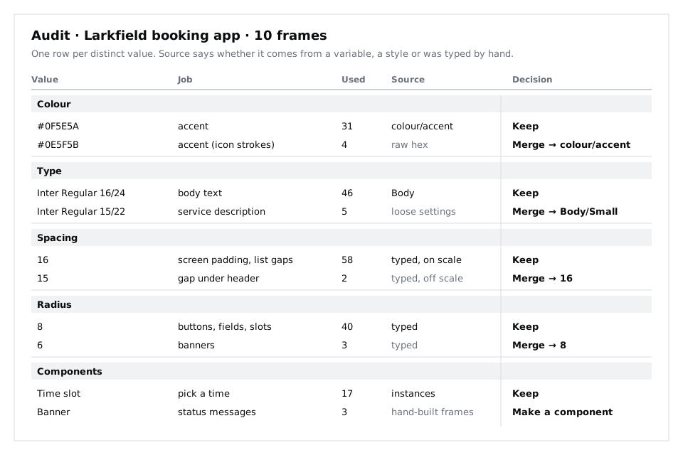
#0E5F5Bon four icon strokes. The icons were pasted as SVG and one of them kept its own colour instead ofcolour/accent. Pasted icons and illustrations are the most common source of stray colours.#FFFFFFas a raw fill on the photo caption card on Home. Same value ascolour/surface, but not bound to it, so a future change tosurfacewould miss it.#5B6371on the description lines added under each service on Choose a service during the prototype revisions. It is one step offcolour/text-muted(#5A6270).
Do not decide anything yet. Counting first and deciding later stops you from merging the first near-duplicate you see into a value that turns out to be the odd one.
Check it worked
Click each frame in turn: every colour Selection colors lists for it appears in your Colour section, and every raw hex has a row with its layer and screen named in the Job and Used columns. For Larkfield you have the thirteen variables plus every raw value you found.
Step 3 · Inventory text settings
Text drifts differently from colour. A layer can carry a text style, or it can carry loose settings (a font, size and line height typed into the Typography section) that happen to look like a style. Click a text layer: the Typography section shows a style name when one is applied, and plain values when it is not.
Go through each frame and click every text layer that is not inside a component instance (components were styled once, so their text is consistent unless an override changed it). Shift-click to take several at once; if the Typography section shows mixed values, click them one by one. Add a row to Type for each distinct combination of font, weight, size and line height, and write the style name, or "loose", in Source.
Larkfield has five text styles: Heading/L (28/34), Heading/M (20/26), Body (16/24), Body/Small (14/20) and Label (14/20, semi bold). Watch for:
- Sizes one pixel off a style, such as 15/22 for a line that should be
Body/Small. These are almost always typed by hand. - The same size with a different line height, such as 16/20 beside
Bodyat 16/24. On a dense phone screen the tighter line looks fine in English and breaks the moment a longer word or a second language wraps onto two lines. If the app may carry Yoruba, Hausa or French alongside English, test the longest translation before you accept a tighter line. - Weights outside the set, such as a Medium heading where every other heading is Semi Bold.
Check it worked
Every text layer outside a component either shows one of the five Larkfield styles, or has a row in Type marked "loose" with its screen and job. Count the rows: if you have more than eight, the type is drifting and parts 4 and 6 of this series have real work to do.
Step 4 · Inventory spacing and corner radius
Spacing lives in two places: auto layout gap and padding fields, and distances between layers that are not in auto layout. Check both.
For auto layout, select each auto layout frame and read its gap and its four padding values in the right sidebar. For everything else, select a layer, hold Alt (Windows) or Option (Mac) and hover a neighbour to see the distance. Add each distinct number to Spacing with a count and a job.
The mid-fidelity tutorial put Larkfield on a scale of 8, 16, 24 and 32. Mark each value in the Source column as "on scale" or "off scale". In the example file, the spacing looked like this:
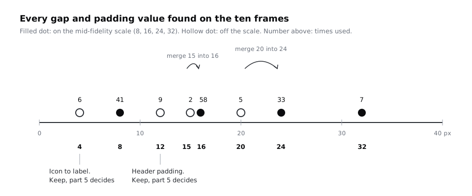
A picture like this tells you more than the list. The 15 is a slip: two uses, one pixel away from 16. The 4 and the 12 are different. They are used consistently for a real job (the gap between an icon and its label, the padding inside the header), and the scale simply never had a value for that job. Those are not mistakes to fix but gaps in the scale, and part 5 decides whether the scale grows.
Then do the same for corner radius: select each button, field, time slot, card and banner, read its corner radius, and add a row to Radius. The high-fidelity tutorial set buttons to 8. In the example file the time slots and fields followed, the hand-built status banners used 6, and the photo on Home used 12.
Check it worked
Your Spacing section lists every distinct gap and padding value with a count and an on-scale or off-scale mark, and your Radius section lists every corner radius with what uses it. Pick any three auto layout frames at random: each of their gap and padding values is in the table.
Step 5 · Inventory components and the things that should be
Open the layers panel on each frame. Instances show the component icon; plain frames and groups do not. Add a row to Components for each of the main components in the file, with its number of instances: for Larkfield, Header, Button (primary and secondary), Text field, Time slot, List row and the six Icon components.
Then look for two kinds of trouble:
- Detached instances. A button that looks exactly like the others but is a frame, not an instance, was detached at some point. It will not pick up the next change to the main component. Add it under its component with Source "detached" and the screen it is on.
- Repeated hand-built patterns. Anything you see built the same way three or more times without being a component. On Larkfield, the status banners (the
accent-tintbanner on Booked, thenotice-tintbanner on Time gone, thedanger-tintbanner on Could not book) are hand-built frames with an icon and a line of text. The day buttons in the week strip on Pick a time are another. Add each as a row with Source "hand-built" and the number of copies.
These rows are the raw list for part 6, which specifies ten core components and their states. Patterns that repeat are where the component list comes from, rather than from a generic list of what a design system "should" have.
A note for anyone shipping to low-end Android phones: count images and icon types here too. Every distinct icon set or illustration style is another set of files to download on prepaid data. Two icon styles doing the same job is a merge, not a matter of taste.
Check it worked
Every component in the file has a row with an instance count. Every detached instance and every pattern you found three or more times has its own row with its screens listed. Select a few buttons and fields on the frames at random: each one is either an instance in your count or listed as detached.
Step 6 · Decide keep, merge or drop for every row
Now fill the Decision column, one section at a time. Use three rules, and write the rule's reason in a few words after the decision:
- Keep a value that has a clear job and no near-duplicate doing the same job.
- Merge two values that do the same job and that a person could not tell apart side by side. The less-used value merges into the more-used one, unless the more-used one fails a check such as contrast.
#0E5F5Bmerges intocolour/accent; the raw#FFFFFFmerges intocolour/surface(same value, now bound);#5B6371merges intocolour/text-muted; 15 merges into 16; 20 merges into 24; the 15/22 description text merges intoBody/Small; the banners' radius of 6 merges into 8. - Drop a value with no job, or one that only existed for a single screen and can be redesigned away.
Similar is not the same as duplicate. colour/line (#D5D9DF) and colour/border (#7D8592) are both greys used for edges, and they look like candidates to merge. They are not: line is a decorative divider, and border is the visible edge of a control that has to reach 3:1 contrast (WCAG 1.4.11). Two values with different jobs stay, however close they look. The opposite case matters on cheap phone screens at low brightness: two greys one shade apart look identical there, so they can never carry a difference in meaning. If two such values were meant to signal different things, that signal needs a second cue, not a third grey.
For values you cannot settle yet, such as the 4 and 12 spacing values, write "Keep, part 5 decides" so they do not get lost.
Check it worked
Every row in all five sections has a decision and a short reason, and no row says "merge" without naming what it merges into. Find colour/line and colour/border: both say keep, with different jobs written beside them.
Step 7 · Summarise the audit for the next parts
At the top of 11 Audit, under the dated note, add a short summary as a text layer, one line per section, with the count before and after the decisions. For the example file it read:
- Colour: 16 values, 13 after merges, all bound to variables.
- Type: 8 settings, 5 after merges, all as text styles.
- Spacing: 8 values, 6 after merges, 2 waiting for part 5.
- Radius: 3 values, 2 after merges.
- Components: 6 components (counting the six icons as one set), 1 detached instance to relink, 2 hand-built patterns to make into components.
Do not apply the merges to the screens yet. Part 2 gives each kept value a token name, and applying them now means changing the same layers twice. The audit page is the brief for the rest of the series, so leave it in the file and keep it updated if anyone edits the screens before part 8.
If you are presenting this to a team, the before and after counts are the argument: they show the system will be smaller than the screens' current chaos, not bigger.
Check it worked
The 11 Audit page opens with a dated note, the list of audited frames and five summary lines with before and after counts. Someone who has never seen the file can read the summary and say how many colours, text styles, spacing values and radii the system will start with.
Next steps
Part 2, Name design tokens from primitives to roles, takes every kept value from this audit and gives it a name in two layers: raw primitives and the roles that use them.
From there, Build a colour palette with tonal ramps works on the Colour section and Define a spacing scale and radius tokens settles the values this audit left for part 5. If you have not built the Larkfield screens, Turn a mid-fidelity layout into a high-fidelity design creates the variables and text styles this audit counts.
Part of these paths
Related tutorials
- Turn a mid-fidelity layout into a high-fidelity designYou will have high-fidelity Larkfield Clinic booking screens in Figma, coloured, typeset, with icons and one photo, every text and colour pair checked for contrast and ready to wire into a prototype.
- Name design tokens from primitives to rolesYou will have the Larkfield Clinic values split into a primitives collection and a semantic collection in Figma variables, every semantic token aliasing a primitive, and a one-paragraph naming rule your team can apply to any new token.
- Build a colour palette with tonal rampsYou will have four ten-step colour ramps built in OKLCH on a Figma palette page, each step labelled with its contrast on white and on the darkest grey, and the Larkfield semantic colour tokens pointing at ramp steps.
Need this done for you?
Padding does this work for growing companies, from the first diagnosis to a system that keeps working.
Get new tutorials