AI in design · Intermediate · 17 min
Design for streaming AI answers and long waits
By Padding · Updated 18 Nov 2026
Any design tool with frames and a prototype mode, such as Figma or Penpot · November 2026
You will have a labelled state sequence for one AI answer, from send to complete, with a timed-out and a stopped ending, a stop button, scroll rules, status-line copy and screen reader notes a developer can build from.
On this page
Most loading states have two moments: waiting, then done. An AI answer has more. Nothing happens for a second or two, then the assistant may go off and check something, then words start arriving faster than anyone reads them, then they stop. Somewhere in there the person may lose patience and press stop, or the connection may drop and leave half a sentence on screen. If you only design the finished answer, every one of those moments gets decided by whoever writes the code, usually on the day.
This tutorial designs the whole sequence for one question to the Larkfield Clinic booking assistant: "Can I get a travel vaccine this week?" To answer, the assistant has to look up free Vaccination slots, which takes a few seconds, then write a short reply. You will decide what is on screen at each moment, what the stop button does, where the page scrolls, what a screen reader hears, and how a stopped or timed-out answer ends. The output is a row of labelled frames and a handful of notes, not a finished visual style.
The wider chat screen (the opening message, suggested prompts, handing off to the booking form) is covered in Design a chat interface for an AI assistant. Here you zoom in on one reply.
Step 1 · Write down the phases and a time budget
Before drawing anything, list what happens between the tap on Send and the finished answer. Open a page in your design file called Streaming states and add a text block at the top with these phases, one per line:
- Sent: the person's message appears in the thread.
- Waiting: the request has gone; no text has come back yet.
- Checking: the assistant is calling a tool, here the clinic's appointment lookup.
- Streaming: words are arriving.
- Complete: the answer has finished and any buttons in it work.
Then two endings that replace Complete:
- Stopped: the person pressed stop.
- Timed out: nothing new arrived for too long, or the connection dropped.
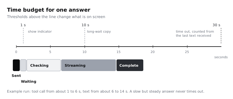
Now give each phase a time budget. Use well-known response-time limits as the starting point: about 0.1 seconds feels instant, about 1 second keeps someone's train of thought, and around 10 seconds is where attention drifts. For Larkfield, write:
- Sent: instant (under 0.1 s). The message never waits for the network.
- Waiting: if no text or status after 1 s, show the waiting indicator.
- Checking: if a tool call starts, show its status line straight away.
- Long wait: at 10 s with no new text, change the status copy.
- Timed out: 30 s since the last text arrived, end the answer.
These are design targets, not promises. Ask your developers what the slowest realistic case looks like, especially on mobile data. Many Larkfield patients book on low-end Android phones over prepaid mobile data, where a reply can arrive in bursts with long gaps between them. The 30 second limit is measured from the last thing that arrived, not from Send, so a slow but steady answer never times out.
Check it worked
Your Streaming states page starts with seven named phases and four thresholds (1 s, the start of a tool call, 10 s and 30 s). Read the timed-out rule aloud: it says "since the last text arrived", not "since Send".
Step 2 · Design the sent and waiting frames
Duplicate your chat screen and name the copy 1 Sent. Add the person's message to the thread, "Can I get a travel vaccine this week?", in its sent style. It appears the moment they tap Send, before any reply, so they know the tap worked.
In the same frame, change the composer. The text field clears and the Send button becomes a Stop button in exactly the same position and size. Give it a square stop icon and a visible label, Stop, so its spoken name matches what sighted people see. Keeping it in the same spot matters for two reasons: someone already has their thumb there, and keyboard focus stays on a control that still exists instead of falling back to the top of the page.
Leave the text field editable. People often think of a better question while waiting, and they can type it now. Sending is what is blocked, not typing.
Duplicate 1 Sent as 2 Waiting. Under the person's message, add the assistant's message bubble with a small waiting indicator inside it: three dots, or a short word such as Thinking. This frame is what people see after 1 second with nothing back. If your team animates the indicator, design a still version too for people who have turned on reduced motion in their system settings, and note that the animation stops the moment text arrives.
Check it worked
1 Sent and 2 Waiting show the question in the thread, an empty text field and a Stop button with a visible label in the same place as Send. 2 Waiting has an assistant bubble with an indicator in it and a note beside the frame about the reduced-motion version.
Step 3 · Add a status line for slow tool calls
Generic dots are fine for a second or two. Once the assistant is doing real work, say what it is. Duplicate 2 Waiting as 3 Checking and replace the indicator with a status line inside the assistant bubble:
Checking vaccination times…
Write status lines with these rules:
- Say what is being done in the reader's words, not the system's. "Checking vaccination times", not "Calling availability API".
- One line at a time. When the step changes, replace the line; do not stack a log of steps under each other.
- Present tense, ending with an ellipsis, and short enough to fit on one line inside the bubble. Test it: set the frame to 320 pixels wide, put the line in the Body text style, and shorten it until it stops wrapping. That usually means about 30 characters or fewer.
- No percentages unless your developers can give a real one. A progress bar that jumps from 10% to done teaches people to ignore it.
Then design the long wait. Duplicate 3 Checking as 3b Still checking and change the line to:
Still checking. This can take a little longer on a slow connection.
The one-line rule is for the status lines people see while work is happening. This long-wait message is a short explanation rather than a status, so it may wrap to two lines on a 320 pixel screen; check that it is no longer than two. This version appears at the 10 second mark. Add a second, quieter line under it with a way out that does not depend on the assistant: Or choose a time yourself, linked to the Pick a time screen of the normal booking flow. A person on a weak signal can leave without losing anything.
Check it worked
3 Checking has one status line in plain words that stays on one line in a 320 pixel wide frame at Body size. 3b Still checking has the longer copy, wrapping to no more than two lines at that width, and a link to the booking flow. Read both lines to someone who does not work on the product and ask them what the assistant is doing. They should be able to tell you without hearing the word "API" or "tool".
Step 4 · Design the streaming message and the stop button
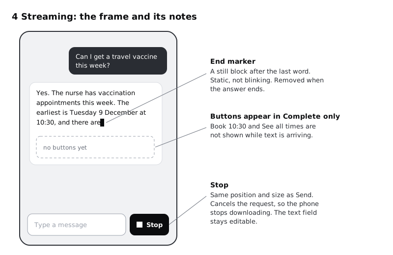
Duplicate 3 Checking as 4 Streaming. The status line disappears and the answer starts to fill the same bubble, so nothing jumps sideways. Write the partial text as it would look about halfway through:
Yes. The nurse has vaccination appointments this week. The earliest is Tuesday 9 December at 10:30, and there are
Decide three things about the text while it arrives, and write each as a note beside the frame:
- The end marker. A small block or bar after the last word shows the answer is still coming. Keep it static, not blinking. Answers can stream for longer than five seconds, and blinking content that runs that long needs a way to stop it; a still marker avoids the problem.
- What stays hidden until the end. Buttons and links in an answer, such as
Book 10:30orSee all times, appear only in Complete. A button that appears mid-sentence moves under a thumb that was about to tap something else, and a booking button for a time that might be corrected two lines later is worse. - How fast text appears. Ask for text to be added in small groups of words rather than one token at a time. It reads more smoothly, and redrawing the page dozens of times a second is hard work for an older phone.
Now the Stop button. Its job is to end the request, not just to hide the text. Write that in the note: pressing Stop cancels the request so the phone stops downloading, which matters to anyone paying for data by the megabyte. Stop is available from 1 Sent to the end of 4 Streaming, and turns back into Send in Complete.
Check it worked
4 Streaming shows partial text inside the same bubble as the status line was, ending in a still marker, with no buttons in the answer yet. Three notes sit beside it (marker, hidden buttons, word groups) and a fourth beside the Stop button says that it cancels the request.
Step 5 · Decide what happens to scroll position
Streaming text makes the conversation longer while someone may be reading it. There are two cases, and they need opposite behaviour. Write them as a short rule next to 4 Streaming:
- The person is at the bottom of the thread. Keep the newest line in view as text arrives, so the answer grows upwards from the composer.
- The person has scrolled up, for example to reread the clinic's address in an earlier message. Do not move them. Leave the page where it is and show a small
New answer belowbutton just above the composer. Tapping it scrolls to the latest text and the button goes away.
Define "at the bottom" so it can be built: within about one line height of the end of the thread. Anything further up counts as scrolled up, and the moment someone drags up during streaming, automatic scrolling stops for the rest of that answer.
One more rule for long answers: when the answer completes, do not jump to its last line. If the start of the answer has scrolled off the top, the person should still be able to read it from the start. Bring the top of the answer into view only if they have not scrolled at all.
Draw 4b Streaming, scrolled up: the same thread with an earlier message in view, the streaming answer off screen below, and the New answer below button over the bottom of the thread.
Check it worked
You have a written rule for both cases, a number for "at the bottom", and a 4b frame with the New answer below button placed so it does not cover the composer or the Stop button. Scroll your own prototype of the thread up and point to where the new text is: it should be below the visible area, not pulling the view.
Step 6 · Plan what a screen reader announces
If every new word were announced, a screen reader user would hear a stream of fragments that restarts with each update, and nothing else on the page could get a word in. The aim is the opposite: say briefly that something is happening, then read the finished answer once.
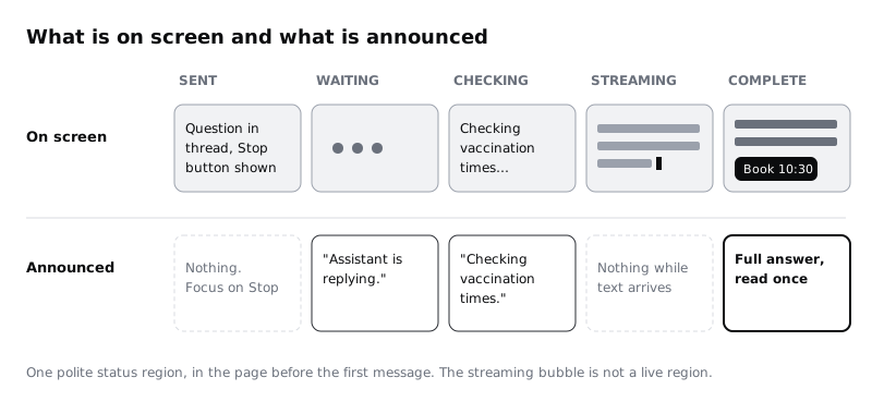
Add a column of notes under the frames, one per state, headed Announced. For Larkfield:
1 Sent: nothing extra. Focus stays on Stop.2 Waiting:Assistant is replying.3 Checking:Checking vaccination times.(the status line, read once when it appears)3b Still checking:Still checking. You can stop, or choose a time yourself.4 Streaming: nothing. The answer is being written but is not read yet.5 Complete: the full answer text, read once, thenBook 10:30 buttonis reachable as the next item.6 Stoppedand7 Timed out: their short ending line, described in the next step.
Then add a handoff note that explains the mechanism in words a developer can act on:
- Use one polite status region that is already in the page when it loads, separate from the message list, and write the lines above into it. Polite means it waits for the screen reader to finish what it is saying; nothing here needs to interrupt.
- Keep the streaming bubble itself out of any live region. Mark it busy while it fills if your team wants, but do not rely on that alone: support varies between screen readers.
- Do not move focus to the answer when it completes. People may be typing their next question.
Test this with a real screen reader before release, at least TalkBack on Android and VoiceOver on iPhone. Many Larkfield patients use low-cost Android phones, where TalkBack is the built-in screen reader, so treat it as a first-class target rather than an afterthought.
Check it worked
Every frame has an Announced note, 4 Streaming says "nothing", and 5 Complete says the full answer is read once. The handoff note names one polite status region that exists before the first message. Read the announcements column top to bottom at speaking pace: it should take under half a minute and make sense without the screen.
Step 7 · Design the complete, stopped and timed-out endings
Duplicate 4 Streaming three times and name the copies 5 Complete, 6 Stopped and 7 Timed out.
5 Complete. Finish the text: Yes. The nurse has vaccination appointments this week. The earliest is Tuesday 9 December at 10:30. Some travel vaccines need more than one dose, so the nurse will check what you need at the appointment. Remove the end marker, add the buttons Book 10:30 and See all times, and turn Stop back into Send. Booking goes through the normal Your details and Confirm screens, so a person always checks the time before it is booked; the assistant never books for them.
6 Stopped. Keep the text that had arrived. Deleting it throws away something the person may have wanted to read. Remove the end marker and add a line under the text in Body/Small and colour/text-muted: You stopped this answer. Offer one action, Ask again, which sends the same question. Do not show booking buttons, because the times in a cut-off answer may be incomplete.
7 Timed out. Keep any partial text but make clear it is unfinished, using words and an icon rather than colour alone: This answer didn't finish. Your connection may have dropped. in the notice style, with two actions: Try again and Choose a time yourself, the second linked to Pick a time. The fallback is the important one. A person whose signal keeps dropping can still book without the assistant.
For the announcements, 6 Stopped says Answer stopped. and 7 Timed out says the notice line once. Add both to your Announced notes.
Check it worked
You have three ending frames. 5 Complete has no end marker, two buttons and Send back in place. 6 Stopped keeps the partial text with a stopped line and Ask again, and no booking buttons. 7 Timed out keeps the partial text, uses an icon and words to say it did not finish, and offers a link to the booking flow. Cover the colours on 7 Timed out with your hand or switch your screen to greyscale: you can still tell it from 6 Stopped.
Step 8 · Lay out the sequence and walk it with a stopwatch
Arrange the frames left to right in phase order: 1 Sent, 2 Waiting, 3 Checking, 4 Streaming, 5 Complete. Put 3b Still checking under 3 Checking and 4b Streaming, scrolled up under 4 Streaming. Put 6 Stopped and 7 Timed out under 5 Complete as branches. Draw arrows between them and label each arrow with its trigger: after 1 s, tool call starts, first text arrives, stream ends, Stop pressed, 30 s since last text.
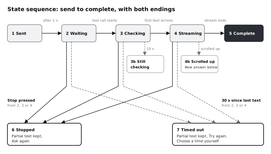
Link the main row in your prototype with timed transitions that roughly match your budget (1 second, 5 seconds, 8 seconds), and put a click link on the Stop button of 4 Streaming that goes to 6 Stopped. Then walk it with a colleague holding a stopwatch. Play it three times:
- Let it run to Complete. Ask: did the wait feel explained at every point?
- Press Stop halfway through streaming. Ask: is it clear what was kept and what to do next?
- Read only the
Announcednotes aloud while the colleague watches the frames. Ask: did anything important happen that was not said?
Write each answer next to the sequence and fix anything that came up before you hand it over.
Check it worked
Your page shows nine frames, every arrow has a trigger label, and the prototype runs from Send to Complete on timers and from Streaming to Stopped on a tap. Under the sequence you have three short notes from the walk-through, one per run, and none of them says "I didn't know what it was doing".
Next steps
The same sequence works for any AI feature that takes a few seconds, not only chat: a summary, a draft reply, a search over documents. Change the status lines and keep the rules.
- Design error, refusal and fallback states for AI features covers the answers that fail while looking finished, which a timer cannot catch.
- Design loading states: spinners, skeletons and progress chooses a loading pattern for the rest of the Larkfield app by expected wait.
- Announce errors and notices with a live region builds the kind of status region your announcement notes ask for, and tests it.
- Show uncertainty and sources in AI answers designs what goes inside the Complete answer once it has arrived.
Part of these paths
Related tutorials
- Design a chat interface for an AI assistantYou will have a scope sheet for a task-focused booking assistant and seven Figma frames covering its main chat states, from the opening message to hand-offs to the real booking form and to a person.
- Design loading states: spinners, skeletons and progressYou will have a loading-state table for every wait in a booking flow, with the pattern chosen by expected wait time, and Figma frames for a skeleton, a button spinner, an upload progress bar, an optimistic switch and a "taking longer than usual" state.
- Design error, refusal and fallback states for AI featuresYou will have a failure matrix for an AI booking assistant that covers wrong answers, refusals, outages and rate limits, with a non-AI way forward for every row and a set of state frames that keep people moving.
Need this done for you?
Padding does this work for growing companies, from the first diagnosis to a system that keeps working.
Get new tutorials