AI in design · Intermediate · 17 min
Ask AI for design critique and weigh what it says
By Padding · Updated 18 Nov 2026
Any design tool that exports PNG, a general-purpose AI assistant your organisation allows for design work (one that accepts image attachments for the image run), and a spreadsheet · November 2026
You will have an AI critique of one screen, tested against a heuristic review you did by hand first, every AI point sorted into useful, generic or wrong, and one merged findings list with a short note on where AI critique helped and where it could not.
On this page
Paste a screen into an AI assistant and ask "what would you improve?", and you will get a confident list in seconds. Some of it will be sharp. Some of it would fit any screen ever made. And some of it will be wrong in a way that is hard to spot unless you already know the screen well: a problem that is not there, or a standard quoted with the wrong number.
You cannot weigh that list by reading it. You need something to measure it against. So this tutorial does the review by hand first, seals it, and only then asks the AI. You give the AI the same screen twice, once as an image and once as a written description, match its points against your own, and sort every point into one of three buckets: useful, generic or wrong. You end with one merged findings list where every row says where it came from, and a short, specific note on what AI critique is good for on your team.
The running example is Larkfield Clinic, a fictional community clinic, and its appointment booking app. The screen is the high-fidelity Pick a time: a Back header, the line Nurse appointment · 15 min, a row of seven days with Tue 9 selected, the heading Tue 9 Dec, Morning slots 09:00, 09:20, 09:40, 10:30 and 11:00 with 10:30 selected and ticked, Afternoon slots 14:00, 14:40, 15:20 and 16:00, the line Can't see a time that works? Call 01234 567 890, and a Continue button. Use any screen of your own in its place.
Step 1 · Review the screen by hand before you ask
The order matters. If you read the AI's list first, its points become yours: you will look for what it named and stop looking for the rest. That is the same reason two heuristic evaluators work apart.
Open a new spreadsheet with a tab called Baseline. Spend 30 to 45 minutes on the one screen, using the method from /tutorials/run-a-heuristic-evaluation: be the patient once, then go through the ten heuristics one by one. Write each finding on its own row with an ID, the element, what happens, why it matters and one heuristic number. Include the screen's states as well as its happy path; for Pick a time that means the No times this week and Time gone frames too.
If you already ran a full heuristic evaluation of the flow, copy the rows for this one screen instead of starting again.
The Larkfield baseline has six findings:
- B-1 (H1): the screen does not show the clinic name or address; it first appears on Confirm.
- B-2 (H7): there is no control to move to next week.
See next weekonly appears when this week has no free times. - B-3 (H1): taken times are not shown, so the gap between 09:40 and 10:30 looks like the clinic is closed then.
- B-4 (H5): choosing 10:30 does not hold it. The patient can fill in Your details and only learn the time has gone after Continue.
- B-5 (H3): the line
Nurse appointment · 15 mincannot be tapped to change service; only the Back control does that. - B-6 (H10): the phone line gives a number but not the hours someone will answer it.
When the list is done, lock it: protect the tab, or save a dated PDF copy. You will not add to it after you see the AI's answers, or the comparison stops meaning anything.
Check it worked
The Baseline tab has at least five findings, each with an ID, an element, a heuristic number and a reason. It is dated and protected or saved as a PDF, and you have not opened an AI tool yet.
Step 2 · Prepare the screen as an image and as a description
Different inputs give the AI different blind spots, so you give it two. That way you can see which of its points come from looking and which come from your words.
The image. Export the frame as a PNG at 2x, so small details such as icons and hint text survive. In Figma, select the frame, add an export setting in the right sidebar, choose PNG and 2x, and export. Check that the screen holds only example data. A real patient's name in a test frame is personal data, and it should not go to an AI tool at all. Export the state frames as separate images if you want them reviewed too.
The description. Write the screen out in plain text, top to bottom, the way a screen reader would meet it. Say what each element is, what it says and what it does. Then add three things the image cannot show:
- Who uses it and where. "Patients and carers booking at a community clinic, mostly on their own phones, some on older Android phones with small screens and prepaid data."
- What happens before and after. "Patients arrive from Choose a service. Continue goes to Your details."
- The states. "If someone else books 10:30 first, the patient sees
10:30 was just taken. These times are still free.after Continue. If the week is full, the slots are replaced byNo free times this weekand aSee next weekbutton."
Write the description from the design, not from your baseline. Do not mention problems you found, or the AI will hand them back to you and you will count them as its own.
Check it worked
You have a PNG of the screen that shows the tick on 10:30 clearly when you open it at 100 percent, and a text description of 150 to 300 words. Read the description against your baseline: no sentence in it points at one of your findings.
Step 3 · Ask for critique in a form you can check
An open question gets an essay. Ask instead for findings in the same shape as your baseline, so you can line them up row by row.
Start a new conversation for each input, so the image run does not see the description and the other way round. If your tool remembers earlier chats, check its settings and turn that off for this work if you can. Attach the PNG (or paste the description) and send:
You are reviewing one screen of a mobile appointment booking app for a
community clinic. The screen is "Pick a time". Patients arrive from
"Choose a service" and go on to "Your details".

List usability and visual design problems you can see on this screen.
For each one give:
1. The element it is about
2. What you observe, as a fact about this screen
3. Why it is a problem and for whom
4. One of Nielsen's ten usability heuristics, by number (H1 to H10)
5. How sure you are: high, medium or low

Rules:
- Only list problems you can point to on this screen. No general advice.
- If you quote a standard such as WCAG, give the success criterion number
  and the exact threshold.
- Separately, list anything you cannot judge from this input and would need
  real users or more context to decide.
Copy each answer in full into a tab of its own, AI image and AI description, with the date and the kind of tool at the top. Do not edit them. Give each point an ID as you paste: I-1, I-2 for the image run and D-1, D-2 for the description run.
AI answers vary from one run to the next. One run is a sample, not a verdict. If you have time, run the image prompt again in a fresh conversation and note which points appear both times.
For Larkfield, the image run returned eight points and the description run seven.
Check it worked
You have two tabs of untouched AI output, dated, with every point numbered. Each run came from its own new conversation. Both answers include a list of things the AI said it could not judge; if one does not, ask for it in the same conversation and paste the reply under the first answer.
Step 4 · Match the AI's points against your baseline
Add a tab called Match. Put your baseline IDs down the left, with two columns beside them: Image run and Description run. For each AI point, decide whether it describes the same problem as one of your findings, on the same element, even if the words differ. If it does, write its ID in that row. If it matches nothing, list it under a heading Not in baseline at the bottom.
Be strict. "Users may not know where to go" is not a match for B-1 unless it names the missing clinic name or address. A vague point that could be read as a match for three findings is a match for none.
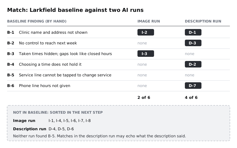
Read the pattern before you judge single points. In the Larkfield run, the description found more of the baseline than the image did. That is partly because the description named the Time gone and No times this week states, which a single image does not show. It also means some of those matches came from your words: the AI read that a time can be taken after Continue and pointed out that choosing a time does not hold it. Useful, but not independent. The image run found less of the baseline, but its matches came from looking.
Neither run found B-5. A problem only a person who tries to tap the service line would notice is the kind both inputs tend to miss.
Check it worked
Every AI point appears exactly once on the Match tab, either beside a baseline finding or under Not in baseline. For each run, count how many baseline findings it matched and write it at the top, such as "Image 2 of 6, description 4 of 6".
Step 5 · Sort every AI point into useful, generic or wrong
Now judge each AI point on its own, matched or not. Add a column Bucket to both AI tabs and give every point one of three values, using a test for each, not your gut.
- Generic. Test: would the sentence fit any screen in any app? "Improve the visual hierarchy so the primary action stands out" and "Ensure colour contrast meets accessibility standards" pass that test easily, which is why they are generic. They name no element, no pair of colours and no ratio. Do not argue with them; they cost nothing and change nothing.
- Wrong. Test: open the design file and check the claim. It is wrong if the thing it describes is not there, if it quotes a standard incorrectly, or if it states something about the screen it could not have known from its input.
- Useful. Test: it names a real element, the problem is there when you look, and someone could act on it or test it. A useful point can match your baseline or be new.
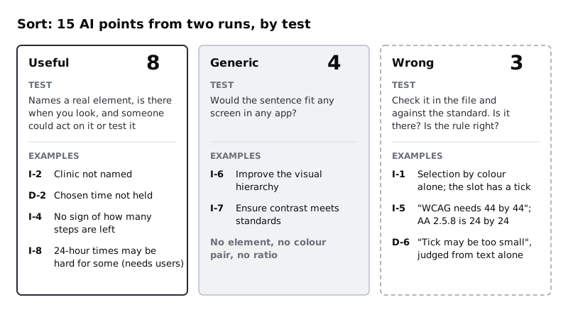
For Larkfield, the three wrong points show the three ways critique goes wrong:
- I-1, a problem that is not there. "The selected time is shown only by colour; add an icon or label." The selected slot has a tick, added in the high-fidelity pass so that selection does not rely on colour alone. The AI missed or ignored it. Open the PNG at 100 percent before you blame the export; if the tick is clear, the point is wrong.
- I-5, a standard quoted wrongly. "Time slots should be at least 44 by 44 pixels to meet WCAG." WCAG 2.2 at level AA (success criterion 2.5.8) asks for 24 by 24 CSS pixels, or enough space around a smaller target; 44 by 44 is the stricter AAA level, 2.5.5. Bigger targets can still be a good choice, but the claim about the rule is wrong. Then measure the slots in your file anyway: the point is wrong about the rule, and you still want to know the real size.
- D-6, a claim it could not know. "The tick on the selected slot may be too small to notice." The description run had no image. It guessed at a visual problem from a word.
Mark one more thing in a column Needs users: points that may be right but that no review, by hand or by AI, can settle. I-8 says some patients may find 24-hour times such as 14:40 harder to read than 2:40 pm. That depends on Larkfield's patients, not on the screen. Mark it Yes and keep it for the next usability test.
Check it worked
Every AI point has one bucket. Every point marked Wrong has a note saying what you checked: a layer in the file, a measurement, or a WCAG Understanding page. Count the buckets per run. For Larkfield: image run 4 useful, 2 generic, 2 wrong; description run 4 useful, 2 generic, 1 wrong.
Step 6 · Write the merged findings list
Add a tab called Merged. It holds every baseline finding plus every useful AI point that was not already in the baseline, one row per problem. Leave out the generic and wrong points; they stay on their own tabs as a record.
Use the columns from your baseline and add two:
- Source: Hand, AI image, AI description, or a combination such as "Hand, AI description".
- Needs users: Yes or No.
Rewrite each AI point in your own words in the same format as your baseline rows. Do not paste the AI's phrasing: it tends to mix the observation with a fix, and a finding should say what happens, not what to build.
The Larkfield merged list has eight rows:
- B-1 Clinic name and address not shown. Source: Hand, AI image, AI description.
- B-2 No control to reach next week. Source: Hand, AI description.
- B-3 Taken times hidden, gaps look like closed hours. Source: Hand, AI image.
- B-4 Chosen time not held. Source: Hand, AI description.
- B-5 Service line cannot be tapped to change service. Source: Hand.
- B-6 Phone line hours not given. Source: Hand, AI description.
- N-1 Nothing shows how many steps are left before the booking is made (from I-4). Source: AI image. Needs users: Yes; check whether patients feel lost, not just whether a progress bar is missing.
- N-2 24-hour times may be harder for some patients to read (from I-8). Source: AI image. Needs users: Yes.
Both new rows are questions, not answers. That is typical: when AI critique adds something a careful hand review missed, it is often a fair question about people the reviewer has not met. It still needs those people to answer it.
Check it worked
Every row on Merged has a Source and a Needs users value. Every baseline finding is there. No row came from a point you marked generic or wrong. Pick any AI-sourced row and you can point to it on the screen yourself.
Step 7 · Write down where AI critique helped and where it could not
Finish with a short note at the top of the Merged tab, so the next person on the team does not have to work this out again. Use numbers from your own run, not impressions.
The Larkfield note read:
- Second pair of eyes: the two runs together matched five of six hand findings and added two fair questions. Worth ten minutes after a hand review, not instead of one.
- Image versus description: the description run matched more of the baseline, partly because it echoed what the description said. The image run was more independent but misread a visible detail.
- Noise: 4 of 15 points were generic and 3 were wrong, one of them a wrongly quoted WCAG threshold. Every point had to be checked in the file before it could be used.
- What it could not do: tell us how Larkfield's patients read times, whether they feel lost mid-booking, or anything about the clinic's own process, such as when the phone line is staffed. Those need patients and staff.
- Next time: give the description run the same screen without the states, then add them in a second message, to see what it finds on its own.
If your users are on low-end Android phones or prepaid data, add a line on that too. Neither run raised slow loading or data cost on the Larkfield screen, because nothing in a static image or a short description shows them. If they matter for your users, they belong in your hand review and your test plan, not in an AI prompt.
Check it worked
The note has a match count, a bucket count, at least one thing AI critique could not judge, and one change for next time. Someone who reads only the note can decide whether to use AI critique on the next screen and how.
Next steps
- Build the hand review this tutorial depends on, for a whole flow with two evaluators: /tutorials/run-a-heuristic-evaluation
- Sharpen the visual side of your own baseline with ten checks and a test for each: /tutorials/critique-a-screen-with-a-visual-design-checklist
- Take the rows marked Needs users into a test with patients: /tutorials/plan-a-usability-test
- Use the same check-everything habit on research notes: /tutorials/synthesise-interview-notes-with-ai-and-check-it
Part of these paths
Related tutorials
- Critique a screen with a visual design checklistYou will have a ten-point visual design checklist with a test for each point, and a written critique of a real sign-up screen, under one page, where every finding states what you saw, the principle it breaks and a fix someone could draw.
- Run a heuristic evaluation of an existing appYou will have one merged list of usability problems in an existing booking flow, found by two evaluators working apart, with each problem tied to a heuristic, a screen and a severity rating.
- Turn a mid-fidelity layout into a high-fidelity designYou will have high-fidelity Larkfield Clinic booking screens in Figma, coloured, typeset, with icons and one photo, every text and colour pair checked for contrast and ready to wire into a prototype.
Need this done for you?
Padding does this work for growing companies, from the first diagnosis to a system that keeps working.
Get new tutorials