AI in design · Intermediate · 18 min
Design consent and data controls for AI features
By Padding · Updated 18 Nov 2026
Any design tool with frames, such as Figma or Penpot, and a shared document or spreadsheet · November 2026
You will have a first-use screen, a just-in-time prompt, a settings screen and a delete flow for an AI assistant, each written in plain language from a data inventory your team has confirmed, and checked with five people.
On this page
Most AI features ask for consent in the worst possible place: a checkbox at sign-up that links to a policy nobody opens. By the time someone types "I think my blood pressure tablets are making me dizzy, can I see a nurse?" into a booking assistant, that checkbox is long forgotten. They do not know the message went to an AI service, whether anyone at the clinic will read it, or how long it stays anywhere.
Consent is an interface problem as much as a legal one. The questions a person has are simple: what happens to what I type, can I say no, can I take it back, and can I talk to a human instead. If the answers are true, short and in front of them at the moment they decide, they can make a real choice. If the answers live in a policy page, they cannot.
This tutorial works on the Larkfield Clinic booking assistant, the chat in the clinic's appointment app that answers questions such as "Can I get a travel vaccine this week?" and hands off to the normal booking flow (Choose a service, Pick a time, Your details, Confirm, Booked). Health data raises the stakes: most data protection laws, including the GDPR, treat information about someone's health as a special category with stricter rules. You will start from facts, decide which choices are real, then design four surfaces: a first-use screen, a prompt when someone asks for a person, a settings screen and a delete flow. Your data protection lead or lawyer signs off the final wording; your job is to make it true, findable and understandable.
Step 1 · Write a data inventory with the people who know
You cannot write an honest consent screen from guesses. Before you draw anything, book half an hour with a developer who built the feature and whoever handles data protection, and fill in a table together. Make a document or spreadsheet called Assistant data inventory with one row per kind of data and these columns:
- What: the data, in plain words.
- Why: what the feature needs it for.
- Where it goes: every system that receives it, including the AI service.
- How long: when it is deleted, and by whom.
- Who can see it: people, not systems.
- Used to improve anything? yes, no, or only if the person opts in.
- Source: where the answer came from (a contract clause, a settings page in the admin tool, a developer's confirmation with a date).
Larkfield's finished inventory has four rows. The values are Larkfield's own decisions; yours will differ.
- Messages the patient types. Why: so the assistant can answer, and so the clinic can look into a complaint or a wrong answer. Goes to: the AI service, which writes the reply, and Larkfield's chat store on the clinic's server. Nothing is kept on the phone. How long: the screen is cleared when the patient closes the assistant, finishes a booking or is idle for 30 minutes (the
History rulesfrom the chat interface tutorial); Larkfield's server deletes its copy after 30 days; the provider's terms say it does not keep messages after replying and does not train on them. Who sees it: nobody at the clinic, with two exceptions the patient chooses. Reception sees a chat if the patient asks for a person and chooses to share it. If the patient turns on improving the assistant, one named member of staff reads their chats with names and dates of birth removed. Improve: only if the patient opts in. Source: provider data terms, clause and date noted; developer confirmed the 30-day server job and the name removal on 12 November. - Account details. Name and date of birth, so a booking made through the assistant reaches the right record. These are not sent to the AI service.
- Bookings made through the assistant. Kept with all other appointments, under the clinic's normal records rules. Deleting a chat does not delete a booking.
- Ratings (thumbs up or down). Kept for 12 months, without the message text unless the patient opts in to helping improve the assistant.
Any cell that says "probably", "I think" or "check with the vendor" is a question, not an answer. Mark it and chase it before you write copy that depends on it.
Check it worked
Your inventory has a row for every kind of data the feature touches, and every cell in Where it goes, How long and Who can see it has a source with a name or document and a date. Nothing in those three columns says "probably".
Step 2 · Separate what the feature needs from what is optional
A choice is only a choice if saying no leaves the person able to carry on. Go through the inventory and sort every use of data into two groups.
Necessary to use the assistant. Sending messages to the AI service is how the assistant works at all. You cannot offer "use the assistant but do not send my messages to it". The honest choice here is whether to use the assistant, so the non-AI path must work just as well: the normal booking flow, and a phone number. At Larkfield, the Home screen keeps its Book an appointment button whether or not someone opens the assistant.
Optional. Everything else that is not needed to answer the question in front of the person:
- Sharing a chat with reception when the patient asks for a person.
- Using chats to improve the assistant, which means a member of staff reads them with names removed.
- Keeping chats on the phone to read again later.
Every optional use starts switched off. A switch that is on before the person touched it is not their choice, and the GDPR says silence, pre-ticked boxes or inactivity do not count as consent. Larkfield dropped the third item entirely: the History rules already decided there is no list of past chats, because phones are often shared and the booking itself is the record.
Write the result as a short list at the top of your design page, under a heading Choices, with the default next to each.
Check it worked
Your Choices list has two groups. Every item under Optional has the default "off", and for each one you can say what still works if the person never turns it on. The Necessary group names the non-AI alternative (at Larkfield, the booking flow and the phone line).
Step 3 · Draft the first-use screen
The first time someone opens the assistant, show one screen before the chat. It answers the four questions in the order people ask them, each in one or two sentences, and it gives them a way out that is as easy to press as the way in.
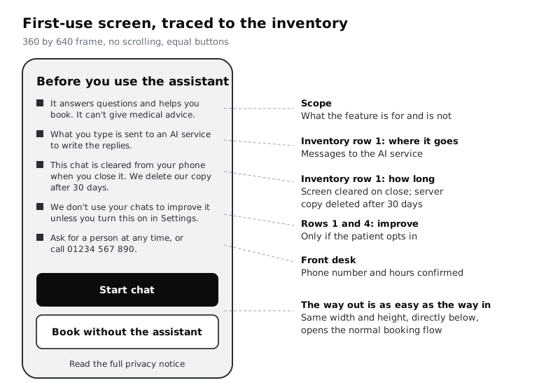
Write the copy first, in a text layer, before you design anything around it. Larkfield's reads:
- Title:
Before you use the assistant - What it does:
It answers questions about our services and helps you book. It can't give medical advice. - Where your messages go:
What you type is sent to an AI service to write the replies. You don't need to describe symptoms to book. - How long we keep them:
This chat is cleared from your phone when you close it. We delete our copy after 30 days. - Improving the assistant:
We don't use your chats to improve it unless you turn this on in Settings. - A person instead:
You can ask for a person at any time, or call 01234 567 890. - Buttons:
Start chat(primary),Book without the assistant(secondary, same size).
The first sentence of that line matches the notice in the assistant's opening message, This chat is cleared when you close it., and the second says what happens on Larkfield's side, so the two never read as contradicting each other. Every sentence must match a row in the inventory. Put the row number next to each line in a comment so a reviewer can trace it. If a line cannot be traced, delete it or fix the inventory.
Now design the frame. Keep the six lines visible without scrolling on a 360 by 640 frame, the size of a common low-end Android phone. Many Larkfield patients book on prepaid data, so do not put the explanation behind a video or a large illustration. Make both buttons full width and at least 48 px tall, and place Book without the assistant directly under Start chat, not as a small link at the bottom. Add a Read the full privacy notice link under the buttons for people who want the detail; the screen should be enough without it.
Check the reading level by reading the copy aloud to someone outside the project. WCAG's reading-level criterion uses roughly lower secondary school education as its yardstick; for a health service, aim simpler than that. Replace any word you have to explain, such as "process", "retain" or "model".
Check it worked
Your first-use frame shows the title, five lines and both buttons on a 360 by 640 frame with no scrolling. Each line has a comment naming an inventory row. The two buttons are the same width and height, and Book without the assistant opens the normal booking flow in your prototype.
Step 4 · Ask the optional question at the moment it matters
The first-use screen tells people what happens by default. It does not ask them to make optional choices up front, because nobody can judge whether to share a chat with staff before they know they will need a person. Ask each optional question when the person has the information to answer it.
For sharing a chat, that moment is when the patient asks for a person during reception's hours. The chat interface tutorial's Hand-off component already says whether reception will see the conversation; here you make that the patient's choice. Before the Reception hand-off appears, show a short sheet:
- Title:
Share this chat with reception? - Body:
If you share it, the receptionist can read what you've typed here, so you don't have to repeat it. If you don't, they'll start fresh. Either way, you can call 01234 567 890. - Buttons:
Share chatandDon't share, the same size, and neither one preselected.
If the person closes the sheet without choosing, nothing is shared and they go back to the chat. That matches the default in your Choices list. Then set the Hand-off card's line about what travels to match the answer, for example Reception can see this chat. or Reception can't see this chat.
For improving the assistant, there is no natural moment inside a chat, so do not invent one. Leave it in Settings, switched off, and mention it on the first-use screen as you did. A pop-up asking people to help train the assistant after every chat would push them towards yes by repetition.
There is one more moment worth designing: when a patient starts typing a lot about symptoms. You might be tempted to detect health details and warn about them, but that would mean another system reading the message. A fixed hint under the message box does the same job for everyone: For booking you only need the service and a time. For medical advice, call us.
Check it worked
Your Share this chat with reception? frame has two buttons of equal size with neither highlighted, and your prototype treats closing the sheet as not sharing. The Reception hand-off card says whether reception can see the chat, matching the choice. The message box on the chat frame has the fixed hint under it. Nothing in the chat flow asks about improving the assistant.
Step 5 · Design the settings screen
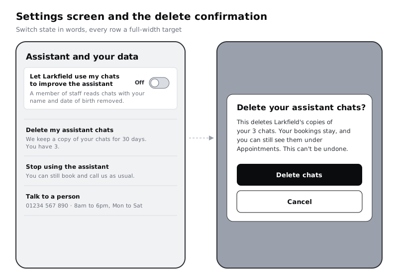
People who change their mind need one place to go, and they need to find it from where they are. Add a frame called Assistant and your data, linked from the assistant's menu and from the app's main Settings screen. Lay it out in this order:
- One switch, with a label that says what happens, not what the feature is called:
Let Larkfield use my chats to improve the assistant(off). Hint under it:A member of staff reads chats with your name and date of birth removed. Off unless you turn it on.This is the staff access in inventory row 1, in plain words. - Delete your chats: one row,
Delete my assistant chats, with a hint that says what Larkfield holds:We keep a copy of your chats for 30 days. You have 3.There is no list to browse; per theHistory rules, past chats are not shown on the phone, so this row is the only place they surface. - Stop using the assistant: a row that hides the assistant from the Home screen. Hint:
You can still book and call us as usual. - Talk to a person: the phone number and the front desk's hours.
Show the switch's state in words as well as position and colour, for example On or Off beside it. Someone who cannot tell grey from teal, or who has the screen in bright sun, can still read the state. Make the whole switch row, not just the small track, the tap target. In the developer notes, ask for the switch to be built as a real switch control so screen readers announce its name and whether it is on or off.
If your app is used in more than one language, test the switch labels in the one that runs longest. Larkfield's patients use the app in English and Yoruba, so the team checks both; labels must wrap to two lines rather than be cut short with an ellipsis, because a cut-off switch label hides what you are agreeing to.
Check it worked
Your Assistant and your data frame has one switch, off, with Off written beside it and a hint that names who reads chats if it is on. The delete row states the 30 days and the number of chats Larkfield holds. The frame is reachable in your prototype from both the assistant's menu and the main Settings screen. Every row is at least 48 px tall.
Step 6 · Design delete and opt-out so they are as easy as opting in
Turning something on took one tap. Undoing it should not take more than two. The GDPR puts it as withdrawing consent being as easy as giving it, and it is a good design rule anywhere.
Design three flows from the settings screen:
- Delete my assistant chats. This gets a confirmation dialog, because it removes several records at once and cannot be undone. Say exactly what goes and what stays:
- Title:
Delete your assistant chats? - Body:
This deletes Larkfield's copies of your 3 chats. Your bookings stay, and you can still see them under Appointments. This can't be undone. - Buttons:
Delete chatsandCancel. Repeat the action in the button; neverYesandNo. - Afterwards:
Chats deleted.and the row's hint changes toYou have no saved chats. - Stop using the assistant. One tap hides it from the Home screen and shows
Assistant hidden.with anUndobutton for a few seconds. An undo is safer than a dialog here because nothing is lost: turning it back on is the same row. - Turn off improving the assistant. The switch goes off and the hint changes to
We've stopped using your chats from now on.If chats already used cannot be taken back out (ask the people in your inventory meeting), say so in the hint. Do not imply more than you can do.
Do not confuse the chat's Start again control with deletion. It clears the screen, not Larkfield's server copy, so its label and any notice it shows must not say deleted. Each sentence about deletion must match the inventory. If the provider keeps copies for a period after deletion, the dialog says that, with the period.
Check it worked
Your prototype has three flows from the settings screen. Deleting chats takes two taps and the dialog names what is deleted and what is kept, with the same count as the settings row and button text that repeats the action. Hiding the assistant takes one tap and shows Undo. Every claim in the three flows traces to a row in the inventory.
Step 7 · Put the way to a person on every surface
A person who does not want to use an AI service at all is making a reasonable choice, and for a clinic it must never block them from care. Go through every frame you have made and check that each one has a way to reach a human:
- First-use screen:
You can ask for a person at any time, or call 01234 567 890. - Inside the chat: a
Talk to a personoption in the menu, and the assistant offers it whenever it cannot answer. Share this chat with reception?sheet: the phone number is in the body, so the patient can call whatever they choose.- Settings screen: the
Talk to a personrow with the phone number and the front desk's hours. - Delete dialog: not needed, but the settings screen behind it has the row.
Then check what "a person" means in practice with whoever runs the front desk. If a patient asks for a person in the chat at 9pm, what happens? Larkfield's answer is a message in the chat: Our front desk is open 8am to 6pm, Monday to Saturday. Call 01234 567 890 then, or book a callback for tomorrow. Write that state as a frame. A promise of a human that nobody answers is worse than no promise.
Check it worked
Every frame in your flow either shows a way to reach a person or sits directly on top of a screen that does. You have a frame for the out-of-hours answer, and its hours match what the front desk confirmed.
Step 8 · Test whether people understand what they agreed to
A consent screen works if the people who read it can say back what it means. You can find out with five people and a printed or on-screen copy of your frames. Pick people who match your users: for Larkfield, patients and carers, including at least one who usually books for someone else and one who reads English as a second language.
Show the first-use screen for as long as they want, then take it away and ask four questions:
If you type something into the assistant, who or what sees it?What happens to your chat when you close it?(a right answer covers both: cleared from the phone, Larkfield's copy deleted after 30 days)If you don't want to use the assistant, what can you do?How would you delete your chats later?(for this one, give them the app prototype and watch)
Write each answer in a sheet with one row per person and one column per question, and mark it right, partly right or wrong against the inventory. Do not explain anything until all four are answered.
A question most people get wrong points at a sentence to rewrite. In Larkfield's first round, three of five people said "the receptionist" for question 1; the line said "processed by an AI service", and "processed" read as "handled by staff". Changing it to "sent to an AI service to write the replies" fixed it in the second round. Rewrite, then test with five new people.
Check it worked
Your sheet has five rows and four answers per row, each marked right, partly right or wrong. At least four of five people answer each question right before you hand the frames over. For any question below that, you have changed a specific sentence and tested again.
Next steps
You now have consent and data controls a patient can understand, built from facts your team has confirmed. Keep the inventory with the design files: when the provider or the retention period changes, the inventory changes first and the copy follows.
- Design the conversation these screens sit in front of with /tutorials/design-a-chat-interface-for-an-ai-assistant.
- Plan what the assistant does when it cannot help, including handing over to the booking form, with /tutorials/design-error-refusal-and-fallback-states-for-ai.
- Apply the same care to your own research data before it reaches an AI tool with /tutorials/remove-personal-data-before-sharing-research-with-ai.
- Tighten the labels, buttons and hints across the flow with /tutorials/write-interface-copy-for-labels-buttons-and-errors.
Part of these paths
Related tutorials
- Remove personal data before sharing research with AIYou will have a de-identified interview transcript that is safe to give an AI tool, a mapping file stored apart from it, and a short checklist to repeat for every transcript in the study.
- Design error, refusal and fallback states for AI featuresYou will have a failure matrix for an AI booking assistant that covers wrong answers, refusals, outages and rate limits, with a non-AI way forward for every row and a set of state frames that keep people moving.
- Design a chat interface for an AI assistantYou will have a scope sheet for a task-focused booking assistant and seven Figma frames covering its main chat states, from the opening message to hand-offs to the real booking form and to a person.
Need this done for you?
Padding does this work for growing companies, from the first diagnosis to a system that keeps working.
Get new tutorials